shape
carat
color
clarity

How small is too small for super ideal?

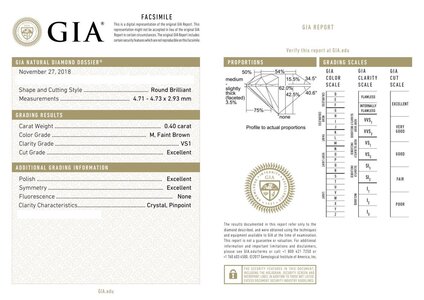
Also, the JA stone dimensions are 4.71×4.73 (face up), and the CBI is 4.80x4.81. In theory less than a .1mm difference shouldn't be visible (or at least not much), but IMHO the CBI looks soooo much bigger!
 
Interesting. Thanks for guinea pigging this!
We’re the m’s report numbers/images something that excited you?
Before you got to see next to the CBI, of course.
 
Interesting. Thanks for guinea pigging this!
We’re the m’s report numbers/images something that excited you?
Before you got to see next to the CBI, of course.

Definitely! I love small tables and relatively deeper stones, so the 62% depth and 54% table seemed perfect. On paper, it's essentially perfect for me!cert.jpeg
 
I agree the CBI looks brighter and larger. I'm not surprised the M is less bright just because of the color but also the cut. And I'm not surprised it isn't tinted enough. I don't think the M looks bad, but yes, I would choose the CBI over the other
 
I agree the CBI looks brighter and larger. I'm not surprised the M is less bright just because of the color but also the cut. And I'm not surprised it isn't tinted enough. I don't think the M looks bad, but yes, I would choose the CBI over the other

Absolutely the M doesn't look bad by itself, but it just pales in comparison to the CBI.
 
Well.... The M is very contrasty as expected.

Yeah. The contrasty-ness is something I like a lot, but maybe it's that combined with the fact that the color isn't tinted enough for my liking that makes me overall not thrilled. That plus the AMAZING performance on the CBI all works to make me confident in returning the JA stone. It definitely seemed more tinted in the JA video vs IRL (at least to my eyes).
 
Wow, that looks barely tinted! I too like warm brown or gold undertones and that is just….. unimpressive. Shoot. Hey you know the CBI is a winner! What are your plans for it? Apologies if you already said so earlier :)
 
Yeah. The contrasty-ness is something I like a lot, but maybe it's that combined with the fact that the color isn't tinted enough for my liking that makes me overall not thrilled. That plus the AMAZING performance on the CBI all works to make me confident in returning the JA stone. It definitely seemed more tinted in the JA video vs IRL (at least to my eyes).

The fact you are not seeing much tint means the M is well cut with minimum leakage. Still, I gotta say it appears a bit dull. The D is just stunning.

Having that said, those nails are cut even better.
 
Thank you for all the comparison pics. The D is certainly the winner, hands down! The M looks rather blah to be perfectly honest. I am still looking at all the smaller CBI’s too….thinking about a bracelet.
 
Thanks for posting! There does seem to be a difference in light return in the center of the stone, but IANAE.
 
@lovedogs thank you for posting. This is a great illustration to show the difference between a stone with the right parameters- on paper - and the reality. The CBI blows the JA away IMO. Thank you again - im showing this to DH. He and I are such cut geeks!
 
Oooh. Those comp pics are fab!!

The thing that stands out most to me is how much larger the CBI looks, even in photos - I can imagine that effect is magnified significantly in-person!! I’ve seen something similar with my J diamond compared to colourless stones of similar size but my comps weren’t as tight as yours.

Thanks for sharing!! :love: :cool2:
 
Yes the CBI is the winner in all arenas compared to the JA stone. I personally don’t care for all the contrast in the JA stone; to my eyes it makes it appear darker - not as bright - regardless of the color difference.

can’t wait to see what you do with the new diamond! Thanks for this ‘test’ - I think we all learned something!
 
GET 3 FREE HCA RESULTS JOIN THE FORUM. ASK FOR HELP
Top