You are using an out of date browser. It may not display this or other websites correctly.
You should upgrade or use an alternative browser.
You should upgrade or use an alternative browser.
Input needed for CAD for my OEC reset - specifically what to do with ring shoulders
- Thread starter Mreader
- Start date
Mreader
Ideal_Rock
- Joined
- Aug 14, 2018
- Messages
- 7,513
After looking at a zillion photos I think the shape I’m most drawn to it this but the main inspos have pave and I was thinking I would just do gold. So the closest I could find is this:
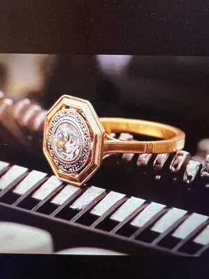
But a touch thicker such as this:
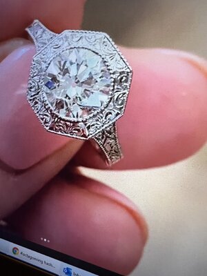
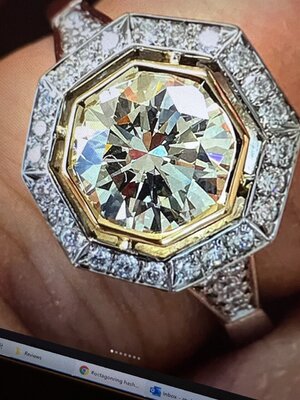
I also am contemplating making the roundels (sp?) more solid rather than notched kind of like in this ring:
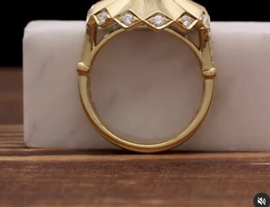
But I am still mulling everything over.

But a touch thicker such as this:


I also am contemplating making the roundels (sp?) more solid rather than notched kind of like in this ring:

But I am still mulling everything over.
- Joined
- Aug 14, 2009
- Messages
- 27,485
I’m having difficulty visualizing what it means to “make the top flat rather than domed”. I’m so bad at this stuff!!
Sorry! Bad description on my part. Here’s what I meant - the band on the left, the exterior is flat. Whereas the band on the right has a domed exterior. The left band looks wider to the eye at a glance even though they’re the same width - the flat tricks the eye.
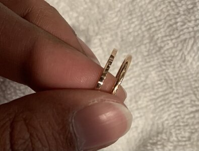
Then… Whatever you do to the edge of the octagon (milgrain, bevel, etc.) - Copy that on the shank.
Edit - Seems like you’re headed in exactly that direction
Mreader
Ideal_Rock
- Joined
- Aug 14, 2018
- Messages
- 7,513
S
Edit - Seems like you’re headed in exactly that direction
Haha yes without really realizing that was what I was doing - flattening out that part of the shank. Thanks for the pictures they helped alot!
caolsen
Brilliant_Rock
- Joined
- Feb 21, 2010
- Messages
- 1,488
Love the horse head nail idea. As for my idea of a carving, here is an AD article of the use of geometry Islamic art - https://www.architecturaldigest.com/story/geometric-patterns-islamic-art
From that article, this door grabbed me… something like that door frame as a milligram on the shoulders above the rondel.
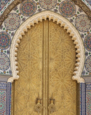
From that article, this door grabbed me… something like that door frame as a milligram on the shoulders above the rondel.

- Joined
- Jul 23, 2012
- Messages
- 20,213
Love the horse head nail idea. As for my idea of a carving, here is an AD article of the use of geometry Islamic art - https://www.architecturaldigest.com/story/geometric-patterns-islamic-art
From that article, this door grabbed me… something like that door frame as a milligram on the shoulders above the rondel.

Yea I think the horse head nail shank would looks in keeping with the geometric design- and less common/ overdone.
but I think the op my consider it masculine.
Mreader
Ideal_Rock
- Joined
- Aug 14, 2018
- Messages
- 7,513
Yea I think the horse head nail shank would looks in keeping with the geometric design- and less common/ overdone.
but I think the op my consider it masculine.
Yes I think so. I asked him to lower the basket and flatten the shoulders and milligram will be added to the shoulders. I also wanted it wider. here is the new cad; i’m getting a wax mailed out. Let me know if you guys see anything glaring. I love the picture you posted of the Islamic art. My mind is not that creative to then incorporate into jewelry - for me I will look at jewelry just say do this or don’t do that. I’m really impressed when you guys come up with creative designs just based on things that you see in nature or architecture.
Attachments
- Joined
- Jul 23, 2012
- Messages
- 20,213
Yes I think so. I asked him to lower the basket and flatten the shoulders and milligram will be added to the shoulders. I also wanted it wider. here is the new cad; i’m getting a wax mailed out. Let me know if you guys see anything glaring. I love the picture you posted of the Islamic art. My mind is not that creative to then incorporate into jewelry - for me I will look at jewelry just say do this or don’t do that. I’m really impressed when you guys come up with creative designs just based on things that you see in nature or architecture.
You’re adding millgrian?
are you happy with this version?
Love the horse head nail idea. As for my idea of a carving, here is an AD article of the use of geometry Islamic art - https://www.architecturaldigest.com/story/geometric-patterns-islamic-art
From that article, this door grabbed me… something like that door frame as a milligram on the shoulders above the rondel.

Love the details
- Joined
- Jul 23, 2012
- Messages
- 20,213
if it were me I would make the side metal on the bezel thicker on the profile. It’s very thin and doesn’t seem to be in keeping with the hefty top of the bezel. I also think the shank could use a taper I think it looks too heavy (think of a lolly pop) with a big bezel on a thin shank that doesn’t do taper up to the head.
The next bit is my personal aesthetic probably so I don’t think I can sell you on it - but since you said you have a hard time imagining I drew on your cad.
I also think the basket detail is too much. I would widen the shank and just take it out all together.
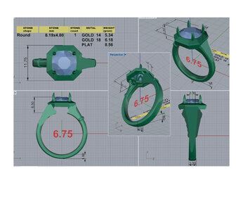
The next bit is my personal aesthetic probably so I don’t think I can sell you on it - but since you said you have a hard time imagining I drew on your cad.
I also think the basket detail is too much. I would widen the shank and just take it out all together.

- Joined
- Jul 23, 2012
- Messages
- 20,213

Alistair Kelsey on Instagram: "Radiance - New Radiance variation, featuring a central deep teal Australian sapphire claw set with burnt tips, atop an octagonal frame with champagne diamond side panels, in 18ct yellow gold. #alistairkelseyjewellery #j
236 likes, 10 comments - alistairkelseyjewellery on June 16, 2020: "Radiance - New Radiance variation, featuring a central deep teal Australian sapphire claw set with burnt tips, atop an octagonal frame with champagne diamond side panels, in 18ct yellow gold. #alistairkelseyjewellery...
 www.instagram.com
Sort of like how the underside of this looks.
I know this is too bulky for you, but have that shank 3 sides and not 2 you could still add some detail to it down the shank like you want to with the bars.
Mreader
Ideal_Rock
- Joined
- Aug 14, 2018
- Messages
- 7,513
You’re adding millgrian?
are you happy with this version?
There was always going to be miligrain like the cvb inspo so around the faux bezel and the edge of the octagon. Also brushed gold not shiny. And then on the edge of the shoulders.
Mreader
Ideal_Rock
- Joined
- Aug 14, 2018
- Messages
- 7,513
if it were me I would make the side metal on the bezel thicker on the profile. It’s very thin and doesn’t seem to be in keeping with the hefty top of the bezel. I also think the shank could use a taper I think it looks too heavy (think of a lolly pop) with a big bezel on a thin shank that doesn’t do taper up to the head.
The next bit is my personal aesthetic probably so I don’t think I can sell you on it - but since you said you have a hard time imagining I drew on your cad.
I also think the basket detail is too much. I would widen the shank and just take it out all together.

I like what you drew on the shoulders! But yes I wouldn’t want to eliminate the basket. Thank you for changing it so I can understand more clearly.
- Joined
- Jan 3, 2013
- Messages
- 5,299
Very pretty design. I look forward to seeing it finished. Will the finish be satin? A couple of items I will point out having been through quite a few CADs myself.
I do like what @Niel suggested with the reverse taper thickening up to the stone.
My lay-person thoughts now..
1. The basket has a sharp ^ (v shape) facing N/S and what would concern me is the ability to wear a band. Not sure if you plan to but something to think about. I see that spot either eating a band, creating a gap or wearing down (if worn with band).
2. I had DK make me a collet style soli last spring and the tiny negative dark space I saw between the chunky faux ‘bezel’ and the stone was distracting for me. So much so that I changed it to a straight-up bezel without the prongs. I see that space in your CADs and wonder if you raise the stone slightly and squish the metal bezel in tighter you may eliminate that dark empty space.
Of course these are my own experiences and I think it’s a beautiful design. I love more substantial pieces.
Mreader
Ideal_Rock
- Joined
- Aug 14, 2018
- Messages
- 7,513
Very pretty design. I look forward to seeing it finished. Will the finish be satin? A couple of items I will point out having been through quite a few CADs myself.
I do like what @Niel suggested with the reverse taper thickening up to the stone.
My lay-person thoughts now..
1. The basket has a sharp ^ (v shape) facing N/S and what would concern me is the ability to wear a band. Not sure if you plan to but something to think about. I see that spot either eating a band, creating a gap or wearing down (if worn with band).
2. I had DK make me a collet style soli last spring and the tiny negative dark space I saw between the chunky faux ‘bezel’ and the stone was distracting for me. So much so that I changed it to a straight-up bezel without the prongs. I see that space in your CADs and wonder if you raise the stone slightly and squish the metal bezel in tighter you may eliminate that dark empty space.
Of course these are my own experiences and I think it’s a beautiful design. I love more substantial pieces.
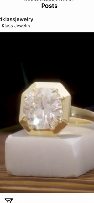
Thank you @Slick1 - yes the finish will be satin. I do not plan on wearing a band with it - in fact this will be for index or middle finger. The empty spaces, do you mean the part I circled in red - that look shadowy- on the CAD? (below) I didn't even notice that...but in the inspo piece I don't see any space irl (reposting DK's inspo below). So now I am confused!
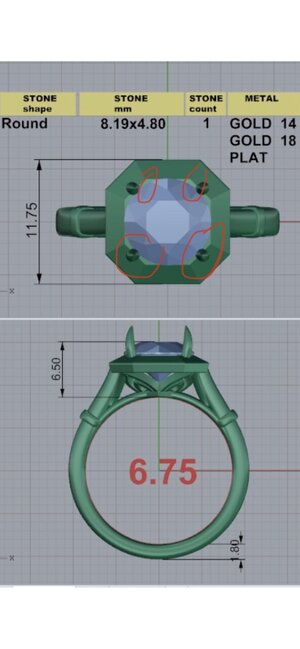
Mreader
Ideal_Rock
- Joined
- Aug 14, 2018
- Messages
- 7,513
@Mreader Yes!! That’s the area I am referring to. Do you have a head on view of the inspiration ring?
Will that sharp ^ dig into a your finger?
Yay for satin finish!!
Here is the link on IG https://www.instagram.com/p/CI9MVGfBMYO/?utm_source=ig_web_copy_link
Also I don't know about the ^ digging in; I will see when I get the wax which will probably help me determine that.
- Joined
- Jan 3, 2013
- Messages
- 5,299
Here is the link on IG https://www.instagram.com/p/CI9MVGfBMYO/?utm_source=ig_web_copy_link
Also I don't know about the ^ digging in; I will see when I get the wax which will probably help me determine that.
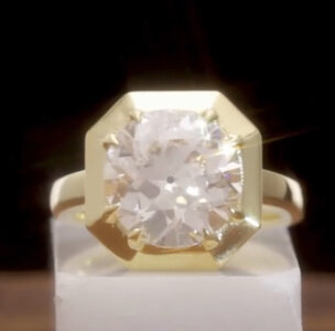
Ok! I took a screenshot of it head on and it appears the stone is set just above so there doesn’t seem to have that space I was thinking. It’s gorgeous!! Love!!
ETA I would maybe mention that you want it to be set like this since your cad does show a little negative space in there.
Mreader
Ideal_Rock
- Joined
- Aug 14, 2018
- Messages
- 7,513
Yes thank you for pointing that out so I will be sure to say something!
Mreader
Ideal_Rock
- Joined
- Aug 14, 2018
- Messages
- 7,513
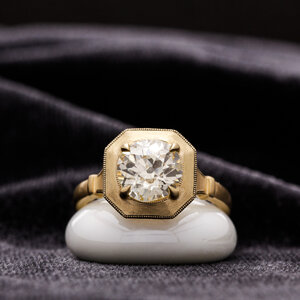
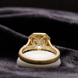
Hey guys; got the glamour shots and am a little worried. The first worry is that the color looks odd, but I am thinking it's a reflection. It looks strangely dark almost like a patina, but the shot of the back looks gold and bright. So again hoping it's the lighting since it was taken on a dark cloth or something. Showing front and back to show you see what I mean:
The other concern is that there seems to be blank spots in the milgrain near the prongs, and especially on the side. The side looks weird in that it just stops before the roundel:
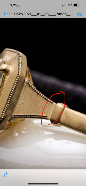
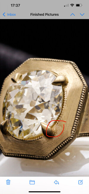
I just got these and I wrote David and asked about it. Do you guys know if milgrain would be easy to add after the fact like this? @Niel


The other concern is that there seems to be blank spots in the milgrain near the prongs, and especially on the side. The side looks weird in that it just stops before the roundel:


I just got these and I wrote David and asked about it. Do you guys know if milgrain would be easy to add after the fact like this? @Niel
klrrrr
Shiny_Rock
- Joined
- Aug 5, 2019
- Messages
- 433
@Mreader - I can't comment on whether this would be an easy fix, but I wanted to share that this would 100% bother me and be on my list of must-fix items before shipping! The good news is that the ring is an absolute stunner, swoon!
Personally, I love the shade of gold in the pictures, but I see what you mean about it looking like patina. My guess is that it's just a reflection of the surroundings, particularly in the milgrain.
Personally, I love the shade of gold in the pictures, but I see what you mean about it looking like patina. My guess is that it's just a reflection of the surroundings, particularly in the milgrain.
- Joined
- Jan 29, 2015
- Messages
- 378
Mreader
Ideal_Rock
- Joined
- Aug 14, 2018
- Messages
- 7,513
Actually I love love love the color of the gold, but agree you should ask him to fix the milgrain. oh my, this is going to be AMAZING!
what is this type of finish called?
I think it’s called a satin finish or brushed gold.
- Joined
- Oct 19, 2013
- Messages
- 5,816
What did you ask for? Brushed or satin finish? Knurled?
( Did you go verbal for that or show him an example of what you wanted?)
And you didn’t ask for any patina or none was discussed?
The milgrain areas can be fixed/redone/added to, but ask for pictures of the work that’s been redone before it’s sent back out.
My biggest worry about any rework of milgrain would be double imprinting or not lining up with the existing ones.
And truly my thoughts are if you weren’t wanting the general design feature effects as rustic they are and you aren’t smitten- I think it’s a redo. Not a rework of multiple areas.
Last edited:
- Joined
- Jul 23, 2012
- Messages
- 20,213
Hey guys; got the glamour shots and am a little worried. The first worry is that the color looks odd, but I am thinking it's a reflection. It looks strangely dark almost like a patina, but the shot of the back looks gold and bright. So again hoping it's the lighting since it was taken on a dark cloth or something. Showing front and back to show you see what I mean:
The other concern is that there seems to be blank spots in the milgrain near the prongs, and especially on the side. The side looks weird in that it just stops before the roundel:
I just got these and I wrote David and asked about it. Do you guys know if milgrain would be easy to add after the fact like this? @Niel
The millgrain is done after the ring is finished and looks like they missed a bit so I don’t see why they could fix this mount- I would be surprised if they had to make a whole new casting.
diamondyes
Brilliant_Rock
- Joined
- Oct 16, 2020
- Messages
- 1,826
Mreader
Ideal_Rock
- Joined
- Aug 14, 2018
- Messages
- 7,513
What did you ask for? Brushed or satin finish? Knurled?
( Did you go verbal for that or show him an example of what you wanted?)
And you didn’t ask for any patina or none was discussed?
The milgrain areas can be fixed/redone/added to, but ask for pictures of the work that’s been redone before it’s sent back out.
My biggest worry about any rework of milgrain would be double imprinting or not lining up with the existing ones.
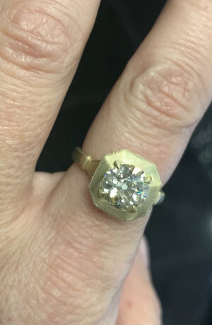
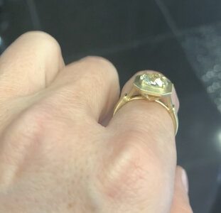
I gave him an inspo photo and said I wanted the gold to look like that. I just got a video and the color is super beautiful. It does look quite different from the photo.
- Joined
- Jan 29, 2012
- Messages
- 6,282
I think the design is beautiful! 
If the milgrain can be fixed in the areas you noted earlier, I think you'll be in good shape.
It may be nothing but I'd ask DK about this dark spot (circled in red). I also circled some sort of discoloration. It could be just a reflection off the gold but just on case, I wanted to bring it up.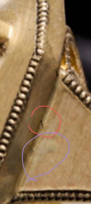
And the biggest reminder of all: This is a massively blown up pic. It's easy to get nervous and spot "problems" that are almost invisible in person. We all do it but sometimes it's nice to have someone remind us.
I cant wait to see what this looks like on your hand. Such a beautiful design.
If the milgrain can be fixed in the areas you noted earlier, I think you'll be in good shape.
It may be nothing but I'd ask DK about this dark spot (circled in red). I also circled some sort of discoloration. It could be just a reflection off the gold but just on case, I wanted to bring it up.

And the biggest reminder of all: This is a massively blown up pic. It's easy to get nervous and spot "problems" that are almost invisible in person. We all do it but sometimes it's nice to have someone remind us.
I cant wait to see what this looks like on your hand. Such a beautiful design.
Mreader
Ideal_Rock
- Joined
- Aug 14, 2018
- Messages
- 7,513
I think the design is beautiful!
If the milgrain can be fixed in the areas you noted earlier, I think you'll be in good shape.
It may be nothing but I'd ask DK about this dark spot (circled in red). I also circled some sort of discoloration. It could be just a reflection off the gold but just on case, I wanted to bring it up.
And the biggest reminder of all: This is a massively blown up pic. It's easy to get nervous and spot "problems" that are almost invisible in person. We all do it but sometimes it's nice to have someone remind us.
I cant wait to see what this looks like on your hand. Such a beautiful design.
Thank you! And yes I know that things that are magnified can show "flaws" that are not easily visible irl. He said there were some water marks on the ring that would be gone before the final polish. My main concern is the milgrain, especially the side. It looks so weird that it stops and that there is that blank space before the roundel. Hopefully it can be fixed and not have the issue that @Rfisher mentioned...other than that I love the look.
Share:
Past, Present, Future: The Meaning of Three-Stone Engagement Rings Past, Present, Future: The Meaning of Three-Stone Engagement Rings - 04/14



300x240.png)