GemView
Shiny_Rock
- Joined
- Jul 25, 2005
- Messages
- 225
Date: 10/19/2007 7:57:23 PM
Author: lyra
The only thing that really matters is that YOU like it.My personal preference is that I like it better in one tone. But you want 2 tone with a gold shank, so that''s what you should have. You obviously really love the ring, otherwise you wouldn''t be defending it. To me that means it must be the right ring for you. At least you''ve actually seen it and tried it on and that''s something none of us can experience just by looking at pictures. Go for it.

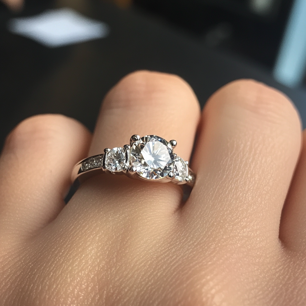
Thanks for encouraging me to "just go for it", Lyra! I think one reason why it may sound like I''m defending the setting is because I just don''t have many other choices that incorporate a bezel setting with the two tone look. As I mentioned to diamondsrock, a lot of the two-tone bezel settings that are on the market at this time are using white metal on the finger and yellow around the diamonds, which strikes me as somewhat backward because yellow bezels not only tend to make the stone appear smaller, but may reflect a yellow color into the stone. Since we went to the effort & expense of purchasing a colorless diamond, I would rather not surround it with high karat gold, which is VERY yellow compared to white or even 14K. (When it comes to yellow gold, I prefer the look of 14K over 18K, actually.)
Perhaps I should clarify that the question really isn''t about whether or not the two tone look is appealing — I knew that would be the wrong way to go about asking for opinions if only because many PSers don''t like yellow gold to begin with. To see if we were talking about the style/size of the ring — which was my concern — vs. the color combination, I thought it might help to post a B&W version of the ring. Doing so has helped demonstrate that maybe this ring is overdoing the yellow gold part, which is one reason it looks busy. I don''t entirely disagree with that opinion, either. I feel the 18K is just TOO yellow compared to the 14K I usually prefer, and on top of that the pictures I took make the yellow gold portions come across even stronger — more more like 22K.

The great part of this upgrade setting search is that if anyone were to know of alternative designs it would be the folks here on PS. As it is, I''ve spent hours upon hours looking — and had been looking for about a month even before I posted anything about this particular setting. Unfortunately, I only know of the sites that come up on a Google search, whereas many of the mom & pop jewelers don''t show up that way because their Web sites haven''t been coded correctly to appear in those results.
I''m really sorry I seem so confused… If I hadn''t already found that my current setting didn''t work out, perhaps I would not be so cautious. But having made that mistake once, I''m trying not to make it twice.

So does anyone else wish to weigh in on the original setting? I''m also happy to receive links to alternative two tone settings — or bezel settings of any kind/color.
Thanks again!


300x240.png)