shape
carat
color
clarity

New Octavia - opinions on Fluorescence & ring design

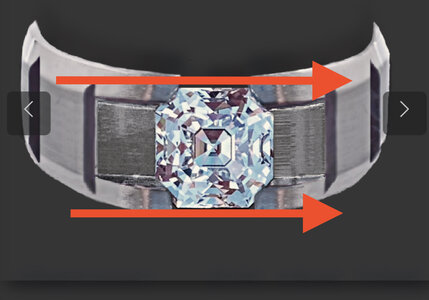
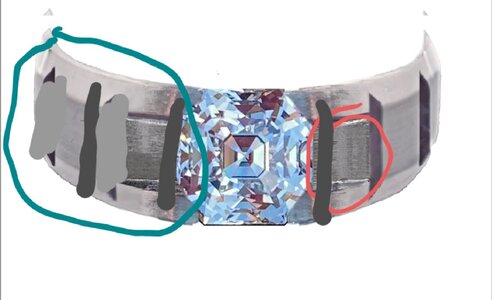
I think what diamond seeker means is this:C1C60E4E-2025-4AE3-B868-62D2E6967D71.jpeg

Let’s call the top and bottom red lines I have drawn “rails” for the discussion. If we can make the rails th same width or slightly wider than the stone, it would make the stone look bigger than what you have.

Currently, with your rendition, the rails seem to “engulf” the stone. A minor tweak and, I think the geometry will work as well.

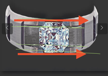
What can also be considered is that the width of the rails be the same as the width of the windmills at each corner. The green lines are my poor attempt with fingers on iPhone. 740CD81F-3CB6-4946-A83F-B5CAEDE9F1CB.jpeg

the width of the stone is 6.3mm. So you could make it 6.4mm wide??
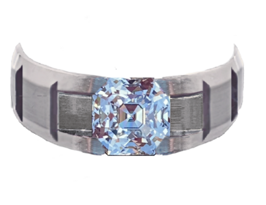
voilla!
15325165-D07B-4B19-99FB-2286B5F90EE8.png

I love how this has become a community project. You all are amazing!
 
Last edited:
Are you thinking of changing the entire band width or doing a "reverse taper" of sorts where the shank narrows down at the stone then gradually returns the original width?

Also, what is the purpose of the flaps/ears (red circle) on each side of the stone? The grain of the material looks like they are sloped at a different angle than the rest of the ring. Is the slope intentional or a by-product of hood photochop skills? Lol

Lastly, what are your thoughts on starting the breaks at the stone edge instead of having those flaps? It reminds me a tile job where they put the full pieces of tile in the most visible area and then put the short odd pieces in a corner where it is less visible. Except this is reversed on the ring. The "fillers" are near the star of the show. I drew a very rough sketch on the left side to illustrate better.

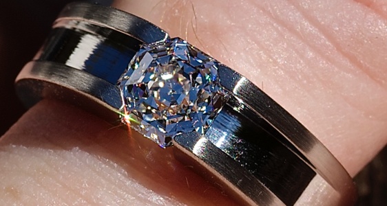
20210625_120620.jpg
 
Are you thinking of changing the entire band width or doing a "reverse taper" of sorts where the shank narrows down at the stone then gradually returns the original width?

Also, what is the purpose of the flaps/ears (red circle) on each side of the stone? The grain of the material looks like they are sloped at a different angle than the rest of the ring. Is the slope intentional or a by-product of hood photochop skills? Lol

Lastly, what are your thoughts on starting the breaks at the stone edge instead of having those flaps? It reminds me a tile job where they put the full pieces of tile in the most visible area and then put the short odd pieces in a corner where it is less visible. Except this is reversed on the ring. The "fillers" are near the star of the show. I drew a very rough sketch on the left side to illustrate better.
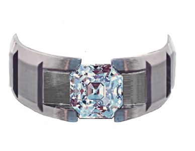
20210625_120620.jpg

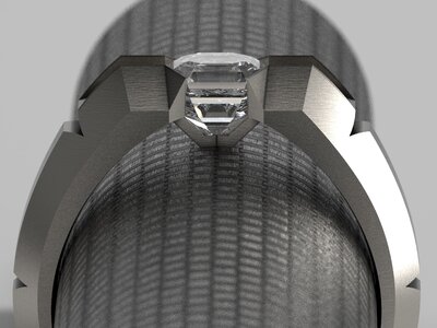
They aren’t flaps. It's groove.

It can be hard to perceive a three-dimensional object in a two dimensional drawing.

The stone mounts like Boonerings "Sidegrooves" (like Kenny's ring) to allow for light to enter all sides of the stone. A more traditional tension-mount may obstruct light from entering at the sides.

9E07AF10-5CFC-4B54-B92E-1FDABF51B865.png

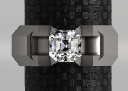
And I’m actually sticking with the design below. It's my favorite so far.
1C197AC2-9D2A-445C-9648-63EBB319921A.png

Just did the other mock-up to entertain the suggestions posted ;)2
 
Last edited:
@Dr_Diesel and thst is what is most important. What you like.

It sounds like it would be a much easier process for jeweler to work with once you know what you want.
 
Community project. Lololol.
 
Caysie & her team nailed it.

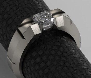
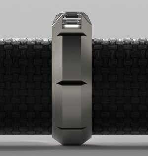
The CAD renderings took the design to a new level through the collaborative efforts of Caysie, her CAD designer and her Bench Jeweler over the course of this past week.

They really captured the strong architectural/industrial vibe I was hoping for. .. and brought in something that feels almost a little futuristic. Both she and I are super stoked about the design.

This team is a joy to work with, dedicated, passionate and frankly just brilliant! It’s only fitting to complement the genius behind the Octavia.

@diagem
@Karl_K

CAD drawings are complete and we’re head into production

B75896E7-F3D3-426E-8CD5-FE642137A04F.pngD2A9AFF4-2C89-4326-9D79-16D21B6EA58D.jpeg5F31DC30-C7F6-4668-8EDD-6FAD8E8E117E.jpeg83D681E7-77FF-4E8D-8421-D750404949B8.jpegF9271006-76A1-4E17-894C-383FC9BEBBAA.jpeg
768FCA8A-D7C4-44CE-822B-6E059AB967F2.jpeg
 

Attachments

  • 9A757664-A8A3-4368-9009-28237CCBC293.jpeg
    9A757664-A8A3-4368-9009-28237CCBC293.jpeg
    174.9 KB · Views: 6
Last edited:
WOW>. that looks amazing. love the structure architecture of it.
 
I was half dozing half surfing and saw the image and I was like huh who smushed the crown down, someone sure is gonna be mad.
It woke me up enough to think.... whew it wasn't a nightmare just a cad LOL
The table is much smaller and the ch much higher on the real deal which is gonna make it look even more kewl than the cads which is already kewl.
 
Yay!!! That looks awesome it does seem to capture your vision!
 
Kewl indeed! =)2
 
I was half dozing half surfing and saw the image and I was like huh who smushed the crown down, someone sure is gonna be mad.
It woke me up enough to think.... whew it wasn't a nightmare just a cad LOL
The table is much smaller and the ch much higher on the real deal which is gonna make it look even more kewl than the cads which is already kewl.

Haha! Yeah, CAD doesn’t have an Octavia file. Maybe you should write one ;)2

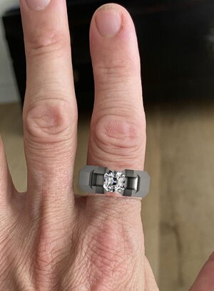
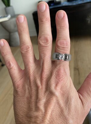
I had to photoshop the face-up view in but it was too much of a fuss to do the other angles.

The tall crown is just gonna take it over the top.
 
Wowww I am so excited for you!!!
 
Yiiiiip!! That is so exciting! Any other photos?
 
Yiiiiip!! That is so exciting! Any other photos?

Not yet. We had issues with the first casting & made some minor adjustments. They won’t change its apppearance however.

I’m super excited…and working with Caysie is beyond my capacity to articulate at this moment. “Incredible” doesn’t do the experience justice. She is a true and soulful artisan. A dying breed in today’s world…and one well worth supporting!!!

I cannot convey how much I adore and respect her as a human being! Anyway, I’m gushing…more on that experience later.

Will keep you all posted as things evolve!

The ring has a name now:

渋い

(shibui)
 
Just photoshop, but still fun!
 

Attachments

  • 77F012D9-45A0-4096-9810-C8DAA9349E89.jpeg
    77F012D9-45A0-4096-9810-C8DAA9349E89.jpeg
    217.5 KB · Views: 17
Last edited:
OOOh, I can’t wait to see it. Although the photoshop is an excellent substitute for the time being!
 
can't wait to see it~!
 
Exciting project!
 
Any further updates?
 
This is exciting to watch take shape! Incredible stone and the ring is truly one of a kind. Can't wait to see the finished product.
 
GET 3 FREE HCA RESULTS JOIN THE FORUM. ASK FOR HELP
Top