shape
carat
color
clarity

Not happy with Whiteflash

Let me start by saying I don’t know anything about setting height! All I’m saying is that after looking at many rings with six prong settings at Tiffany’s my ring appeared to be set higher. I don’t know is there a setting guide that states -

X mm above the donut is a low setting.
X mm above the donut is an average setting.
X mm above the donut is considered a high setting.

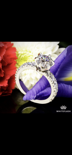
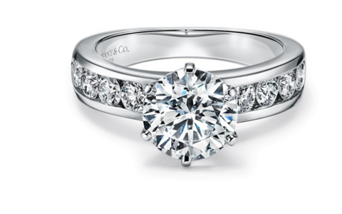
As for the prongs my prongs appear to be bigger and higher than say Tiffany tab prongs. The height of my prongs are to the table of the stone (at profile) where as Tiffany prongs in the previous photos and the photo of the 1.5 carat ring that was sent to whiteflash “that my ring was designed to copy” have prongs that are lower than the table (at profile) And appear to extend less onto the upper girdle facet

you say- the prongs themselves do look dainty considering the design imho.
Michelle at whiteflash said that petite claw was the smallest prong design possible! Do you feel that there is a smaller prong design That could have been chosen?

I don't think there is a setting guide in mm but generally it seems like a rule of thumb would be

LOW little to no space visible between the bottom of the basket and the diamond
@adlgel gave a good example

MEDIUM a tiny bit of space visible

HIGH obvious space between the bottom of the setting and the diamond.

(None of these are good or bad imho, it's a matter of preference)


PRONGS
the typical tiffany tab prong is not *that* petite
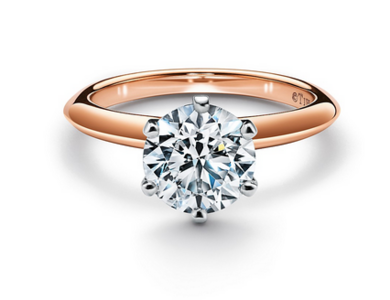
1625769184154.png

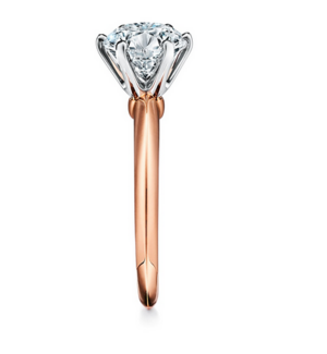
i can't find the exact ring you posted, but here is a similar tiffany with thinner prongs, see how the basket itself is thinner from the side?
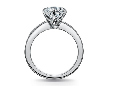
1625769265018.png1625769312383.png1625769290094.png

Michelle is correct, the petite claw is the daintiest shape you can make with a prong, but the basket you choose also matters.

1625768330626.png


I haven't worked with this vendor and I have no opinion about them one way or the other...they definitely should tighten up that gap on the prong, that's not good QA. But the thickness and setting height seem normal. It may not be what you want or asked for. I think you'll need to be very specific with about what you want and it's possible you'll need a different design to get the effect you are after.
 
Last edited:
I haven't worked with this vendor and I have no opinion about them one way or the other...they definitely should tighten up that gap on the prong, that's not good QA. But the thickness and setting height seem normal. It may not be what you want or asked for. I think you'll need to be very specific with about what you want and it's possible you'll need a different design to get the effect you are after.

Well said.

OP, I’m sorry about the quality issues you’ve encountered. WF is a reputable brand and it sounds like they are already working with you to fix the issues. That said, WF will be able to give you a well-made WF setting, not a Tiffany setting. You might want to take a moment to evaluate what you really want here; it sounds like you have your heart set on a Tiffany ring.
 
I don't think there is a setting guide in mm but generally it seems like a rule of thumb would be

LOW little to no space visible between the bottom of the basket and the diamond
@adlgel gave a good example

MEDIUM a tiny bit of space visible

HIGH obvious space between the bottom of the setting and the diamond.

(None of these are good or bad imho, it's a matter of preference)


PRONGS
the typical tiffany tab prong is not *that* petite

1625769184154.png

i can't find the exact ring you posted, but here is a similar tiffany with thinner prongs, see how the basket itself is thinner from the side?
1625769265018.png1625769312383.png1625769290094.png

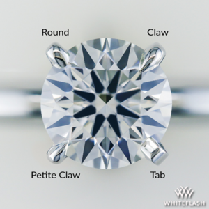
Michelle is correct, the petite claw is the daintiest shape you can make with a prong, but the basket you choose also matters.
1625768330626.png


I haven't worked with this vendor and I have no opinion about them one way or the other...they definitely should tighten up that gap on the prong, that's not good QA. But the thickness and setting height seem normal. It may not be what you want or asked for. I think you'll need to be very specific with about what you want and it's possible you'll need a different design to get the effect you are after.

What a great photo of prong styles! I've saved that for future reference! Thanks for posting it!
 
I had a similar issue with WF on the prong as I felt that it was too chunky at first. They asked me what type of prong I wanted, and made it tinier the second time and I was happy.
But even after the second time, my ring still has the issue of asymmetric prong, like your second picture. It didn’t bother me as much as I thought maybe no rings have prongs that are completely symmetrical? Maybe that’s just not practical expectations? At least that’s what I told myself. Attached pic not sure if you can see it, my prong is more to the left of the center. Overall though I love my ring still.C531C5C6-1FEE-4F35-BC39-FC0F3BFDF701.png

I thought I knew what you were talking about right up until you said your prong is more to the left of center and now I don't see it. It looks centered to me?? It does look like the reflection makes it look a bit wonky, but that's just a reflection and if I draw the outline of it over the pic it looks fine. If you switch the light source to the other side does it look a bit off in the other direction?
 
@jfra I can certainly see the issues you mentioned. There's some wonkiness going on there for sure. Not only is the diamond not seated properly, the entire head appears to be tilting to the right. This would drive me crazy. The prongs to engulf the top of the diamond, which would also not be my preference. And they are not petite claws by any means.

1625789913550.png


I'm actually surprised by the comments trying to minimize the concerns and make it seem as if this is all in your head. Especially a place with super detail-oriented folks like PS, where there are lengthy threads of minute flaws complained about on settings all the time. We, PSers, should get that. We expect more, which is why we stick with (and endorse) PS-quality vendors.

Is it because the critique is not from a popular poster? Or because it is of a beloved vendor?

And, looking at the thickness of the head at the bottom, if the head/prongs were made thinner (as requested and also as they said they could do), the diamond can certainly be set lower without appearing 'squatty.' The total thickness of the prongs coming to the head at the bottom adds height.

Now this speaks nothing to WF's ability to make it right. I believe they can and will. I've bought several diamonds from them and also looked into having them make my pendant and will be a repeat customer in the future.
 
Last edited:
@jfra I can certainly see the issues you mentioned. There's some wonkiness going on there for sure. Not only is the diamond not seated properly, the entire head appears to be tilting to the right. This would drive me crazy. The prongs to engulf the top of the diamond, which would also not be my preference. And they are not petite claws by any means.

1625789913550.png


I'm actually surprised by the comments trying to minimize the concerns and make it seem as if this is all in your head. Especially a place with super-detail oriented folks like PS, where there are lengthy threads of minute flaws complained about on settings all the time. We, PSers, should get that. We expect more, which is why we stick with (and endorse) PS-quality vendors.

Is it because the critique is not from a popular poster? Or because it is of a beloved vendor?

And, looking at the thickness of the head at the bottom, if the head/prongs were made thinner (as requested and also as they said they could do), the diamond can certainly be set lower without appearing 'squatty.' The total thickness of the prongs coming to the head at the bottom adds height.

Now this speaks nothing to WF's ability to make it right. I believe they can and will. I've bought several diamonds from them and also looked into having them make my pendant and will be a repeat customer in the future.

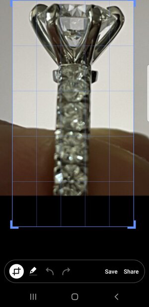
The head is tilted because the ring is tilted.Screenshot_20210708-174601_Samsung capture.jpg
 
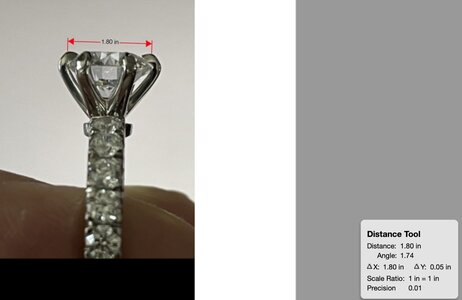
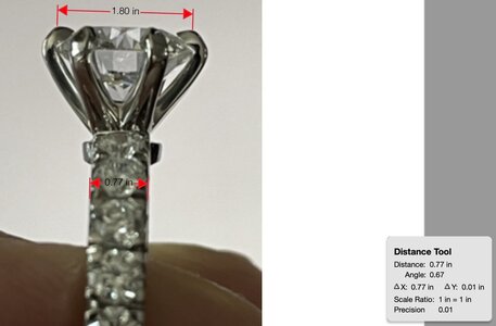
Thanks for pointing that out. I went ahead and measured the angles on Adobe because the ring does not appear tilted enough to me to explain the tilt of the head.

The angle/tilt of the head is listed at 1.74. The angle/tilt of the shank is measured at 0.67.

Which confirms to me that while the ring is slightly tilted, the head (not the donut) is, comparatively, even more so.

psringtilt.jpg

psringtilt2.jpg
 
Here we go again.
Instead of making assessment of the ring itself, people just talk about the PS community as whole.
:wall:
Can we talk about the ring itself?

Btw, I do not like the overall craftma ship on this ring based on these photos.
 
I genuinely dont see the issues OP is talking about (beyond the one prong not touching). That assessment has nothing to do with the vendor or OP.
 
I thought I knew what you were talking about right up until you said your prong is more to the left of center and now I don't see it. It looks centered to me?? It does look like the reflection makes it look a bit wonky, but that's just a reflection and if I draw the outline of it over the pic it looks fine. If you switch the light source to the other side does it look a bit off in the other direction?

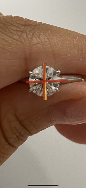
It’s hard to capture in picture but IRL the bottom prong is definitely a bit skewed and more to the left of the center. I took a better picture, the red lines are the actual angle and the yellow line is the 90 degree center line where the bottom prong is supposed to be. It’s not that big of a difference but I can see it IRL. I’m just wondering, do you guys not have this problem w your rings? I thought no rings are completely symmetrical or am I wrong
567EEA4E-26EF-4379-BC8F-CC7561B17331.jpeg

I’m curious about this, too! I’m assuming the setter needs to put the prong flush against a flat surface for security , and the more prongs there are (or how they’re shaped) means slight adjustments need to be made or there will be a gap between the stone and prong.
 
I genuinely dont see the issues OP is talking about (beyond the one prong not touching). That assessment has nothing to do with the vendor or OP.

I see that the claws aren't very small, but I've honestly never expected very small claws from WF and these look in line with their petite claw example pics???? The prong not touching is obviously a flaw. Also I can guarantee my reaction wouldn't be different if it was a different vendor because I've called out WF for issues on several threads lately, and I do think both that their QC is slipping and that they are making bulkier pieces.

It’s hard to capture in picture but IRL the bottom prong is definitely a bit skewed and more to the left of the center. I took a better picture, the red lines are the actual angle and the yellow line is the 90 degree center line where the bottom prong is supposed to be. It’s not that big of a difference but I can see it IRL. I’m just wondering, do you guys not have this problem w your rings? I thought no rings are completely symmetrical or am I wrong
567EEA4E-26EF-4379-BC8F-CC7561B17331.jpeg

I think I am honestly not detail-oriented enough to pick up this kind of thing on my rings. All my rings could have asymmetries that small and I would not notice, except maybe if I was taking magnified pictures to post.
 
Hi,
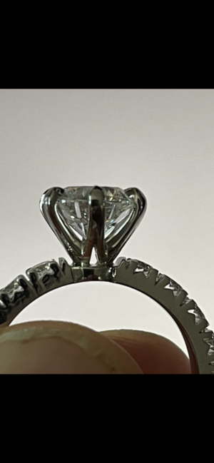
The problem isn’t so much about the height of the set stone. IMO, it almost looks as though the prong head is slightly too BIG for your diamond. The prongs are chunky and tall, and they are swallowing your stone.
 
Hi,
The problem isn’t so much about the height of the set stone. IMO, it almost looks as though the prong head is slightly too BIG for your diamond. The prongs are chunky and tall, and they are swallowing your stone.

I agree with you, it seems to overwhelm the diamond.
 
Been crazy busy with work & life, so late to the game.

@jfra, where do you stand with WF? I saw @Texas Leaguer reached out and offered to work with you. He is the VP. Have you responded, and are they fixing the ring?

In regards to the tilt, I am not saying it doesn't exist, but the picture you posted shows an exaggerated view. I don't think you did it intentionally, but it's clear to see there is tilt at play. I drew parallel lines in red next to the crown angle. Look at how the one on the right is considerably more shallow than the one on the left. Being a H&A stone, we know your stone doesn't have that sort of a variance in crown angles. Rather, it's highlighting the tilt angle at which the photo was taken.

Do you see what I mean?

You may still dislike the prong style/size, but that seems like a relatively easy fix. I think Bryan and his team can take care of you, if you will allow them to do so.

1625789913550.png
 
I had a similar issue with WF on the prong as I felt that it was too chunky at first. They asked me what type of prong I wanted, and made it tinier the second time and I was happy.
But even after the second time, my ring still has the issue of asymmetric prong, like your second picture. It didn’t bother me as much as I thought maybe no rings have prongs that are completely symmetrical? Maybe that’s just not practical expectations? At least that’s what I told myself. Attached pic not sure if you can see it, my prong is more to the left of the center. Overall though I love my ring still.

My WF Tiffany style setting has slightly asymmetric prongs viewed from one of the side angles, but it doesn't bother me. I've had 3 Tiffany style heads and the WF one is most symmetric of the 3. If you search online for actual Tiffany e-rings, you will see that a lot of the rings in the non-stock photo, "real-life" rings, are slightly asymmetric as well. On top of that Tiffany does not align the prongs with the table/arrows, which would bother me way more.
 
Last edited:
I genuinely dont see the issues OP is talking about (beyond the one prong not touching). That assessment has nothing to do with the vendor or OP.

I can't even see the one prong not touching lol.
 
I also see the prongs being super tall and chunky which is what OP specifically did not want from the designing stage.
Also asymmetry bothers me as well. It’s like a painting on the wall that is slightly crooked — some people don’t get bothered at all and some do.
 
I also see the prongs being super tall and chunky which is what OP specifically did not want from the designing stage.
Also asymmetry bothers me as well. It’s like a painting on the wall that is slightly crooked — some people don’t get bothered at all and some do.

They appear "super tall and chunky" because the pic is blown up. In real life, they will not look this big as the ring is much smaller. There is nothing chunky about that ring.
 
Dont forget that the prongs need to have a minimum thickness in order to provide enough stability. I went with a similar design for my engagement ring (designed it myself in Rhino) and my caster made sure that I didnt go too thin on the prongs. In order to set it lower, you would have to either flatten the prongs (there is a limit to how much you can lower the angle) or widen the base. Plus you might have to open the bottom of the setting (cant see from the photos if that's already part of the design). As far as the ring is concerned, I do see the slight tilt and that one prong that is not ideally positioned but I wouldnt say it's horrible. Also, it seems rather easy to fix.
 
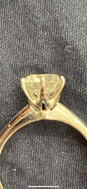
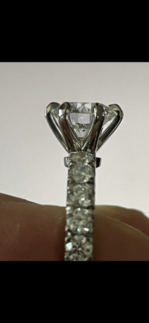
I just purchased from Whiteflash a cut above 2.18 carat round D VVS2. I am very disappointed with the craftsmanship CF9E4739-939D-4E96-9C3A-EDFC975312DB.png9E8056B7-22E2-4991-AF2B-8D4F933ED4A0.png5ED9F9F1-F705-4130-8068-E8E4FA27587F.pngof the ring. I will include photos here but the prongs where supposed to be petite claw and they look monsterous. The diamond was supposed to be set as low as possible and it is actually higher than the CAD drawing that we agreed upon. The 6 prongs are not symmetrical 1 of them is off. 1 prong shows that the diamond is not seated on the prong properly (space is visable). The six prongs are not attached to the center of the donut, they are closer to 1 side.
This is just horrible craftsmanship, and all this after my salesperson Michelle said she looked at the ring and it was perfect!!
I would never buy anything from Whiteflash again truly horrible craftsmanship!

I’m curious about your setting. Was it custom made by WF? It looks like my eternity wedding band that I would like to match w a setting for my new diamond.
 
Re. The ring:

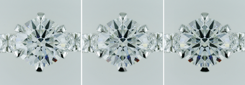
From OP's post #21 - I believe the ring is slightly tilted N/S in this photo, so I'm considering only E/W symmetry (parallel to the band)...
I cropped this image, flipped it horizontally, and superimposed the flipped image onto the original - lining them up such that the outlines of the diamonds and the arrowheads match exactly. Left is the original, the middle is flip superimposed with 30% opacity, and right is flip superimposed at 100% opacity.
Whilst the prongs on top remain aligned E/W, the prongs on the bottom shift slightly. If this is true to real life, this may be the "prong asymmetry" that OP is complaining about. However, it’s very slight - and honestly could be just an artifact of photography (ie. If the ring in the original image is actually slightly tilted E/W as well as N/S then that will convey into the shift).
I think, for me, if I saw the ring IRL I would know pretty quickly, but obviously I can't do that so... Shrug.

TRANS1DELETE.png


To the posters who are determined to label PS as unfairly biased toward WF:

Many PSers are biased toward WF. And I happily argue that it's not at all unfair. Why?
1. WF is a PS featured vendor. Check out what it takes to become a PS featured vendor here - it's no walk in the park.
https://www.pricescope.com/featured-vendors
2. The last thread wherein a poster was dissatisfied with her WF piece showed WF to be responsive and determined to make that poster whole, willing to make accommodations above and beyond any reasonable expectations. Even when it was proven definitively that the poster was incorrect. Even when the poster then accused them of fraud.
WF has proven again and again that they take customer satisfaction very seriously. If there are problems with this ring, WF will address them. That’s why so many of us are biased toward WF.
 
Been crazy busy with work & life, so late to the game.

@jfra, where do you stand with WF? I saw @Texas Leaguer reached out and offered to work with you. He is the VP. Have you responded, and are they fixing the ring?

In regards to the tilt, I am not saying it doesn't exist, but the picture you posted shows an exaggerated view. I don't think you did it intentionally, but it's clear to see there is tilt at play. I drew parallel lines in red next to the crown angle. Look at how the one on the right is considerably more shallow than the one on the left. Being a H&A stone, we know your stone doesn't have that sort of a variance in crown angles. Rather, it's highlighting the tilt angle at which the photo was taken.

Do you see what I mean?

You may still dislike the prong style/size, but that seems like a relatively easy fix. I think Bryan and his team can take care of you, if you will allow them to do so.

1625789913550.png

What I am curious about is what type of camera was used to take the photo?
Was it an iPhone? An Android phone?
Point and Shoot Camera? A DSLR?

When I take photos of squares or rectangles with my Samsung phone, they are definitely distorted. I am not saying that is the case with the OP but am just curious.
 
I find it helpful to hear all experiences positive and negative with vendors. Hope they get you setting corrected soon.
 
Re. The ring:

From OP's post #21 - I believe the ring is slightly tilted N/S in this photo, so I'm considering only E/W symmetry (parallel to the band)...
I cropped this image, flipped it horizontally, and superimposed the flipped image onto the original - lining them up such that the outlines of the diamonds and the arrowheads match exactly. Left is the original, the middle is flip superimposed with 30% opacity, and right is flip superimposed at 100% opacity.
Whilst the prongs on top remain aligned E/W, the prongs on the bottom shift slightly. If this is true to real life, this may be the "prong asymmetry" that OP is complaining about. However, it’s very slight - and honestly could be just an artifact of photography (ie. If the ring in the original image is actually slightly tilted E/W as well as N/S then that will convey into the shift).
I think, for me, if I saw the ring IRL I would know pretty quickly, but obviously I can't do that so... Shrug.

TRANS1DELETE.png


To the posters who are determined to label PS as unfairly biased toward WF:

Many PSers are biased toward WF. And I happily argue that it's not at all unfair. Why?
1. WF is a PS featured vendor. Check out what it takes to become a PS featured vendor here - it's no walk in the park.
https://www.pricescope.com/featured-vendors
2. The last thread wherein a poster was dissatisfied with her WF piece showed WF to be responsive and determined to make that poster whole, willing to make accommodations above and beyond any reasonable expectations. Even when it was proven definitively that the poster was incorrect. Even when the poster then accused them of fraud.
WF has proven again and again that they take customer satisfaction very seriously. If there are problems with this ring, WF will address them. That’s why so many of us are biased toward WF.

I get that and I don’t have a dog in the fight as they say bc I’ve never had dealt with the company (I daydream of having ACA studs but alas). And yes their customer service seems stellar which I noted above to OP. I’m not disputing that at all. I’ve still noticed though that when someone has an issue of a wonky prong or asymmetry or whatnot, that if it’s WF it’s “minor” or “no big deal” or “I don’t see it” whereas with someone else it’s “demand they fix it” “that would drive me nuts” etc. This is just anecdotal observation I’ve noticed from reading threads over the years. I think it is human nature to be more forgiving of a vendor that you love and admire of course. But I think it makes users reluctant to share if their experience is less than great.
 
I get that and I don’t have a dog in the fight as they say bc I’ve never had dealt with the company (I daydream of having ACA studs but alas). And yes their customer service seems stellar which I noted above to OP. I’m not disputing that at all. I’ve still noticed though that when someone has an issue of a wonky prong or asymmetry or whatnot, that if it’s WF it’s “minor” or “no big deal” or “I don’t see it” whereas with someone else it’s “demand they fix it” “that would drive me nuts” etc. This is just anecdotal observation I’ve noticed from reading threads over the years. I think it is human nature to be more forgiving of a vendor that you love and admire of course. But I think it makes users reluctant to share if their experience is less than great.

I think that’s true and at the same time in this case there may be a limit to how happy the op will be with the design itself. Hopefully she’s getting things resolved to her liking.
 
GET 3 FREE HCA RESULTS JOIN THE FORUM. ASK FOR HELP
Top