TravelingGal
Super_Ideal_Rock
- Joined
- Dec 29, 2004
- Messages
- 17,193
Re: Old european cut three stone ring by 23rd Street Jeweler
Ha, thanks Enerchi!
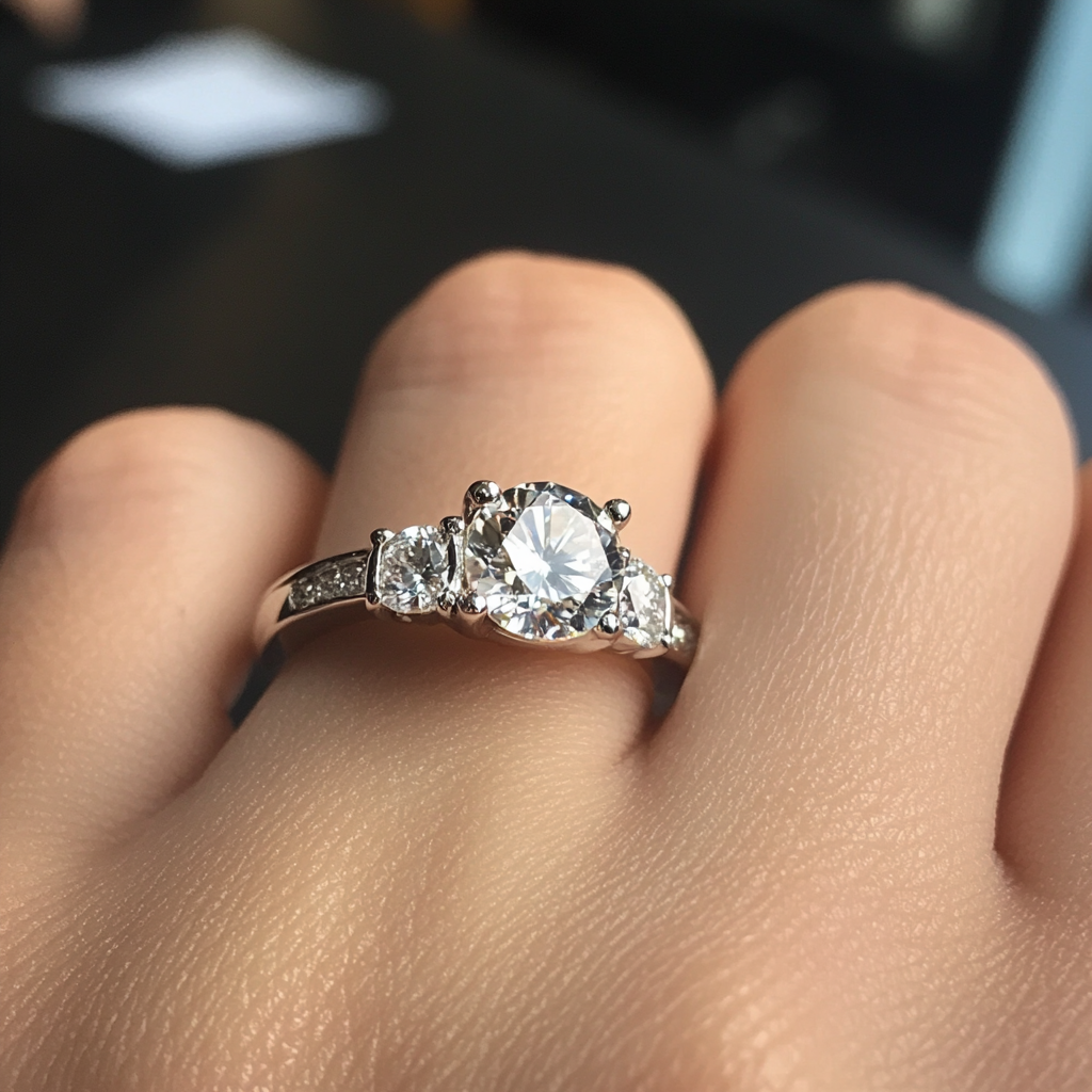
It IS growing on me, but I do think it's best to think of it (assuming anything can even be done). I'm curious as to whether the engraver just went renegade, or if the bench that did the ring intended it this way. Either way, it is beautiful, just in a different way!
You are right in that this does seem to "panel" off each of the octagons more and differentiate each of the octagons more than I think the "blend" of one seamless line would be. So interesting, how PSers care about nuance, eh? And I think I'm one of the more laidback people around here when it comes to design. Or maybe just one of the less creative, artsy ones (which is probably more correct!)
Enerchi|1337295874|3197755 said:WHOA! That is amazing TGal! Just AMAZING! it is a perfect new "Heirloom antique" ring! Just gorgeous - Coatimundi found the perfect jumping off for you and then 23rd street just added further to the perfection of that setting - well done, TGal, well done!


I see the dots/milgraining comment you are speaking of. I kind of like how yours is as it enhances the 'strut's so to speak, of the mount portion, while the delicate prongs (oh, how I love me some delicate claw prongs....!) enhance the trilogy of the diamonds. If it were me, I'd stick with the way it is, but you'll have to sleep on it a bit to decide if you want to change it.
Your book/review (tee hee!!) was wonderful! I love all your details and thoughts that you pulled together for us to enjoy - thank you so much! You are a wonderful reviewer!!!
Enjoy this stunning ring - and many thanks for all of those gorgeous diamond **** shots - can never get enough!!!! LOVE IT!!!
Ha, thanks Enerchi!
It IS growing on me, but I do think it's best to think of it (assuming anything can even be done). I'm curious as to whether the engraver just went renegade, or if the bench that did the ring intended it this way. Either way, it is beautiful, just in a different way!
You are right in that this does seem to "panel" off each of the octagons more and differentiate each of the octagons more than I think the "blend" of one seamless line would be. So interesting, how PSers care about nuance, eh? And I think I'm one of the more laidback people around here when it comes to design. Or maybe just one of the less creative, artsy ones (which is probably more correct!)


300x240.png)