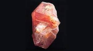
shape
carat
color
clarity

Opinion on potential padparadscha sapphire

It may be my monitor but the finewater one looks straight up orange, maybe a hint of yellow but certainly not pink in any respect.

I loved that Leon pad with the floral halo.

I mostly just have pad jealousy because I love the color but dang, it looks horrible against my skin. :lol:
 
I think they have to be pastel in order to qualify as a padparadcha. We all definitely like what we like though. :))
Thank you. I did not know that they had to be pastel. That’s good to know. I have read the definitions in books and admired several IRL, but I don’t think I’ve ever seen the AGL definition. They are such beautiful gems. Padparadcha has always been one of my favorites.
 
@corundum_conundrum Thanks for that insight! I didn't know that about ovals, though I did observe a similar dark spot at a jeweler while looking at other sapphires IRL.

@chrono My SO and I both agreed that it'd be okay for a gem to not come back pad if we love the color, but we just don't want to pay pad prices for something that's not, and we want to pay fair pink prices if that sapphire is pink. As for design, current thinking is either a 3 stone or standalone with a pave band, with a interesting basket (is that the right term for the part holding the gem?), e.g. filigree or lined with melees. I originally really wanted rose gold, but I've seen some beautiful pads with white gold, and I've also seen some beautiful two-tone rose/white gold rings.

@Arcadian see above - we're okay with it not being pad, but just want to make sure we're not overpaying if it's not. The seller explicitly said that the stone may or may not come back as a pad so I doubt they would cover the cost of a cert.

@LilAlex thank you! I've read about pads washing out against flesh but I hope I can find one that pops.

After everyone's feedback on the cut and looking at the gem in all sorts of different lighting (and not being unable to unsee those shadows), I think my SO and I will likely send this one back (haven't shipped out to AGL yet). It's pretty, but as a poster earlier said, it doesn't make our hearts sing. The hunt continues.

That Finewater one made my jaw drop! It does look quite orange on my screen, but I can see pink. My SO reached out to ask about an AGL cert, and Gary said AGL identified the gem as orange :eek2: and he disagreed, hence the Lotus Gem Lab cert. What do you all think? Is Lotus Gem Lab a respectable lab? Is this worth the asking price without a AGL cert?

Here's the LGL cert as a PDF - you can zoom in to get a closer look at the gem: http://lotusgemology.com/media/reports/pdfs/9805-9241S.pdf
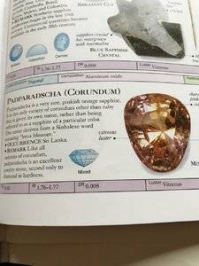

Honestly from the many divided opinions you can see here, that stone is borderline at best. There are many different labs, and they won't all agree on something as subjective as what is a pad vs an orange sapphire. However most people treat AGL as the pre-eminent authority.

Food for thought: Because the stone really doesn't look like a conventional pad, if you ever try to sell it (for anything like it's current price) then many buyers are going to make the sale contingent on an AGL (prestige) report saying it is a pad with appropriate origin. Especially since it appears to face up a little small for the weight -- making the price tag quite steep for many of us.

In these cases I feel like It is far less relevant what the seller thinks the stone is. What is important is what the buyer is willing to accept it as.
 
@corundum_conundrum Thanks for that insight! I didn't know that about ovals, though I did observe a similar dark spot at a jeweler while looking at other sapphires IRL.

@chrono My SO and I both agreed that it'd be okay for a gem to not come back pad if we love the color, but we just don't want to pay pad prices for something that's not, and we want to pay fair pink prices if that sapphire is pink. As for design, current thinking is either a 3 stone or standalone with a pave band, with a interesting basket (is that the right term for the part holding the gem?), e.g. filigree or lined with melees. I originally really wanted rose gold, but I've seen some beautiful pads with white gold, and I've also seen some beautiful two-tone rose/white gold rings.

@Arcadian see above - we're okay with it not being pad, but just want to make sure we're not overpaying if it's not. The seller explicitly said that the stone may or may not come back as a pad so I doubt they would cover the cost of a cert.

@LilAlex thank you! I've read about pads washing out against flesh but I hope I can find one that pops.

After everyone's feedback on the cut and looking at the gem in all sorts of different lighting (and not being unable to unsee those shadows), I think my SO and I will likely send this one back (haven't shipped out to AGL yet). It's pretty, but as a poster earlier said, it doesn't make our hearts sing. The hunt continues.

That Finewater one made my jaw drop! It does look quite orange on my screen, but I can see pink. My SO reached out to ask about an AGL cert, and Gary said AGL identified the gem as orange :eek2: and he disagreed, hence the Lotus Gem Lab cert. What do you all think? Is Lotus Gem Lab a respectable lab? Is this worth the asking price without a AGL cert?

Here's the LGL cert as a PDF - you can zoom in to get a closer look at the gem: http://lotusgemology.com/media/reports/pdfs/9805-9241S.pdf
If AGL doesn't accept it as a padparadcha, it's not worth 15k to me. That's a giant chunk of money.
 
TE="T L, post: 4301223, member: 33940"]https://www.jckonline.com/magazine-article/labs-define-padparadscha/[/QUOTE]
Thank you for the link! The two books I pulled out of my library mentioned pinkish orange/orangey pink, but not tone or saturation for some reason. The book I have by Antoinette Maitlins does say that “true padparadscha should exhibit a pink and orange color simultaneously.” The Smithsonian book by Cally Hall I have has a photo of a pad with this phenomenon. Here is the photo. I’m certainly no expert. I’m just a hobbyist. I’m just going on what I’ve seen IRL and in books. It sounds like the industry may standards have changed. C333D6EE-74D2-4A10-9BC6-43DC256BBDC3.jpeg
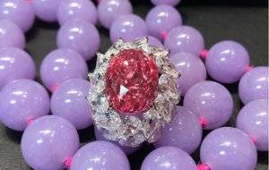
 
Thank you for the link! The two books I pulled out of my library mentioned pinkish orange/orangey pink, but not tone or saturation for some reason. The book I have by Antoinette Maitlins does say that “true padparadscha should exhibit a pink and orange color simultaneously.” The Smithsonian book by Cally Hall I have has a photo of a pad with this phenomenon. Here is the photo. I’m certainly no expert. I’m just a hobbyist. I’m just going on what I’ve seen IRL and in books. It sounds like the industry may standards have changed. C333D6EE-74D2-4A10-9BC6-43DC256BBDC3.jpeg
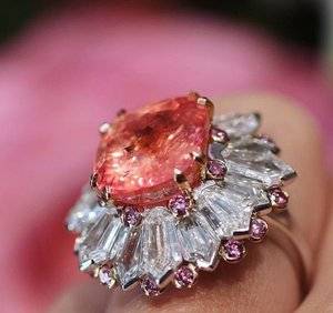
Interesting how people interpret things differently. When I read that bit about simultaneous display of pink and orange, I would have taken it to mean pinkish orange, or orangish pink....as in oR, RO/OR, rO on the color wheel. But I see how it can be interpreted differently to describe distinct areas of orange and pink zoning within the same stone? Kind of like a parti sapphire. For years I just assumed the color had to fall between that pinkish orange to orangish pink in order to hope to qualify as padparadscha, didn't think that there had to be distinct orange and distinct pink in the same stone. As for the "pastel" bit, I just assumed it was implied because I've always seen padparadscha color described as delicate. In fact, if a stone had a deeper tone, I think it would start to look like a songea sapphire or something rather than a pad.
 
Last edited:
I'll post what I think are examples of orangey pink, and pinkish orange.

To me, this one is a more pinkish pad....on my monitor, I would describe it as watermelon or fruit punch color. But who knows a lab might say it's only a pink sapphire.
30iojknmfc.jpg

And this one a more orangey pad...I would describe this color as coral.
2309458.jpg

Any darker, the stones would start to look like some Songea sapphire....not good. Saturation wise, I don't think more saturated stones than these occur naturally. Lighter and less saturated ones would appear peach.
 
I was sure I read that the labs are either now considering or have included saturated orange pinks as padparadscha?
 
In my experience, pads used to be accepted by labs only up to medium tone, medium to good saturation until a few years back.

Then at some point something changed and vividly saturated pads started popping up not only classified as padparadscha by all major labs, but also sold as such and at a vast premium over the mediums (just have a look at the past few years of Christie's/Sotheby's catalogues and/or any bigger dealer at a large gem show).

Side note:
I'll post what I think are examples of orangey pink, and pinkish orange.

To me, this one is a more pinkish pad....on my monitor, I would describe it as watermelon or fruit punch color. But who knows a lab might say it's only a pink sapphire.
30iojknmfc.jpg

While there is some orange (barely perceptible, it's more colour contamination than an under/overtone), I don't think any honest lab should classify this as anything other than an orangish pink sapphire. I'd never pay for it as a pad, but large portions of the global market would.

And this one a more orangey pad...I would describe this color as coral.
2309458.jpg

That is a very, very, very rare occurrence in natural sapphires and (for me) definitely one of the paragon pad colours.

Oh, also - padparadscha prices have gone through the roof in the past year or so.
 
Lol. I’m just going to flat out admit that I’m now more confused than ever about what a padparadscha is. It looks like I was interpreting two distinct color zones, while others are interpreting a blend. I’m saying orange and pink, while others on here are saying orangey pink. I have read everyone’s comments and have read linked articles. I’m not in the market for one, but I do love to look at them. I’m so glad Pricescope is here so I can learn, but I have lost my pad way. I’m trying to learn, really I am.
 
I'll post what I think are examples of orangey pink, and pinkish orange.

To me, this one is a more pinkish pad....on my monitor, I would describe it as watermelon or fruit punch color. But who knows a lab might say it's only a pink sapphire.
30iojknmfc.jpg

And this one a more orangey pad...I would describe this color as coral.
2309458.jpg

Any darker, the stones would start to look like some Songea sapphire....not good. Saturation wise, I don't think more saturated stones than these occur naturally. Lighter and less saturated ones would appear peach.
Both are beautiful!
 
It looks like I was interpreting two distinct color zones, while others are interpreting a blend.

About that... Ideally, the stone should be mixed/blended. If it has a pink body colour with one small patch of clearly outlined orange, for example, it wouldn’t really be fair or nice to call it a padparadscha.
The funny thing is that this can be rectified by cutting; a colour zoned orangish pink sapphire can be made into a padparadscha by recutting if the orange is near the culet but it’s crazy risky (colour loss and uncertain results, possibly or even likely worse off than where you began) so it isn’t normally done.

What I’m referring to though is really distinct colour zones - almost outlined ones, visible even at a glance. There’s a limit to that too; if the stone on the other hand has zones of predominantly one and the other colour but the brilliance pattern blurs the lines between where one begins and the other ends, then it’s fair to say it’s a blend and call it a pad if the colours fit.
A perfect blend throughout is almost impossibly difficult at any price at all (had enough orders for “10/20 carat perfect padparadscha” in my time to know that that’s a joke and a waste of time).
 
In my experience, pads used to be accepted by labs only up to medium tone, medium to good saturation until a few years back.

Then at some point something changed and vividly saturated pads started popping up not only classified as padparadscha by all major labs, but also sold as such and at a vast premium over the mediums (just have a look at the past few years of Christie's/Sotheby's catalogues and/or any bigger dealer at a large gem show).

Side note:


While there is some orange (barely perceptible, it's more colour contamination than an under/overtone), I don't think any honest lab should classify this as anything other than an orangish pink sapphire. I'd never pay for it as a pad, but large portions of the global market would.


That is a very, very, very rare occurrence in natural sapphires and (for me) definitely one of the paragon pad colours.

Oh, also - padparadscha prices have gone through the roof in the past year or so.

Yeah the first one was sold as a pad, auctioned by Christie's. But I agree it's predominantly pink so I thought maybe a lab might call it just a pink sapphire. And yes I keep seeing those types of sapphires sold as padparadschas more and more.
 
About that... Ideally, the stone should be mixed/blended. If it has a pink body colour with one small patch of clearly outlined orange, for example, it wouldn’t really be fair or nice to call it a padparadscha.
The funny thing is that this can be rectified by cutting; a colour zoned orangish pink sapphire can be made into a padparadscha by recutting if the orange is near the culet but it’s crazy risky (colour loss and uncertain results, possibly or even likely worse off than where you began) so it isn’t normally done.

What I’m referring to though is really distinct colour zones - almost outlined ones, visible even at a glance. There’s a limit to that too; if the stone on the other hand has zones of predominantly one and the other colour but the brilliance pattern blurs the lines between where one begins and the other ends, then it’s fair to say it’s a blend and call it a pad if the colours fit.
A perfect blend throughout is almost impossibly difficult at any price at all (had enough orders for “10/20 carat perfect padparadscha” in my time to know that that’s a joke and a waste of time).
Thank you for your response. This is really informative. I finally think I understand.
 
Thank you for your response. This is really informative. I finally think I understand.

Glad to help.
I'm more sick and tired of getting offered "padparadschas" than most on here - it's a facepalm at least a few times a day/week for me. :D
 
If anyone is interested in an example of a parti colored orange and pink sapphire, gemfix has one. GRS certifies it as a pinkish orange sapphire while GIA calls it a parti colored sapphire. @Frost, your comments on the difficulties of cutting this type of sapphire made me think of this stone.
https://gemfix.com/gems/sapphire-pink-13-502

... and that's more or less what I meant by it, great find. Neither GRS nor GIA gave it 'padparadscha' (and rightly - it isn't), but when you're in the trade, this and a hundred times more obviously blatantly NOT pads get offered as such over and over and over again.

It's a great example of "what it could have been (but isn't)" sapphire. :)
 
Glad to help.
I'm more sick and tired of getting offered "padparadschas" than most on here - it's a facepalm at least a few times a day/week for me. :D
That does sound frustrating. I realized after educated yesterday that I actually love orange and pink parti colored sapphires, not padparadschas. That should bring down the price point a couple of notches.
 
If anyone is interested in an example of a parti colored orange and pink sapphire, gemfix has one. GRS certifies it as a pinkish orange sapphire while GIA calls it a parti colored sapphire. @Frost, your comments on the difficulties of cutting this type of sapphire made me think of this stone.
https://gemfix.com/gems/sapphire-pink-13-502
That is beautiful and exactly what I want. That would definitely fall into the big anniversary or birthday gift category though. It would be nice if I could just click the add to cart button!
 
Both are beautiful!

haha I was thinking "You can call it anything you want including murky mud but if you give it to me I won't say no to it!"

They are gorgeous! Especially the first one!
 
haha I was thinking "You can call it anything you want including murky mud but if you give it to me I won't say no to it!"

They are gorgeous! Especially the first one!
Exactly! Call it anything! My sweet grandmother said “I don’t know what it is, but it’s beautiful”, when my mom gave her a gift one time and she wasn’t sure what it was. I always think of that when I see a gem I love, but can’t identify it or don’t have a clue about what to call the color.
 
what about this one?

https://gemfix.com/gems/sapphire-pink-13-499
it is close in appearance to the one you were originally interested in, it faces up larger than the finewatergems one. It may not be designated a pad by AGL (AGL is a bit stricter than GIA), but it doesn't command a sky high price tag either.

That is very pretty! After all the sample pics in this thread though (and realizing how different gems can look in person), I *think* what I like is more orangey, closer to that "coral" one that @Cockatiel posted :oops: Maybe what I'd call salmon. Of course, it's so hard to tell because I haven't quite built that muscle to figure out what a stone will actually look like in person compared to how they look photos. I wish it were easier to window shop IRL for pads and pink sapphires.

If anyone is interested in an example of a parti colored orange and pink sapphire, gemfix has one. GRS certifies it as a pinkish orange sapphire while GIA calls it a parti colored sapphire. @Frost, your comments on the difficulties of cutting this type of sapphire made me think of this stone.
https://gemfix.com/gems/sapphire-pink-13-502

So what makes this a parti? Is it because the orange is so well defined that the pink is only visible around the edges?
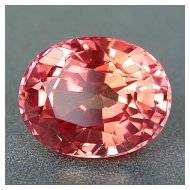
 
So what makes this a parti? Is it because the orange is so well defined that the pink is only visible around the edges?

It's a stone with distinct zones of color that neither mix naturally, nor were they made to mix enough through cutting (sometimes it just isn't possible, it looks like they've tried but sometimes you just can't).
Without seeing the stone in person, I'd take a guess that the body mostly contains orange, with possibly one or two zones of other colors reflecting on the edges.

Additionally, those zones aren't really pink. The stone has a purplish tone - and pads should not have any at all according to all traditional definitions and all major lab guidelines. This is most likely the main reason why the labs didn't give it the pad report to begin with (with the added reason being the color zones as they are).

Compare that stone to the following examples - random images pulled off Google for the search query "perfect padparadscha":

the-ideal-padparadscha-color.jpg
images.jpeg
images-2.jpeg

All of the above stones have their colors sufficiently 'mixed' and of the correct hues for most labs to give them that classification. Notice the smooth transitions? The "blended" colors? Pink/orange/yellow as primary components in various mixes.

The colors themselves won't always be blended flawlessly and you will be able to notice small flashes of pink or orange or yellow here and there, but what really counts is the overall impression. Does the stone, overall, have an impression of a mixed pink/orange/yellow (at least two of those) in it? If yes, chances are it can be called a pad. If not, and there are distinct zones face-up or there's brown or purple admixture, then most likely not.

Generally speaking about color zones; if you have a sapphire to try this on, you can pretty easily see color zones if you just put the stone onto a white plate and fill that plate with water (or glycerine, or any similar clear liquid - the closer the liquid RI to corundum, the better). You lay it on the plate face down, completely submerged, take the plate out to daylight et voila - you'll see where the color zones are in the stone very clearly in a way that's impossible to see in air or face-up. It'll look like patches, strips, lines or swathes of color in some places, almost none in others. Sometimes you'll see a completely unexpected third color that doesn't show up face up at all and only serves as a very minor modifier in the final composition of hue.
This doesn't mean anything in practice most of the time and it doesn't impact the price if there's nothing to see face-up, but it does give cutters an idea of what they're working with, for example (and it can be fun to observe).

Another note on color zones: 9 times out of 10, they will be much more visible in an enlarged, motionless photo than in person. DSLRs show a single moment, while the eye sees the whole thing in motion/blur so it kind of blends in more to the eye in person than it does like this over the Net (there are exceptions to this also though).
The second photo looks straight up salmon to me. Is that what pads are supposed to be? I think when I go to a gem show later this month, I am going to ask every vendor to show me their padparadscha. I really need to see what they look like in person.
 
The second photo looks straight up salmon to me. Is that what pads are supposed to be?

Hmm, it's a mix of orange and pink on my monitor, something like 70-30 in favour of orange. Very even and smooth. And in some ways, salmon/peach/coral is a good way of describing a component of pad color (with the stress on 'component' - it needs to be more than one color).

It's also largely a matter of personal taste. Some people like orange based ones, some like pink bases. Others still think that it has to have some yellow inside. It's up to the person in the end, but there are general guidelines like that it shouldn't be just a color zoned sapphire, or that it shouldn't be brown, purple etc.

Maybe not directly on topic - I'm sure it doesn't apply to any stones posted here or most stones on the Net - but there's a particularly large stream of new brownish-orange material coming out of Madagascar at the moment and you see a lot of 'padparadschas' offered as such in the trade which aren't that - they're orangish brown-yellow sapphires.
Even more hair-raising, there's also a stream of natural pads being mined there which show a degree of tenebrescence, as in they literally lose color on exposure to sunlight and gain it back under UV. And it's not due to treatments, it's just a property of the material. Can't be too careful and it's always a good idea to keep a pad for at least a few days to make sure the color is there to stay. SSEF wrote a nice article on it and they even carry out 'fade tests' now for African pads to determine color stability.
Personally, I don't pay for pads, orange and yellow sapphires until I've sunbathed them for a day or two, bombarded them with daylight calibrated lamps and got them checked for beryllium. To see a nice stone turn into a pale off-white leaves you with such a sinking feeling.
 
Dear @Frost thank you for sharing such amazing trade information which is immensly valuable to those of us who would not have a clue. I suck at pad identification beyond the basics, and you're teaching a whole other ballgame to these stones. I remember a couple of years back I also thought that pads had to do pastel, and found out not necessarily. Of course that also meant what, I don't know....lol

These thing about pads having tenebrescence, wow, thats interesting! I knew hackmanite and a few other stones had this but not any type of corundum. You also state only African Pads are tested this way, none others have shown this ever?

Again thank you for sharing this info. I will say I was never likely to ever buy a pad but I might now...lol
 
GET 3 FREE HCA RESULTS JOIN THE FORUM. ASK FOR HELP

Featured Topics

Top