shape
carat
color
clarity

Opinion on potential padparadscha sapphire

No problem at all @Arcadian, glad to. It's really info that should be public, just that to my knowledge there's no repository of up to date knowledge for consumers to help make informed decisions (although Pricescope seems to be doing that pretty well in general). As gem dealers we make informed decisions every day; there's no reason why consumers shouldn't be able to do the same. And the industry holds people to account and expects responsibility and clean business on the inside - it should on the outside too.

Hah, yes - I held the same belief, that pads should be pastel, for years. I want to smash my head into a wall when I remember all the vivid gorgeous stones I could have bought a few years ago when prices weren't insane but I smartly declined because "not padparadscha". :lol:
Things seem to have changed on the sourcing end; nowadays they'll ask for crazy amounts if something is a proper pad with strong saturation.

No other pads, to my knowledge, naturally show tenebrescence, but 'pads' can be artificially created out of paler stones by X-raying. It's not something that labs routinely look for, but it's fortunately very easy to see - you simply put the stone onto a reflective plate and keep it in the sun for a few hours (making sure inquisitive birds stay well away). It also works with strong artificial lights. If it's been X-rayed, it will usually lose color very fast. The exact same thing goes for X-rayed yellows. I bought one like that some months ago, was in the process of taking photos when I realized it was turning pale. Promptly gave it back the next morning for a refund.

Other than pads; only some (definitely not all) Sri Lankan yellow sapphires can and do show a degree of tenebrescence naturally. In my experience, it only occurs in unheated stones and only from certain areas - heating seems to stabilize the color and I've yet to see one where the color changed after being heated (normal heating, not Be, of course). The solution, again, is simple - not paying until you've had the stone and really lit it up for a while. If the color stays the same, you're all good; if not, time for returns.
 
Stuff's so complicated....I am never buying sapphires again... Especially padparadschas or potential padparadschas. :lol:
 
Stuff's so complicated....I am never buying sapphires again... Especially padparadschas or potential padparadschas. :lol:
Me neither!
 
Frost, it is funny how we see different colors on different monitors. I do love what I see as the salmon color. Purchasing Pads sounds too daunting and expensive for me. Thank you for your wealth of information.
 
What a great thread! I was looking for a pastel pad a couple of years back- finally gave up as I decided it was too complicated. Bought a cute little pastel sapphire (AGL deemed it "light orange"), but since it has strong pink fluorescence it gave me the look I wanted. Anyway, it satisfied my Pad urge and was certainly much less expensive!!
 
What a great thread! I was looking for a pastel pad a couple of years back- finally gave up as I decided it was too complicated. Bought a cute little pastel sapphire (AGL deemed it "light orange"), but since it has strong pink fluorescence it gave me the look I wanted. Anyway, it satisfied my Pad urge and was certainly much less expensive!!
Sometimes the most important thing is not a label, but getting a stone you love at a fair price!
 
Sometimes...? ;)
 
Frost, it is funny how we see different colors on different monitors. I do love what I see as the salmon color. Purchasing Pads sounds too daunting and expensive for me. Thank you for your wealth of information.

No problem at all.
Regarding monitors; vendors should incorporate color profiles into their photos (web standard is sRGB) to help manage colors more evenly across devices. It doesn't usually make a huge difference, but every bit counts. And another thing... Mobile screens - pads and phones - show color overly saturated and with a different cast 99% of the time in my experience. So mobile shopping is a huge no-go for gems.

Best way to be as sure as you can be, always just ask them to edit the color to look accurate if they haven't already, and mail you the photos/videos.

This forum really opened my eyes about how difficult it is to be a consumer trying to buy stones online... I mean, after a few months on here, I'd personally not even try! :lol: And yet there we all are, the entire trade, expecting people to make decisions worth hundreds, thousands, hundreds of thousands, on nothing but a picture and a word. It's tough, I understand how it could feel like shooting in the dark.

Stuff's so complicated....I am never buying sapphires again... Especially padparadschas or potential padparadschas. :lol:

I don't think it's a big deal with corundum in general. But yes - pads are a mess to buy even in person. :D Blues, pinks, yellows and the rest are a lot safer in my experience so far, but always directly ask and confirm that you can return it if the stone doesn't work for you, or if you make a subsequent report with your preferred lab and it says anything differently.
 
Wow, thank you @Frost for the detailed explanations. All that about the tenebrescence and fading is scary, but good to know to watch out for.

@pinkjewel do you have a photo or link to a thread? I would love to see it!

Sometimes the most important thing is not a label, but getting a stone you love at a fair price!

This! After this thread I'm definitely in this mindset, but "fair price" piece is what's hard for a newbie.
 
No problem at all.
Regarding monitors; vendors should incorporate color profiles into their photos (web standard is sRGB) to help manage colors more evenly across devices. It doesn't usually make a huge difference, but every bit counts. And another thing... Mobile screens - pads and phones - show color overly saturated and with a different cast 99% of the time in my experience. So mobile shopping is a huge no-go for gems.

I noticed the thing about monitors and screens too. My phone is ridiculous and shows everything to be very saturated. My skin even looks yellow green and not flesh colored! Even a gray stone looks lavender or something on my phone so I browse a lot on my phone but switch to my laptop when I want to purchase something to check it out on my laptop screen. My Ipad is not as bad, I would say it's on par with my laptop, maybe it's how the screen is calibrated. But all my phones have been crazy.
 
I saw this ring and thought of the OP. https://www.loupetroop.com/listings...ied-padparadscha-sapphire-diamond-ring-custom
This lovely sapphire comes is untreted which is a rarity among sapphires.

Ohh, I like that color. Too bad it’s an emerald cut. Too boxy for me :((

My SO and I are still thinking about the Finewater gem — maybe too orange or too saturated to be a pad but it’s so pretty and sparkly. :love: We know it’s super expensive for small face up size and no AGL cert though.

Any thoughts on https://gemfix.com/gems/sapphire-pink-13-468? It looks to me as if there are distinct color zones, even in the video.
 
Any thoughts on https://gemfix.com/gems/sapphire-pink-13-468? It looks to me as if there are distinct color zones, even in the video.

Hm, looks very nice too. Both of these posted above look nice, with the caveat that the first one looks too strongly pink in the last photo (definitely doesn't qualify for a pad - but it very much does in the first few. So just a matter of figuring out how it really looks). If it's like the first few photos, that's really beautiful.

Regarding the second one, one thing to keep in mind is that color zoning normally ends up a lot more distinct in online media than it does to the eye in real life. I won't say 'more visible' in absolute terms because the zoning can be visible more or less, depending on the stone. But it definitely usually looks a lot more distinct/separated as the stone is massively enlarged and the interplay of colors through brilliance which naturally blends them to the unaided eye doesn't really translate into online media that much.

Anyway, both are nice to see.
 
Thanks Frost! What you said about color zoning makes sense. For the first stone, I noticed the same thing about the last photo, which makes me feel even more that it’s impossible to tell if I’ll like a gem just from online photos.


I like the color in the photo! However, I feel like Goldilocks — the oval looks too long. Also, the description says “well cut for a pad” — is the cut bad? And the gem also looks a lot lighter in the video. Would the gem look closer to the first photo when set? I’ve read that gems look darker when set, so I’m wondering if I shouldn’t dismiss just because a gem looks too light.

My SO also inquired about the RD pad posted earlier in the thread and it’s $30k+ :eek-2:
 
Thanks Frost! What you said about color zoning makes sense. For the first stone, I noticed the same thing about the last photo, which makes me feel even more that it’s impossible to tell if I’ll like a gem just from online photos.


I like the color in the photo! However, I feel like Goldilocks — the oval looks too long. Also, the description says “well cut for a pad” — is the cut bad? And the gem also looks a lot lighter in the video. Would the gem look closer to the first photo when set? I’ve read that gems look darker when set, so I’m wondering if I shouldn’t dismiss just because a gem looks too light.

My SO also inquired about the RD pad posted earlier in the thread and it’s $30k+ :eek-2:
OMG! I can't believe how expensive that is! (not that I know anything about pricing but STILL). Here's the thing, with Princess Eugenie's engagement, I think people are marking up pads or "pad-like" stones. I know you had a stone earlier that was a light pastel pink... are you leaning more towards that color or the orange-pink of a pad? If it is the former, you could contact several vendors and tell them what you are looking for and your budge and they could suggest something. You should be able to find something in a reasonable price range. If your budget truly is $15k you will still find something amazing as a pad though!
 
@Jbows I know the original stone was more baby pink, but after seeing it in person and looking at more photos online, I definitely like the orange-pink coral color more (or so I think, since I haven't seen any of those in person!).

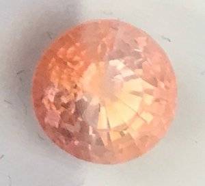
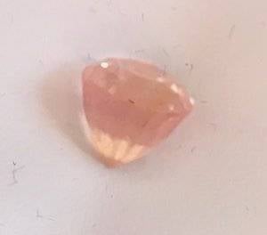
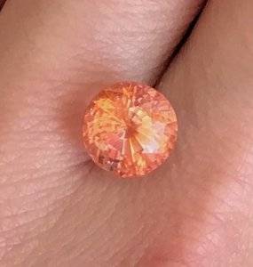
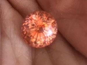
Exciting news! My SO and I realized that we just needed to see the Finewater in person because we kept going back to it no matter what pads we saw online. We couldn't stop thinking about the fact that it's round -- round is what I originally wanted, but we had resigned ourselves to ovals or cushions since round pads didn't seem to exist. And everything we got from Gary showed the gem on fire. SOOO, he bought it! I was concerned about overpaying since AGL doesn't call it a pad (and it does look peachy orangey at certain angles), but he thinks if I love it and we can't find it anywhere else, then it's fair to him :love: And it's gorgeous!

Here are some some quick indoor daylight shots...

in the gem box
**photos removed at request of OP**
 

Attachments

  • IMG_0942.jpeg
    IMG_0942.jpeg
    38.8 KB · Views: 115
  • IMG_0946.jpeg
    IMG_0946.jpeg
    71.8 KB · Views: 116
  • IMG_0948-1 copy.jpg
    IMG_0948-1 copy.jpg
    87.2 KB · Views: 114
  • IMG_0949.jpeg
    IMG_0949.jpeg
    98.5 KB · Views: 117
Last edited by a moderator:
Whoah. Pad or not, that's a very, very nice color to have.
 
Your sapphire is lovely. The color reminds me of the sun. :appl:
 
@Jbows I know the original stone was more baby pink, but after seeing it in person and looking at more photos online, I definitely like the orange-pink coral color more (or so I think, since I haven't seen any of those in person!).

Exciting news! My SO and I realized that we just needed to see the Finewater in person because we kept going back to it no matter what pads we saw online. We couldn't stop thinking about the fact that it's round -- round is what I originally wanted, but we had resigned ourselves to ovals or cushions since round pads didn't seem to exist. And everything we got from Gary showed the gem on fire. SOOO, he bought it! I was concerned about overpaying since AGL doesn't call it a pad (and it does look peachy orangey at certain angles), but he thinks if I love it and we can't find it anywhere else, then it's fair to him :love: And it's gorgeous!

Here are some some quick indoor daylight shots...

in the gem box
**edited at OP request**
OMG it's so pretty! If you love it, and you are happy with a fairly high setting (it looks pretty deep) then you should keep it! If it makes you happy every time you look at it, it's the one!
 
Last edited by a moderator:
I do love it so far — in fact, had to hide it from myself so I could get some work done :) But it is deep (7.08mm per the report), which we were concerned about. I think I need to go try on some high settings to decide. It won’t get in the way of my work but according to my SO, I’m also quite clumsy.

I’m excited to go home and look at it more in different lighting :kiss2:
 
What a beauty!!! Would love to see more pics.
It’s a deep stone indeed, but a good jeweller can make a nice cathedral shank for it to mask the height a bit and to protect your stone. Any ideas on who will set it for you if you decide to keep it?
 
What a beauty!!! Would love to see more pics.
It’s a deep stone indeed, but a good jeweller can make a nice cathedral shank for it to mask the height a bit and to protect your stone. Any ideas on who will set it for you if you decide to keep it?
Definitely needs a custom setting due to the depth.
 
Beautiful stone! What a happy colour! I bought a deep sapphire from Gary too and I love it. It did need a custom setting but I was fine with that.:appl:
 
Here is my very deep sapphire from Gary. The sapphire had such a big belly that it could not go into the setting so they built the prongs up. I love that the depth is not masked - I love seeing it from all sides. It is like a tall thistle flower. I am very careful when I wear my rings though. It is a Stuller setting with custom prongs.922016124023.jpg
 
Here is my very deep sapphire from Gary. The sapphire had such a big belly that it could not go into the setting so they built the prongs up. I love that the depth is not masked - I love seeing it from all sides. It is like a tall thistle flower. I am very careful when I wear my rings though. It is a Stuller setting with custom prongs.922016124023.jpg
That's a pretty ring, but I would be very careful. Longer prongs are not as secure if you don't have a deep enough basket to hold the stone.
 
Yes it happened accidentally without me okaying the height. The jeweller already had to fix his work once so I left it. Never go to a new jeweller because your main one is on vacation! lol
 
Those are all gorgeous Acinom! So well made!
 
Thanks for sharing your rings @ilovegemstones and @Acinom! @ilovegemstones -- how deep is your gem?

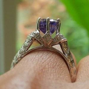
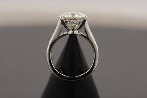
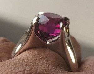
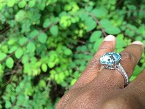
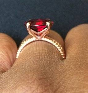
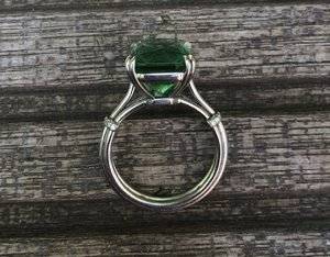
@Acinom I especially love the first and fourth settings - I definitely want an interesting basket/gallery. Do you have any more photos of the shank of the fourth ring (red gem)?

We're currently looking at Joseph Jewelry or David Klass for the setting based on the reviews we've read here, so we'll try to get some quotes, which should also help us get a sense for who we click better with.
 
GET 3 FREE HCA RESULTS JOIN THE FORUM. ASK FOR HELP

Featured Topics

Top