shape
carat
color
clarity

Padparadscha, Paraiba and Black Diamond

Is anyone up to mocking up this to a padparadscha center, paraibe melee halo, larger pad halo, all in a black gunmetal top setting? If it is too complicated, then I'd do pad, black diamond, pad in white metal. Too many different colours make cohesion and flow difficult to achieve.

r1293_Ring_Paraiba_Leon_Mege_New_York_watermark.jpg
 
@andrewcarter173
I wonder if you ask Inken, or wish to procure yourself, the melee and one of those sticky top clear gem layout boxes, for easy and secure viewing together next to your Pad.
And take it around to the multiple lighting environments around you.

I think viewing the different stones and the way they behave /different color shifts in multiple lightings next to each other before setting is something to take into consideration.
Seeing the sizes of the melee you’ve indicated (and their colors) in real life perspective in the box in your hand vs monitor screen mock-up, as well.

I know my peach isn’t the same color as your Pad. I don’t have my green nor my blue Paraiba anymore and they were cabochons anyways. But my sapphire next to black onyx and turquoise, (plus what I remember of the Paraiba glow) and I liked them together.
Liking them together in how they perfom/look differently in different lighting environments is something I would definitely study up on.
 
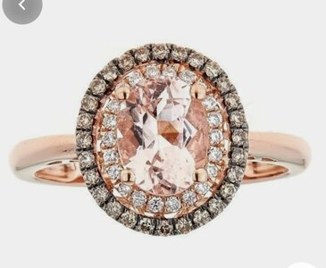
I'm not a huge fan of the blue and black double halo personally, I think the colours are distracting from the centre stone which should be the star of the show. I liked the other image posted by Rfisher as the double halos were small and subtle and all the colours flow and don't take away too much from the centre stone yet it is still very unique. Have you considered champagne diamonds? Not as harsh as black, but they will give a beautiful sparkle and I think would compliment the warm tones more. You could even do one row in a lighter more golden shade and then another row in a darker cognac shade if you wish. I've also seen black rhodium plating behind champagne diamonds to give it a more dark bold colour. Here's the closest to what I was thinking, but with lighter gold champagne in the first halo. 20201226_110509.jpgBut also what does your wife like if she is going to be wearing it?
 
Thanks for all the advice everyone.

As an immediate next step I have ordered some cheap but appropriately sized black diamond melee to see how things fit in the flesh (I’d already acquired the Paraiba melee).

I think it will tell in person.
 
Thanks for all the advice everyone.

As an immediate next step I have ordered some cheap but appropriately sized black diamond melee to see how things fit in the flesh (I’d already acquired the Paraiba melee).

I think it will tell in person.

I can’t wait to see this project progress! I adore black diamonds and the color combo you’ve picked is quite striking.
 
Thanks for all the advice everyone.

As an immediate next step I have ordered some cheap but appropriately sized black diamond melee to see how things fit in the flesh (I’d already acquired the Paraiba melee).

I think it will tell in person.

You too, mister
Any updates? :)

Signed
Antsy Pantsy Impatientsy
 
I am still waiting for some damned black diamonds to arrive from Etsy to see how the whole melee fits together before I send it off to Inken!

FWIW I let Inken source my melee for projects now, and she has been surprisingly very competitive with melee pricing. I know when I source melee from her they are matched well in color (more so even than Yvonne or anyone else I have worked with), and there is little turnaround time since she gets everything in NYC. Something to keep in mind if you do a next project with her. I will often pick out my colored stone melee myself when I am doing a design with four more colors (not counting black or white as gems in those colors are fairly easy as far as availability, and will not cause trouble for color matching).
 
I think the black melee is too bold & distracting from that gorgeous pad, but like the idea of using darkened metal to make it all pop! Can’t wait to see how this turns out...
 
So I chickened out on this one…

I had a deep and meaningful with my partner and while she loved the design, we felt it just would have limited wearability. It’s a little too bold…

So going for more of an Art Deco style classic. Going to set these in platinum.

2F239EE9-1837-49DB-9481-7A51984D56CA.jpeg
 
Well, gosh, I liked the black/blue/pad combo. I did see it more as a right-hand ring vs an engagement ring. I think the combo above (baguettes) does it justice and keeps it so it's wearable with about anything. I still think I'd halo the pad with white diamonds as well as
the slender baguettes.

Going to be pretty either way though!
 

Well… I’m absolutely blown away by this…

If pad color change gets any better than that, then I’ll be damned!!!
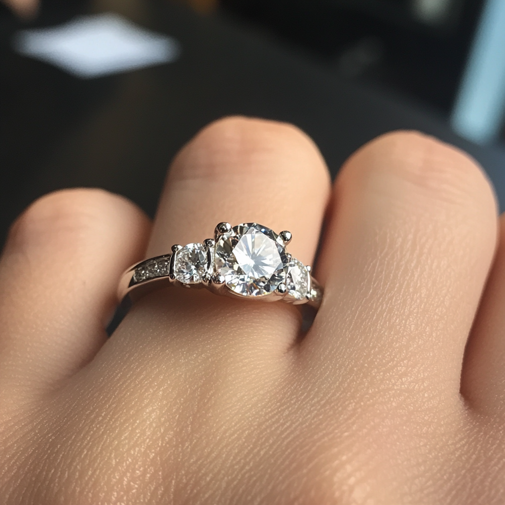
Absolutely gorgeous ring, well done
 
So I chickened out on this one…

I had a deep and meaningful with my partner and while she loved the design, we felt it just would have limited wearability. It’s a little too bold…

So going for more of an Art Deco style classic. Going to set these in platinum.

2F239EE9-1837-49DB-9481-7A51984D56CA.jpeg

OP, while it’s disappointing not to see your bold design come through, I would like to applaud the great communication between you and your wife. It’s more important that she ends up with a ring that she loves and can wear often. That pad deserves to be worn a lot!
 
GET 3 FREE HCA RESULTS JOIN THE FORUM. ASK FOR HELP

Featured Topics

Top