shape
carat
color
clarity

Padparadscha Sapphire Search Round 2

Current thoughts: this one looks like it has more color zones, and it's not as saturated? Also unheated, 3.04ct, Madagascar origin.
 
The one in the box is so gorgeous! I absolutely love the color.
 
The one in the box is so gorgeous! I absolutely love the color.

Thank you! Impatiently to receive it and take a look! What do you think of the pad pics I just posted btw?
 
Thank you! Impatiently to receive it and take a look! What do you think of the pad pics I just posted btw?

I think it’s quite nice too. I like the colour zoning. The one in the box seems to be evenly one colour. They both have no window so I think it’s what appeals to you more.
 
I think it’s quite nice too. I like the colour zoning. The one in the box seems to be evenly one colour. They both have no window so I think it’s what appeals to you more.

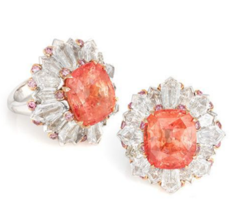
I think I'm leaning towards the 2.9ct one right now because I prefer a more even color. It also reminds me of that amazing David Morris pad ring:

1614350782807.png
 
I like them both but would definitely lean towards the boxed one because the color is so gorgeous to me.

That's how I'm currently leaning to-- the color is also more even imo. It reminds me of a lovely grapefruit <3
 
I prefer the 2.9 (the first one you posted). The other one is good too, but I prefer the first bc of consistent coloring and saturation throughout the stone
 
I prefer the 2.9 (the first one you posted). The other one is good too, but I prefer the first bc of consistent coloring and saturation throughout the stone

I'm so glad to hear that from you, that's how I'm leaning right now as well :)
 
I'll pop in say the first pad is the one I had the butterflies for. The mix/cut is just really pleasing to my eye. It looks like a good one, ya know? That's exactly what I said to myself, "Ooh, that looks like a really good one!"
 
I'll pop in say the first pad is the one I had the butterflies for. The mix/cut is just really pleasing to my eye. It looks like a good one, ya know? That's exactly what I said to myself, "Ooh, that looks like a really good one!"

Yaaaay another vote for the first one, and yes! The more I look at it, the more butterflies I get :) I just need to see it IRL to confirm :)
 
Waiting to receive the aforementioned pad for viewing, but was also sent pics of this one:

IMG_20210226_154134.jpgIMG_20210226_154323.jpgIMG_20210226_153443.jpg

what do u guys think of this in comparison to the 2.9ct?

i like the first one way better, this one appears to have color zoning and the shape is not as symmetrical as the other one.
 
Waiting to receive the aforementioned pad for viewing, but was also sent pics of this one:

IMG_20210226_154134.jpgIMG_20210226_154323.jpgIMG_20210226_153443.jpg

what do u guys think of this in comparison to the 2.9ct?

The color doesn't seem as even and doesn't seem as well cut either? Sorry! This new one doesn't excite me as much the other one did.
 
So is this the one? It's very very pretty and looks close to the pad in your ring :).
 
Looks good from pics. How do you feel about it?
 
So is this the one? It's very very pretty and looks close to the pad in your ring :).
It is! A bit shiftier, but with a lovely sparkle/sheen. It was night time when I took pics, so I'm going to wait for daylight to make a final call :)

It does look really close to your pad ring. Would make a terrific set. :kiss2:
They are very close! And just when I think this one looks a bit more pink, it shifts a bit orange in more shaded light lol.

Looks good from pics. How do you feel about it?
I like it so far! I need to see how it looks in natural daylight and my office lighting though :)It has a lovely sheen to it though, moreso than my current one actually.
 
Ooooo I love it!!! Definitely more orange than the one you have
 
It is! A bit shiftier, but with a lovely sparkle/sheen. It was night time when I took pics, so I'm going to wait for daylight to make a final call :)


They are very close! And just when I think this one looks a bit more pink, it shifts a bit orange in more shaded light lol.


I like it so far! I need to see how it looks in natural daylight and my office lighting though :)It has a lovely sheen to it though, moreso than my current one actually.

Ooh yes, I definitely love a good sheen on a sapphire. Definitely agree on the need to view it in natural daylight. I trust you not to leave us hanging and will give us more gorgeous pictures of this beautiful pad! :P
 
@Lilith112 that's gorgeous! Looks great against your skin tone as well! :love:
 
@voce I just want to check in with you; do you see any violet modifiers? Feedback would be very appreciated~
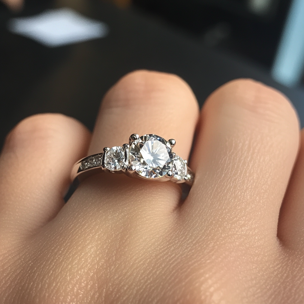
 
@voce I just want to check in with you; do you see any violet modifiers? Feedback would be very appreciated~

I personally don't see violet modifiers from the photos you've shared. That doesn't mean there couldn't be modifiers in person. It's also about how well certain colors are picked up by the particular camera you use.
 
Wow - it is really lovely to my eyes. I think you found a keeper!
 
Love it!
 
:shock: You better be keeping this. It's fantabulous.
I mean, really!!
 
GET 3 FREE HCA RESULTS JOIN THE FORUM. ASK FOR HELP

Featured Topics

Top