shape
carat
color
clarity

Pop the cork - I just bought the first Ocatvia

Status
Not open for further replies. Please create a new topic or request for this thread to be opened.
Oh, mama. Holy smokes. That amazing cut coupled with your amazing photography skills is making this thread one of my favorites. A huge congrats, Kenny, not only did you purchase the first Octavia, you are officially the best gift-giver of all time! And Karl? You should feel like a proud parent having created this amazing cut. Truly breathtaking.
 
Ahahahahaha, love the doggie inclusions.
9.gif
 
Date: 12/27/2009 9:49:01 PM
Author: kenny
We have noticed some new inclusions in the Octavia that were not on the GIA report, but we love these inclusions.
30.gif
You crazy man!
 
AMAZING! You bought the first ever and you gave it away! You are one amazing person with a huge heart! I would be too greedy and keep it for myself
27.gif
 
What a beautiful stone! I have always loved Asschers and the Octavia has now become my dream cut...hopefully one day!
 
Absolutely stunning!!!!!! I am looking forward to seeing the completed project
30.gif
 
omgosh! such a spectacular diamond! those first shots, especially the one showing such violet colors are GORGEOUS! and i looked at the video a dozen times just oooohhhing over those sparkles. YUM. congrats!! can''t wait to see the final piece!
 
Date: 12/28/2009 3:54:30 PM
Author: JoeNewbie11
Hey Kenny,
Curious how you would compare the Octavia to your other amazing Asscher?
This would definitely be a case study because you have a top notch Asscher and the new Octavia.
Would love to hear an indepth analysis of the two.

I'll post a comparison after I've had some time with them.
Keep in mind the conventional asscher is almost a carat larger, and that's bound to influence any viewer.

I'm looking at settings.
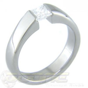
Which of the following four styles would go best with the Ocatvia?
Try to ignore the stones in the pics and visualize an Octavia in the design.

Let's call this #1:

0number1.jpg
 
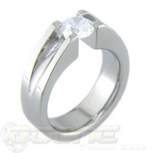
#2
This one allows even more light to get in and an even larger viewing area, but the design looks less clean to my eyes.

0number2.jpg
 
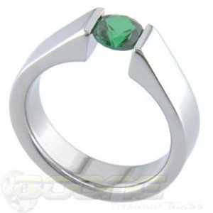
#3

0number3.jpg
 
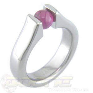
#4

0number4.jpg
 
Love the design of #2 - you get profile views from all sides!! The way it's executed looks a bit utilitarian, though, very bulky. Could it be slimmed down somewhat, with cleaner lines?


I really like the simplicity of #3 - the profile of the shoulders is very elegant.


I'm least fond of #4 - there's so much side metal it's overwhelming.


Can't really go wrong, though!
 
Good point on #4, but I'm sure Bruce could position the girdle closer to the top of the gap to prevent that.
And keep in mind this is a big latino man's ring so bulky may actually look appropriate.
 
Can you help me out with the difference between 1 and 3 besides the groove to hold the stone in #1(which is assume is there only because it is a princess)... these are my favorite of what you posted.
 
Yeah 1 and 3 do look similar.
I'll have to call and ask.

BTW, I spoke to Bruce a while ago and IIRC he said they can be made for square stones without the slot.
 
Date: 12/29/2009 7:54:31 PM
Author: kenny
Good point on #4, but I'm sure Bruce could position the girdle closer to the top of the gap to prevent that.
And keep in mind this is a big latino man's ring so bulky may actually look appropriate.
2.gif
11.gif
12.gif


Still like #3 better, though. Fits Octavia better, somehow
9.gif


Wait, I have to explain? Hmm...
 
Thanks Yssie.
You don't have to explain.
You like what you like.
2.gif
 
#3 I think would show it off best.
 
Date: 12/29/2009 9:03:28 PM
Author: Karl_K
#3 I think would show it off best.
Agreed!
 
I like 2 and 3 the best for a big latino man''s ring
9.gif
Or a latino man''s big ring, whichever you prefer.
 
I agree about ring 3. It just works.
 
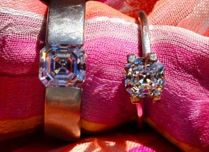
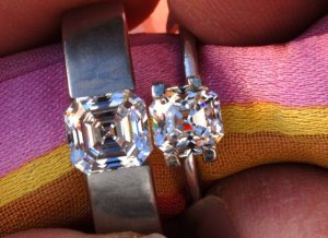
Left: 2.26 ct F VVS2 asscher
Right: 1.34 ct H VS2 Octavia

aomm.jpg
 
The do not look near a carat apart in weight.

aomm2.jpg
 
Date: 12/31/2009 4:03:37 PM
Author: kenny
The do not look near a carat apart in weight.
You''re right, they don''t. Great pic!!!
 
wow, kenny. I think I am equally in awe of the stone and your photography skills. Time to hop on the Octavia bandwagon
9.gif


Add another vote for setting #3.
 
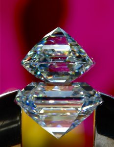
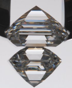
GIA 1.34 H VS2 Octavia on top of GIA F VVS2 asscher.
Even in the side view it is hard to see the extra carat.

09bothhm.jpg
 
This one really shows difference in the table percentage:
33% for the Octavia
61.3% for the asscher
Almost double

I'm sure this is not optimum lighting or angle for showing body color but not much difference is visible between F (top) and H (bottom), though granted the H is smaller.

0a0a0a.jpg
 
Date: 12/29/2009 9:03:28 PM
Author: Karl_K
#3 I think would show it off best.
This, I think, is the opinion you''d want to listen to. He knows.
2.gif
 
Congratulations! It is gorgeous.
 
How do I talk Nate into buying me one? I''m so jealous!
 
Status
Not open for further replies. Please create a new topic or request for this thread to be opened.
GET 3 FREE HCA RESULTS JOIN THE FORUM. ASK FOR HELP
Top