shape
carat
color
clarity

Sapphire-philes - Need Opinions =)

Status
Not open for further replies. Please create a new topic or request for this thread to be opened.

konijn7

Rough_Rock
Joined
Jan 31, 2006
Messages
4
hi everyone,

from my lurking, i've found you guys (and gals) to be really knowledgeable, so i was wondering what you all thought of the untreated sapphires below [which do you like better, do you think they both suck, are they overpriced, etc.]. they're both from the arnsteins at the natural sapph. co. and i may be picking one up in the next 2 days. all opinions are gladly welcome.

ct: 1.15
dimensions: 6.95 X 4.98 X 3.65
shape: oval
cut: mixed, brilliant crown
color: vivid
clarity: IF, VVS1
price: 1265.00

1A.jpg


1C.jpg


=========================

stone #2:
ct: 1.71
dimensions: 8.76 X 6.78 X 3.66
shape: oval
cut: mixed, fancy crown
color: intense
clarity: IF, VVS1
price: 1368.00

2A.jpg


2B.jpg


many thanks in advance =)
 
I can''t give any opinions on the quality of those stones, but I like the color of the first one a lot more than the second one.
 
Hi, from another relative newcomer. As people here are fond of saying, it really does depend on color, and what you like. I just bought a sapphire from NSC, a round .97 carat rated IF/VVS1, "vivid" color like the first stone you posted (it''s my avatar, btw). I also looked at a stone with "intense" color, like the second. While the second was was more "sparkly" for lack of a more scientific term, the one I ended up with just had better color. If you are planning on picking it up in NYC, you should be able to compare the two easily. I only dealt with Michael at NSC via email, but they were very helpful, and I believe they will send out two stones for the sake of comparison. Here''s a hint, too. Look at the the price per carat on the NSC details page for each, it gives you a good idea of relative quality of the stones.

Good luck,
Becky
 
my experiance with saphs has been that photos tell you nothing. zip. nada. Our stone looks utterly differant than its cherrypicked photo. I''d totally look at both of them.

From a consumer''s opinion, though, I don''t really like the aethetics of the cut...it looks a tad tilted and aysemetrical to me. However, I know sometimes colored stones must be cut to showcase the color and this does not always equal symmetrical or ''ideal'' cut proportions...
 
thanks for the replies - keep ''em comin''
1.gif


i''m going to stop by nsc on friday to check them out in person ''cause like rainbow said, .jpgs can be deceiving. i like the deep blue of the top stone and the sparkly-ness of the second, so i guess it''s matter of ascertaining what my gf would like better - just came on here to get opinions from those in the know.

becky: congrats on your sapph. purchase; it looks very impressive!
 
Date: 1/31/2006 12:16:12 PM
Author: rainbowtrout
my experiance with saphs has been that photos tell you nothing. zip. nada. Our stone looks utterly differant than its cherrypicked photo. I''d totally look at both of them.

From a consumer''s opinion, though, I don''t really like the aethetics of the cut...it looks a tad tilted and aysemetrical to me. However, I know sometimes colored stones must be cut to showcase the color and this does not always equal symmetrical or ''ideal'' cut proportions...
Bad cutting is not to showcase the color, but rather simply bad cutting, or the result of trying to maximize the weight from the piece of rough. Correct angles will always yield a more beautiful stone. You see many very poorly cut sapphires, since they are often "native" cut, the maximum yeild or face up size are the first goals.

The second picture, to me, looks like better crystal than the first one. Neither one are especially attractive cuts, the meets or off pretty bad on the first stone.
 
Color is of course the primary concern here - but do pay attention to depth and face up sizes. Each of those stones has the same depth - but what a difference in face up area for this ct wieght. You are paying per ct - but face up sizes can vary significantly.
 
I was mostly referring to "ideal" i.e "diamond proportions," which do not always work for colored stone. Sorry for the confusion. I agree the first stone''s cut looks odd.


RE: depth/faceup value. Tricky issue. My stone has actually been discussed on these boards a number of times over the past few years where people have almost bought it, but alwaays chose a different stone in the end for faceup value. One of the best comments I remember was "This stone is a collectors dream, but it is not a ring stone."

When we first saw the stone it was just amazing. Beautiful color, lovely cut to look at, if quite deep it seemes even and well proportioned to me. Of course then we got into thinking perhaps we were being ripped off, paying only for carat weight, perhaps our eyes were fooled and it was a "native cut" stone.
It seems to be cut so deep bc the color is in "bands" when viewed from the side and there is a distinct darker band right at the bottom of the stone..in our appraisal oldminer mentionned it was cut so deep to capture that last band of color.


In the end, after a few days tromping around the jewelry district in Boston and Philadelphia, nothing I have seen can sit on the table next to this guy and compete in color or brilliance. OTOH, it is annoying that we will probably need a custom setting for the stone since it is quite deep (although the girdle is not too thin as was suggested here at first).

So I guess my point is that "deep" is not necessarily bad or a mark of poor craftsmanship, but it IS a tradeoff. How much does faceup value matter?
 
I have never seen your stone, so I certainly can not comment on it.
Interesting thing when cutting a stone, if you had a colorless stone, with just one small area of color in it, and you place that colored area right in the bottom of the pavilion, when viewd through the crown the whole stone will look to have that color. This is the trick that cutters will use when creating a doublet.
Most American cutters follow meetpoint designs, with critical angle held to 1 decimal place. The results are usually yield in the 22 to 32% range from the rough, but perfect symmetry and the maximum light return (assuming the design is correct). Also much more interesting cuts are made, rather than the typical ovals and rounds you see in native cut stones, with step cut pavilions.
An example is this avitar, with is a tsavorite garnet, with the crown all triangles.
 
Having obsessively lurked on the NSC site, I''ve always preferred the second stone. But I''m a bit of a magpie, I love sparklies!
10.gif


And I am seriously displeased with you Selkie. Now I can''t fantasize about that sapphire anymore.
39.gif
Well, at least a fellow PSer has it and will cherish it.
 
Sorry Wren!
5.gif
Not to worry, I''ll take good care of it and give it a nice home.

Selkie
 
Both look nice to me - cut, color everything. For a solitaire setting (i.e no sidestones or pave frame), I would probably prefer #2 because it is somewhat larger, and I also like lighter color. #1''s color seems great - if anything, it may turn out too dark for me, but that doesn''t mean much because I like sapphire lighter than the preferred (=highest priced and valued at this time).

My 2c
 
Just an idea...

2.12cts, 7.54 x 6.73mm x 5.33mm. $1000 sapphire... Size, cut and color as much as the seller describes (taking GIA 6/6 as reference) make it quite obviously preferable to me. There will be no cute NYC shopping, but a card and a lab report from the other side of the world.

4007.jpg


The stone can be certified for treatment and origin on its way. And I would think the 'rent' in lower where it comes from than in NYC (where isn't!).
 
Honestly, I like the second one about a thousand times more.
 
Date: 2/3/2006 8:15:36 PM
Author: EBree
Honestly, I like the second one about a thousand times more.

From the look of the picture alone, I would say the same. But there is something about that stone that gives me second thoughts - the crown is not low, but quite flat, and this allows to see what seems to be a window in the stone from the top view. Since the stone is not too dark, the strong light and white background make it hard to notice - I can't say I am sure of what I'm talking about here. In buyer's shoes
5.gif
, I'd ask about this at least.
 
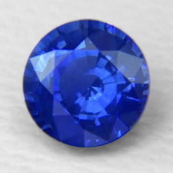
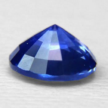
thanks for the feedback everyone - it''s much appreciated =) the two sapphs i posted earlier actually looked much better in person, but when i started looking at the round shapes they just seemed more appealing. i wound up going with a 1.17 ct round IF/vivid/slightly over 6 mm. i almost certainly overpaid, but it''s a beautiful gem. it looks similar to the one in the pics below:


pic1a.jpg


pic1b.jpg


now to educate myself regarding the proper care/cleaning/etc. regarding sapphs.

-cheers
 
Have you decided what sort of setting you''ll go for?
 
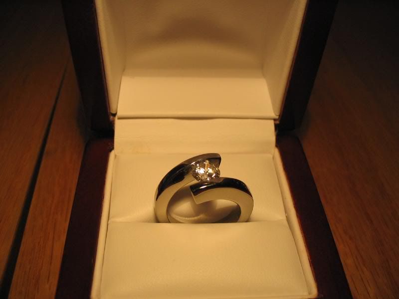
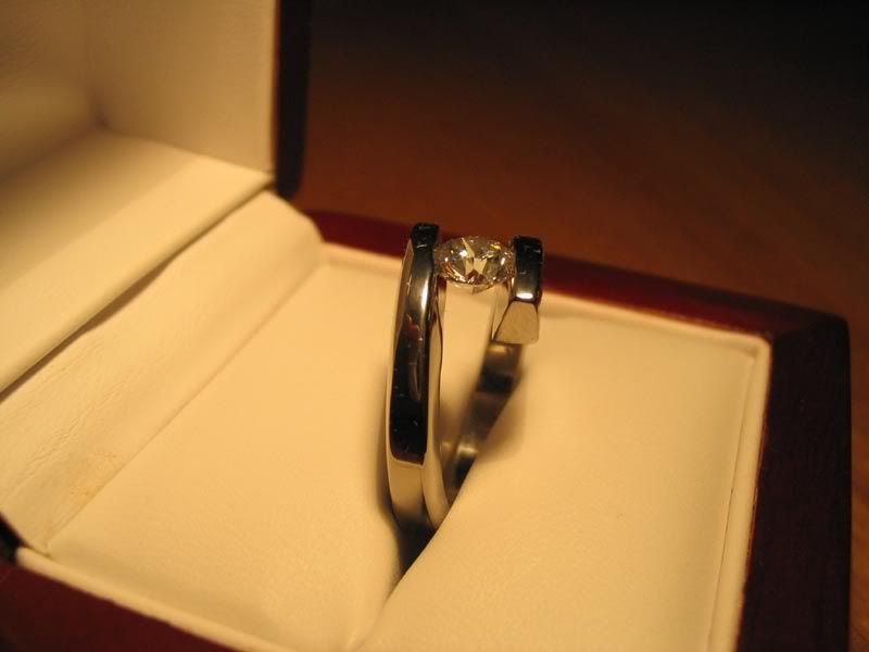
it''s a tension-set titanium ring, similar to the pics below:

IMG_0661.jpg


IMG_0663.jpg
 
Status
Not open for further replies. Please create a new topic or request for this thread to be opened.
GET 3 FREE HCA RESULTS JOIN THE FORUM. ASK FOR HELP

Featured Topics

Top