- Joined
- Jun 30, 2014
- Messages
- 2,423
Doing a major happy dance here with my latest from Yvonne  I've never been so unsure about a project only to be blown away in person. I sort of hesitate in posting this one as pictures don't do the ring justice.
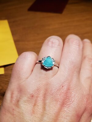
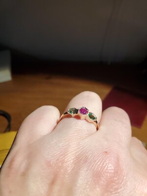
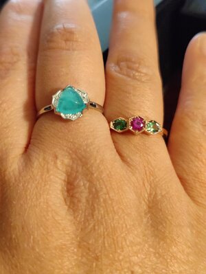
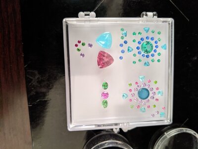
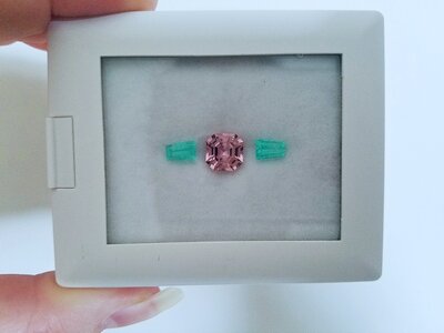
Yvonne had two 3 stone sets of neon Burmese spinels. As I immediately grabbed one set, she decided to keep the other. Not sure what I wanted to do with them, we agreed that she would design something for both of us and coined it the "sister ring project".
Shortly thereafter, Yvonne received a couple of parcels of equally neon melee and decided to figure out how to use them in our project. Then the design took make many months as she struggled to get her vision realized. Admittedly, showing me the cads as she went, I wasn't sure but admittedly had no suggestions so trusting her design sense just said to go for it.
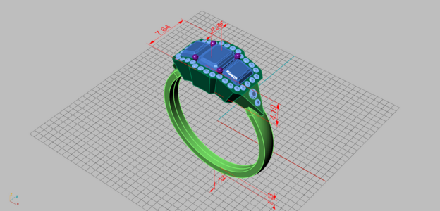
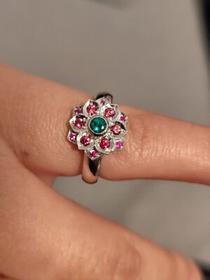
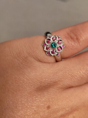
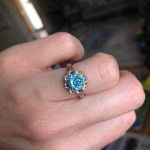
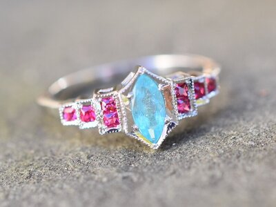
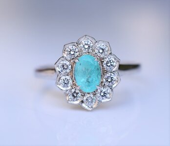
She went ahead with her ring first so I could adjust to my liking after. For those who follow her on FB/Insta, you may have seen it:
My first reaction was to substitute the melee, as they looked soft in tone, but I wasn't sure with what would look better - so decided to keep it as is because I trust what she sees in person especially when it comes to color. (And yes, they are neon IRL as I would later learn) I also decided to do the ring in 18K YG (my preference over her choice of platform). The design was still more boxy than her traditional aesthetic that I've come to expect but she loved her ring so I trusted that i would love mine.
Knowing that I like my finger coverage, we agreed to adjust the cad slightly to use larger melee for my version.
When my ring was finished, she sent me pictures but questioned whether I would like it as it wasn't as "dainty" as hers. I admitted that my reaction was not one of love. I felt the setting in rich 18k YG distracted the stone with a "boxy gold tray" look. And was concerned that combined with the melee took away from the amazing center stones which to me were the whole point of the project. But I wanted to see it in person before tweaking.
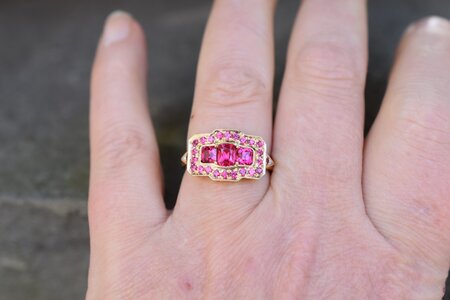
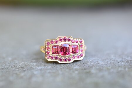
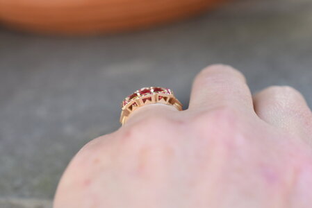
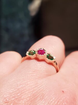
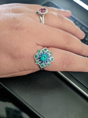
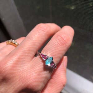
As I received the ring and put it on, I was immediately in love...it was PERFECT and I quickly told Yvonne that I do not need to change a thing. She agreed, with relief, it looked great on my (larger) hand. It is pure sparkly neon finger coverage.
On hand, the gold is not as prominent and the melee actually match the center stones perfectly with the gold providing just enough separation so the center stones stand out. I have my share of neon pinks but this ring just blows them away in terms of grabbing attention...regardless of lighting.
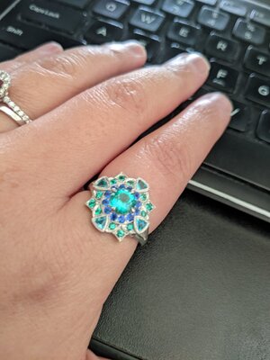
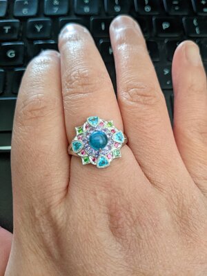
Pictures don't capture the neon/sparkle (which can blur photos). Seeing it in person, I see now why Yvonne is so happy with her ring as I am mine.
But here we go:
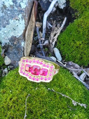
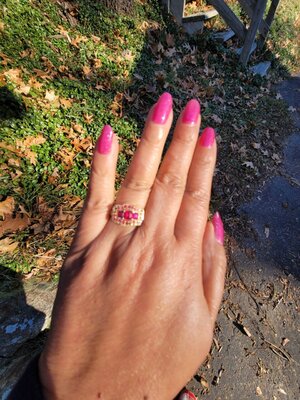
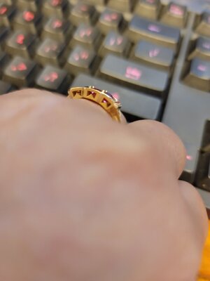
Indoor pics do not do this ring justice at all -and just highlights my original concerns with the ring. But IRL, outdoors and indoors- it still glows and sparkles (honestly!)
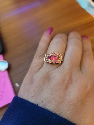
Yvonne had two 3 stone sets of neon Burmese spinels. As I immediately grabbed one set, she decided to keep the other. Not sure what I wanted to do with them, we agreed that she would design something for both of us and coined it the "sister ring project".
Shortly thereafter, Yvonne received a couple of parcels of equally neon melee and decided to figure out how to use them in our project. Then the design took make many months as she struggled to get her vision realized. Admittedly, showing me the cads as she went, I wasn't sure but admittedly had no suggestions so trusting her design sense just said to go for it.

She went ahead with her ring first so I could adjust to my liking after. For those who follow her on FB/Insta, you may have seen it:
My first reaction was to substitute the melee, as they looked soft in tone, but I wasn't sure with what would look better - so decided to keep it as is because I trust what she sees in person especially when it comes to color. (And yes, they are neon IRL as I would later learn) I also decided to do the ring in 18K YG (my preference over her choice of platform). The design was still more boxy than her traditional aesthetic that I've come to expect but she loved her ring so I trusted that i would love mine.
Knowing that I like my finger coverage, we agreed to adjust the cad slightly to use larger melee for my version.
When my ring was finished, she sent me pictures but questioned whether I would like it as it wasn't as "dainty" as hers. I admitted that my reaction was not one of love. I felt the setting in rich 18k YG distracted the stone with a "boxy gold tray" look. And was concerned that combined with the melee took away from the amazing center stones which to me were the whole point of the project. But I wanted to see it in person before tweaking.


As I received the ring and put it on, I was immediately in love...it was PERFECT and I quickly told Yvonne that I do not need to change a thing. She agreed, with relief, it looked great on my (larger) hand. It is pure sparkly neon finger coverage.
On hand, the gold is not as prominent and the melee actually match the center stones perfectly with the gold providing just enough separation so the center stones stand out. I have my share of neon pinks but this ring just blows them away in terms of grabbing attention...regardless of lighting.
Pictures don't capture the neon/sparkle (which can blur photos). Seeing it in person, I see now why Yvonne is so happy with her ring as I am mine.
But here we go:


Indoor pics do not do this ring justice at all -and just highlights my original concerns with the ring. But IRL, outdoors and indoors- it still glows and sparkles (honestly!)

Last edited:



300x240.png)