dmack
Shiny_Rock
- Joined
- Aug 8, 2019
- Messages
- 268
Project 1 of 3.
It's not precisely a 'wall of bling'
It ISN’T??? Now I want to know what you think constitutes a wall of bling because that. Ring. Is. Stunning.
Project 1 of 3.
It's not precisely a 'wall of bling'
Project 1 of 3.
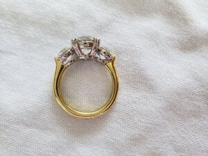
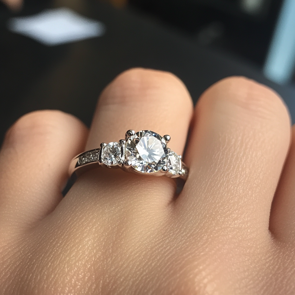
Well, I ummed and ahhed for literally years about upgrading the center stone in my three stone. In the end, I decided another $12k for .15mm was just nutty. So...I replaced the sides with something a little larger. I stayed with super ideal cuts, F color, VS2, and went from sides that were 2 x .61 F VS1, so 1 x .95 F VS2 and 1 x .96 F VS2. My center stone is an F VS2, so we've got some nice flow going on!
It's not precisely a 'wall of bling', but it certainly looks more substantial on the finger, as the sides have gone from 5.45mm to 6.35mm, and the change in proportions is definitely noticeable.
Altho I love tiny sides, I actually prefer what I now have. The center stone is still clearly THE center stone, and the ring hugs the finger even better than it did before. It's a little more traditional than previously in its proportions, and I love that. It's just the most stunning ring!

Hi @bling_dream19!I'm so glad the larger sides seem to be well received; I know a LOT of people prefer tiny sides, but I do think this gives a lovely balance while still looking elegant. I just love it! The other two will see regular wear - particularly the spinel ring, which I wore today with jeans and which held its end up during proceedings!
<pumping @joelly back to life>
Hi Joelly - are we good now?Thank you for those comments - they made me laugh out loud! I'm currently sitting up in bed wearing the three stone, and I have to say - there's not much to dislike!! I'm getting a *great* deal of pleasure from it!
Hi @dmackFor my money, a 'wall of bling' ring lacks coherent and clean design. It reminds me of those rings from Zales, where they've thrown everything at it, bar the kitchen sink! You look at those rings and they seem to be just an amorphous mass of 'stuff', rather than a clean design - irrespective of size! So I'm hoping I haven't gone *there*.
Project 1 of 3.
Well, I ummed and ahhed for literally years about upgrading the center stone in my three stone. In the end, I decided another $12k for .15mm was just nutty. So...I replaced the sides with something a little larger. I stayed with super ideal cuts, F color, VS2, and went from sides that were 2 x .61 F VS1, so 1 x .95 F VS2 and 1 x .96 F VS2. My center stone is an F VS2, so we've got some nice flow going on!
It's not precisely a 'wall of bling', but it certainly looks more substantial on the finger, as the sides have gone from 5.45mm to 6.35mm, and the change in proportions is definitely noticeable.
Altho I love tiny sides, I actually prefer what I now have. The center stone is still clearly THE center stone, and the ring hugs the finger even better than it did before. It's a little more traditional than previously in its proportions, and I love that. It's just the most stunning ring!

Hi @dmackFor my money, a 'wall of bling' ring lacks coherent and clean design. It reminds me of those rings from Zales, where they've thrown everything at it, bar the kitchen sink! You look at those rings and they seem to be just an amorphous mass of 'stuff', rather than a clean design - irrespective of size! So I'm hoping I haven't gone *there*.
