- Joined
- Jul 21, 2004
- Messages
- 9,159
It''s true that the people selling stones may not be interested in publicizing images of less than ideal diamonds but I deal with them all the time. I''m extremely interested in delving into what can be learned from these images. As John points out, standardization is the key for this to be useful in analyzing the stone instead of analyzing the skill of the photographer.Date: 4/4/2005 6:26:26 PM
Author: noobie
I guess no one would want to try to hawk a poorly cut stone with an IS photo
Date: 4/4/2005 5:42:44 PM
Author: JohnQuixote
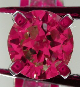
This is like the answer given by the corner musician when the young boy asked him “Sir – how do you get to Carnegie Hall?” “...Practice, son. Lots and lots of practice.”How are you getting the alignment right so that the image is taken from a direction that is perpendicular to the table? It seems like a few degrees of variation can have a profound affect on the image.
John,Date: 4/4/2005 10:19:59 PM
Author: JohnQuixote
Ack!
No no. No one is trying to make a bad stone look good or vice versa.
We are simply promoting natural lighting for performance assessment.
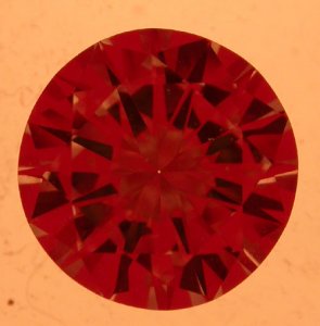
Ideal-scope photos have become common parlance...Soon AGS ASET photos will enter our lexicon as well...There is an increasing need for standardization...To this end we would like to share our approach.

I do think that if we had standardization we would all learn more from comparisons, and an ideal-scope photo with CCT is repeatable - the biggest criticism of other performance assessment tools is that they are not.
Cool,Date: 4/5/2005 1:19:12 AM
Author: Rhino
Interesting pic Wink. I was wondering how Paul''s princess cuts would look. That image gives an understanding of why it didn''t get ideal grade. Being a photo junkie of these sorts I have some thoughts to contribute when I get up to work.
Date: 4/5/2005 9:28 AM
Author: denverappraiser
John & Garry,
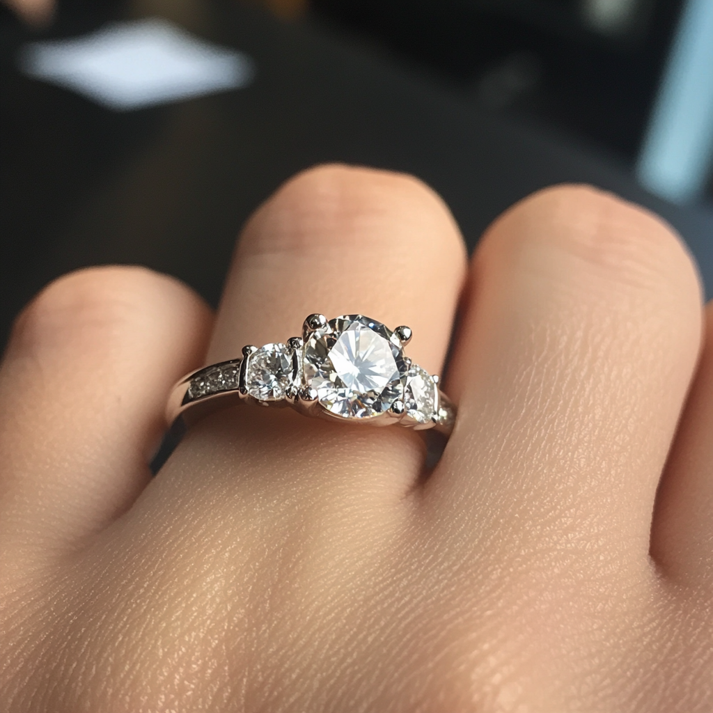
Unlike the diamond dealers here, much of my interest in this topic has to do with getting a decent image on mounted stones. This prevents use of the tray system or the little light tray that you’re selling. Decent tools for analyzing and documenting the optics of mounted stones are few and far between and this seems like it has tremendous potential. It would be especially useful if it were possible to take a sufficiently standardized image that it could be overlaid or compared with a previously taken pic by someone else and have a reasonable chance of recognizing it as the same stone.
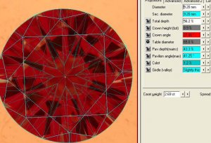
What I really want is a reasonable way to convert these images into a DiamCalc or GemCalc wireframe diagram. Standardized pictures seems like a giant step towards this. While I’m at it, I wish I were taller.
Date: 4/5/2005 4:47:59 PM
Author: Wink
John,
Thanks. From your Ack! response I hope you did not think I was inferring that you were making bad stones look good, I absolutely know better!
What I am saying is that there have already been instances of people putting photos of stone A with stone B and saying it was a picture of stone B. I think that is a bigger potential issue than what light temperature was used in the photo.
I sincerely mean that I want to learn to take photos as nice as yours though, as they do show the stone in its proper light. I think I see another major investment in photographic equipment in my future...

I'm sure it's nowhere near as tricked out as yours. I took a promotional IS that Dave Atlas gave me at a show somewhere (thanks Dave!) and broke out the cone. I cut off a piece of a plastic film can to make a half inch long extension tube and attached it with electrical tape where the eyepiece on the IS used to be. This fits nicely around the lens of my Nikon 4500 at just the right distance for focusing the macro mode to the biggest view. I then set the camera on the desk pointing straight up and hand hold the stone at the focusing plane and line it up using the reflected glare between the table and lens as a guide. The 5100K lights are the ceiling lights in my lab. When I'm at customer sites, I use do this under an ottlight and I rest half of a ping pong ball on the back of the ring as a diffuser. The loose stone photo is made with the same arrangement of the camera and the cone but I take the picture from the top and I just press the camera against the IS and against the light box for stability. It works pretty well and it's VERY fast. I suspect that if I swapped out the light box with something that has a better color mix, I would be getting pretty comparable photos to yours. (at least IS photos, I still covet your h&a pics and your advertising style face up pics but that's a different discussion.)Date: 4/5/2005 7:21:37 PM
Author: JohnQuixote
The photos you took through mountings at 5100K are nicely done. What kind of environment do you have?

Garry,
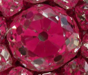
Can you please explain why it is useful to be close to the light diffuser? John seems to be disagreeing on this point and my best pics seem to come from using the ceiling lights, which are 8 feet away.
John,
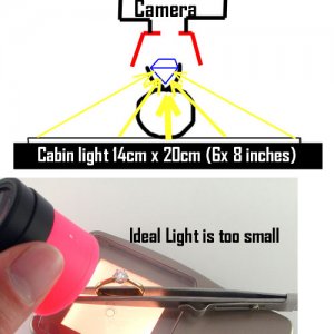
How about this for a random idea. Use a lap to polish the end of a glass rod to be perfectly square. Pick a rod that’s exactly the size of the eyehole in the IS. To align the stone, put the stone on the light tray, place the IS cone over the top, poke the rod through the eyehole and press the flat end against the table of the stone. Twist the rod to cause the stone to level up. Even if the original placement is a little off center, this will square the table to the eyehole, which is really the objective anyway.
Neil

Garry,
The settings on my camera make it difficult to be in both Macro mode and Indoor mode. I’m reasonably confident that this is a problem with the operator and not the camera.
Your expert model includes a diffuser rather like my ping pong ball that effectively expands the angle of the light source to a full 180 degrees of relatively even light but this doesn’t seem to be one of your recommended tools for taking pictures.
I agree that the color of the light doesn’t really have much to do with the ability to analyze the merits of the stone but it sure makes the pics prettier. There’s something to be said for that too. It also has an effect on the color saturation in the image. As a stand-alone thing this is not so important but it seems like it would be important for a consumer who is comparing photos taken by several different people. Lastly, it seems to have an effect on the sharpness of the different areas. For my long term objective of making the wireframe model from the picture, this seems like an important goal. No?
John,
Two more random thoughts on the alignment topic:
It seems like the light tray could be modified to include a fitting of some sort so that the IS cone fits into it in exactly one way. This will lock the alignment of the eyehole to the stone location.
A second IS cone could perhaps be modified to invent a leveling tool. I doesn’t need to be the same cone that the image is taken through since the cones are readily available and are identical to each other. This also frees up the opportunity to drill additional holes, add extra parts and the like that would otherwise mess up the image.
Date: 4/6/2005 9:23:19 AM
Author: denverappraiser
Garry,
The settings on my camera make it difficult to be in both Macro mode and Indoor mode. I’m reasonably confident that this is a problem with the operator and not the camera. Do you have access to a 12 year old boy?
Your expert model includes a diffuser rather like my ping pong ball that effectively expands the angle of the light source to a full 180 degrees of relatively even light but this doesn’t seem to be one of your recommended tools for taking pictures. not absolutely recomended for taking large quantites, but adequate for your purposes i think Neil.
I agree that the color of the light doesn’t really have much to do with the ability to analyze the merits of the stone but it sure makes the pics prettier. There’s something to be said for that too. It also has an effect on the color saturation in the image. As a stand-alone thing this is not so important but it seems like it would be important for a consumer who is comparing photos taken by several different people. then you might want to go down to a camera shop and try your camera with one of the Cabin type lights - the one we like costs $150 from the on-line vendor Lastly, it seems to have an effect on the sharpness of the different areas. For my long term objective of making the wireframe model from the picture, this seems like an important goal. No? That reminds me - we were working on a ''manual'' for DiamCalc users to do that - have you become proficient yet Neil?
Neil
Date: 4/6/2005 3:58:39 PM
Author: Garry H (Cut Nut)
Date: 4/6/2005 9:23:19 AM
Author: denverappraiser
Do you have access to a 12 year old boy?
I can do better than that. I have a 14 year old granddaughter. She is much smarter than me. She is much smarter than any boy. Just ask her.
That reminds me - we were working on a ''manual'' for DiamCalc users to do that - have you become proficient yet Neil?
Proficient? Hah! I’m dreadful at it.
I actually suspended my practice because I was doing so poorly and it was getting frustrating. With a fair bit of effort I can get a pretty good model of very well cut stones but I’ve found several areas that cause me trouble if the stone is less than excellent and even with super-ideals I''m not all that satisfied with my results. For example, are you able to make a Diamcalc model the 1.94 in the sample photo?
Neil
I agree, it is a pain. Here is a photo I took a few minutes ago with both a watermark and a copywrite on it. Both have their problems. The copywrite is too easy to crop and the watermark can interfere with seeing the item. Make it too dark and it is a total pain, make it too light and no one can figure it out anyway, plus it is REALLY annoying. Sort of like saying, "Hey, I don''t trust you to look at my WONDERFUL photo you thief." Gee, now there is one impression I would like to avoid, while at the same time avoiding "Rhinogate". (Heck, my photos aren''t THAT good, yet, and if they want to steal it they will anyway.)Date: 4/5/2005 7:39:24 PM
Author: JohnQuixote
Wink...As I re-read the thread last night I said to Angela: ''I typed ''Ack'' in a post today.'' ( I have ack''d her before).
I know you didn''t mean it like that, and thanks for the clarification
Ever since ''Rhinogate'' happened we''ve been brainstorming about what can be done to avoid that, as well as what you describe. We''ve been victims of image nickery in many public instances...I worry about private situations. Watermarks notwithstanding, the digital age is a two-edged sword.
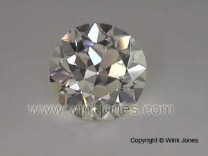
This was a qucky Neil - about 6 minutesDate: 4/6/2005 5:20:37 PM
Author: denverappraiser
Date: 4/6/2005 3:58:39 PM
Author: Garry H (Cut Nut)
Date: 4/6/2005 9:23:19 AM
Author: denverappraiser
Do you have access to a 12 year old boy?
I can do better than that. I have a 14 year old granddaughter. She is much smarter than me. She is much smarter than any boy. Just ask her.
he he
That reminds me - we were working on a ''manual'' for DiamCalc users to do that - have you become proficient yet Neil?
Proficient? Hah! I’m dreadful at it.
I actually suspended my practice because I was doing so poorly and it was getting frustrating. With a fair bit of effort I can get a pretty good model of very well cut stones but I’ve found several areas that cause me trouble if the stone is less than excellent and even with super-ideals I''m not all that satisfied with my results. For example, are you able to make a Diamcalc model the 1.94 in the sample photo?
Neil
Date: 4/6/2005 9:22:51 PM
Author: lostdog
'Since the color temp of the lighting is fixed the saturation is the same edge-to-edge no matter what size.'
Do I miss something or are these two different issues? Is saturation only a function of color temperature? Or isn't there a question of photometric distribution?

Also, would it make any sense to have a reference as part of the frame? The equivalent of the way a color palette is used in calibrating other visual systems, it could be something, let's say a bar across the bottom of the frame, with various zones that should show a certain range of values. If the lighting is even, then it matches a certain pattern. And then down the road as the image was displayed or printed, you could be sure that if the zones matches the standard pattern, then the actual diamond image is being represented correctly, too. (and maybe build in a registration serial number to each image to allow being sure it comes from the right source?)
"CCT and CRI don't tell the whole story. Each just measures (or approximates) color temperature in a certain manner."
Okay, I wrote that poorly. CRI doesn't approximate color temperature. It does attempt to describe the color properties of light in an indirect way. The ability of a source to render colors is related to the distribution of the spectrum of colors that compose the light it is emitting. CRI sums it up, but but a high CRi can still be poor for color matching purposes.
