shape
carat
color
clarity

Tell me what you think about ring w/ CAD drawings

RomanticSoul

Rough_Rock
Joined
Feb 21, 2014
Messages
7
Hi all...this is my first post on PS. First thank you to all who participate in discussions. It makes it easy for someone like me to get educated on as much engagement ring information I needed leading up to the point that I was ready to shop for a ring.

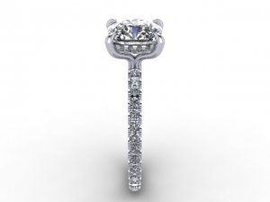
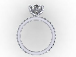
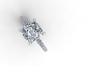
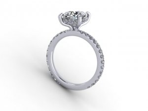
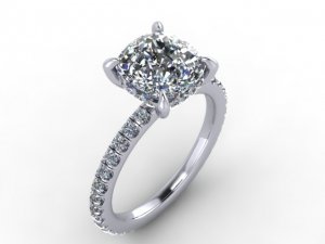
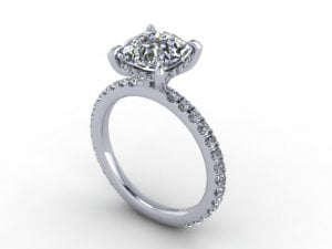
I would love if everyone could take a look at the CAD drawings of the ring that I'm designing for my girlfriend (soon to be fiance :love: ).

Here are the specs:
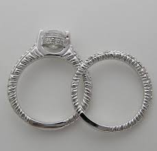
G SI1 2.5 carat Old Mine Brilliant on a pave full of single cut melee diamonds around the band (eternity band but drawings don't show them all the way around) and around the basket. I asked for a non-cathedral setting meaning that the prongs would be directly attached in a U-shape from the band as to not have any high shoulders and essentially giving it a low profile. The ring is being designed so that when placed next to a wedding band, the band will sit flush with the engagement ring.

I really wanted to make something special that my girlfriend would love from the moment she lays eyes on it. Since I respect the opinion of everyone on this board, I would love to get your insight on what you think.

Thank you once again to all of you for providing such knowledgeable insight!
_15277.jpg

_15278.jpg

_15279.jpg

_15280.jpg
 
Last 2 images...

_15281.jpg

_15282.jpg
 
First off, your gf is a very lucky lady to be getting such a huge stone!! :love:

As far as the setting... I'll be honest. I like the single-cut stones on the bands. I don't like the head at all -- the way it goes up, then curves out is awkward to me. I think it could be done much better and still be low-profile/sit flush. Is there a specific reason the jeweler did it this way?? :confused:
 
msop04: Thank for responding and even a bigger thank you for stating what you did about the head. :appl:

I asked the designer the same question because I thought the angles of the prongs could have been softer and not at such a hard angle. I'm waiting to hear back but as I have read through many posts on PS, it seems that it takes a few revisions to get what you want. I'll let everyone know what he states when I hear back.

Thanks again.
 
RomanticSoul|1393348900|3622710 said:
msop04: Thank for responding and even a bigger thank you for stating what you did about the head. :appl:

I asked the designer the same question because I thought the angles of the prongs could have been softer and not at such a hard angle. I'm waiting to hear back but as I have read through many posts on PS, it seems that it takes a few revisions to get what you want. I'll let everyone know what he states when I hear back.

Thanks again.

You are 100% correct on this! I think if you were to take him some photos of different rings and let him know how you would prefer it look, then he will be able to better execute the ring to your liking. :))
 
msop04|1393352874|3622750 said:


msop04: Thanks for sharing links to some other beautiful rings. It's hard to tell the angle of the prongs on the halo rings but the angles seem perfect on the images of the first link you provided. My designer is going to create a plastic resin model of the ring so that I can get a more accurate view of the ring and the angles of the prongs. Hoping that this gives me the accurate representation that I'm looking for.

Only 35 days until proposal day! :Up_to_something:
 
Hi all. I'm meeting the ring designer tomorrow and he is going to have a plastic resin model of the ring. Is there anything I should be looking for in specific? Thanks.
 
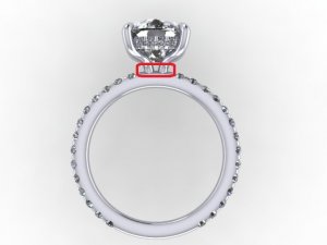
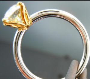
The area in red is where it looks most awkward to me, as though the ring is being strangled and becomes a weak point where the stone/head will catch in pockets, gloves and other items of clothing. I feel that the head can be better integrated into the shank with a small donut.

_15329.jpg
 
Chrono|1393426226|3623380 said:
The area in red is where it looks most awkward to me, as though the ring is being strangled and becomes a weak point where the stone/head will catch in pockets, gloves and other items of clothing. I feel that the head can be better integrated into the shank with a small donut.


Chrono: I asked that the ring not have a high cathedral look to it. I wanted it at a lower profile but yet allowing a matching wedding band to sit flush next to this ring. Do you think that by adding a donut it would lift the head very high or interfere with a wedding band sitting flush next to this ring?

Thanks for the comment!
 
It may not be a perfect flush fit but should come very close; more pictures are in msop's last link. I like that the head is integrated into the setting, instead of being plunked atop the shank.

e_amp_weddingrings.jpg
 
Chrono|1393426226|3623380 said:
The area in red is where it looks most awkward to me, as though the ring is being strangled and becomes a weak point where the stone/head will catch in pockets, gloves and other items of clothing. I feel that the head can be better integrated into the shank with a small donut.

This is exactly what I was trying to explain (you did a much better job with the pictorial!). I think OP can still get this corrected and have the rings sit flush. All the rings I linked are flat at the base and will sit flush with their bands.

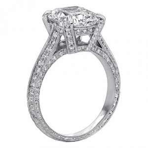
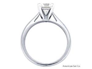
OP, cathedral isn't a height, but a style of setting. This is a cathedral. It has similar bent head at the bottom like yours, but what makes it "cathedral" is how the shank goes up to meet the head at a higher spot than just at the base. ( I hope that made sense)
http://www.rcjewelry.com/Product/Ca...ong-Diamond-Halo-in-14K-White-Gold-30366.aspx

More cathedral settings...
lower_cathedral_0.jpges569-1_0.jpgcathedral_0.jpg

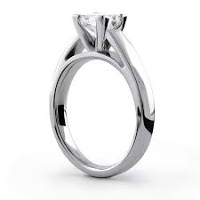
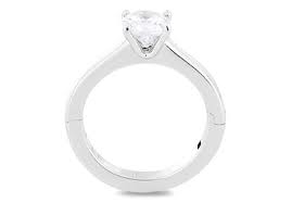
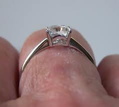
I think maybe what you want a ring that will sit flush and is low profile... maybe something like these??

me1560_b.jpgimagesca55fvyx.jpgimagescal73txw.jpgimagesca8gihnm.jpg
 
RomanticSoul|1393446217|3623616 said:
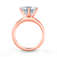
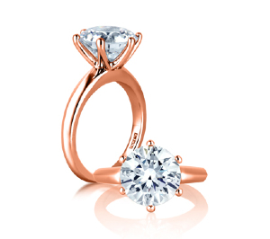
I think I prefer the setting in the picture of the ring in rose gold provided by msop04.

Here is a link to the setting and look that I was going for:

http://www.youtube.com/watch?feature=player_embedded&v=WJELPdixJuA

What do you think?

I love that VC setting. Now I understand the indentions on the CAD. However, I feel VC's flows better and is not as blatant as the CAD suggests -- maybe your jeweler could "soften" the look a bit, maybe not make it look so deliberate?? Did you take him some photos of this ring? Here is a link with photos from different angles:

https://www.pricescope.com/communit...a-solitaire-with-erd-old-mine-cushion.186000/
 
RomanticSoul|1393446217|3623616 said:
I think I prefer the setting in the picture of the ring in rose gold provided by msop04.

Here is a link to the setting and look that I was going for:

http://www.youtube.com/watch?feature=player_embedded&v=WJELPdixJuA

What do you think?

I love the six prong set in rose gold as well! It's by A. Jaffe. It's a really good company with reasonable prices. I have personally tried on this setting and it's lovely... very luxurious!

http://www.ajaffe.com/details/classic-6-prong-solitaire-engagement-ring-me1560.html
 
I meant to tell you... it can be made in any metal of your choice. Also, A. Jaffe's WG alloy doesn't have to be rhodium plated.

me1560_c_0.jpg
 
Oh... my.

Well, since you asked for thoughts, here is my honest opinion: it is so enticingly close!!

The prongs - the curve of the prongs - that's what *makes* this ring, IMO. It's what your eyes automatically focus on. I love the idea of the pronounced S-curve, but I really don't like the way the convex "outward" portion of curve is flattened to accomodate the width of the pave basket - it has two inflection points instead of one. Can the width of the basket be reduced at all? Or can the flattening be removed in some other way?

DBL has perfected the S-prong, IMO - it is clean, smooth, and sexy. The curve in your CAD is exaggerated, obviously, but lacks this fluidity.


It must be said here that the ring in the photo was hand-forged so it was possible to bend the wires exactly as desired. With a cast piece the fine-tuning is limited to whatever shape the wax was made into, and you can only make small alterations to fit and flow of the fine details with a heavier or lighter hand in polishing... so it's that much more important that your designer understands what you want the final product to look like, so he/she can ensure the wax will yield a casting that is compatible with your vision.

Ditto Chrono, I don't like the head/shank attachment at all. I think having the band meet the sides of the head (instead of being "plunked atop the shank") would be much more elegant and graceful, and depending on the width of the shank and diameter and spacing of the prong wires should allow for a flush (or alllllmost flush) fit.

I also don't like the sort-of-squareness of the shank and basket in contrast to the very rounded, curved S-prongs. Either both basket and shank should be round in cross-section, to match the curving flowing S-prongs, or the basket and shank should be boldly, unrepentantly square, to contrast. Right now they're sort-of roundedly square-ish... it just looks indecisive, to me. I actually prefer the idea of the square shank and basket for contrast. Any pave will "soften" it just a bit, and pave is an excellent distraction, which should help with molding the sharp edges of the basket to fit inside the soft curve of the prongs...

Actually, I'd consider making the prongs thicker and heftier, too, they look very delicate in that CAD pic and since they're the focus of the ring it seems appropriate that they carry more weight, literally ::)


I wish I had the time to learn CAD! I can visualise exactly what I'm trying to describe in my head - and I can turn it around and see it from different angles - but trying to describe it with words.. not so much :sick:

dbl_uber_flower.png
 
I just looked at the Victor Canera inspiration linked earlier - it looks completely different to me, honestly. He embraces the flatness - his prongs aren't even trying to be S-shaped. Your CAD sits in-between - which style are you trying to emulate?
 
Gypsy!!!

This thread needs you!
 
I am interested in the A Jaffe ME 1560. It is the one in rose gold pictured. I cannot find anyone close to me who has it. I would love a ring that is medium high set and fits against my eternity band. I love that ring.
 
msop04|1393449267|3623648 said:
RomanticSoul|1393446217|3623616 said:
I think I prefer the setting in the picture of the ring in rose gold provided by msop04.

Here is a link to the setting and look that I was going for:

http://www.youtube.com/watch?feature=player_embedded&v=WJELPdixJuA

What do you think?

I love the six prong set in rose gold as well! It's by A. Jaffe. It's a really good company with reasonable prices. I have personally tried on this setting and it's lovely... very luxurious!

http://www.ajaffe.com/details/classic-6-prong-solitaire-engagement-ring-me1560.html


Where did if fall on the height spector?
 
GET 3 FREE HCA RESULTS JOIN THE FORUM. ASK FOR HELP
Top