Atwater
Brilliant_Rock
- Joined
- May 11, 2010
- Messages
- 535
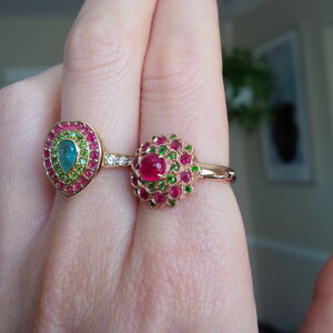
I love those stones together! I am not picking up Christmas vibes though, it looks more tropical to me. I would set them in 18k yellow. I have a pink spinel, demantoid and paraiba ring in 18k yellow and I love the richness of it and how it plays up the juicy colors. I will try and find a pic.
I would love to see your ring in 18k yellow.

The ring on the left is the 18k yellow one I mentioned. The ring on the right is also spinel and demantoid, but set in 14k rose gold. I actually like this color combination of stones in either metal, so I don't think you can go wrong either way! I just thought this pic might be helpful to visualize the color.

It’s craftsmanship. A good jeweler easily be able to do it without a gap. These are both lovely settings.
 www.instagram.com

Of course I love it!I like it, but it really does not matter.
You have to like it.
This baby is coming home soon
Login • Instagram
Welcome back to Instagram. Sign in to check out what your friends, family & interests have been capturing & sharing around the world.www.instagram.com

Haha, has to be an insiderI saw this in my FB feed this morning and thought it must belong to a PSer!!!
DK
This baby is coming home soon
Login • Instagram
Welcome back to Instagram. Sign in to check out what your friends, family & interests have been capturing & sharing around the world.www.instagram.com

I saw this in my FB feed this morning and thought it must belong to a PSer!!!
DK

This baby is coming home soon
Login • Instagram
Welcome back to Instagram. Sign in to check out what your friends, family & interests have been capturing & sharing around the world.www.instagram.com


Of course I love it!

Isn't it! I haven't seen the stones for such a long time that I was even stunned by them myself when I first saw the videoIts so fresh and juicy
Thank you! Totally agree on the happy vibe.I love everything about this ring -- so well executed with really fabulous flow and colors and such a happy vibe -- enjoy!!
Thank you! Pictures shared by you and Neptune really helped me make decisions. I will surely post more pictures once I receive it (likely next week).
Hubba, hubba.
I should have know this was yours! I saw it on DKs Instagram and I knew it was too well done not to belong to a PSer. It is stunning! The gems paired together even better than I imagined (and I can imagine a whole dang lot). The yellow gold was an excellent choice. It seems to highlight both colors. This beauty is exquisite and I can’t wait to see your pics!
Woot woot! It turned out fantastically (is that a word?)!! Well, it's a dream come to life. Enjoy it!
Thank you! Putting the stones near to yellow and rose bands made yellow gold a clear winner for me. I no longer had any double after that and it turns out great!I can't imagine a soul alive who wouldn't.
P.S. I was really torn on whether yellow or rose would work better here (and I think either would have). But the yellow created more contrast and everything just seems to be poppin'!
