shape
carat
color
clarity

Blue sapphire question

Rad_Fan

Ideal_Rock
Joined
Sep 1, 2018
Messages
3,173
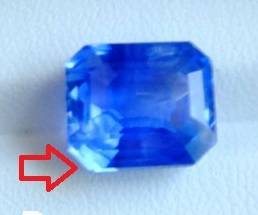
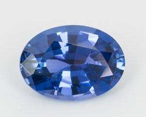
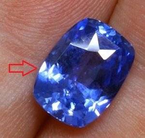
The pale sparkle shown on these 2 sapphires (red arrows) is the indication of color zoning and that the saturation is not strong/intense enough? Or just bad angle?

If the same areas stay consistently pale from different photos or videos, then for sure it's 1 of these 2 reasons?

Not buying but just wanted to train my eyes.
il_794xN.1638287280_glmp.jpg il_fullxfull.1624668442_3lj2.jpg
 
Last edited:
I think you will find that is glare and reflected light off the top facets of the stone and table. If the top stone comes from enhoerning then it has multiple videos (some on instagram) so you should be able to check that theory (or if the stone has colour zoning).
 
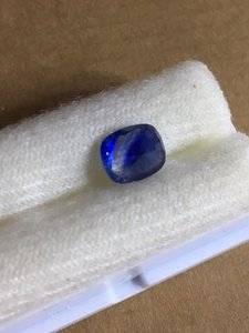
I am seeing the same thing happening here.

0126.jpg
 
I think you will find that is glare and reflected light off the top facets of the stone and table. If the top stone comes from enhoerning then it has multiple videos (some on instagram) so you should be able to check that theory (or if the stone has colour zoning).

I will go back and look some more. Maybe a video with slow movement does help to see the gem better.
 
Aren't these just light-reflecting facets, meaning a good sign of luster?
 
Brilliance scintillation. You will see it in every stone and as you move it around, that bright area should light up and move across the stone.
 
Brilliance scintillation. You will see it in every stone and as you move it around, that bright area should light up and move across the stone.

Thanks @chrono. However, I don't remember seeing them from more saturated sapphires like...this one (maybe just a wee bit on the 5th picture) and the one of @mpc.

The more saturated blue, the lesser pale brilliance scintillation?
 
If the tone is too dark or a stone is too silky, it can appear less brilliant.
In example one, yes, it is there in the 5th picture.
 
I was just going to add that the silk might “improve” the pale scintillation...even it out a bit?
 
No your photos shows light hitting the stones and the way the camera picks that up, not colour zoning, colour zoning looks like this;

IMG_2807.JPG

This sapphire looked fine face up, it was cut to hide the colour zoning but upside down you could clearly see the different colours in it....
 
Thanks for showing that picture, @arkieb1

I honest have gone back and check your LT sapphire many times. I adore that rich blue scintillation.
 
Thanks for showing that picture, @arkieb1

I honest have gone back and check your LT sapphire many times. I adore that rich blue scintillation.

I've sold most of the ones I had for sale except the asscher.
 
The brightest reflection from the facet is actually the true hue of a stone.
 
The brightest reflection from the facet is actually the true hue of a stone.

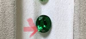
Brightest = lightest (red arrows), correct?

When the time comes, I don't know if I want one with "uneven" tone or something a bit more silky...:?:
 
9583C557-CE95-4FCD-8937-D015DA547A7A.jpeg
Brightest = lightest (red arrows), correct?

When the time comes, I don't know if I want one with "uneven" tone or something a bit more silky...:?:
It is the light return from the pavilion that shows the true hue. Not the surface reflection. I am not sure for this photo Let me find a better sample. Most stones show multcolor. You can read Richard Wise the secret of the gem trade. He has explained this because of the length the light travels.
 
It is the light return from the pavilion that shows the true hue. Not the surface reflection. I am not sure for this photo Let me find a better sample. Most stones show multcolor. You can read Richard Wise the secret of the gem trade. He has explained this because of the length the light travels.

Will search for more Richard Wise's info.

The tsavorite(?) you posted at least showed nice green hue there but the sapphires I posted looked so washed out and almost white in those areas. I am thinking that they are not as vivid saturated. Or, I need to look for med dark tone?
 
Will search for more Richard Wise's info.

The tsavorite(?) you posted at least showed nice green hue there but the sapphires I posted looked so washed out and almost white in those areas. I am thinking that they are not as vivid saturated. Or, I need to look for med dark tone?

I think you should find some sample photos you like first since I don’t know what is your ideal colour
 
I think the best way to observe the hue of a gem is against a light background in natural diffused light. Of course, you should always view a gem in multiple light sources to evaluate color shift, tone and overall performance.
 
I don't really understanding what he is trying to say here. The loose sapphire and that of the ring are the same gem? I know that gem looks darker after set but that is a HUGE difference!

VLAD
 
I don't really understanding what he is trying to say here. The loose sapphire and that of the ring are the same gem? I know that gem looks darker after set but that is a HUGE difference!

VLAD
No, they’re different gems. One is lighter toned and more of a grayish blue, and the one in the ring is more medium to medium dark toned and a more saturated blue. He’s just saying that they don’t “black out” like some sapphires (the Kate/Diana ring is the most famous example of a sapphire that blacks out).
 
I think you should find some sample photos you like first since I don’t know what is your ideal colour

THESE look attractive to me and they look pretty consistent.

BURMA looks too deep and sleepy but that little bit of slightly lighter blue scintillation is attractive.
 
(the Kate/Diana ring is the most famous example of a sapphire that blacks out).

I am so tired of looking at that sapphire. :roll
 
I am so tired of looking at that sapphire. :roll
I’m tired of everyone fawning over it, and buying copycats, like it was the pinnacle of sapphire beauty! :eek2::confused2:
 
THESE look attractive to me and they look pretty consistent.

BURMA looks too deep and sleepy but that little bit of slightly lighter blue scintillation is attractive.
The top ones need to be viewed on a white background to be sure. They should also be viewed on their sides, face down, and with the tables perpendicular to your line of sight.

I agree that the Burma is too sleepy, it’s also a tad bit too dark IMO.
 
Oh...I really LIKE the sapphire despite the gaudy setting. Thanks for the inspiration!

How do you explain those darken factets? Cut issue or less silk?

OVAL

Well those are what I call facet shadows, which are just areas where light transmission doesn’t get back to the eye. Unless it’s a cabochon, you will always have that. All faceted transparent gems have them, even clear gems like goshenite. However, fine silk, medium to light tone in combination with the right amount of silk, decent cutting, all helps lessen to the amount of extinction.
 
I’m tired of everyone fawning over it, and buying copycats, like it was the pinnacle of sapphire beauty! :eek2::confused2:

@ T_L & @ Rad_Fan - I'm not sure anyone can actually tell without seeing it in person. I have a sapphire that always photographs dark, much like that stone which mostly always photographs dark but if you go into sunlight, inside lighting, shop lighting or anywhere else it's what Sri Lanka dealers consider their "ideal colour" so it's Royal blue with poop lighting but it's a vivid Peacock or much better colour when the lighting hits it and something quite magical to behold. So I guess you have to live or work in an environment with decent lighting most of the time to enjoy it and not be bothered it can take dark almost black photos unless you have a lightbox or the correct equipment to try and capture the colour the human eye sees.

I too always thought Diana's sapphire was too dark, but after owning this stone I'm not so sure, I can't think they would have paid huge sums of money and selected it out of a tray of stones/rings if it didn't have something magical going for it....

I’ve never ever seen a picture of Diana’s ring where it didn’t look blackish, and there’s a million pictures of it in all sorts of lighting. I cannot say that about everyone else’s celebrity stone. For example Victoria Beckham’s photograph superbly. I can believe Garrard’s sold her a dud. Fine gem houses don’t always carry great stones, especially if they specialize in diamonds. I think the Duchess of Windsor had more luck in her choices with Cartier, than a nineteen year old girl who only had a “D” pendant as her main piece of jewelry at the time. She got better gems to wear over time, but It’s a pity she didn’t live long enough! I heard she chose it because it was the largest stone in the tray and it reminded her of her grandmother’s style of ring.

I know what you’re saying though, and maybe it’s impossible to properly photograph, but I think my biggest concern with that stone is that people use photos of it as a benchmark for fine sapphire.
 
Last edited:
@ T_L & @ Rad_Fan - I'm not sure anyone can actually tell without seeing it in person. I have a sapphire that always photographs dark, much like that stone which mostly always photographs dark but if you go into sunlight, inside lighting, shop lighting or anywhere else it's what Sri Lanka dealers consider their "ideal colour" so it's Royal blue with poop lighting but it's a vivid Peacock or much better colour when the lighting hits it and something quite magical to behold. So I guess you have to live or work in an environment with decent lighting most of the time to enjoy it and not be bothered it can take dark almost black photos unless you have a lightbox or the correct equipment to try and capture the colour the human eye sees.

I too always thought Diana's sapphire was too dark, but after owning this stone I'm not so sure, I can't think they would have paid huge sums of money and selected it out of a tray of stones/rings if it didn't have something magical going for it....

That's fair. When buying online, the 1st impression has to be pleasing to my eyes. There are so many to choose from so it's easy to pass certain ones if they don't "look good" to me. Granted, online vendors will always display their gems under the best light setting so I also worry about being fool by the initial look of them.

Now...can we please see that sapphire of yours?:twisted2:
 
GET 3 FREE HCA RESULTS JOIN THE FORUM. ASK FOR HELP

Featured Topics

Top