shape
carat
color
clarity

Celestial or floral setting for diamond? Can't decide :(

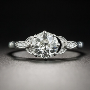
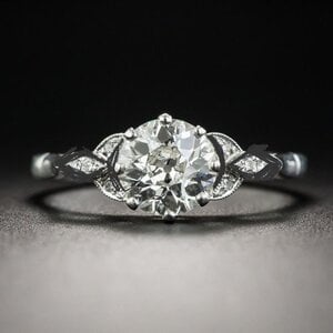
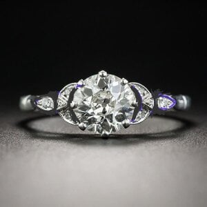
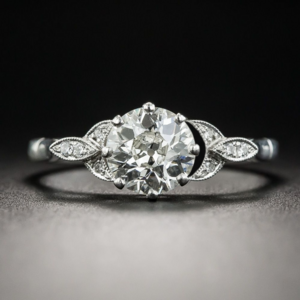
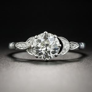
Which style for a hand-forged e-ring for OEC, celestial or floral?

  • Celestial ring with moons

    Votes: 28 75.7%
  • Floral ring with petals

    Votes: 9 24.3%

  • Total voters
    37
I’m so excited about that band!

FOMO is real so I just purchased the princess cut version of the sapphire band from Inken. I'm so excited for you... and me!!! lol
 
FOMO is real so I just purchased the princess cut version of the sapphire band from Inken. I'm so excited for you... and me!!! lol

I want to see pics when it arrives!!!! :kiss2:
 
So flattered to be tagged @Cerulean, and sorry for the holdup! It’s been an absolute hell week — death in the family, grand theft auto, emergency kitty hospitalization — but I finally have a chaos-free moment to reply. Assuming a plague of locusts doesn’t strike before I finish typing…

Of the two specific rings in your first post, I prefer the celestial option.

It seems like the floral (and brussel sprout!) designs you are currently considering are a bit of a departure from the more sculptural/asymmetric/organic ideas you toyed with in previous threads. What pushed you in this new direction, if you don’t mind me asking?

Full disclosure: floral motifs that are super stylized/only vaguely suggestive of petals, etc. aren’t the most exciting to me (PS blasphemy, I know). I really liked some of the flowery rings you’d previously shared in your mokume gane thread, and I was especially keen on the more organic, dimensional petal design sketched by @yssi in your VCA wire flower thread. I just prefer a more…literal(?) interpretation, I guess. And I do think a wearable version of that is totally possible, especially for an artsy fartsy type such as yourself. :D

I was also really drawn to the art nouveau-ish green gemstone ring you shared in that same thread. I may have missed some posts here and there — out of curiosity, why did you decide against working with that designer? Was it just an issue of that particular design not meshing well with the multicolor and original WBs?

I’ve run across some pieces on 1stDibs, IG, etc. over the last few weeks that made me think of you/your previous reset threads, but I don’t think I saved them. Kicking myself now! I’ll scroll through my camera roll just in case.

Can’t wait to see where you land with this reset!

Oh my, what a week you’ve had! I’m so sorry about all of that! Hope things settle for you soon. I appreciate the time you’ve given to thoughtfully answer despite the recent difficulties you’ve experienced. Feel no pressure to reply right away!

These are all extremely reasonable questions. I feel like I’ve bounced all over the place with this project! To the moon and back, one might say!

The primary change for all of it, is an underlying desire to pick a style that goes with my original, plain ‘ole wedding ring. The more I thought about tossing it aside for the sake of a stylistic change, the sadder I felt. I thought I wasn’t very sentimental about it, but I think my husband swayed me. It is very important to him although he was willing to have me put it away in a box, and I think that is ultimately why it’s important to me too. He practically sighed with relief when I shared that I may want to pick a design that will match it and keep it as part my daily stack.

Neither the very organic hand carved floral style or the mokume gane would make much sense with a plain platinum band, unfortunately. I also agree with posters that I should nab a special mokume gane piece while actually in Japan! And this is another silly detail…but I really prefer the organic pieces in yellow gold and they are more accurate to the real time. Art nouveau items were never, ever made in platinum. The little art historian in me is a bit unnerved by the perversion, metal choice is a concession I made with my husband (i.e. that I’d go with platinum no matter what so our sets vaguely matched.) I also bought a very white diamond and would prefer her in a white metal.

I think you are right about the halfway-to-organic styles. I find them less exciting too and you helped articulate it for me.

TLDR; husband agreed that those styles can be explored in the future for special anniversaries for alternative sets. What a sweetie.
 
Apologies for the thread jack... @Cerulean My ering is platinum and I'm pretty sure it's art nouveau. No?
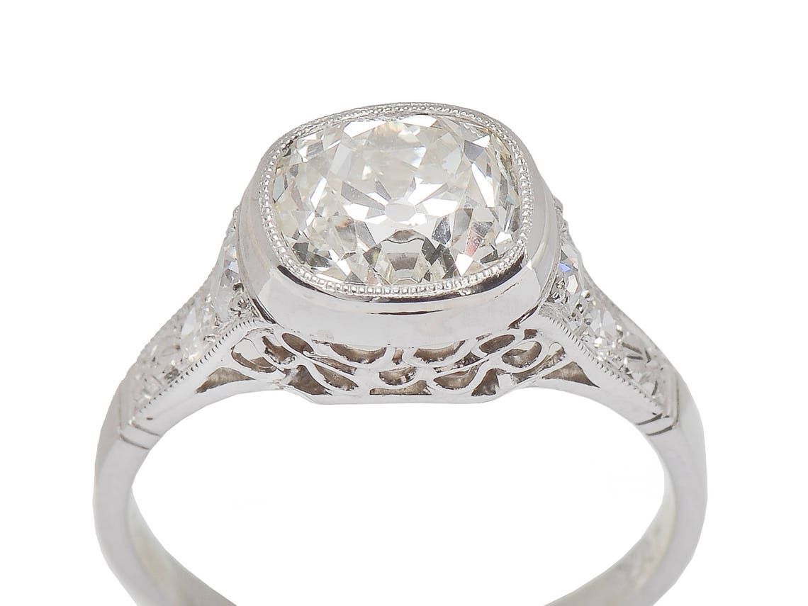
il_1140xN.1368482402_765e.jpg
 
These are all extremely reasonable questions. I feel like I’ve bounced all over the place with this project! To the moon and back, one might say!

The primary change for all of it, is an underlying desire to pick a style that goes with my original, plain ‘ole wedding ring. The more I thought about tossing it aside for the sake of a stylistic change, the sadder I felt. I thought I wasn’t very sentimental about it, but I think my husband swayed me. It is very important to him although he was willing to have me put it away in a box, and I think that is ultimately why it’s important to me too. He practically sighed with relief when I shared that I may want to pick a design that will match it and keep it as part my daily stack.

Neither the very organic hand carved floral style or the mokume gane would make much sense with a plain platinum band, unfortunately. I also agree with posters that I should nab a special mokume gane piece while actually in Japan! And this is another silly detail…but I really prefer the organic pieces in yellow gold and they are more accurate to the real time. Art nouveau items were never, ever made in platinum. The little art historian in me is a bit unnerved by the perversion, metal choice is a concession I made with my husband (i.e. that I’d go with platinum no matter what so our sets vaguely matched.) I also bought a very white diamond and would prefer her in a white metal.

I think you are right about the halfway-to-organic styles. I find them less exciting too and you helped articulate it for me.

TLDR; husband agreed that those styles can be explored in the future for special anniversaries for alternative sets. What a sweetie.

I was going to mention this in my original comment, but I cut it as my post was already long as hell: I love that you plan to keep your original wedding band (altered width or not). For one, I’m a sentimental fool, so I would personally want to do the same in your shoes. For another, I think it’s great you are recognizing and respecting something that’s super important to your feller. As I think we’ve already established, you and I have a similar dynamic with our respective dudes — their jewelry opinions are as fervent as they are rare, so it’s nice to throw them a bone when they do pipe up about something. Especially when it’s an easy bone to fling. Funny that you are discovering you might be the sentimental type, too!

TOTALLY understand your preference for yellow gold when it comes to organic/sculptural designs. I feel the same way, but kinda figured it was a “just me” thing. Not sure if it’s the anachronism for me, as I don’t think I’d ever do a straight up art nouveau repro myself. But on a gut level, artsy sculptural pieces just feel right in 18k yellow gold. Whereas platinum perfectly suits a celestial motif — and as @yssie pointed out, there’s a nice “red thread” between the milgrain sidestones and plain shank in your example to your wedding band and bright cut eternity. And while I personally like the contrast of colorless diamonds in high(er) karat YG, I totally get why you prefer to keep your E in platinum, especially considering the need to match the wedding band. For whatever reason, I really like the look of plain yellow gold bands with platinum e-rings, but would not like a yellow gold e-ring with a platinum WB.

So let’s 86 the floral motif altogether. And make a pact to both do mondo artsy fartsy, photorealistic/sculptural 18k RHRs after our e-rings are done!

Now that that’s settled — I’m on board with @yssie’s suggestions for the celestial ring, although I wouldn’t have come up with them myself.
  1. I LOVE the thought of hiding a colored stone (that matches one of the sapphires in the eternity) flush set in the inside of the e-ring shank. I know you mentioned Inken only has enough melee for one band, but if you do a one-stone sizer spacer, would that mean you have one loose stone left over to use in the e-ring?
  2. Totally dig the idea of exaggerating the air gap between the center and moons. Like @DorotheaBrooke , I appreciate the subtlety of the moons — I think a celestial motif is hard to pull off. (In fact, I didn’t think elegant execution was even possible before seeing the ring you posted! Stars and moons stuff usually tends sort of cheesy and “juniors” to me.) That said, I think I’d prefer it to be a little less subtle, which could be achieved with a gap/more distinct crescents.
Only thing I’m not so sure about is the bezel. Like you, I’m not a big on enclosed bezels. And I think it might feel too much like your current setting with the partial bezels (at least it would for me). But I don’t pretend to know jack about jewelry design and don’t have a better solution to offer.

Side note: you mentioned Maytal’s portfolio is more diverse than her IG represents. Do you happen to have any pics? I’ve only seen halos and pave solitaires on her site, and would be curious to see what other styles she’s done! I’ve heard she’s great to work with — and I too love that she does sketches — but I had ruled her out as an option as I’m not all that interested in hyper-feminine modern micropave stuff.
 
Apologies for the thread jack... @Cerulean My ering is platinum and I'm pretty sure it's art nouveau. No?

il_1140xN.1368482402_765e.jpg

I LOVE your e-ring. i especially loved seeing your hunt for special wedding bands to pair with it! This actually appears to be late Edwardian/early art deco. (Art nouveau and Edwardian pieces overlapped in their time period, but art nouveau is much more free form). I could be wrong..but that's my guess!

There is also a decent amount of stylistic overlap in early art deco and art nouveau styles circa late teens and early 20s in the art deco period. In early art deco pieces, you do see a decent amount of floral motifs and more "frill" and less hard, geometric lines like you see in the late 20s and especially 30s where art deco became a bit more austere.

sorry to nerd out haha!
 
Appreciate your insight! Yeah, I can see how it could seem stylistically borderline, but the seller said it was from 1890, or maybe even earlier, which would predate the art deco period (if correct).
 
I was going to mention this in my original comment, but I cut it as my post was already long as hell: I love that you plan to keep your original wedding band (altered width or not). For one, I’m a sentimental fool, so I would personally want to do the same in your shoes. For another, I think it’s great you are recognizing and respecting something that’s super important to your feller. As I think we’ve already established, you and I have a similar dynamic with our respective dudes — their jewelry opinions are as fervent as they are rare, so it’s nice to throw them a bone when they do pipe up about something. Especially when it’s an easy bone to fling. Funny that you are discovering you might be the sentimental type, too!

TOTALLY understand your preference for yellow gold when it comes to organic/sculptural designs. I feel the same way, but kinda figured it was a “just me” thing. Not sure if it’s the anachronism for me, as I don’t think I’d ever do a straight up art nouveau repro myself. But on a gut level, artsy sculptural pieces just feel right in 18k yellow gold. Whereas platinum perfectly suits a celestial motif — and as @yssie pointed out, there’s a nice “red thread” between the milgrain sidestones and plain shank in your example to your wedding band and bright cut eternity. And while I personally like the contrast of colorless diamonds in high(er) karat YG, I totally get why you prefer to keep your E in platinum, especially considering the need to match the wedding band. For whatever reason, I really like the look of plain yellow gold bands with platinum e-rings, but would not like a yellow gold e-ring with a platinum WB.

So let’s 86 the floral motif altogether. And make a pact to both do mondo artsy fartsy, photorealistic/sculptural 18k RHRs after our e-rings are done!

Now that that’s settled — I’m on board with @yssie’s suggestions for the celestial ring, although I wouldn’t have come up with them myself.
  1. I LOVE the thought of hiding a colored stone (that matches one of the sapphires in the eternity) flush set in the inside of the e-ring shank. I know you mentioned Inken only has enough melee for one band, but if you do a one-stone sizer spacer, would that mean you have one loose stone left over to use in the e-ring?
  2. Totally dig the idea of exaggerating the air gap between the center and moons. Like @DorotheaBrooke , I appreciate the subtlety of the moons — I think a celestial motif is hard to pull off. (In fact, I didn’t think elegant execution was even possible before seeing the ring you posted! Stars and moons stuff usually tends sort of cheesy and “juniors” to me.) That said, I think I’d prefer it to be a little less subtle, which could be achieved with a gap/more distinct crescents.
Only thing I’m not so sure about is the bezel. Like you, I’m not a big on enclosed bezels. And I think it might feel too much like your current setting with the partial bezels (at least it would for me). But I don’t pretend to know jack about jewelry design and don’t have a better solution to offer.

Side note: you mentioned Maytal’s portfolio is more diverse than her IG represents. Do you happen to have any pics? I’ve only seen halos and pave solitaires on her site, and would be curious to see what other styles she’s done! I’ve heard she’s great to work with — and I too love that she does sketches — but I had ruled her out as an option as I’m not all that interested in hyper-feminine modern micropave stuff.

I heart this whole comment so much. Thank you, thank you.

You hit the nail on the head. I run the show more soooo many aesthetic decisions, that when my husband does say boo...I listen. So, I really appreciate that you get it! I also totally get how different units have totally different approaches to this sorta thing...I do think, like many things, to each their own!

And I TOTALLY get what you mean with mixing vintagey platinum rings with yummy, rich gold wedding bands. Erstwhile kills their photo ops with this juicy combo, but also totally agree that the other way around is...not my favorite.

Those flowy art nouveau lines, and even more sculptural jewelry (*cough cough* Lent's grasping hands) in general just lend themselves to warm yellow or even rose golds to me. There is a softness and glow that colored golds just give off...they radiate. Whereas platinum is sleek, cool, heavy and luxe in its own way that just makes tons of sense with cleaner lines and tiny details like milgrain.

I need to be mindful of how the materials play with different styles, and it sorta took me a little while to puzzle it out. I am SO sensitive to it with my art...and more many, these details are utterly irrelevant.

@DorotheaBrooke, you were spot on. That the moons are subtle, and that is part of the allure, but a little more air gap is a fab idea. I am also leaning heavily towards prongs. I have also expressed issues with prongs before, so I know @yssie is familiar with my woes. Way back when (lol 2 whole years ago), I got claw prongs and they caught little fuzzies and pulled my hair and just drove me insane. So I need to be careful with prongs! No tiny talons for me.

The one thing I was toying with was a crown-like head, and dropping the whole profile down and simplifying it. I will lean on the designer here to help me puzzle it out...but here is an example of what I was talking about.

IMG_8339.jpg


P.S. Regarding Maytal. @elrohwen has a gorgeous example. HERE. So, I'd still say you made the right call choosing Leon. Maytal's earlier work consists of much more filigree, engraving, and more vintage-inspired works. Sleek and modern doesn't seem to be her thing based on what I have seen. She shared photos with me in a private email chain so I feel a little weird sharing them on a public forum, but if you are curious you can always reach out to me through Loupetroop. If you dig way back in old Maytal threads, you can find some examples too.

P.P.S. The pact is a deal. I want a juicy, colored stone nestled in a bed of carved golden leaves, and I want you to have your dream Anthony Lent ring.
 
Appreciate your insight! Yeah, I can see how it could seem stylistically borderline, but the seller said it was from 1890, or maybe even earlier, which would predate the art deco period (if correct).

Well yes that sure would predate art deco! That is even too early for edwardian. I am totally just guessing, as I know of these time periods more through fine art than jewelry. def don't trust my guess :lol:
 
Well, it looks like you've gotten fantastic advice.
The Queen especially knows what's what and understands your aesthetic and emotional view down to the ground.
I am all in for this ride!


This is close to what I was talking about just a bit more carved/ three dimensional with the leaf detailing and bead set like the Berganza brooch from earlier. So, in reality pretty infinitesimal tweaks from the celestial vibe.
IMG_8339.jpg

*It's interesting, I love the idea of a floral prong, yet for the life of me, I couldn't find the right execution. It was too easy a spill over to the impractical and for me personally, what would be the point of that for a daily wear engagement ring? It defeats the purpose.
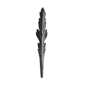
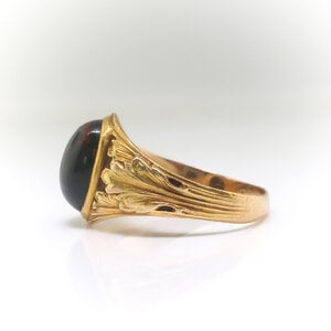
25836_prod_2844-ring-side.jpgstamped-steel-acanthus-leaf-item-69_137.jpg

This is pretty right, this Acanthus? The problem is pairing this down to not swallow the stone it's holding; easier said than done I think, for me it's still a daydream, for now.
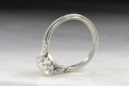

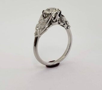
Thanks so much for weighing in. I think the details in that platinum ring combined with the celestial element will be lovely. I also went gaga for this profile and crown...

1631490049975.png

I totally know what you mean, I can't for the life of me find the right execution of petal rings either. Either they are too simple and symmetrical, or so detailed that they'd be totally unrealistic for daily wear. I think I am looking for something that doesn't exist. Gary Roe's work is the closest I found.

That Acanthus is stunning. Thanks for sharing. I do worry that the design would be gorgeous with a big stone, but that it might swallow my wee diamond! Or, would look weird with my plain band...

I know one day, I will get my carved, deliciously detailed sculptural ring. Maybe an anniversary ring with a chonky OMC...10, 15, or 20 years from now :lol:
 
What if the "moons" sat on top? And then the other detail would be pear-shaped instead of a marquise. Here is a sketch, added in a tiny bit more space like @yssie suggested between the moons and the center stone

IMG_8348.jpg
 
Yes! What will happen to the bead set? Will they become actual pears and halfmoons or stay a melee set into the shape?
 
Yes! What will happen to the bead set? Will they become actual pears and halfmoons or stay a melee set into the shape?

great question...I think i would probably do melee
 
IMG_8348.jpg

LOVING this alteration!
I would 100% keep the pear detail in melee with milgrain edge ❤️
But the portion of the marquise that currently bisects the moon on each side - would you remove that, and just have the flat moon?
One thing I do really like about this mount as-is is the introduction of that height difference in the side elements…
 
Prefacing this with confidence that whoever you work with will have ideas as well - just for a quick visual.

1631512459586.png

1631512469552.png

1631512476852.png

1631512436117.png
(I think I made the moon too fat here)

Also wondering about ways to change the gallery such that the shank doesn't go under the moons - so that what you see between center and inner moon wall really is just negative empty space...

One more - tucking the pear under the moon. But the moon is really too fat here too :???: almost feel like this might be better with a round instead of a pear…
53F5B9B4-65B7-40DC-A1A0-B330941A8143.png
 
Last edited:
I don't love the original marquise. I wasn’t going to say anything, but since you apparently feel the same way - I saw sharks. Now I can't unsee sharks. Sorry in advance...

1631513432882.png
 
Last edited:
Prefacing this with confidence that whoever you work with will have ideas as well - just for a quick visual.

1631512459586.png

1631512469552.png

1631512476852.png

1631512436117.png
(I think I made the moon too fat here)

Also wondering about ways to change the gallery such that the shank doesn't go under the moons - so that what you see between center and inner moon wall really is just negative empty space...

One more - tucking the pear under the moon. But the moon is really too fat here too :???: almost feel like this might be better with a round instead of a pear…
53F5B9B4-65B7-40DC-A1A0-B330941A8143.png

Thank you so much for mocking these up. Extraordinary! So helpful. I need to learn to use photoshop…I just hate Abode anything!

There is definitely something off about the original marquise. Of these mock ups, I actually think I am really liking the last version with pears tucked underneath. I also thought about a version where the marquise sides are just made to be smaller.

like this

732E17CA-48DD-4F3C-977C-1EC368E78BD4.jpeg

or smaller yet

0111991C-6847-4FC8-8A8D-85A2CAF0904D.jpeg
 
I don't love the original marquise. I wasn’t going to say anything, but since you apparently feel the same way - I saw sharks. Now I can't unsee sharks. Sorry in advance...

1631513432882.png

no offense taken AT ALL. This tickled me
 
Very rough sketches. Obviously a designer can and should weigh in, just having fun dreaming up tweaks

smaller marquise on top
AAA5F476-51DE-48F0-AC08-6E4E8FA18969.jpeg

Versus larger tucked under pear

D54ED760-74A1-4804-829E-3433BCB1F936.jpeg
 
Last edited:
Those flowy art nouveau lines, and even more sculptural jewelry (*cough cough* Lent's grasping hands) in general just lend themselves to warm yellow or even rose golds to me. There is a softness and glow that colored golds just give off...they radiate. Whereas platinum is sleek, cool, heavy and luxe in its own way that just makes tons of sense with cleaner lines and tiny details like milgrain.
P.P.S. The pact is a deal. I want a juicy, colored stone nestled in a bed of carved golden leaves, and I want you to have your dream Anthony Lent ring.
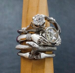
Well there you have it — you just articulated my feelings about both metals perfectly. This is why the world needs more art nerds!

Case in point: I saw these on Lent’s IG and was like, “huh, don’t think I’ve ever hated something so much.”

A40C476B-7F47-4771-92BC-FD65BF2D1E81.jpeg

P.S. Regarding Maytal. @elrohwen has a gorgeous example. HERE. So, I'd still say you made the right call choosing Leon. Maytal's earlier work consists of much more filigree, engraving, and more vintage-inspired works. Sleek and modern doesn't seem to be her thing based on what I have seen. She shared photos with me in a private email chain so I feel a little weird sharing them on a public forum, but if you are curious you can always reach out to me through Loupetroop. If you dig way back in old Maytal threads, you can find some examples too.

Sorry for the continued thread jack here, but yes, I think Leon was the right choice for my e-ring (hoping I still think so when I finally see the thing, haha). I asked with future projects in mind, but mostly on behalf of my sister, who is starting the e-ring process now. She originally reached out to LM, but let’s just say the two didn’t hit it off famously, lol. Figured MH might be a better fit for her on the personality front. I’ll shoot you an email.

Gary Roe's work is the closest I found.

So THAT’S who made the gorgeous green tourmaline ring! Just went to his IG and am dyyying over his ginko leaves, holy mackerel.
 
Well there you have it — you just articulated my feelings about both metals perfectly. This is why the world needs more art nerds!

Case in point: I saw these on Lent’s IG and was like, “huh, don’t think I’ve ever hated something so much.”

A40C476B-7F47-4771-92BC-FD65BF2D1E81.jpeg


Sorry for the continued thread jack here, but yes, I think Leon was the right choice for my e-ring (hoping I still think so when I finally see the thing, haha). I asked with future projects in mind, but mostly on behalf of my sister, who is starting the e-ring process now. She originally reached out to LM, but let’s just say the two didn’t hit it off famously, lol. Figured MH might be a better fit for her on the personality front. I’ll shoot you an email.


So THAT’S who made the gorgeous green tourmaline ring! Just went to his IG and am dyyying over his ginko leaves, holy mackerel.

Lol wow I REALLY don’t like platinum with those hands! They look…sickly?

I’ll talk to you soon, lady!
 
Hot damn, you guys are all so good! I love these tweaks.

Definitely keep the melee + milgrain! And the gap looks SO GOOD. Goodbye, wall of bling! Fare-thee-well. The celestial motif comes through so much stronger, too.

I agree with @yssie (quelle surprise) — I prefer the shapes overlapping a bit so they are at different heights, rather than side by side on the same plane. Much more visually interesting from all angles. I really like those pears in place of the marquis (hey, you always wanted pears, right?!), either tucked under or on top of the crescents. Although I also could totally get on board with rounds tucked under the moons like @yssie suggested, or your little itty bitty marquis on top.

I can’t quite tell from your sketch, but are you thinking of doing like a split bridge (? I am for sure using the wrong terminology here) in order to keep that negative space uninterrupted from the top down? Where it’s shaped to run directly under the crescents on either side. Something like this:

CE9A2E84-13C4-400D-968A-0888E6DF7C5C.jpeg

I need to learn to use photoshop…I just hate Abode anything!

If you have an iPad and Apple Pencil, you should try Procreate! Not as powerful as Adobe, but way more fun.
 
Hot damn, you guys are all so good! I love these tweaks.

Definitely keep the melee + milgrain! And the gap looks SO GOOD. Goodbye, wall of bling! Fare-thee-well. The celestial motif comes through so much stronger, too.

I agree with @yssie (quelle surprise) — I prefer the shapes overlapping a bit so they are at different heights, rather than side by side on the same plane. Much more visually interesting from all angles. I really like those pears in place of the marquis (hey, you always wanted pears, right?!), either tucked under or on top of the crescents. Although I also could totally get on board with rounds tucked under the moons like @yssie suggested, or your little itty bitty marquis on top.

I can’t quite tell from your sketch, but are you thinking of doing like a split bridge (? I am for sure using the wrong terminology here) in order to keep that negative space uninterrupted from the top down? Where it’s shaped to run directly under the crescents on either side. Something like this:

CE9A2E84-13C4-400D-968A-0888E6DF7C5C.jpeg


If you have an iPad and Apple Pencil, you should try Procreate! Not as powerful as Adobe, but way more fun.

Husband likes the pears too, actually. Hmm. Food for thought. I’ll run it past Maytal and see what she says, although something happened in the intervening 24 hours that may delay execution of this bad boy until March. That’s okay! Patience isn’t a bad thing, especially considering how fickle I’ve been.

Yes, exactly! That “split bridge” or whatever it’s called. I like the the shape of the sides is reflected below as though it were a silhouette, and with negative space between. No idea how to describe it effectively but the image is the idea incarnate!

I actually do have a (sadly) neglected iPad and give that go. I use other design tools at work, but something about photoshop always made me cringe.
 
I just saw this ring and thought of this thread. I’m not sure if it’s close to what you’re looking for but thought I’d throw it out there!

944F73D2-2BBD-4E89-8CB3-B3E750C9E8D5.png
 
I just saw this ring and thought of this thread. I’m not sure if it’s close to what you’re looking for but thought I’d throw it out there!

944F73D2-2BBD-4E89-8CB3-B3E750C9E8D5.png

It’s definitely my style! It’s a great example of a delicate bezel with little flourishes on the sides - thanks for thinking of me
 
Hey @Cerulean - have you received your colorful sapphire band yet? Do you love it?
 
GET 3 FREE HCA RESULTS JOIN THE FORUM. ASK FOR HELP
Top