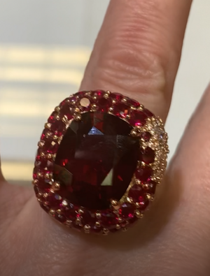
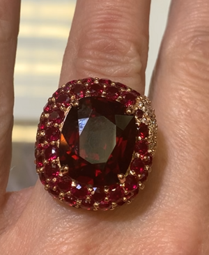
shape
carat
color
clarity

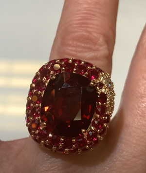
David Klass and spinel ring bezel

I’m guessing that the reason he is insisting it’s fine is because you can’t see those ‘flaws’ with the naked eye. I think you should trust him and see the ring in person and then decide.
 
When you say that he's not having it, what do you mean exactly?
You don't need to post the convo, some would even say it's wrong, but I'm curious what he's replying to you when you bring up the issue you're seeing.

If you could tell us or summarize it that would help. Sometimes there's a break down somewhere in communication that can lead to frustration and a new set of eyes can help!

I do see the issues with what he calls your "bezel". It definitely looks uneven and unprofessional looking and doesn't really fit the quality I'm used to seeing from him.

Also do you think he truly understands your issue with the ring? Maybe editing the photo by drawing arrows to the area or trying your best to draw it out and sending it to him would help a lot. I've never heard of DK just plum out saying he won't alter an aspect of a ring or design that his customer wants, especially as this looks doable.

So that's what makes me think there's been a breakdown somewhere or a slight misunderstanding.

It's a lovely ring besides the unevenness and prongs. I hope you get this sorted soon and can continue to enjoy making projects with Dk!

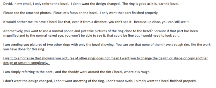
I did not address the prongs and to be honest, it looks off-centre but I did not wish to whinge. It is difficult to keep the monkey mind from frustrating negative thoughts. It is also difficult to remain neutral and not jump to conclusions and for this, I must apologise to @Rfisher who mentioned stalking and I was not in the right frame of mind to read the word 'stalking' last night. I want all of you to understand I admire David's work and don't want this to be a David bashing opportunity because I do know he is very skilled and always always, he has ensured good work. Until this ring, that is.

So, this is what he replied:

1644235728695.png

This is what I said after he replied. I hope it sounds calm and reasonable.

1644235785908.png

And now, let's look at the prongs and how the stone is sitting. It looks like the prongs are higher on the right, and lower on the left.

1644235876996.png1644238036353.png
 
Last edited:
Having that one obviously much smaller melee than the rest is not acceptable to me. They must all be the same size. The bench did not calculate the sizes correctly and just threw in that small one to make it fit. He would have to remake the ring to correct this and I expect no less.
 
Having that one obviously much smaller melee than the rest is not acceptable to me. They must all be the same size. The bench did not calculate the sizes correctly and just threw in that small one to make it fit. He would have to remake the ring to correct this and I expect no less.

That is the part I cannot figure out. It looks like that is intentional? A design aesthetic with the gold intentional showing on the right hand side?
 
The prongs are definitely uneven and set notably higher on the visual right. That, combined with the unmatched melee makes the right side of the ring look dramatically different than the left. I'm a sucker for symmetry and that would drive me nuts - probably more than the questionable metal work you were originally disappointed with.

Upon further viewing of the original photos it looks like the changes on the upper right are intentional. So disregard that. The prongs are still uneven/assymmetrical, though
 
Last edited:
@Mreader Good point about it possibly being intentional. I hope @ChaiK will clarify.
 
I am wondering why the prongs should then be unsymmetrical.

I don't think the dissymetry in the prongs is intentional; the dissymetry is a lack of thought on detail.

Anyway, only happy positive thoughts and let's hope another round of emails would help David to consider carefully what I am saying.
 
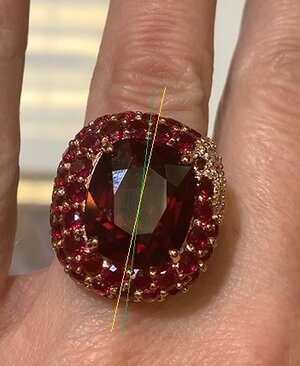
Actually, could it be that it's not the prongs that are asymmetrical but the stone is rotated?

The green line splits the setting itself in two. I'm going by the melee - there are four stones up and down between each of the two prongs. Draw a line that goes in the middle, prongs look okay.

The yellow line splits the stone in two, going by the facets and the visible table. Looking at that, not only the prongs, but the entire ring starts to look asymmetrical.

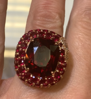
DK ring.jpg
 
I might suggest that, if communications are not productive at the moment, there may be a lot of stress and flurry for jewelers in the lead-up to Valentine's day. It might be helpful to have him set the ring aside for now, not ship it, and circle back to discuss in a couple of weeks.
 
Actually, could it be that it's not the prongs that are asymmetrical but the stone is rotated?

The green line splits the setting itself in two. I'm going by the melee - there are four stones up and down between each of the two prongs. Draw a line that goes in the middle, prongs look okay.

The yellow line splits the stone in two, going by the facets and the visible table. Looking at that, not only the prongs, but the entire ring starts to look asymmetrical.

DK ring.jpg

Thank you so much.

David and I have managed to sort out the issue about the bezel.

Now I need to explain to him carefully the assymetry that is going on in this ring.

Please help me word it such that he does not misuderstand. I don't want David to think I want a completely new design.

My thoughts are that where the tiny stone sits, right next to it, at the edge, is where the prong should sit, and then the assymetry would be resolved. But I am not sure and I don't want to convey the idea that the small stone should be taken out to leave a huge gap or filled in with a big chunk of gold. Thank you so much for your help.

Attaching the picture again so we can see it better. I wish I could upload a video.

1644262663585.png
 
Last edited:
@Avondale, can I simply cut and paste the above message? Is it clear enough?
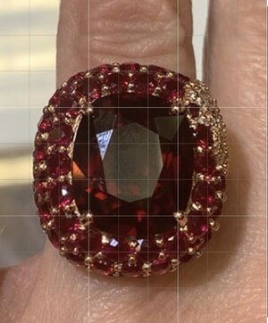
Sure you can! Use the image as well. It's yours, after all, I just drew some lines on it. :D

But if we try to word it better... hmmm...

I'd say the stone appears to be rotated several degrees to the side and thus out of alignment. The two lines - the green and the yellow one - should overlap, there should only be one single line. By what I'm seeing, the stone needs to rotate a little bit to the left (or counter-clockwise) in order to be well aligned in the setting.

If you've managed to agree for the rim of the basket to be fixed and that requires the stone to be dismounted, I imagine it should actually be quite easy when mounting it again to make sure it's straight.
 
I like the design element of the one smaller melee as the white stone design wraps forward. The design looks beautiful, like a butterfly in the first set of pictures.
Here’s the picture straightened with a grid over it. It looks good to me, but I honestly don’t have an eye for details that others can help you with. Hope this picture helps!
DBC57F00-94A8-4380-B550-D1CC303104A0.jpeg
 
Oh, a grid is a very good idea! I added the line going through the middle of the stone so that the issue is obvious just by looking at the image.

DBC57F00-94A8-4380-B550-D1CC303104A0.jpeg

This green line should be vertical in the image and it's clearly not.
 
It looks intentional to me as well. The ring has a butterfly in that corner, it's seen on one of the pictures uploaded to the original post.
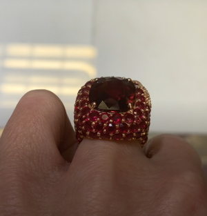
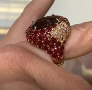
The butterfly in the corner is lovely, and I agree that it is intentional. I think what @chrono and @musicloveranthony are saying is that having 1 tiny melee looks really odd. I think it would have been significantly better to leave the butterfly on the side (as it is), but not have any melee in that corner. Right now, the 1 tiny melee looks like a mistake rather than intentional.
 
Thank you so much, all of you. I could not have done this without you. In fact, I think David misunderstood because I called the cushion shape an oval !

Ok, whilst we wait for this to be fixed, let's look at how cute the ring is.

The bezel looks gritty here in this video picture but if we don't focus on it, it is so cute. And the work around the butterfly is very very good.
1644264517077.png1644264666972.png
1644264711684.png
 
The melee remind me of pomegranate seeds. Yum!

I do see the asymmetry though. That would bug me for the price you paid.
 
The butterfly in the corner is lovely, and I agree that it is intentional. I think what @chrono and @musicloveranthony are saying is that having 1 tiny melee looks really odd. I think it would have been significantly better to leave the butterfly on the side (as it is), but not have any melee in that corner. Right now, the 1 tiny melee looks like a mistake rather than intentional.

But if we take out the small stone where the butterfly is, then what happens? I don't want it filled with gold. Maybe swap to a diamond.

But that might make the butterfly look odd.
 
Wow, stunning ring. Love the grid and lines idea to help communicate what you want.
 
The melee remind me of pomegranate seeds. Yum!

I do see the asymmetry though. That would bug me for the price you paid.

Ok. I am still trying to word the email about assymetry. I want to be very very careful about this assymetry issue. Can I say this:

David, I don't know how to explain so I attach a picture with the grid that shows up the assymetry clearly. Something like that. I don't want to suggest rotated stones.

Also, would changing the prongs to sharp claws help? Thank you so much, all of you!:kiss2::kiss2:
 
But if we take out the small stone where the butterfly is, then what happens? I don't want it filled with gold. Maybe swap to a diamond.

But that might make the butterfly look odd.

what about a different color stone? are those rubies? if they're rubies then what about a blue sapphire? if they're garnets what about a green tsavorite garnet? if they're spinel, what about a grey or blue spinel?
 
what about a different color stone? are those rubies? if they're rubies then what about a blue sapphire? if they're garnets what about a green tsavorite garnet? if they're spinel, what about a grey or blue spinel?

They're rubies. I think a tsavorite might work there but that could also be too jarring a difference in colour.

or a tiny paraiba blue.

The main stone is a spinel. Looks dark but I would wear it in the correct lighting to bring out its best.

A diamond? So like the butterfly has a diamond extra. I wonder if it would look odd. Diamonds are easiest.

Melee is hard to work with so you can see that David really did try his best here.
 
Oh and I found another picture of the work in progress of this ring. The spinel really is lovely in a lot of different lighting conditions.

The bezel looks fine here but in the process of setting, perhaps it got warped. Melee is difficult.

1644266374577.png
1644266397567.png
 
Claw prongs vs flat prongs will not help with the asymmetry as it is more of a personal preference in looks. A bright light blue melee will look fabulous but will DK be able to find such a paraiba on short notice? Diamond is a consideration but I worry it will get lost in all that colour. Can someone photoshop?
 
I would leave it with that smaller ruby melee. I like it! I think anything else you put there will be a distraction. That side is different due to that beautiful butterfly. To me, it works!
 
I would leave it with that smaller ruby melee. I like it! I think anything else you put there will be a distraction. That side is different due to that beautiful butterfly. To me, it works!

Yes, me too. Leaving it ruby. Keep it trouble free. Just fix the asymmetry and the bezel.
 
Last edited:
@Rfisher Come back!
Thank you so much, all of you. I could not have done this without you. In fact, I think David misunderstood because I called the cushion shape an oval !

Ok, whilst we wait for this to be fixed, let's look at how cute the ring is.

The bezel looks gritty here in this video picture but if we don't focus on it, it is so cute. And the work around the butterfly is very very good.

1644264517077.png1644264666972.png
1644264711684.png

I finally see the butterfly! Haha I felt like I was going crazy or that it was some jewelry term I had never heard of. I see it now that you show that photo of the side view. That is so cool!
 
The butterfly is great - seeing it from that angle makes that one stone not stand out as much. There are other stones that same size below the butterfly so it does fit with the rest of the design
 
Pretty ring.

Keep your reply to David very simple.

Hi David,
As you can see from the attached photo, the stone is not set symmetrically in the basket. Please make the necessary adjustments.

Thank you,
ChaiK
 
GET 3 FREE HCA RESULTS JOIN THE FORUM. ASK FOR HELP

Featured Topics

Top