Gypsy
Super_Ideal_Rock
- Joined
- Aug 8, 2005
- Messages
- 40,225
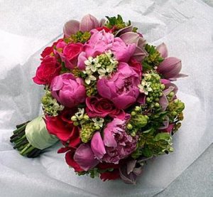
It would probably look a little like this:Date: 8/29/2006 11:09:13 PM
Author: Fancy605
hmm I kinda like all those colors together. (both pinks!) I know, I know, you only want one, but still--it all looks neat in the collage.
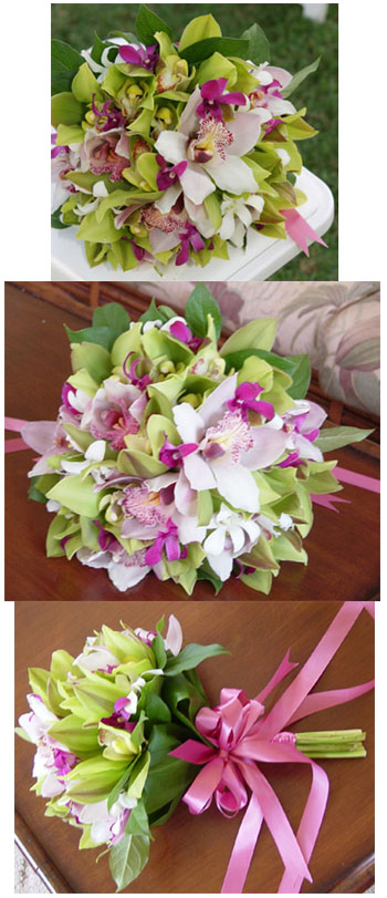
I wonder what boquette #2 would look like with the bright pink flowers where the light pink ones are.

Date: 8/29/2006 11:24:06 PM
Author: flopkins
oooh I just remembered ,Mara had some fuschia in her bouqet that looked really nice.

original thread
Absolutely what I was thinking. The fuschia could be overboard if used everywhere but is very effective to brighten things up. The pale pink is nice but the whole color palette becomes more muted and could wash together if left without something to draw your attention.Date: 8/30/2006 1:16:34 PM
Author: Mara
i think fuschia works if you don''t have too much going on...to me it''s a sparingly used accent color, especially with lime greens. but if you intend to use the colors all over the place everywhere one looks, i''d go with the softer pink.
Date: 8/29/2006 10:36:59 PM
Author: decodelighted
It's the green I'm having issues with ... the green in the flowers is fresher ... in the cloth it's too acidic. Though in the flower pix I like the light pink MUCH MUCH MUCH better than the fuschia.
Flower pix #2 - PERFECT!!!
Flower pix #1 - umm... more dramatic but not 'lovely' enough for you
Did that make sense??