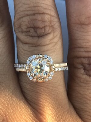
shape
carat
color
clarity

Help me with my setting for my old mine

Mjay

Brilliant_Rock
Joined
Mar 15, 2018
Messages
1,124
I posted on the thread that I started about my diamond as well but I’m guessing no one is going to see it so I thought I’d start a specific thread about setting her. I’m a very indecisive person and your opinions mean a lot to me.

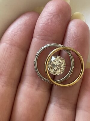
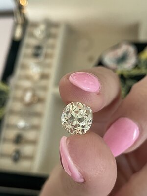
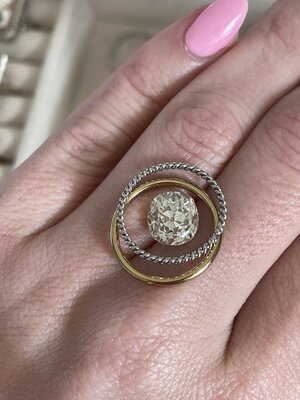
Just to recap; my stone is a 3.60 ct UV color old mine. I love warm stones and want to embrace and play up the color. Not sure if this will be best achieved in 18k yellow or perhaps contrasting with platinum.

So my 1st dilemma is 18k yellow or platinum or both. I am typically a gold girl but I had DK create my first platinum solitaire last year (I sold it) and I absolutely fell in love with aspects of Platinum. I love the weight of it and I love the patina that it develops. That being said I just wanna do whatever will do my stone the most justice.

I’ll attach my 3 ideas in comments below.
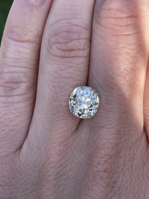
A7F77743-88E2-472B-A794-CDCD7C430959.jpeg
 

Attachments

  • A12464E1-3F64-4029-A8CD-5341DF82DA3E.jpeg
    A12464E1-3F64-4029-A8CD-5341DF82DA3E.jpeg
    170.4 KB · Views: 97
  • AA510C65-7804-43C4-AB4B-28804EF10BA1.jpeg
    AA510C65-7804-43C4-AB4B-28804EF10BA1.jpeg
    144.8 KB · Views: 99
  • 381EECFE-591F-44E1-AA1C-2EC596E9C2F9.jpeg
    381EECFE-591F-44E1-AA1C-2EC596E9C2F9.jpeg
    199.6 KB · Views: 94
Idea number 1:

I absolutely love this solitaire by ring concierge. It’s so modern and totally different than my other setting. Also I get the best of both worlds with my yellow gold and my platinum. I was thinking of having DK create a variation of it possibly with a single cut melee on the shoulders. It looks fantastic but my stone is obviously not yellow. My concern with this idea is that I am going to create a crazy clashing mess. One would think that the cup would play up the warmth of my stone but I’m afraid it’s not gonna play it up enough and my diamond will be clashing with the melee on the shoulders. I want contrast not clash. Two-tone metal and clashing diamonds could just be an absolute disaster or maybe my diamond would look yellow enough and I could pull it all off. I would love to hear everyone’s thoughts on this.
CB432915-6235-436F-9AE5-BFC1CFB51FAB.jpeg
 
Last edited:
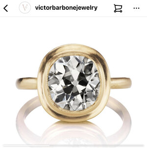
Idea number 2:

I’m obsessed with Victor Barbone designs. I showed my husband some of their designs last night and he fell in love with the Hunter setting and I totally agree. I was thinking of creating a variation of the hunter setting but set a bit higher with a more intricate basket. My concerns are: 1- is it different enough from cleone (my OMC in Megan thorne setting) 2- I was hoping to go high polish and not brushed or matte. Would this bezel style look ok polished? 3- DK Is amazing but I’m concerned that he won’t be able to execute the fine milgrain to my satisfaction. And all of the pieces I’ve seen from him the milgrain is much chunkier.

31578BE0-36F0-4054-8DB8-22011E6E1B81.jpeg
 
Idea number three:

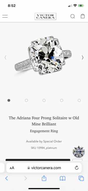
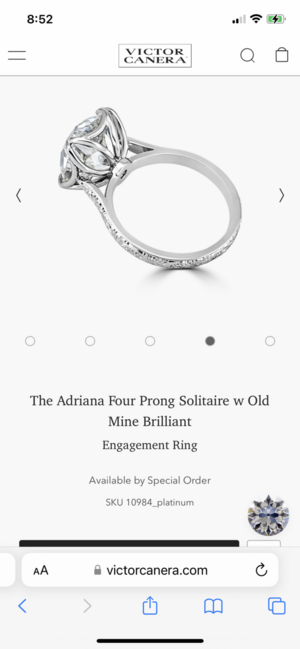
I came across this Victor canera design and it totally stopped me in my tracks. I am absolutely in love with it. It’s not anything like I originally wanted but there is something oh so special about it. Unfortunately my husband doesn’t care for it. I’m wondering if he might feel differently if it was yellow gold. I do really love this in platinum though. I haven’t reached out to VC yet. I have seen mixed comments as to whether he is working with outside stones. My guess is that he’s doing it as a case by case basis depending on how busy he is. My concerns with this is the fact that it isn’t a bezel. I’m a bit concerned about the lack of protection. And obviously I’m not sure if he will even work with my stone.
 

Attachments

  • 6DFF0A40-9629-4DC9-929F-8D0887834CFC.png
    6DFF0A40-9629-4DC9-929F-8D0887834CFC.png
    235.8 KB · Views: 247
  • 94562231-1AEC-4951-8CB0-730F7F71BF55.png
    94562231-1AEC-4951-8CB0-730F7F71BF55.png
    186.2 KB · Views: 249
This is so tough! I was surprised because think it looks really nice in the platinum despite being so warm. I know you were wanting something different from your first YG setting for Cleone. But also hard to see if it's at its "most tinted" in those photos where it is circled by platinum.

Maybe PS-ers who have antique cuts in the similar color range + set their stones in WG or platinum can share pictures or give input :)

Also, if you are a YG girl at heart, I do think it's okay if both are in YG. I've learned to stop fighting a need to diversify my wardrobe, accessories etc. since I gravitate towards the same color schemes over and over.
 
Idea number 2:

I’m obsessed with Victor Barbone designs. I showed my husband some of their designs last night and he fell in love with the Hunter setting and I totally agree. I was thinking of creating a variation of the hunter setting but set a bit higher with a more intricate basket. My concerns are: 1- is it different enough from cleone (my OMC in Megan thorne setting) 2- I was hoping to go high polish and not brushed or matte. Would this bezel style look ok polished? 3- DK Is amazing but I’m concerned that he won’t be able to execute the fine milgrain to my satisfaction. And all of the pieces I’ve seen from him the milgrain is much chunkier.

31578BE0-36F0-4054-8DB8-22011E6E1B81.jpeg

My vote is for this design. I think your diamond would look amazing in this setting (both the bezel and the yellow gold). I love lower colour diamonds and bezel settings though...so I'm a bit biased that way.
 
Yes, from these choices I would definitely choose #2. It would showcase your diamond better and be something that could be worn every day without fear of hurting it somehow.

Number one has the obvious possible problems you have stated and looks 'fancier' - if that matters to you!

Number three changes the look of the diamond too much for me.

Your diamond looks like it will pop and sparkle so to me, less setting and more diamond!
 
I don’t think your stone has enough yellow in it for the yellow gold bezel. When DK made a ring for me I had him do an 18k yellow bezel to play up the yellow in the stone but it had a very obvious yellow tint to it. So I agree that the yellow bezel might not be the best here.

You said that option 3 stopped you in your tracks, that says a lot, so that would be my pick.

As far as the concern with DK not being able to execute fine enough milgrain, my ring has milgrain and I think it is very fine and delicate in person, maybe his uber bench did it. It does not come across as fine in pictures though.
 
Can you put your diamond in a YG chain and then a separate pic of it in a silver colored chain to get a better sense of how the color looks? Re #2, if you are concerned about DK doing the milgrain then I wouldn’t risk spending $$ on something you have concerns about based on past execution (as long as you’ve seen enough pics to make an educated decision). As for #3, I really like the shape of your stone and feel like it gets lost in this setting.
 
Jumping in to say that your stone is gorgeous and all your options are wonderful!

I love the idea of a two tone setting where you play up the yellow of your stone with a cup etc. But there’s honestly no way to know how your stone will look unless you try. If you can ask DK to make you a wax model that’s yellow coloured wax and pop your stone in, it’ll give you an idea! That’s my fav of the options you’re considering, so I’m hoping that’s the direction you’ll go!
 
Number 3 for me. I think the bezel in number 2 is a bit too heavy, but I do like option 1 if you want some yellow gold.
 
This is so tough! I was surprised because think it looks really nice in the platinum despite being so warm. I know you were wanting something different from your first YG setting for Cleone. But also hard to see if it's at its "most tinted" in those photos where it is circled by platinum.

Maybe PS-ers who have antique cuts in the similar color range + set their stones in WG or platinum can share pictures or give input :)

Also, if you are a YG girl at heart, I do think it's okay if both are in YG. I've learned to stop fighting a need to diversify my wardrobe, accessories etc. since I gravitate towards the same color schemes over and over.

I was surprised by how much I like it In platinum! I think the contrast gives it a stunning vintage glow. I’m going to play with it more today but I just can’t seem to get a super strong tint in any light face up. I was playing with it and wondering how I’m the heck it could have been graded UV and then I tipped it over. It definitely shows body color tipped over but not face up. I’m really hoping a pricescoper has a warm stone in platinum and can weigh in.
 
My vote is for this design. I think your diamond would look amazing in this setting (both the bezel and the yellow gold). I love lower colour diamonds and bezel settings though...so I'm a bit biased that way.

Bezel was definitely my first instinct with this stone. I love bezels! I was originally considering something similar to the VB Barcelona setting (a more delicate bezel) but my husband loves this chunky one. I think it’s very pretty and I value my husbands opinion. Do you think it would look ok high polish and not brushed?
 
Yes, from these choices I would definitely choose #2. It would showcase your diamond better and be something that could be worn every day without fear of hurting it somehow.

Number one has the obvious possible problems you have stated and looks 'fancier' - if that matters to you!

Number three changes the look of the diamond too much for me.

Your diamond looks like it will pop and sparkle so to me, less setting and more diamond!

Thank you! I agree that I can’t go wrong with number 2. I think I should probably reconsider a more delicate bezel as well.
 
I don’t think your stone has enough yellow in it for the yellow gold bezel. When DK made a ring for me I had him do an 18k yellow bezel to play up the yellow in the stone but it had a very obvious yellow tint to it. So I agree that the yellow bezel might not be the best here.

You said that option 3 stopped you in your tracks, that says a lot, so that would be my pick.

As far as the concern with DK not being able to execute fine enough milgrain, my ring has milgrain and I think it is very fine and delicate in person, maybe his uber bench did it. It does not come across as fine in pictures though.


Thank you! I agree, it’s just not yellow enough. I would definitely choose that setting if it was. I’m wondering if I just did the two tone without the melee if that would look good. Perhaps I can engrave the shank instead! I appreciate your comments on the milgrain. I’m just judging based on his Instagram which is magnified photos. I’m betting if I was very clear about how I want it to look, he could make it happen. I’m pretty sure there is a DK thread on here somewhere. I need to find it.
 
Can you put your diamond in a YG chain and then a separate pic of it in a silver colored chain to get a better sense of how the color looks? Re #2, if you are concerned about DK doing the milgrain then I wouldn’t risk spending $$ on something you have concerns about based on past execution (as long as you’ve seen enough pics to make an educated decision). As for #3, I really like the shape of your stone and feel like it gets lost in this setting.

Thank you! I’m going to play with metals more today. I need to look at more real life photos of DK’s milgrain work. I feel like if I am extremely clear with him he will do it to my satisfaction but I’m just extremely picky about it so I’m nervous. So number three totally knocks my socks off in pictures but I agree about the shape change. I love the look in pictures but I am wondering if it would make me feel the same way in real life. My main hesitation with that one is actually just the lack of protection for my stone.
 
I don’t think your stone has enough yellow in it for the yellow gold bezel. When DK made a ring for me I had him do an 18k yellow bezel to play up the yellow in the stone but it had a very obvious yellow tint to it. So I agree that the yellow bezel might not be the best here.

You said that option 3 stopped you in your tracks, that says a lot, so that would be my pick.

As far as the concern with DK not being able to execute fine enough milgrain, my ring has milgrain and I think it is very fine and delicate in person, maybe his uber bench did it. It does not come across as fine in pictures though.

I agree with this. I think it looked best next to platinum. Unplated white gold would be nice as well. It's truly not yellow enough, and I think it may end up looking kind of just meh and off color in a high carat yellow. I don't like the VB setting and the milgrain just looks worn to me, rather than delicate, but that's just my view.
 
Jumping in to say that your stone is gorgeous and all your options are wonderful!

I love the idea of a two tone setting where you play up the yellow of your stone with a cup etc. But there’s honestly no way to know how your stone will look unless you try. If you can ask DK to make you a wax model that’s yellow coloured wax and pop your stone in, it’ll give you an idea! That’s my fav of the options you’re considering, so I’m hoping that’s the direction you’ll go!

I agree. If I could actually pull it off that would be a no-brainer to me. I love that setting. It’s so bold and modern. I hadn’t thought about a yellow colored wax model! That is a fantastic idea. I think I should probably start with asking DKs opinion on it. I’m now considering going with that option of the delicate bezel and two tone but if my diamond doesn’t look yellow enough I could engrave the shank instead of adding melee. I wonder if he could use a warmer color single cut melee- I’m assuming it still wouldn’t be warm enough but worth an ask.
 
I agree with this. I think it looked best next to platinum. Unplated white gold would be nice as well. It's truly not yellow enough, and I think it may end up looking kind of just meh and off color in a high carat yellow. I don't like the VB setting and the milgrain just looks worn to me, rather than delicate, but that's just my view.

Thank you! Your opinion means a lot to me. You have fantastic taste! It truly isn’t the yellow that I was expecting from a UV graded stone. I still absolutely love it but it’s just crushes some of my ideas.
 
Thank you! I agree, it’s just not yellow enough. I would definitely choose that setting if it was. I’m wondering if I just did the two tone without the melee if that would look good. Perhaps I can engrave the shank instead! I appreciate your comments on the milgrain. I’m just judging based on his Instagram which is magnified photos. I’m betting if I was very clear about how I want it to look, he could make it happen. I’m pretty sure there is a DK thread on here somewhere. I need to find it.

@Cerulean recently upgraded her ER to a beautiful ST OMC and bezeled it in YG with a combination of melee and engraving on the shank

Perhaps you can do a similar setting but in two tone with whatever engraving style or pave you prefer on the shank or a combination of engraving and melee in your personal style like Cerulean did on her lovely setting? To be perfectly honest, I am not loving the pave on the RC shank for your stone. I think it may also be too much of a contrast with your old cut and “clash.” I do think it’ll be lovely with bright cut pave.

Your stone really does not seem to face up as UV! It looks more like OP faced up in your pics. I do have a GIA N in platinum but it’s in prongs and not bezeled so I don’t think my ring would be all that helpful. I think unplated white gold that @elizat suggested is also something to consider. I do have a GIA M bezeled in unplated white gold and love the look (it’s a necklace not a ring).
 
Last edited:
I think option 1 would look awesome with some larger single cut melee and a wider band or some colored stones/diamonds. Whats your favorite color?
That would take the new style edge off it and match the stone.
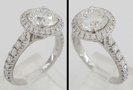
Like the classic Cartier style but the older ones with single cuts. In just showing this for the shank not the halo.
s-l1600.jpg
 
Number 3 does it for me...I agree with @Austina about the bezel on number 2...its a little too thick and distracting for me*.
 
@Cerulean recently upgraded her ER to a beautiful ST OMC and bezeled it in YG with a combination of melee and engraving on the shank

Perhaps you can do a similar setting but in two tone with whatever engraving style or pave you prefer on the shank or a combination of engraving and melee in your personal style like Cerulean did on her lovely setting? To be perfectly honest, I am not loving the pave on the RC shank for your stone. I think it may also be too much of a contrast with your old cut and “clash.” I do think it’ll be lovely with bright cut pave.

Your stone really does not seem to face up as UV! It looks more like OP faced up in your pics. I do have a GIA N in platinum but it’s in prongs and not bezeled so I don’t think my ring would be all that helpful. I think unplated white gold that @elizat suggested is also something to consider. I do have a GIA M bezeled in unplated white gold and love the look (it’s a necklace not a ring).


I absolutely love cerulean’s ring! I think a bezel similar to hers but with delicate milgrain on the inner bezel and engraving would look lovely. I don’t know much about different pave styles/options. I need to do more research. I owned an OP years ago and honestly my first thought when I received my stone was how it looked like my OP face up. Face down I can definitely see how they graded at UV but face up is what matters here. I don’t own any unplated white to look at but I’ll definitely consider it.
 
Number 3 does it for me...I agree with @Austina about the bezel on number 2...its a little too thick and distracting for me*.

Thank you! I think I’m going to nix that option and replace with a thinner bezel. Yeah number 3 is just incredible. I’m going to reach out today and see if he’ll work with my stone. I’m just nervous about the lack of protection though. My stone is a VVS2 and I don’t see anything particular concerning clarity wise but nevertheless the girdle is very thin and I think it’s best to protect it.
 
I absolutely love cerulean’s ring! I think a bezel similar to hers but with delicate milgrain on the inner bezel and engraving would look lovely. I don’t know much about different pave styles/options. I need to do more research. I owned an OP years ago and honestly my first thought when I received my stone was how it looked like my OP face up. Face down I can definitely see how they graded at UV but face up is what matters here. I don’t own any unplated white to look at but I’ll definitely consider it.

Here is a good thread on unplated WG with a lot of pics. The thread itself has links to other threads re: the issue.

 
I agree. If I could actually pull it off that would be a no-brainer to me. I love that setting. It’s so bold and modern. I hadn’t thought about a yellow colored wax model! That is a fantastic idea. I think I should probably start with asking DKs opinion on it. I’m now considering going with that option of the delicate bezel and two tone but if my diamond doesn’t look yellow enough I could engrave the shank instead of adding melee. I wonder if he could use a warmer color single cut melee- I’m assuming it still wouldn’t be warm enough but worth an ask.

Considering how white your stone faces up, may I suggest a curveball?

Setting option 1, but with the bezel in platinum and the band in YG with yellow melee.

I think that would be utterly magnificent.
 
I think option 1 would look awesome with some larger single cut melee and a wider band or some colored stones/diamonds. Whats your favorite color?
That would take the new style edge off it and match the stone.
Like the classic Cartier style but the older ones with single cuts. In just showing this for the shank not the halo.
s-l1600.jpg

Hmm I hadn’t thought about colored diamonds. I’m all for a wider band. I love that look. I’m not that familiar with single cut melee. I’m loving the look though! Will it face up a bit warmer than full cut melee? I’m afraid of clashing.
 
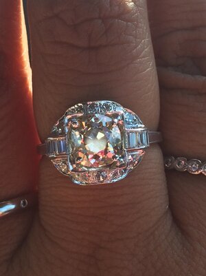
Ok. You asked for pics of a every warm stone in platinum. Here is my non cert omc in yg and in platinum.

245F021E-18D0-4814-B5AF-FB88795A080E.jpeg


Thank you! That is super helpful! I’m loving the contrast in the platinum!
 
Considering how white your stone faces up, may I suggest a curveball?

Setting option 1, but with the bezel in platinum and the band in YG with yellow melee.

I think that would be utterly magnificent.

Curveball away! Omg that idea is Intriguing. I love the suggestion. I’m having trouble picturing it but it sounds exciting! Off to Pinterest I go!
 
GET 3 FREE HCA RESULTS JOIN THE FORUM. ASK FOR HELP
Top