shape
carat
color
clarity

Help me with my setting for my old mine

Threw her into a cup of gold wrapping paper. Definitely made a difference in poor indoor lighting (6pm. Shutters closed. Only small ceiling fan light) but she still doesn’t look yellow enough to me in the also poor outdoor lighting (6pm shade). Will play with her again when the lighting is better but thus far I’m not seeing what I need to see to feel confident about a cup and white melee 512C5166-FDCE-499C-BAC4-2F4F42CBFDC0.jpeg
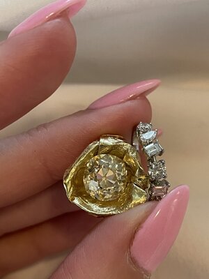
Honestly, IMO that’s pretty yellow. It looks quite a believable fancy light-ish colour.

My personal preference would be to cup it and go for the first idea with very very icy white melee in a platinum shank.

As for cleaning, I’m sure DK would have some suggestions? I was told by a jeweler here that you can clean it as you would a regular open back ring, with windex and hot water; and then soak it in rubbing alcohol for a bit to drive off the water.

Thank you! I need to play in better lighting. It’s pulling much more yellow in my photos than what I’m seeing w my eyes irl. Definitely noticeably yellow in the indoor poor light but outdoor I’m not so sure.
 
Thank you! I need to play in better lighting. It’s pulling much more yellow in my photos than what I’m seeing w my eyes irl. Definitely noticeably yellow in the indoor poor light but outdoor I’m not so sure.

This may not help you
But I always felt relying on pictures of stones next to different metals in different environments -
instead of them in my hand

Not ultimately helpful in finding out which metal I thought looked best with that stone.

Don’t get me wrong
I love watching the journey people take and looking at the eye candy :)
And talking things through with people who ‘get’ it!

Yep totally get it. I need to judge based on what I’m seeing with my own eyes. Im a very indecisive person and don’t have anyone who I can chat with about these things in real life so I enjoy discussing here. I was just hoping someone with experience cupping a stone in this color range would weigh in.
 
Yep totally get it. I need to judge based on what I’m seeing with my own eyes. Im a very indecisive person and don’t have anyone who I can chat with about these things in real life so I enjoy discussing here. I was just hoping someone with experience cupping a stone in this color range would weigh in.

Thank you! I need to play in better lighting. It’s pulling much more yellow in my photos than what I’m seeing w my eyes irl. Definitely noticeably yellow in the indoor poor light but outdoor I’m not so sure.

I don’t know if this is helpful because the stone in question was not an old mine or as low as yours but I have a friend who inherited a 2.75ish (can’t remember exactly) round brilliant stone that was something like OP coloured and she was at her wits end to figure out what to do with it; and I suggested she cup it and surround it with white. The setting she went for was cupping the stone in high karat gold (22kt), but putting the cupped stone in a WG setting (with rhodium Polish, so super white) and icy white melee (she used D-F melee) in a halo with pave shank.

It’s a lot lighter than your stone so this may not be helpful, but my observations are as follows (she wears it all the time as a daily RHR, so ive seen it in all kinds of light):

- her stone is too light imo for the cup to make it truly look “fancy yellow” in any light; but in some lighting I have seen it achieve that lemony almost fancy light colour

- the white against the stone brings out the contrast really well and highlights the yellow quite a lot, IMO. In some lights where the stone looks it’s whitest this doesn’t always work because then it’s like creamy-vanilla against icy white. Not a bad look but not what she wanted.

- her ring looks “somewhat yellow” a lot of the time though, I’d say perhaps 70% of the time.

- she gets a lot more comments on it compared to her engagement ring, and her e-ring is a gorgeous 4ct white EC. The unusual colour really grabs people’s attention.

In my opinion for your stone, it’s not going to look fancy yellow all the time because it isn’t; and because even fancy yellow stones get washed out in some lighting. Colour in a diamond is very mercurial. That being said, I think the cup+bezel is a good idea because it will probably introduce a lot more yellow into the stone than just the cup would; and I think for the cup at least you should do 22kt YG. If it faces up white/vanilla at any point then because of the lighting, it’ll contrast well against the YG bezel.

Alternately, I can’t find a picture of my original idea of a plat bezel with YG+YD shank; but that idea would also look gorgeous IMO.

Thank you so much! That is actually very helpful. I’m struggling to find examples of this scenario. I actually really love the color of my stone. I don’t necessarily need it to look fancy yellow I just want it to contrast enough with the white melee to look good and not clash. David Klass drew up a CAD for me today! I’m just trying to make up my mind.

Option 1- plain platinum shank with cathedral shoulders and 18k yellow bezel. Simple and modern. My stone can be itself and I won’t have to worry about clashing

Option 2- platinum shank with cathedral shoulders. Single cut melee 1/2 shank. 22k cup + bezel. More fancy but nervous about cup and clashing. The creamy vanilla against icy white is what I’m nervous about.

I’m definitely leaning towards option 1
 
Have you sent the stone to DK yet? I bet once you see it side by side with his sample metals and the melee you'll know exactly which way to go!
 
Thank you so much! That is actually very helpful. I’m struggling to find examples of this scenario. I actually really love the color of my stone. I don’t necessarily need it to look fancy yellow I just want it to contrast enough with the white melee to look good and not clash. David Klass drew up a CAD for me today! I’m just trying to make up my mind.

Option 1- plain platinum shank with cathedral shoulders and 18k yellow bezel. Simple and modern. My stone can be itself and I won’t have to worry about clashing

Option 2- platinum shank with cathedral shoulders. Single cut melee 1/2 shank. 22k cup + bezel. More fancy but nervous about cup and clashing. The creamy vanilla against icy white is what I’m nervous about.

I’m definitely leaning towards option 1

Imo, you’re not going to have the creamy vanilla against icy white problem because you do want to get a YG bezel up in the mix; which will break the visible contrast.

While a plain metal setting is “safer” from a clashing perspective; I love pave shanks; so I’m always going to suggest that route. Though either way you’re going to have a stunning ring! I can’t wait to see it!
 
Have you sent the stone to DK yet? I bet once you see it side by side with his sample metals and the melee you'll know exactly which way to go!

Not yet but if I can’t make a decision I probably will have him take a look
 
Idea number 1:

I absolutely love this solitaire by ring concierge. It’s so modern and totally different than my other setting. Also I get the best of both worlds with my yellow gold and my platinum. I was thinking of having DK create a variation of it possibly with a single cut melee on the shoulders. It looks fantastic but my stone is obviously not yellow. My concern with this idea is that I am going to create a crazy clashing mess. One would think that the cup would play up the warmth of my stone but I’m afraid it’s not gonna play it up enough and my diamond will be clashing with the melee on the shoulders. I want contrast not clash. Two-tone metal and clashing diamonds could just be an absolute disaster or maybe my diamond would look yellow enough and I could pull it all off. I would love to hear everyone’s thoughts on this.
CB432915-6235-436F-9AE5-BFC1CFB51FAB.jpeg

I did not read all the comments but of your setting inspo ideas this one is my favorite.
 
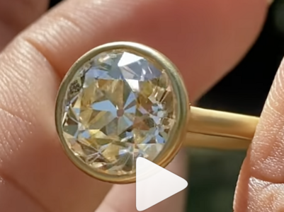
Here to say I think you should bezel in yellow gold - not to brag, but I felt like that the second I saw your stone. ;-) It's too warm to look its best in white metal, which will always look a little... awkward. Even if it doesn't show YELLOW when bezeled in yg, it will still *go*. I mean, look at this! https://www.instagram.com/p/CiGTJj5vhmE/?utm_source=ig_web_copy_link
1665072116004.png
It's S/T. Dolly has a few other last-third-of-the-alphabet stones bezeled in yellow and I think it is a terrific look.

Then, I would definitely do a platinum shank for the weight and...coolth? of it. I love the way platinum feels. Simple bezel head and engraved shank, maybe? I'm sorry, I am home with a sick 3-year-old and didn't get to give the rest of the thread sufficient attention to see which way you're leaning, but still.

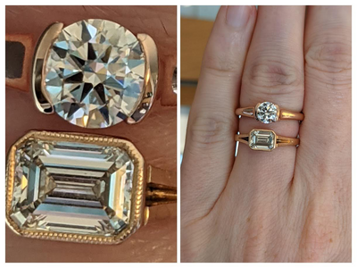
David Klass did the setting on the lower (emerald) bezel ring. It's sub-1-ct. I didn't ask for anything special about the milgrain, but it is very fine and lovely!
1665072347360.png

What gold is that below that DK did for you? It looks like 22K! Beautiful
 
What gold is that below that DK did for you? It looks like 22K! Beautiful

Ah, bad lighting, it's 18k rose -- but he did so a lovely job, I have been very pleased with his workmanship.
 
@Mjay I can't recall if this was discussed above, but what about option A with engraving on the shank? It would offer texture and a bit of sparkle without competing with the center stone.
 
Gosh I almost feel embarrassed to be continuing on with this. I’m hoping to have a clear direction by the time DK gets back to work on Tuesday.

Things I’ve decided:
Two tone- platinum shank
Yellow gold bezel.
Single cut melee if I decide on pave

Things I’m still torn on:
- To cup or not to cup
—I’m concerned about cleaning and the overall affect it will have on my stones performance and color.
- Pave or plain shank
—prefer pave but can I get enough contrast with my stone for it to look good
- type of pave
—I’m totally confused on the options. Someone suggested bright cut. Would love advice on this.

Current options:

1-safe choice but classic
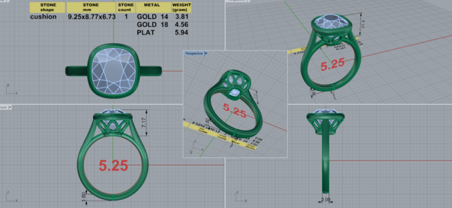
—plain platinum shank with 18k yellow bezel. No milgrain. Simple and modern. Preliminary safe choice CAD by DK below.

2- All in and hope for the best
— 18k or 22k gold cup with pave on shank. Milgrain on inner bezel

3- screw the cup but attempt to be fancy
—no cup. Pave on shank and hope that bezeling my stone in yellow gold will provide enough contrast with the white melee on the shank. Perhaps I’m overthinking and it just might look fine?


481C8392-71BF-4B9F-8E2C-406C11107BB1.png
 
Also worth noting that I showed my son (5 year old) some inspiration photos today and he said he’ll give me the money in his piggybank and I can have all of them!
 
Gosh I almost feel embarrassed to be continuing on with this. I’m hoping to have a clear direction by the time DK gets back to work on Tuesday.

Things I’ve decided:
Two tone- platinum shank
Yellow gold bezel.
Single cut melee if I decide on pave

Things I’m still torn on:
- To cup or not to cup
—I’m concerned about cleaning and the overall affect it will have on my stones performance and color.
- Pave or plain shank
—prefer pave but can I get enough contrast with my stone for it to look good
- type of pave
—I’m totally confused on the options. Someone suggested bright cut. Would love advice on this.

Current options:

1-safe choice but classic
—plain platinum shank with 18k yellow bezel. No milgrain. Simple and modern. Preliminary safe choice CAD by DK below.

2- All in and hope for the best
— 18k or 22k gold cup with pave on shank. Milgrain on inner bezel

3- screw the cup but attempt to be fancy
—no cup. Pave on shank and hope that bezeling my stone in yellow gold will provide enough contrast with the white melee on the shank. Perhaps I’m overthinking and it just might look fine?


481C8392-71BF-4B9F-8E2C-406C11107BB1.png

Is this going to be an everyday wear ring for you?
 
Is this going to be an everyday wear ring for you?

Nope! I’m an addict. It is my largest diamond though and It will probably see more wear time than my others. I typically only wear my rings when I leave the house.
 
Nope! I’m an addict. It is my largest diamond though and It will probably see more wear time than my others. I typically only wear my rings when I leave the house.

Ok, then I wonder if it is wise rule out the cup. I just wonder if the cup will make it more high maintenance…

ETA: I just keep looking at the beautiful faceting of your stone and thinking that a matte 18kt yellow gold bezel with some minimal milgrain would look so pretty. For example, this setting makes the center stone pop so nicely:

 
Last edited:
Here is a good summary of various paves styles.


I think I would personally go for #3. I *think* DK has different gold alloy options including one he calls “antique gold” and also another called “peach gold” which is a mix of RG and YG. I wonder if either of these 2 may work better for your stone. I think the peach gold is similar to your stone’s undertone vs straight yellow and may “clash” less but obviously it would be best to get a side by side pic from DK once your send off your stone. I’m just going by the pics as it shows on my phone and it could be way off.

@sweetpea&babycorn used DK’s peach gold for her shank so it’s the opposite 2 tone but you can check out the color.
 
Last edited:
Ok, then I wonder if it is wise rule out the cup. I just wonder if the cup will make it more high maintenance…

ETA: I just keep looking at the beautiful faceting of your stone and thinking that a matte 18kt yellow gold bezel with some minimal milgrain would look so pretty. For example, this setting makes the center stone pop so nicely:


I’m definitely leaning towards ruling it out. I’m not finding enough information to make me feel confident about cupping it. That ring and setting are to die for.
 
Here is a good summary of various paves styles.


I think I would personally go for #3. I *think* DK has different gold alloy options including one he calls “antique gold” and also another called “peach gold” which is a mix of RG and YG. I wonder if either of these 2 may work better for your stone. I think the peach gold is similar to your stone’s undertone vs straight yellow and may “clash” less but obviously it would be best to get a side by side pic from DK once your send off your stone. I’m just going by the pics as it shows on my phone and it could be way off.

@sweetpea&babycorn used DK’s peach gold for her shank so it’s the opposite 2 tone but you can check out the color.

Thank you for the link on pave! That is very helpful. I’ll ask him about his different alloys. I’d definitely be open to that. Number 3 will definitely be my choice if I can pull it off. I’ll probably just send my stone to DK to see what he thinks
 
Here is a good summary of various paves styles.


I think I would personally go for #3. I *think* DK has different gold alloy options including one he calls “antique gold” and also another called “peach gold” which is a mix of RG and YG. I wonder if either of these 2 may work better for your stone. I think the peach gold is similar to your stone’s undertone vs straight yellow and may “clash” less but obviously it would be best to get a side by side pic from DK once your send off your stone. I’m just going by the pics as it shows on my phone and it could be way off.

@sweetpea&babycorn used DK’s peach gold for her shank so it’s the opposite 2 tone but you can check out the color.

Forgot to add that @sweetpea&babycorn ring is to die for and I just looked up DKs 18k antique gold and holy cow it’s incredible!
 
Forgot to add that @sweetpea&babycorn ring is to die for and I just looked up DKs 18k antique gold and holy cow it’s incredible!

Aww thank you! I love DK’s mixed alloys. The peach gold is very romantic. I think it leans more towards yellow-y with just a hint of rose. His IG post with my ring probably shows the color better than any picture that I could take.

I absolutely LOVE your new stone! FWIW my OMC is an N-color and I just love the mixed metal look. I personally think a gold cup would be overkill (I think you already nixed that idea) but a warmer bezel with plat shank sounds amazing. I think no pave would truly make your old mine be the center of attention, but all personal preference for what you want the entire ring statement to be. I can’t wait to see how this develops!
 
I’m definitely leaning towards ruling it out. I’m not finding enough information to make me feel confident about cupping it. That ring and setting are to die for.

This is the ideal setting your stone I had in my head-turns out it's @bright ice 's former beauty. And, course, it's a Victor Canera design!

 
Aww thank you! I love DK’s mixed alloys. The peach gold is very romantic. I think it leans more towards yellow-y with just a hint of rose. His IG post with my ring probably shows the color better than any picture that I could take.

I absolutely LOVE your new stone! FWIW my OMC is an N-color and I just love the mixed metal look. I personally think a gold cup would be overkill (I think you already nixed that idea) but a warmer bezel with plat shank sounds amazing. I think no pave would truly make your old mine be the center of attention, but all personal preference for what you want the entire ring statement to be. I can’t wait to see how this develops!

I actually had saved DKs video of your ring on Instagram! I love it. I love how you swooped the design In the basket. It’s modern but whimsical. I’m 90 percent sure that I’m nixing the cup idea. It’s almost to risky to me. I think I’m overreacting and just the yellow bezel would be enough to accentuate the warmth and create contrast if I do decide to add melee to the platinum. Right now I am just leaning towards the simple CAD that I had posted a little bit earlier but widening the shank a bit and adding single cut melee. I have another old mine solitaire that is a delicate 18k matte gold So I wanted this one to be a bit more bold and modern.
 
This is the ideal setting your stone I had in my head-turns out it's @bright ice 's former beauty. And, course, it's a Victor Canera design!


Man that is a stunning ring! Thank you for sharing! I finally feel like I’m closing in and what I’ve got in my head atm is actually incredibly similar to that but of course I’m pretty set on my 2 tone.
 
One of the challenges with lower coloured stones is that the report doesn’t tell you about undertones!

Cerulean’s stone is a pure sunny yellow. That’s really rare in lower coloured diamonds. My S/T and U/V OECs both have a touch of olive which I think is much much much more common. I feel like I see this same undertone in your photos too. If it’s there IRL it might be why the yellow gold cup just isn’t singing to you - that slight touch of olive isn’t being enhanced by the deep yellow, and you’re sensitive to colour so you’re picking up on it.

ED47B2A8-06AC-4CF4-9005-16A0A7BE82CE.png
E56A51A8-B526-43B9-8BEB-2C86BB71711E.png

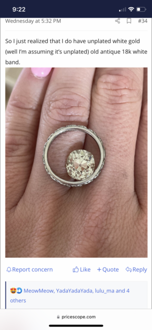
I went with two tone unplated Ni-WG and 14k YG for my stones… The WG I chose has the slightest tinge of green which harmonizes with the stones’ undertone…
 
Last edited:
One of the challenges with lower coloured stones is that the report doesn’t tell you about undertones!

Cerulean’s stone is a pure sunny yellow. That’s really rare in lower coloured diamonds. My S/T and U/V OECs both have a touch of olive which I think is much much much more common. I feel like I see this same undertone in your photos too. If it’s there IRL it might be why the yellow gold cup just isn’t singing to you - that slight touch of olive isn’t being enhanced by the deep yellow, and you’re sensitive to colour so you’re picking up on it.

ED47B2A8-06AC-4CF4-9005-16A0A7BE82CE.png
E56A51A8-B526-43B9-8BEB-2C86BB71711E.png

I went with two tone unplated Ni-WG and 14k YG for my stones… The WG I chose has the slightest tinge of green which harmonizes with the stones’ undertone…

Wow! Thank you. That could very well be the case! Some lights I do feel that she goes super buttery in my fake cup but in outdoor light she’s just so white still. It definitely could be more olive tones. I really appreciate you pointing that out. Admittedly I’m so busy with my kids that I actually haven’t had a chance to really spend time playing with different metals. I’ve been just snapping as many quick pictures as I can and then looking at pictures of her once it’s dark and the kids are in bed.
 
You mean you have real world needs that occasionally invade your PS time? :lol:

So I’ll just drop a few more thoughts here… I hesitate on either white melee or yellow melee. If your stone does have that touch of olive. I don’t think that’s bad!! Not at all. Just that for someone who’s sensitive to colour it requires a bit more finagling the mount. Anyway. If your stone does have that touch of olive, I hesitate on white or yellow melee because if you add in contrasting metal, then now you’re in basically a very muted tri-colour situation. White, yellow, and olive. And that’s a suuuuper challenging colour combo.

My suggestion, in that case, because heck why not:
A very delicate double “layer” sort of deal surrounding the stone, with unplated white gold bezel around your stone as the inner layer, and exterior “layer” in rich yellow gold. Or peach gold, if you like a touch of pink? Keeps everything genuinely two-tone: Inner layer metal matches your stone, outer layer contrasts. Could be double bezels with/without milgrain, prongs and bezel, collet, bezel and engraved “halo”, bezel and pave halo…
 
GET 3 FREE HCA RESULTS JOIN THE FORUM. ASK FOR HELP
Top