shape
carat
color
clarity

Help with design of custom e-ring!! Photos included

JamesT14

Rough_Rock
Joined
Mar 31, 2014
Messages
24
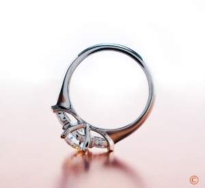
I am working with a local jeweler to try to recreate this beautiful 3-stone round ritaani ring: http://www.ritani.com/engagement-rings-with-bands/three-stone-diamond-engagement-ring-with-matching-band-in-platinum/8116

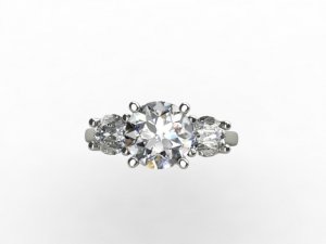
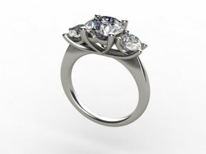
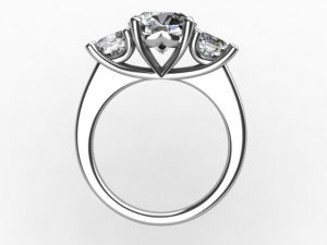
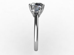
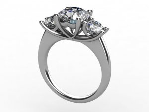
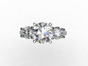
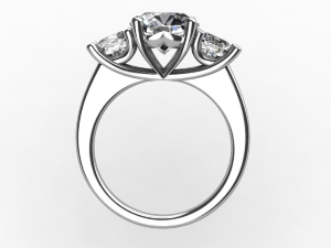
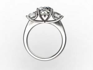
The jeweler just sent me these photos of the renderings he created (see photos included). What do you guys think? How can I improve the design to make it look more like the Ritani, or improve it just in general? Maybe I'm just being paranoid, but the Ritani seems more dainty and less bulky in the setting (the prongs don't obstruct as much of the diamonds). Not sure if it matters, but my center stone is 1.7 ct and sides are .4 ct each.

Any help would be deeply appreciated!

Thanks,
James
finger_0.jpg

side_34.jpg

top_5.jpg

_17337.jpg
 
If you want the Ritani, then buy the Ritani. I think the Ritani is set way too high, personally. It will knock around an catch on things. the Ritani is a hand forged setting, not a cast. And it is stronger for it.

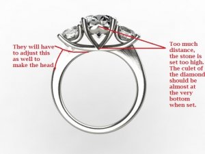
Since you are going custom, I think you should improve on the Ritani. Here are my thoughts (sorry paint is a crude tool, so I did my best to show what I think needs to be done).

finger_1.jpg
 
This is what I mean: this is a much better height for the head: BrianGavin_SqHearts2b_070160.jpg
 
Thanks for the feedback. Out of curiosity, why is it supposed to be set lower? I kind of like the fact that it's raised up because it puts the diamond on display. It's seems to be elevated in the ritani photo as well.
 
JamesT14|1398467101|3660143 said:
Thanks for the feedback. Out of curiosity, why is it supposed to be set lower? I kind of like the fact that it's raised up because it puts the diamond on display. It's seems to be elevated in the ritani photo as well.

It is elevated in the Ritani photos. That's why I said, that as long you are going for custom you might as well improve on the design.

There are certain things that are lovely in theory but in practice are problematic. That's the case with that high set diamond. Yes, it looks nice.

But when you wear a ring you don't want it constantly catching on things-- sweaters, hosiery, lace... your skin. Not will you do damage to the things your ring is caught on, but you can actually do damage to the setting by loosening a prong or even breaking one off if you catch it the right way.

Having a diamond set that high is just asking for trouble in practice.

If you look at the picture I posted for you (recopied below, and flipped), you'll see that the center is still the star, due to the angle and height of the sidestones. But it is a MUCH safer setting height for wearing.

BrianGavin_SqHearts2b_070160.jpg
 
Ok good to know! I will have him bring it down a bit.

Any other suggestions? Is it just me, or does the setting at the top seem to be more round in the Ritani photo, and flatter in the rendering?
 
You are right, the shank is much more rounded in the Ritani photo. I would have him round that out better.

On the head height: you can just send him this picture:

finger_1.jpg

It should tell him what to do.
 
Thank you!

Do you see any other differences between the two designs or room for improvement? What are your thoughts on the design in general? I'm having a last minute panic attack here where nothing looks good to me any more!
 
Oh no!

It's a GORGEOUS and classic style.

Did she ask for a three stone?

I'm partial to them, admittedly. If your lady is too, I am sure that once you have the jeweler round out that shank and lower the head it will be just flat out perfect for her.
 
Yes she loves the classic three stone look. And I know that she likes the setting I'm trying to create... just need to make sure it's designed properly!
 
JamesT14|1398473929|3660246 said:
Yes she loves the classic three stone look. And I know that she likes the setting I'm trying to create... just need to make sure it's designed properly!
:appl:

It's going to be lovely. Please post pictures when you get it.
 
I hope so!
 
The jeweler rounded out the settting to make it look more like the Ritani design. I've included a picture of the remake.

Is this ideal, or do you think he needs to round it out further?

ps: I'm still going to have him lower the center stone as discussed above, but for now just want to make sure the setting roundness is perfect!

Thanks!
J

finger_view__2.jpg
 
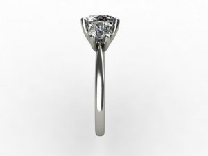
We really need a side view to see if the shank is rounded out enough.
 
Here is the side view.

Thanks!

side_view__2.jpg
 
And just in case it helps, here is the new "perspective" view, and top view.

perspective__2.jpg

top_view__2.jpg
 
I need the full side view like this:

finger_view__2.jpg
 
Gypsy, you need that view once the stone is lowered you mean? The image you just showed is the side view of the new ring (that was further rounded at the top). Do you think it now matches the Ritani photo:http://www.ritani.com/engagement-rings/three-stone-diamond-engagement-ring-in-platinum/4989#secure-shipping ?
 
It's more rounded like the Ritani, but it lost the taper. It needs the taper to match the ritani.

And yes, I'd like to see the height of the head.
 
Good eye! I didn't even notice that. Do you guys have a personal preference on the taper vs. no taper? That's not a big issue for me as, I'm mostly concerned with the top of the setting matching the Ritani (as opposed to the band). Do you think the difference of taper vs no taper will be evident once it's on her finger?
 
Also, how can you tell that the 3D rendering photos are cast and not hand forged?
 
You usually only do CADs for casting. Handforged jewelers/pieces are usually drawn. The entire point of a CAD is to be able to print a casting from it.


As for the taper. I actually prefer it without.
 
GET 3 FREE HCA RESULTS JOIN THE FORUM. ASK FOR HELP
Top