shape
carat
color
clarity

Honest Opinions on Red Spinel

MrsM

Shiny_Rock
Joined
Aug 3, 2010
Messages
264
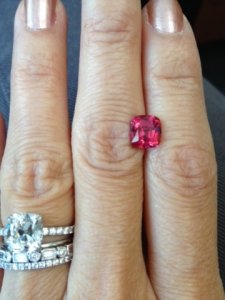
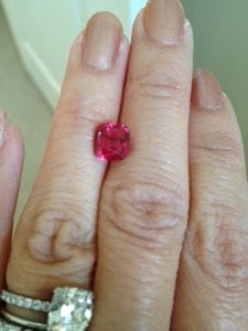
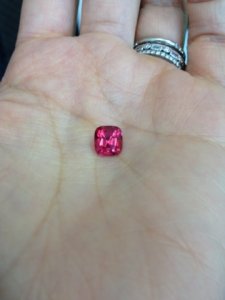
Made a late night purchase recently and just got the stone today. Need those with expert eyes to let me know if I did okay as I was pretty stressed about what I would actually receive! It is a red spinel from Burma. 2.25 ct. I am feeling happy with it right now as I like the reddish pink color; plus it holds color well in all lighting conditions that I have seen thus far. The issue with it is that there are quite a few inclusions but I cannot see them by eye, but they are very obvious when magnified...nothing that affects the integrity of the stone however. Would have loved a clean stone but then I would never have been able to afford it!! Anyway, thinking of making this into a ring but that will be another post once I have some time with the stone :). Let me know what you think...as I am still learning how to "read" colored stones properly.
_6749.jpg

redspinel3.jpg

_6750.jpg
 
How accurate is the colour of the spinel in your photographs?
Can you crop the super large picture so that you "capture" only the spinel? This way, we can see a better magnified picture of the spinel to evaluate the cut, inclusion, etc.
 
Is this the one that was on DB? It's gorgeous. Is it a little purple?
 
I'd like to see closer pictures, too, but I think it's a very pretty stone. I'm a sucker for red spinels - if I had had the money, and wasn't already trying to pare down my number of red spinels, I would have been even more tempted by this one!

What was your very first thought when you opened the package? How do you find the cut?
 
Hi Chrono,

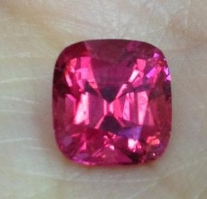
Was hoping you would respond. Have learned SO much from reading all your posts. The color is fairly accurate in the photos...nicely saturated with an open color and no darkness. Native cut with no window that I can see. Here is an enlarged photo...can see some of the inclusions as well as all my fingerprints!

enlargedredspinel.jpg
 
@athenaworth: No this is not from DB...I must have missed that one! I do not see any purple. It is more pink to me.

@NKOTB: Just posted an enlarged photo. When I opened the package, I was definitely very happy with the color. Was worried that I would see brown in some lighting conditions. The inclusions do bother me but they are not obvious unless you put the stone in direct sunlight and see the reflections off them.
 
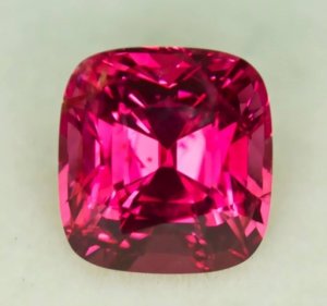
Here is the vendor photo which actually shows the color much better than my enlarged photo.

vendorphoto.jpg
 
It's absolutely gorgeous.
 
I like the red color and I think that spinel is perhaps the most beautiful of all red gems.
 
Honestly, Mrs. M, I am puzzled why the inclusions are concerning you when they are not visible unless magnified? I love the color - find it quite saturated and appreciate that it leans to the cool side of the red family (In other words, pink/purple). It looks stunning. It is very rare to find a spinel with no inclusions upon magnification, so unless they are eye visible and annoying, it appears that you have found a really lovely stone. It looks well cut and I'm so pleased when the shape is other than the ubiquitous oval. Personally, I love cushions. I certainly hope you keep it. :))
 
Mrs.M, that's a really nice stone! I love the color & the cut looks good. It's when you find a colored stone with no inclusions that you should worry! This is eye clean, you say, & inclusions don't affect its performance, so who cares if they show under magnification? I doubt you'll find a single colored gem on PS without any -- they're part of its personality. I think you did very well. I can see that spinel looking wonderful in rose or yellow gold, wow. Can't wait to see what you eventually decide to do with it!

--- Laurie
 
Colour, cut and clarity all look good. Remember that coloured stones are held to a different standard than diamonds; eye clean is all you need, not loupe clean. Cut looks very good for something non-precision cut. Colour isn't red though; not necessarily a good or bad thing. What matters is that you love it. Looks pink with a purple modifier. Saturation looks great. Unlikely to brown out but might turn slightly orangish indoors. Does it? As long as it doesn't shift too much, I'd say you did very well! Any flourescence?
 
beautiful stone!

I also love your e-ring! :D
 
Thanks for all your opinions. Glad to know that I did not do badly for a late night purchase; the color and saturated got me in the video and am very relieved to find out that it is true to life! Yes, this is going to be a keeper!! The more I look at it, the more I realize I love the color even though it is not true red. I am not seeing any orange indoors (all the pics are taken inside; the third not even near a window) and I am not seeing any color shift which really pleases me. (I do not know if it has flourescence--need to get a light to check.)

@minous The inclusions bother me a little bit because there are quite a few and some are closer to the surface and so in certain direct lighting, I can see the big surface one. I know I need to get over this mind clean stuff for colored stones, especially since the stone is overall beautiful to me.

Now I need to start to brainstorming ring ideas :appl: ! Will need your suggestions on that after I gather my thoughts...
 
I am confused now. I thought the stone is eye clean but from what you are saying, it isn't? You can see the big one with your naked eye in direct lighting?
 
@Chrono: It is described as "not easy to see with the naked eye". So if I am looking for it and tilt it at a certain angle in direct light, I can see it, yes. Sorry, my original post was not quite correct. I did not see it when I originally opened the package. Had to get it home and examine it in various conditions.
 
I think it's beautiful! Love that it leans pink/purple instead of orangey. Care to share the vendor?
 
Maybe I'm going nuts because everyone keeps saying that it is pink/red with a purple modifier, but I see mostly an orange modifier (although I can also see hints of purple in some shots.)

It reminds me of an African Pad because of the mix of colors given its looks mostly pinkish-red with an orange modifier to me.

I think its very pretty.
 
Honestly gorgeous! I also see a tad of Orange in the first enlarged picture. .. more like padparadascha anda bigger glint of purple. Just lovely.
 
corundum_conundrum|1370044045|3457112 said:
Maybe I'm going nuts because everyone keeps saying that it is pink/red with a purple modifier, but I see mostly an orange modifier (although I can also see hints of purple in some shots.)

It reminds me of an African Pad because of the mix of colors given its looks mostly pinkish-red with an orange modifier to me.

I think its very pretty.

Interesting that you see mostly an orange modifier because it is slight on my monitor. It is stronger on my iPhone but not by much. Regardless, it is not an unattractive colour by any stretch. The colour still pops and I'm glad the vendor is honest enough to say that the inclusions are on the cusp of eye clean / visible.
 
What Chrono said! I wouldn't kick it out of bed for eating crackers!

Now, how are you going to set it? :Up_to_something:
 
Interesting about the colors different people see. I now see the purple in the photos and am barely seeing it in real life. Am not seeing the orange though...

The stone is from Jeff Davies. This is my first purchase from him and it was an easy and fast transaction given he is located in Thailand. His video was very true to the actual stone.

I have no idea how I am going to set it yet. Yellow gold prongs for sure but that is all I know right now :). If anyone wants to share inspiration photos with me, I am totally open to different ideas.
 
I love the color!!!!
 
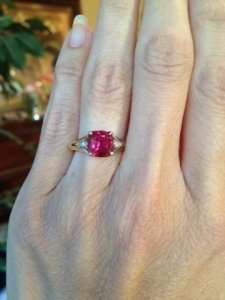
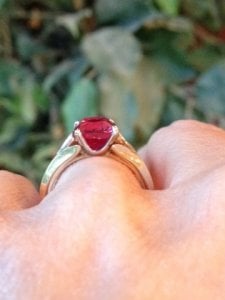
Finally got the spinel set, which has definitely darkened the color. David Klass MC2 inspired setting. There are some additional photos in the David Klass Setting thread in SMTB.

_17968.jpg

_17969.jpg

_17970.jpg
 
Oh, I am so totally off to see more pictures! That setting looks like it has all the best qualities of the MC2 without being ridiculously over the top - like a sleek, elegant version of an MC2! Off to see more photos and drool! :cheeky:
 
Worthy of worship! That's a stunning gem and a timeless/understated setting!
 
Gorgeous!!! It reminds me of raspberry sorbet... I want to lick it!!!! :love:
 
Still loving it! :)
 
GET 3 FREE HCA RESULTS JOIN THE FORUM. ASK FOR HELP

Featured Topics

Top