shape
carat
color
clarity

Need advice on sapphire and opal ring please

Status
Not open for further replies. Please create a new topic or request for this thread to be opened.

Kay

Ideal_Rock
Joined
Feb 20, 2003
Messages
2,573
I am having an opal and sapphire ring made for my mom because my mom’s birthstone is sapphire and my daughter’s (the only grandchild) is opal. My mother liked the general look of this ring with the yellow gold, split shank setting and the small sapphires surrounding the opal. Although the quality of this particular ring does not look great, I gave the picture to my jeweler for inspiration. (CADS to follow.)
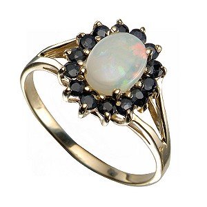
saph-opal ring.jpg
 
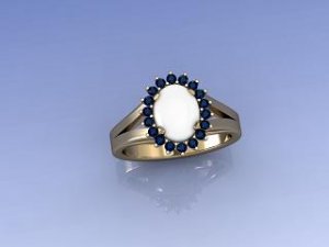
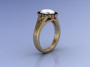
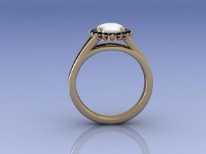
These are the CADs my jeweler sent me. I need to give him feedback, and it is hard to express exactly what should be changed (especially since my mother lives in another state and does not have email/internet access, so I can’t get her opinion).

It may just be the CAD program, but I think the shank should be thinner, more delicate, and with rounded edges instead of squared off. I’m not sure about the profile. I think the stone area is too high off of the ring. Can a split shank be done without being raised at all? I do not want a high cathedral effect. If the shank is raised, should the gallery be left bare, or should detail be added? My jeweler said he could add scrollwork or filigree.
The proportion of the sapphires to the opal is different than in the inspiration ring because my opal is larger (9x7mm), but I think it is okay. I think the prongs on the opal should be more delicate.

I welcome any feedback on the design – I want my mother to love the ring.


sapp-opal cad 1.JPG
 
2nd CAD

sapp-opal cad 2.JPG
 
Last CAD. The setting looks high to me.

sapp-opal cad 3.JPG
 
CADs always look bulkier than the final product since there''s extra metal in the CAD that gets removed during the setting/polishing process. The setting doesn''t look all *that* high but if you''d like it to be lower I wouldn''t think there''d be a problem assuming the opal doesn''t really have a deep belly. That being the case, you can ask your jeweler to set it as low as possible. But yes, definitely state how you want the finished ring to look to make sure you''re on the same page.
 
Agree with Kismet. And I think that the split shank is not as far apart as on the ring you gave for inspiration. See the split shanks meet the ring further apart, where the sappnires are.

HTH
 
CADs never look exactly like the finished product, we''ve seen that on this forum a number of times. Can you post pics of your opal or of sapphire accents? That wouldn''t hurt when it comes to coming up with a perfect design. BTW, how big are the sapphires? You''re right about shank needed to be thinner and rounded, especially considering the oval center and round stones in the halo (to compliment the stones). I''m not sure about your height issues, however, as the reason for raising it is probably to give you a better view of the split shank. If your opal is 7 mm wide and each of the sapphires is, say, 2 mm, with prongs around sapphires that gives you a total of probably 12 mm in width, and that''s a lot considering most women wear rings in 18(ish) mm diameter range - it would give you only about 3 mm of space i.e. shank view, on each side of the ring, and that''s not a lot. Take that profile photo, put your fingers on the perimeter of the halo (one on each side) and lower them to the shank''s level - see how much of that view of the shank you would lose if it were lowered? If you''re fine with that result, then specify to your jeweller that you''d like it as low as possible, just be ready for what might happen to the design if you go for it. Another question - are you sure about yellow gold? If sapphires are not very dark, and if they have a nice blue color, maybe it would be better to go with white gold, as those nice colors coming from within the opal might be more noticable. But it''s your call and your choice that matters, of course, and if sapphires are quite dark, yellow gold is a good idea to lessen the contrast. I''d also think about having that yellow gold in some nice, bright shade of yellow (preferably 18k), to make this ring even more cheerful and colorfull and bring out that symbolism of grandma hugging a grandchild (i.e. mom''s stones surrounding your daughter''s stone - love the idea btw!).

P. S. White opal is such a great stone to symbolize a child, isn''t it.
 
While CADs tend to show a bulkier picture, I think the shank can be thinned out and softened with a little curvature. I also noticed that the prong work on the sapphire is different from the original.
 
Date: 9/23/2009 9:00:58 PM
Author: Kismet
CADs always look bulkier than the final product since there''s extra metal in the CAD that gets removed during the setting/polishing process. The setting doesn''t look all *that* high but if you''d like it to be lower I wouldn''t think there''d be a problem assuming the opal doesn''t really have a deep belly. That being the case, you can ask your jeweler to set it as low as possible. But yes, definitely state how you want the finished ring to look to make sure you''re on the same page.
Thanks. The opal has a nice curvature to the dome, but the bottom side is pretty flat. After some of the threads about misunderstandings with custom work, I definitely want to make sure he and I are on the same page.
 
Date: 9/23/2009 9:18:22 PM
Author: Stone Hunter
Agree with Kismet. And I think that the split shank is not as far apart as on the ring you gave for inspiration. See the split shanks meet the ring further apart, where the sappnires are.

HTH
Good catch. I like the wider split on the inspiration ring, so I will be sure to mention that.
 
Date: 9/24/2009 4:42:36 AM
Author: ma re
CADs never look exactly like the finished product, we''ve seen that on this forum a number of times. Can you post pics of your opal or of sapphire accents? That wouldn''t hurt when it comes to coming up with a perfect design. BTW, how big are the sapphires? You''re right about shank needed to be thinner and rounded, especially considering the oval center and round stones in the halo (to compliment the stones). I''m not sure about your height issues, however, as the reason for raising it is probably to give you a better view of the split shank. If your opal is 7 mm wide and each of the sapphires is, say, 2 mm, with prongs around sapphires that gives you a total of probably 12 mm in width, and that''s a lot considering most women wear rings in 18(ish) mm diameter range - it would give you only about 3 mm of space i.e. shank view, on each side of the ring, and that''s not a lot. Take that profile photo, put your fingers on the perimeter of the halo (one on each side) and lower them to the shank''s level - see how much of that view of the shank you would lose if it were lowered? If you''re fine with that result, then specify to your jeweller that you''d like it as low as possible, just be ready for what might happen to the design if you go for it. Another question - are you sure about yellow gold? If sapphires are not very dark, and if they have a nice blue color, maybe it would be better to go with white gold, as those nice colors coming from within the opal might be more noticable. But it''s your call and your choice that matters, of course, and if sapphires are quite dark, yellow gold is a good idea to lessen the contrast. I''d also think about having that yellow gold in some nice, bright shade of yellow (preferably 18k), to make this ring even more cheerful and colorfull and bring out that symbolism of grandma hugging a grandchild (i.e. mom''s stones surrounding your daughter''s stone - love the idea btw!).

P. S. White opal is such a great stone to symbolize a child, isn''t it.
Unfortunately, I cannot post pictures of the stones. I already gave my jeweler the opal, and he is supplying the side stones. The opal is white, with a nice color play of blue, red and green. I want the sapphires to be a medium to medium dark blue, not the navy color in the inspiration ring. (The jeweler will show me melee to approve once we agree on a design.) The yellow gold was my mother''s choice -- I asked if she would prefer white (which would be my choice), but she likes yellow.

I had not thought about the height of the shank showing off the split better. Maybe I will like it better if there is some scroll work or filigree in the gallery to fill in the space. Right now it looks like the head of the ring is just floating above the shank (which can look cool with a more modern ring, but I don''t like it on this one).

I''m glad you like the symbolism of the ring.
 
Date: 9/24/2009 8:08:40 AM
Author: Chrono
While CADs tend to show a bulkier picture, I think the shank can be thinned out and softened with a little curvature. I also noticed that the prong work on the sapphire is different from the original.
Thanks. I''ll take a closer look at the prong work. That may be part of what is needed to make the different parts of the ring flow together better.
 
Status
Not open for further replies. Please create a new topic or request for this thread to be opened.
GET 3 FREE HCA RESULTS JOIN THE FORUM. ASK FOR HELP

Featured Topics

Top