zhuzhu
Ideal_Rock
- Joined
- Mar 15, 2006
- Messages
- 2,503
Absolutely agree. The top couple of photos look like BE sapphires sold as Pads on shopping channels.Date: 4/11/2010 4:56:56 PM
Author: amethystguy
thanks for the link zhu..reading it I was looking at the stones..the first ring pic (first 2 pics) and the second ring pics (2 of them)..not the booch..those look just like pinkish-red or reddish-pink sapphires to me..now scroll down to the loer pics or the 3 stones next to each other..i think one is a BE and the other 2 are something else..that far right one is similar to what i think of when i hear pad and/or the one or two Zeolite has posted before..anyone else''s thoughts?


OMG - Amguy please buy it, facet it and then propose to me with it!Date: 4/11/2010 5:30:49 PM
Author: amethystguy
I, like LD mentioned, prefer the stones where you clearly see orange and pink seperate..that is not the true definition I don''t think of a pad but thats what i like persoanlly..now as far as a solid block color mix of pink and orange..and I have showed this before and most of you have seen it..Ed at wildfish gems and his pad crystal..that sucker to me has as close to or is the optimum solid pad color there is...tell me that color is not sweet www.wildfishgems.com
Date: 4/11/2010 8:29:23 PM
Author: tourmaline_lover
Actually this is the official definition of padparadscha.
Padparadscha is a pink-orange corundum, with a low to medium saturation and light tone. It can be heated, but not be-heated or synthetic. It can be from any origin.
http://en.wikipedia.org/wiki/Sapphire
A padparadscha cannot be vivid in color even though that article states that they can sometimes be vivid.
Tone is related to saturation. If something is too light or dark in tone, it will also lack saturation.Date: 4/11/2010 10:24:26 PM
Author: colormyworld
Too me the link seems to indicate that tone and hue should be the defining variable. Not saturation.
Wouldn''t you agree?
Date: 4/11/2010 10:29:36 PM
Author: tourmaline_lover
Date: 4/11/2010 10:24:26 PM
Author: colormyworld
Too me the link seems to indicate that tone and hue should be the defining variable. Not saturation.
Wouldn't you agree?
Tone is related to saturation. If something is too light or dark in tone, it will also lack saturation.
CMW,Date: 4/11/2010 10:49:12 PM
Author: colormyworld
Date: 4/11/2010 10:29:36 PM
Author: tourmaline_lover
Date: 4/11/2010 10:24:26 PM
Author: colormyworld
Too me the link seems to indicate that tone and hue should be the defining variable. Not saturation.
Wouldn''t you agree?
Tone is related to saturation. If something is too light or dark in tone, it will also lack saturation.
So a vivid saturation must be at least a 6 tone? While I agree that saturation adds tone. Some hues more that others. Hue IMO in its purest form is devoid of brown or black (gray) that really add to tone. So in my world (I guess population one) you can have a vivid padparadscha. I am still looking for the one padparadscha that costs LESS just because it is vividly saturated with a medium light tone. Can you please point me in the right direction. Or is there no such thing by definition?
By the strict, accepted definition presented by Robert Crowningshield (and endorsed by GIA), the pictures in this article (what is the TRUE Padparadscha) are wildly inaccurate. The writer is attempting to pass himself off as an authority, but meanwhile, he is not even paying attention to what Crowningshield wrote.
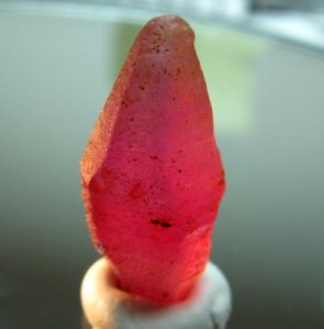
The first picture is an intense and beautiful PINK sapphire. It is not a padparadscha. The 4 sapphires surrounding the green ammolite are far too intense and dark to pass as padparadscha. The pink cushion stone shown first in the ring and then loose, is at least 90% pink. The intense red-orange stone with yellow highlights is far too intense to be a padparadscha, and is showing yellow. I would say that it resembles the 98 ct sapphire in the New York Museum of Natural History, which was considered padparadscha color by the definition of 1910. The only padparadscha pictures in the whole article, are two of the three at the very bottom. They are of very poor color, but at least they are pastel and delicate.
Crowningshield wrote: …light to medium tones of pinkish orange (my comment: mostly orange with some pink) to orange-pink (my comment: equal parts pink and orange). Notice he did not say orangish-pink (mostly pink with some orange), because he did not consider that to be padparadscha.
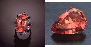
Below is a composite picture. On the left is the 30ct padparadscha ring, surrounded by diamonds and blue sapphires. This stone is considered to be the finest single example of the present day definition of padparadscha. I saw this ring at a Sotheby auction in the late 1980’s, handled it, and examined it with a loupe. It was expected to bring $250,000. I considered selling my house and buying it. But then I’d be living in a tent. It did not sell, at least not during the auction. I didn’t have to move to a tent.
TL: A padparadscha cannot be vivid in color even though that article states that they can sometimes be vivid. I agree.
TL: Tone is related to saturation. If something is too light or dark in tone, it will also lack saturation. I disagree; here’s why:
The shield cut padparadscha on the right of the composite picture is my 0.94ct gem. Keen observers will note it is slightly more saturated and deeper in tone than I have shown before. The color is as accurate as I can get it in Photoshop, while illuminating it with GE Reveal incandescent bulbs. But while the tone and the pinkish orange color are correct, the color saturation is higher in the actual gem, and it is more beautiful than my picture shows. That is why I say that tone and color can match, yet the gem can still posses more or less saturation in that same equal tone and color.

Date: 4/12/2010 12:46:28 AM
Author: zeolite
TL: Tone is related to saturation. If something is too light or dark in tone, it will also lack saturation. I disagree; here’s why:
The shield cut padparadscha on the right of the composite picture is my 0.94ct gem. Keen observers will note it is slightly more saturated and deeper in tone than I have shown before. The color is as accurate as I can get it in Photoshop, while illuminating it with GE Reveal incandescent bulbs. But while the tone and the pinkish orange color are correct, the color saturation is higher in the actual gem, and it is more beautiful than my picture shows. That is why I say that tone and color can match, yet the gem can still posses more or less saturation in that same equal tone and color.

Date: 4/12/2010 1:34:00 AM
Author: velouriaL
those are GORGEOUS, zeolite!
To my eyes, though, they have what I would describe as a brown cast, somewhat similar to the first spinel I posted above, although it is not simultaneously as delicate and intense.
Perhaps what I am identifying as 'brown' is actually just warmth of color?
Date: 4/12/2010 8:03:10 AM
Author: tourmaline_lover
Date: 4/12/2010 12:46:28 AM
Author: zeolite
TL: Tone is related to saturation. If something is too light or dark in tone, it will also lack saturation. I disagree; here’s why:
The shield cut padparadscha on the right of the composite picture is my 0.94ct gem. Keen observers will note it is slightly more saturated and deeper in tone than I have shown before. The color is as accurate as I can get it in Photoshop, while illuminating it with GE Reveal incandescent bulbs. But while the tone and the pinkish orange color are correct, the color saturation is higher in the actual gem, and it is more beautiful than my picture shows. That is why I say that tone and color can match, yet the gem can still posses more or less saturation in that same equal tone and color.
Mr. Zeolite,
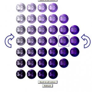
On the upper and lower echelons of the tone scale, where a gem is either very very light, or very very dark in tone, it simply cannot be too saturated because levels of extinction (too dark in tone) or lack of color (too light in tone) simply cannot make for a vivid gem. Even the GIA gemset will not have vivid saturation for the upper and lower tones in this gemewizard example. In the mid tiers of tone, there can be vivid saturation. I consider your gem to be within those mid tiers of tone, and that''s why you are able to see more saturation to your eye.
Perhaps CMW you could give us the benefit of your experience? Rather than continually challenging TL (which you seem to be doing with frequency) you could do some research and find a graphic you would prefer everybody to see that you feel is more appropriate?Date: 4/13/2010 5:23:34 AM
Author: colormyworld
Date: 4/12/2010 8:03:10 AM
Author: tourmaline_lover
Date: 4/12/2010 12:46:28 AM
Author: zeolite
TL: Tone is related to saturation. If something is too light or dark in tone, it will also lack saturation. I disagree; here’s why:
The shield cut padparadscha on the right of the composite picture is my 0.94ct gem. Keen observers will note it is slightly more saturated and deeper in tone than I have shown before. The color is as accurate as I can get it in Photoshop, while illuminating it with GE Reveal incandescent bulbs. But while the tone and the pinkish orange color are correct, the color saturation is higher in the actual gem, and it is more beautiful than my picture shows. That is why I say that tone and color can match, yet the gem can still posses more or less saturation in that same equal tone and color.
Mr. Zeolite,
On the upper and lower echelons of the tone scale, where a gem is either very very light, or very very dark in tone, it simply cannot be too saturated because levels of extinction (too dark in tone) or lack of color (too light in tone) simply cannot make for a vivid gem. Even the GIA gemset will not have vivid saturation for the upper and lower tones in this gemewizard example. In the mid tiers of tone, there can be vivid saturation. I consider your gem to be within those mid tiers of tone, and that''s why you are able to see more saturation to your eye.
Tourmaline lover, Nice graphic on tone and saturation. As I said above some hues will add more tone than others. Since we are discussing padparadschas. Could you please post a similar graphic for those hues.
CMW,Date: 4/11/2010 10:00:13 PM
Author: colormyworld
The problem with the OFFICIAL definition you have supplied is that there is a contradiction there. Above all a padparadscha (your welcome) by all accounts I have seen clearly state that padpardscha should have no brown, and there is the rub. Red and pink hues in lower saturations are perceived as brownish. (slightly brownish for a 2 saturation and very slightly brownish with a 3 saturation) Can you please explain this paradox?
The name 'padparadscha sapphire' shall not be applied in the following cases:Date: 4/13/2010 7:46:28 AM
Author: Chrono
CMW,Date: 4/11/2010 10:00:13 PM
Author: colormyworld
The problem with the OFFICIAL definition you have supplied is that there is a contradiction there. Above all a padparadscha (your welcome) by all accounts I have seen clearly state that padpardscha should have no brown, and there is the rub. Red and pink hues in lower saturations are perceived as brownish. (slightly brownish for a 2 saturation and very slightly brownish with a 3 saturation) Can you please explain this paradox?
Do you mind sharing your source(s) clearly stating that a padparadscha should have no brown? I am very curious because a majority of stones I’ve seen accompanied by a lab memo defined as a padparadscha seem to have varying degrees of a brown tint.
http://gemologyproject.com/wiki/index.php?title=Color_grading