- Joined
- Mar 2, 2009
- Messages
- 13,279
Date: 3/6/2009 4:47:48 PM
Author: MakingTheGrade
Date: 3/6/2009 3:38:18 PM
Author: Linda W
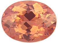
The color looks really pretty.
You know, the more I''m browsing through stones and different colors, I''m really finding that I like the lighter colors better, lol.
Like I think this is an ideal color!
Linda, I''d normally agree, but this guy HAS a $500K pad at his store!!!!!!, so he''s familiar with them. He said mine wasn''t ''pink'' enough. Of course, this is the same guy who keeps telling my friend that she has to go higher than J on her e-ring. I think he''s just a bit of a color snob.Date: 3/6/2009 2:11:38 PM
Author: Linda W
Alj,
I found out a lot of jewelers aren''t familiar with pads. When I wore my rings into my jewelers, he had to actually look up what pads were, ha ha ha ha. On top of that, he didn''t even pronounce the name correctly.

Date: 3/6/2009 6:53:56 PM
Author: Allison D.
Date: 3/6/2009 2:11:38 PM
Author: Linda W
Alj,
I found out a lot of jewelers aren''t familiar with pads. When I wore my rings into my jewelers, he had to actually look up what pads were, ha ha ha ha. On top of that, he didn''t even pronounce the name correctly.
Linda, I''d normally agree, but this guy HAS a $500K pad at his store!!!!!!, so he''s familiar with them. He said mine wasn''t ''pink'' enough. Of course, this is the same guy who keeps telling my friend that she has to go higher than J on her e-ring. I think he''s just a bit of a color snob.


Date: 3/7/2009 12:07:52 PM
Author: ma re
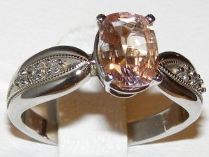
Color and outline are nice, and the cut also looks decent for a pad. Mochi''s #2 is also very nice.
BTW, if you plan on setting the stone in white metal (can''t remember if you stated a metal choice and I don''t feel like searching right now), you can afford to get one that''s more orange than pink, cause orange will get toned down in WG/PLAT, and rose will probably get more pronounced than it would in YG.
Date: 3/7/2009 8:28:25 PM
Author: FrekeChild
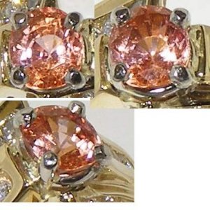
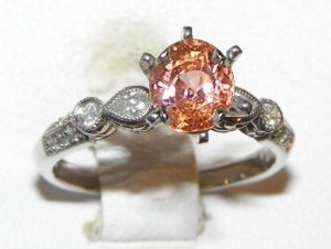
It''s pretty (the ring from NSC) but those prongs...
Date: 3/7/2009 8:52:00 PM
Author: Hudson_Hawk
They''re a little bulky.
So which spinel was it???
It would have a similar effect on the stone''s colors as white, but would make them a little warmer and possibly richer, so IMO it''s an even better choice. Of course, you shouldn''t get a stone that''s too pink (where orange is barely noticable), as RG will make it...all pink. Also keep in mind, that if your whole setting is RG, that might make the stone "disappear in pinkness" i.e. get lost visually. You do need some contrast in the ring regardless of color choices. BTW, what''s your ring style preference - modern, traditional, antique, simple, ornated, high contrast, low contrast, bold, delicate...? Just some food for thoughtDate: 3/7/2009 8:18:09 PM
Author: MakingTheGrade
Thanks for the adviceDate: 3/7/2009 12:07:52 PM
Author: ma re
Color and outline are nice, and the cut also looks decent for a pad. Mochi''s #2 is also very nice.
BTW, if you plan on setting the stone in white metal (can''t remember if you stated a metal choice and I don''t feel like searching right now), you can afford to get one that''s more orange than pink, cause orange will get toned down in WG/PLAT, and rose will probably get more pronounced than it would in YG.
What if I chose rose gold? I currently have no rose gold pieces, but they look lovely and I think might complement the pink in the stone?

Date: 3/7/2009 11:05:21 PM
Author: MakingTheGrade
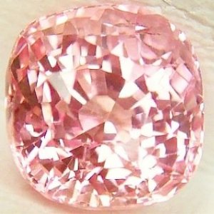
This one (from http://www.planetarygems.com/rare_gems.htm) actually kind of reminded me a lot of linda''s avatar color(no offense linda, I know your pad is MUCH prettier!)
But yeah, I feel like their prices are too good to be true...makes me suspicious. Also, they seem to be catering their gems for astrological purposes...which is kind of odd for a gem company.
