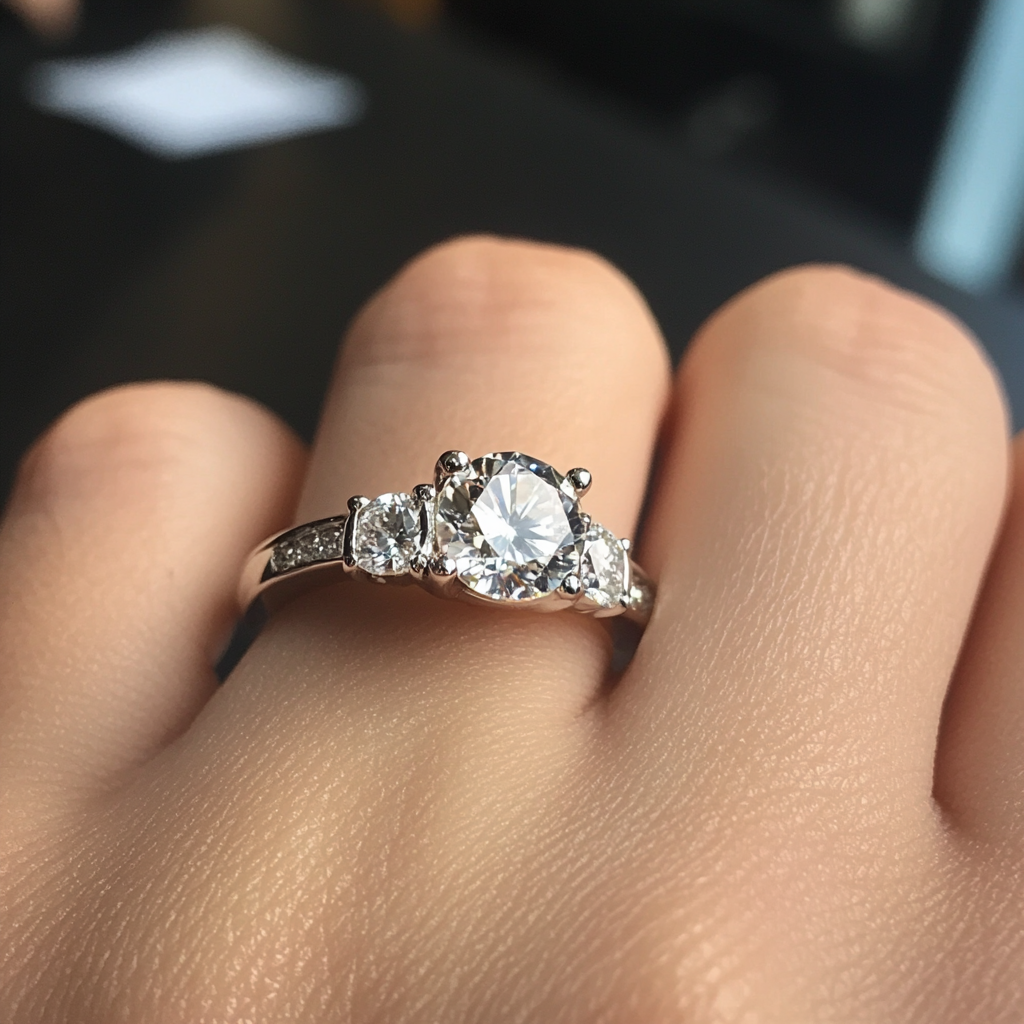
shape
carat
color
clarity

PriceScope Upgraded - Comments and Issues

Hi Andrey, I didn't realize I had posted this is Kenny's thread. I was responding to the comment by "jeweln". Still trying to figure out the new quote system so I've just pasted my comments from that thread into this one (see below). I do like the new format very much and I especially like we can add our comments to the thread at the bottom of the page. It's nice to be able to scroll up and review comments by other posters without having to open a new tab. I know you said you kept the colours the same as before but I hope you will consider making a few changes in the future.

"I like the new look but there isn't enough colour contrast (on my computer) for my eyes and all that bright grey gives me a headache. There is too much of the same colour. I find I have to switch to my iPad if I'm going to be on longer than about 15 minutes.

I'm attaching a link to a news website that I find easy to use. The colour variation makes it easy to read. http://www.ctvnews.ca/ "
 
After working perfectly for several days, this is what the screen looks like on my Google Pixel. Is it a phone issue or a PS issue?
Screenshot_20170328-103156.png

Can you check again and see if you can refresh? We are unable to reproduce this.
 
Help please!

Not sure if this has been mentioned before or not, however, when browsing PS using my Android smart phone, the second row buttons, namely "Watched Threads", "New Posts" and "Alerts", do not appear to be working for me.

The "New Posts" and "Alerts" buttons used to work, however, they stopped for whatever reason(s).

Thanks Admin for looking into this in advance.

DK :))


We are currently reworking the header to make it easier. Hope to have it soon.
 
Hi Andrey, I didn't realize I had posted this is Kenny's thread. I was responding to the comment by "jeweln". Still trying to figure out the new quote system so I've just pasted my comments from that thread into this one (see below). I do like the new format very much and I especially like we can add our comments to the thread at the bottom of the page. It's nice to be able to scroll up and review comments by other posters without having to open a new tab. I know you said you kept the colours the same as before but I hope you will consider making a few changes in the future.

"I like the new look but there isn't enough colour contrast (on my computer) for my eyes and all that bright grey gives me a headache. There is too much of the same colour. I find I have to switch to my iPad if I'm going to be on longer than about 15 minutes.

I'm attaching a link to a news website that I find easy to use. The colour variation makes it easy to read. http://www.ctvnews.ca/ "

I will see what can be done.
 
Thanks Andrey, I don't like complaining because I really do like the changes. I am a migraine sufferer and certain colours, brightness and contrast of colours can be a trigger unfortunately.
 
Can you check again and see if you can refresh? We are unable to reproduce this.
I refreshed and it still looks the same. Restarted the phone too. I found a place in Chrome to reset site to original settings and tried that and I had to log back in. The PS home screen looked ok until I logged back in and then it reverted to the screen shot I posted earlier.
 
Can you tell me which version of chrome it is? It is possible chrome upgraded. It is hard to reproduce as I do not have a that smart device.
 
Can you tell me which version of chrome it is? It is possible chrome upgraded. It is hard to reproduce as I do not have a that smart device.
I'm running Android 7.1.1 on the phone. I can't figure out how to see which version of Chrome it is. Did a google search but there's no info about how to tell chrome version o a phone. If I'm the only one having the problem, I can live with it.
 
Andrey, I just wanted to say how much I love the alerts! It let's me know when someone has replied back to one of my posts. In the past I am sure there were threads that I forgot to go back to, and this really helps that problem!

One other mention about member name search. In the past, when you'd search for a member name, the first search result would be that person's profile. You'd click on that and then have the option of choosing to see all their posts or all their threads. But when I search say for m-2-b, it still sometimes takes me to the forum list page, and other times it takes me to a list of posts that are not hers but maybe some of the same letters are there in the post, although some are posts that have her name in them. This means going through a few extra steps if I am looking for a specific thread of hers. Because of that, I almost have to find any post she has made on the forum just to access her profile page to get to her threads. I am afraid some are going to not even see the option of the list of threads since it is obscure at the bottom of the page with their posts.
 
Yay!!! I see you added find all posts and find all threads on the main profile page! Thanks!
 
Yay!!! I see you added find all posts and find all threads on the main profile page! Thanks!

We are also currently reworking the header and menu to make things easier.

Hope to have it coming this week.
 
I wanted to thank Andrey and everyone behind the scenes for working hard on upgrading PS - the changes are really substancial and improvements can be observed daily.

Many thanks !
 
Please change my screen name back to Natylad again. Thank you.
 
Please change my screen name back to Natylad again. Thank you.

It is done. Please remember to use it as you new login name.
 
Thank you for all you are doing to improve the workings/appearance of the website. I can't imagine how many hours have gone into this!

I can't figure out how to mark a listing in Preloved as "sold." The old sticky said to click "report concern" and the moderators would mark it sold. Somehow I can't see a "report concern" button to click. It's the thread called WTB: Sagefemme setting. It is sold. Thanks!

The report concern button with the new platform says "report" . So you can always do it there. I am trying to see if there is a better way.

I already marked your thread as sold.
 
Thank you!
 
Hi Andrey
why are some member's avatar missing on RT ? .
No longer show a list of login members?
 
Hi Andrey
why are some member's avatar missing on RT ? .
No longer show a list of login members?

Hi Dancing Fire,
Can you send me a screen shot of it?
 
Hi Dancing Fire,
Can you send me a screen shot of it?
Don't know how...
Idunno1.gif
littlebashfulguy.gif
 
Can you name the members that you see the avatars are missing from and give me a link to the thread that you see it on?
 
Can you name the members that you see the avatars are missing from and give me a link to the thread that you see it on?
Hi Andrey
Most of them are new members . Maybe they haven't upload an avatar yet?
 
After working perfectly for several days, this is what the screen looks like on my Google Pixel. Is it a phone issue or a PS issue?
Screenshot_20170328-103156.png


Hi Matata,

I think we may have found this. Can you let me know if you still see the issue?

K
 
Hi Andrey
Most of them are new members . Maybe they haven't upload an avatar yet?

I will try to make a nicer one when i get a chance for all those missing. If someone wants to make a suggestion for it, feel free to post it here.
 
Hi Matata,

I think we may have found this. Can you let me know if you still see the issue?

K
Andrey...you are a gem! I have a normal page view now. Thank you!
 
Great!

FYI - We will be making a change to the header tomorrow, but I think it should just make thinks easier.
 
We just updated the header. and menu. You should be able to get to pages with the menu and the your account easier.

Let me know if anyone is having any issues.

Thank you.
 
We just updated the header. and menu. You should be able to get to pages with the menu and the your account easier.

Let me know if anyone is having any issues.

Thank you.


Thank you Andrey!
 
Thank you Andrey for all the great changes on here. One thing has been driving me nuts. On the main page I always used to immediately go to the Forum Topics tabs off to the right hand side for current topics being commented on. They have tabs for "latest" and "popular". The topics that I see have not changed since the switch over. I really hope you can help me out with this. I've tried logging off and back in. That did not work.
 
Thank you Andrey for all the great changes on here. One thing has been driving me nuts. On the main page I always used to immediately go to the Forum Topics tabs off to the right hand side for current topics being commented on. They have tabs for "latest" and "popular". The topics that I see have not changed since the switch over. I really hope you can help me out with this. I've tried logging off and back in. That did not work.


We are working to sync that up. I hope to have it by next week.

:)
 
GET 3 FREE HCA RESULTS JOIN THE FORUM. ASK FOR HELP
Top