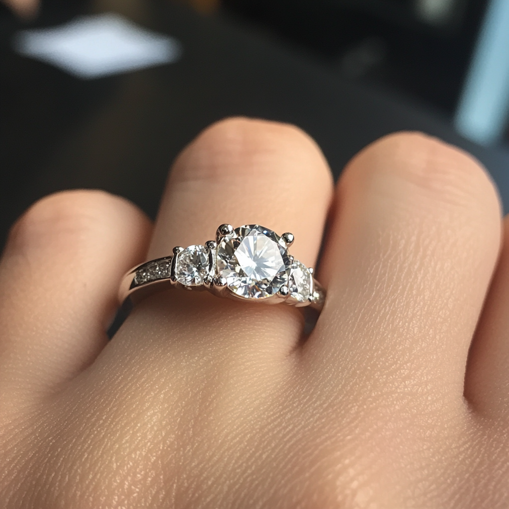
shape
carat
color
clarity

Reception to follow

Status
Not open for further replies. Please create a new topic or request for this thread to be opened.
Oooh I like the last ones!!! They remind me of this cool artist that does swirly stuff kind of "carved" into painted canvases.


ETA: Artist name = Elliott Puckette (a chick) Example of her style can be found here.
 
I did not do a reception card. The last line of my invites said something like ''Reception to follow'' or ''Reception immediately following.'' My ceremony and reception were at the same place, so I didn''t want or need to pay for a separate reception card.
 
Hey I forgot about this place. I started reading that girl's blog from a mention on Wedding Bee I think ... but she has very cute, customizable invite templetes I discovered AFTER ordering our invites ...

Ch Ch Ch Check it out.
1.gif
 
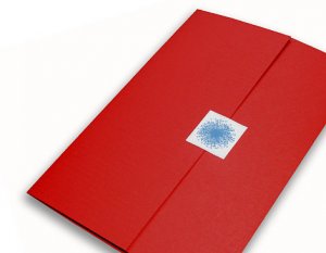
I particularly like PHILADELPHIA ... pix #1

philadelphia1.jpg
 
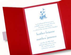
And opened (you can choose different colors)

philadelphia2.jpg
 
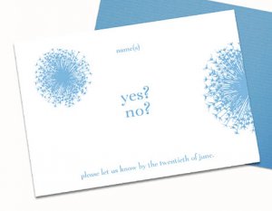
And cute as a button reply card ...

philadelphia4.jpg
 
Oh Deco. I looked at the pricelist and closed it out. About $500 for 50 invites. They are stunning, but well. No. I just can''t do it. I love the ones from your site though, I really do.

My colors are green and white. My bouquet will have light pink in there. My dress and shoes and the boxes of the centerpieces silver. So light pink, light bright green, silver, white. I like the brown boredered invite... but don''t really want a large block of brown on the cards.
 
gypsy, I don't really know what your budget is, but we got our invitations from white aisle and were extremely happy with how they turned out. i've noticed that they've added a lot more fantastic designs. you are free to word them as you wish.

for 50 invites it'd be somewhere between $180-200.


arbor.jpg


4-3%20012.jpg
coco.jpg


MEXICO.jpg

 
Since you''re going informal, here''s what I did:

Our ceremony could only hold X number of guests. We invited a lot more to the reception. So, on our invitations, we just put the time for the reception (in our culture, the reception is the important part of a wedding for non-family guests). For those that we did invite to the ceremony, we bought these opaque paper sheets and printed a little note that said something like, "Ceremony will begin at XX:XX PM upstairs at BLAHBLAH". That way, they knew to come early for the ceremony if they wanted. We just cut those opaque sheets into little slips so each 8.5 x 11 sheet could be used for many, many invitations.

You could do the reverse. Ceremony time with a slip of paper telling when/where the reception is for those you are inviting to both.
 
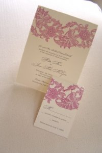
That''s a great site too, Lovely Lulu ... I liked "FROSTING" for Gypsy & Mr. Gypsy! But ya do like "PEONY" blooms, don''t ya Gypsy?? And "VENICE" kinda looks like the lace you like ...
 
LULU... those are STUNNING! And that's right in budget for me. Great! Thanks!


Oh WOW! That site is perfect! THe Venice... the peony... OH OH OH. THANK YOU, THANK YOU, THANK YOU!

Fatafelice-- check these ones with the birds out: http://www.whiteaisle.com/port_antonio_invitation.htm
 
glad to help.
emstar.gif


we got heaps of compliments, especially about them being a unique shape, a longish rectangle that is really quite different then most wedding invites. The paper quality is tremendous and there are lots of choices for fonts and ink colors. i loved how they were both simple and elegant at the same time.

one of my BMs actually just sent us our invite framed in the perfect frame. i hadn't done it myself, because i was afraid it might turn out like something to hang on a grandma's wall, but my friend has excellent taste. she told me that "the lady at the frame place LOVED your invitation design by the way - when the piece was done she was all oo-ing and ah-ing at it!"
 
if they are in your budget, gypsy, i''d go with the white aisle ones. love that site! isnt'' it owned by martha stewart?
anyway, love the deisgns!! LOVE them!
 
OMG! Seriously. These are IT. Price is perfect. Look is perfect... the hardest part will be picking just ONE. WOW.

MEXICO.jpg
# 1 In the lighter pink (mauve color) and the sage green.


OR

2_photo.jpg
#2 In green??


OR

Graphic1.jpg
# 3


4-3%20004.jpg
#4 In sage green.

export.jpg
#5


Graphic1.jpg
# 6 Also in sage green.

LILY_PROOF.jpg
# 7


Okay. Forget everything else. These are THE ONES. Just perfect in style, price, and everything. I love them.

Now umm... which ones do you like? LOL.

I think #1, #4 are my favorites... but the others are amazing too! WOW.

Lulu.. I could kiss you right now!
 
awww. gyspsy you''re making me blush!
emembarrassed.gif


If 1 & 4 are your favorites, I''d go with #1, just because of it''s longish rectangular shape. I loved it. Very striking and is high on the fun mail to open up factor.

Our invites were in the sage green color. it''s beautiful.

want to know another fun little fact about these invites? you''ll only need 39cent stamps to mail them. got to love saving $ any way you can.
 
Lulu, I *love* the white aisle invitations. These are our invitations in pale blue:

veniseinvites.jpg
 
of the ones you posted from white aisle, i like #6 but i would change the font of your names to the style in #7
i''m picky
5.gif
 
I love the 39 cent stamp thing. That's why I didn't pick any of the square invites. I don't like them enough to pay that much more for postage.

Yeah. I'm thinking... Mexico-- # 1 on Green paper. Although... #5 is really awesome too.

Gonna order the sample now. YAY! And I can indeed put 'Luncheon reception to follow" as long as they are in the same location, apparently! YAY!

... #6 would be very bold and striking. Wow. LOL. Hmm...


ETA: Um. I think I'm going to have you guys pick my fonts. LOL. Definitely. Oh these are so great.
 
Eeeek. I did NOT need to see that, Gypsy! That could have potentially saved me about $1500, BUT they aren''t letterpress and my custom design is a little more me, I hope. Oh, God, do not re-think the invites now...
 
gypsy, i don''t mean to dampen all this invitation joy, but i believe that the invites only come on ivory or white paper...
 
Jcrow, did you see their DIY programs? They print the cover with your design and punch all the holes -- you just print the interior pages and assemble. That could make your life easier!
 
Date: 8/25/2006 4:00:01 PM
Author: lovelylulu
gypsy, i don''t mean to dampen all this invitation joy, but i believe that the invites only come on ivory or white paper...

No dampening at all. I want white paper with the sage green design. And maybe a bit colored design like the pictured Mexico design... but with pink and green flowers. White card. I''m thrilled. Trust me.
 
http://www.whiteaisle.com/vine_invitation.htm have birds too. Sorry! I just thought of you when I saw them. Your custom designed letterpress invites are going to be stunning though.


Date: 8/25/2006 3:56:26 PM
Author: fatafelice
Eeeek. I did NOT need to see that, Gypsy! That could have potentially saved me about $1500, BUT they aren''t letterpress and my custom design is a little more me, I hope. Oh, God, do not re-think the invites now...
 
Date: 8/25/2006 4:11:00 PM
Author: fatafelice
Jcrow, did you see their DIY programs? They print the cover with your design and punch all the holes -- you just print the interior pages and assemble. That could make your life easier!
yep i saw. that''s what made me do programs! the french saying ones at that! hehe, i showed my grandma and she said the spelling is wrong... at least it isn''t cajun french.

i was tempted for half a second to order those. then i realized i probably would hate the type or something else would bother me. so i will just do them myself.

oh and DO NOT rethink your invites!! they are personal, one of a kind and fabulous!! say that with us...
 
Date: 8/25/2006 3:15:43 PM
Author: Gypsy
I love the 39 cent stamp thing. That''s why I didn''t pick any of the square invites. I don''t like them enough to pay that much more for postage.

Yeah. I''m thinking... Mexico-- # 1 on Green paper. Although... #5 is really awesome too.

Gonna order the sample now. YAY! And I can indeed put ''Luncheon reception to follow'' as long as they are in the same location, apparently! YAY!

... #6 would be very bold and striking. Wow. LOL. Hmm...


ETA: Um. I think I''m going to have you guys pick my fonts. LOL. Definitely. Oh these are so great.
#6 toned down in a light green wouldn''t be so much like the blue is...

you just say the word, i''m all over fonts!!
 
Well, as premature as all of this is... I''m still over a year out, and all. BUT... will you pick some fonts for me?

I ordered #1 in a sample and #5. I do like #6 too, but didn''t get a sample of that one. I really just need to see/feel the stock and see the envelopes. But I love these so much, I''m probably not going to be overly fussy about the envelopes.

This is a great distraction BTW. Still no word from the vet. *sigh*

I am leaning heavily toward #1 though. It''s the most ''me''.
 
man all these pretty invitations make me want to order some just because!!! and my wedding is OVER!! haha..

gypsy I love any of those white aisle ones,... I don''t think you can go wrong!! Ilike the font in #3... but it''s all just personal taste.
 
for the script i LOVE LOVE LOVE #2's script typeface. it's not overly used. it's a very nice weight and readable.

(i like bickham, but i don't like the big ups of the caps and the little downs of the lowercase letters. Too much of a difference. I always go in and make the caps smaller than the default is- that's hard to do with someone else in control.

i'll need to digest the block text choices and get back with you.
 
Status
Not open for further replies. Please create a new topic or request for this thread to be opened.
GET 3 FREE HCA RESULTS JOIN THE FORUM. ASK FOR HELP
Top