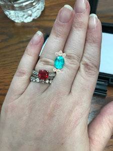
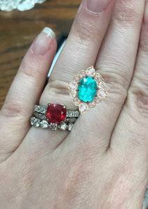
shape
carat
color
clarity

setting for paraiba tourmaline!

Ok I am finally getting the ball rolling on this and have emailed David Klass for a quote. Not sure about CVB... I hadn't realized so many people had bad experiences with her and while I was researching her more on the forum that spooked me. I paid too much money for this stone to be chill if anything goes wrong.

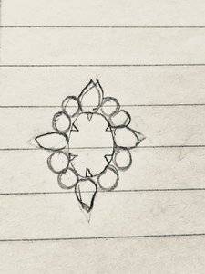
also here's a shitty drawing I emailed them:
IMG_4955.jpg

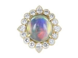
I like your crappy drawing. It's actually better than some one the drawings that I've sent him. :confused2::lol: Are you thinking something similar to this (but for an oval, of course)? And are you still planning on using rose cuts? I'm pretty darn excited to see this one set...mostly because I've been lusting after it in Yvonne's shop and now I can live vicariously through you. :P2

I'm with @Rfisher on some gallery / profile ideas.

halo 31.jpg
 
Elle your bank of setting images must be a fantastic thing to behold!
That one you just posted is divine and a wonderful counterpart to distracts drawing!

Edit
I took some liberties. Hope you don’t mind.
98B67D13-816A-45FF-B4E3-0085DFD9012F.jpeg 9C14C784-136E-484B-A4E4-0D9D69095885.jpeg
 

Attachments

  • 4B4F3E96-2BA9-4591-A5B8-11B22288B78F.jpeg
    4B4F3E96-2BA9-4591-A5B8-11B22288B78F.jpeg
    665.7 KB · Views: 143
Last edited:
Elle your bank of setting images must be a fantastic thing to behold!
That one you just posted is divine and a wonderful counterpart to distracts drawing!

Edit
I took some liberties. Hope you don’t mind.
98B67D13-816A-45FF-B4E3-0085DFD9012F.jpeg 9C14C784-136E-484B-A4E4-0D9D69095885.jpeg

It's a sickness. :lol:

Love your photoshop skills. I need to learn to do that! :mrgreen2:
 
Ha! That's not too bad really. I'm sure they've seen worse drawings!
I'm a DK fan so I think they are a wise choice for this. If you haven't seen it yet, you should look at the recent post by Elle on her DK spinel halo. Spectacular. Yours will be too!

I have indeed seen that post and I love it.

Love the drawing! You will not regret working with DK! I am a huge fan. He will Make sure you love the outcome. It’s a breeze working with him. And his pricing is very reasonable.

My experience with Caysie was not good. Love her work but not the process. And in my case the outcome was not as expected (although beautiful), probably due to my inexperience with Reading CAD’s. I also found it expensive for what it was. And after the bumpy process I did not enjoy wearing the set and I’ve sold it...

I have some CVB bands and I think I will stick with bands/completed designs from her!

I think your drawing idea is great! Do you have any ideas on the profile/gallery?
Count me in as another DK fan and love working with them!
Ask for quote on both his standard bench and his ‘Uber’ bench and what differences to expect on timeline, process and finish?

I don't know that I need the uber bench? Is that handforged?

I am hoping it is set low enough so that there's not really a profile to see - so I haven't really thought about the gallery.
 
I like your crappy drawing. It's actually better than some one the drawings that I've sent him. :confused2::lol: Are you thinking something similar to this (but for an oval, of course)? And are you still planning on using rose cuts? I'm pretty darn excited to see this one set...mostly because I've been lusting after it in Yvonne's shop and now I can live vicariously through you. :P2

I'm with @Rfisher on some gallery / profile ideas.
halo 31.jpg

I love it - I that is very much like what I am thinking! I can't believe after all the googling I did that I didn't find that picture and you just whipped it out! That definitely makes me feel better about the idea of bezeling the rose cuts. I was having trouble finding example images of larger bezeled halos and was worried it would look stupid.

I'm still planning on rose cuts... I think their glimmer will add some interest while still letting the paraiba be the star of the show. Plus I like all my rings to be different and I don't have any rose cuts!

Elle your bank of setting images must be a fantastic thing to behold!
That one you just posted is divine and a wonderful counterpart to distracts drawing!

Edit
I took some liberties. Hope you don’t mind.
98B67D13-816A-45FF-B4E3-0085DFD9012F.jpeg 9C14C784-136E-484B-A4E4-0D9D69095885.jpeg

YAsSSSS THESE ARE AMAZING. I definitely like the one with only two diamonds between more - I want that chonky halo look. I'm going for 6 or 8 prongs on the center stone because after that one time my engagement ring stone fell out, I am very much a More Prongs Are Better person, lol.
 
I love it - I that is very much like what I am thinking! I can't believe after all the googling I did that I didn't find that picture and you just whipped it out! That definitely makes me feel better about the idea of bezeling the rose cuts. I was having trouble finding example images of larger bezeled halos and was worried it would look stupid.

I'm still planning on rose cuts... I think their glimmer will add some interest while still letting the paraiba be the star of the show. Plus I like all my rings to be different and I don't have any rose cuts!

Happy to help. I think it's a super pretty design idea, which is why I had it saved in the first place. I like how the outside edge of the stones are bezeled but the inside edge is held with little prongs. It's very fluid that way.

I'm excited to see you're sticking with rose cuts. They will compliment the paraiba perfectly. :kiss2:
 
C81A0028-5AA6-4D9C-AECB-7D251BFE5D80.jpeg
With rose cuts.
And probably a bit too chunky.
I really really like the detail elle pointed out in the moonstone ring. Prongs on the inside of the rose cuts and bezels on the perimeter.
 
Thank you again @elle_71125 and @Rfisher - I sent the halo ring Elle posted and Rfisher's last mockup along with my last email.

Theoretically I will be getting some drawings and quotes today but we'll see... I can't wait, though. I'm ready to get this show on the road!
 
The first CADs had the bezels all the way around the rose cuts but I think I like where it's only on the outside better, with slightly larger rose cuts, so they've got to make new CADs. The wait is excruciating!
 
The first CADs had the bezels all the way around the rose cuts but I think I like where it's only on the outside better, with slightly larger rose cuts, so they've got to make new CADs. The wait is excruciating!

Can you share the first CADs. I need a fix...I’ll take anything. :lol:
 
I usually don't share CADs until it's done but I'm a bit stumped.

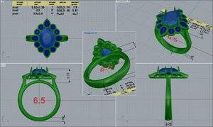
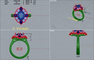
Round 1:
55090-quad (1).jpg

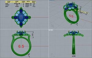
Round 2:
55090-QUAD.jpg
Less bezel, bigger diamonds, more angled, but somehow still not what I want? Should I get rid of the pears? I like them from the top but are they what is stopping it from being angled down more like a dome?

Also, any basket ideas? I'd like the rose-cuts to be easy to clean, but I'd also like to not be able to see skin through them... dilemma.

This is how angled and domey I envisioned it... maybe not quite this much but close. I hadn't thought about how the pears would prevent that. Can't figure out if there's some way to rework it, or if I should get rid of the pears, or if I should give up on it being quite so domelike.
Screen Shot 2019-08-03 at 11.25.29 PM.png
 
F15E7D6B-E359-4B40-ADA6-93D1686E5E85.jpeg
In comparing the rose cuts domes themselves, and the look of the angled placement on this emerald ring he did-
And translate it to your CAD, do you still think it’s not domed enough?
I don’t see why pears would prevent any angle-ing?
And I think the Y ring on the model looks to be higher than 6.53 mm off her finger, as stated on you CAD- so I think it’s quite a bit more angled.

Edited to add - I DO like CAD version #2 better than the #1
 
Last edited:
D3533AEA-3F77-4FB4-AA8C-E1377776F529.jpeg 8B8D2172-24EB-44BF-AA9A-C54349450814.jpeg
Caged in, but still open for cleaning.
 
I don’t see why pears would prevent any angle-ing?
And I think the Y ring on the model looks to be higher than 6.53 mm off her finger, as stated on you CAD- so I think it’s quite a bit more angled.

Edited to add - I DO like CAD version #2 better than the #1

The pears would just prevent it because they can only be angled down so far before they hit my finger, and they're probably at that limit now if a basket is going underneath?

I hadn't noticed that on the profile shot of the emerald cut ring. I don't know that I ever watched the video long enough to get to the profile... I have about no patience for videos.

I definitely like CAD 2 better... I wanted slightly bigger diamonds than in CAD 1 :D

Thank you so much, rfisher, this makes me feel a lot better about it.

I think maybe what's actually bothering me is the shank... I drew a split-shank on it and I like it a lot better, like it gives more balance to the design:

55090-QUAD2.jpg
 
I would still use that pic of the emerald halo ring they did for referencing in actual conversation with them in what you do and don’t want., not assuming it would be the same effect.

Edited for clarity
 
Last edited:
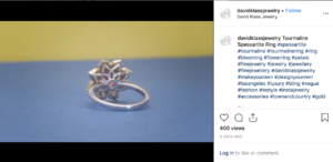
And I saw this basket design on his instagram and think I may like it because it's kind of petaly like the top:

Screen Shot 2019-08-27 at 4.42.51 PM.png

anyway I emailed a hopefully-not-incoherent idea of what changes I want to them... I drew it up and I think I don't want the split shank after all, I think once the basket is on it will be fine. I have no idea ??????

:confused::confused::confused::confused::confused:

Anyway this is why it usually takes me 3+ years to set things...
 
Take this with a grain of salt because I’m certainly not a jewelry designer.
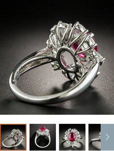
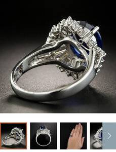
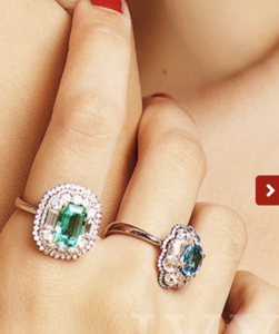
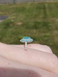
I know you like the dome shape of the above rings. I feel like those come by that shape due to the multiple halos (each set residing slightly under the last). Also, the center stone is usually set a bit higher. I think my paraiba ring has a bit of that dome shape for that reason.

5B814106-0273-4B5C-82C1-98267D19E2A7.png

B15EACD7-A1EE-4CD2-9A1A-9BEAFF48A95E.jpeg

Now, I totally love your design! I like that your keeping the paraiba protected by having it set lower (because that baby was expensive and it deserves the extra protection). :mrgreen2:
I just thought I’d chime in on what I think you mean by dome shaped.
 
And I saw this basket design on his instagram and think I may like it because it's kind of petaly like the top:

Screen Shot 2019-08-27 at 4.42.51 PM.png

anyway I emailed a hopefully-not-incoherent idea of what changes I want to them... I drew it up and I think I don't want the split shank after all, I think once the basket is on it will be fine. I have no idea ??????

:confused::confused::confused::confused::confused:

Anyway this is why it usually takes me 3+ years to set things...

This is a gorgeous gallery btw! I think it would really help even out your ring. Besides, a ring as gorgeous as this one deserves an equally beautiful undercarriage.
 
This is a gorgeous gallery btw! I think it would really help even out your ring. Besides, a ring as gorgeous as this one deserves an equally beautiful undercarriage.

I am so picky about galleries and I feel like I'm giving up by choosing this one... but since I can't put it in the ultrasonic and I'm choosing diamonds you can see right through as the stones, I want to be sure I can clean them with a brush.

Take this with a grain of salt because I’m certainly not a jewelry designer.
I know you like the dome shape of the above rings. I feel like those come by that shape due to the multiple halos (each set residing slightly under the last). Also, the center stone is usually set a bit higher. I think my paraiba ring has a bit of that dome shape for that reason.
Now, I totally love your design! I like that your keeping the paraiba protected by having it set lower (because that baby was expensive and it deserves the extra protection). :mrgreen2:
I just thought I’d chime in on what I think you mean by dome shaped.

The dome look is more about the angle of the halo to me than the multiple levels - the rose cuts in the Ivy New York ring are very, very steeply angled down.

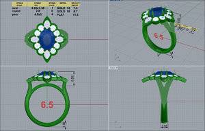
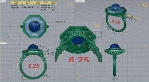
This is the latest cad and I LOVE IT. It is almost exactly what is in my head.

4F10379C-F001-492A-8BC0-D0A2D6BEBFE6.jpeg

I am just wondering if the little round doohickey at the bottom could be taken out so the gallery rests right on my finger. I feel like I’m going crazy about these little details. I’ve never had a ring like this though and I worry it would be more comfortable that way, and I could recapture a bit of lost lowness. It’s srill set fairly low I guess but I worry.
 
The central thing you call a "round doohickey" is probably for structural integrity, because if you had the entire undercarriage lying directly on your finger there would be more frictional forces when the ring is sliding on/off your finger, and over a long time the thinner metal in the undercarriage could move around and be dented if you manage to knock the ring against something.

I actually prefer round 1 because that way I'd be able to stack the ring with other bands, but even if this latest round is absolute not stackable, it still looks lovely.

Oh thanks, that makes sense.

I’m only interested in wearing it solo - I don’t think the look would lend itself to stacking. You’d be able to see the other ring through the rose cuts :eek2: lol. I am also worried that they would crush into the back of the paraiba and chip it if I’m not careful. No need to create extra worries when I already worry so much about damaging it. I am also getting this for middle/pointer finger and I think I only have two bands that size anyway. I have plenty of rings to stack with bands for my ring fingers though!
 
I love :love: love this latest CAD!
And you most certainly can get the ‘round doohickey’ donut tucked in, to be invisible- not removed. I have one like that and can show you the cads (before and after) to show and explain if you wish?
You are just essentially asking him to tuck the donut in under the filigree gallery
 
Last edited:
I love :love: love this latest CAD!
And you most certainly can get the ‘round doohickey’ donut tucked in, to be invisible- not removed. I have one like that and can show you the cads (before and after) to show and explain if you wish?
You are just essentially asking him to tuck the donut in under the filigree gallery

Yes please show me those! Then I can know better what to ask for.
 
I am so picky about galleries and I feel like I'm giving up by choosing this one... but since I can't put it in the ultrasonic and I'm choosing diamonds you can see right through as the stones, I want to be sure I can clean them with a brush.


The dome look is more about the angle of the halo to me than the multiple levels - the rose cuts in the Ivy New York ring are very, very steeply angled down.

This is the latest cad and I LOVE IT. It is almost exactly what is in my head.

4F10379C-F001-492A-8BC0-D0A2D6BEBFE6.jpeg

I am just wondering if the little round doohickey at the bottom could be taken out so the gallery rests right on my finger. I feel like I’m going crazy about these little details. I’ve never had a ring like this though and I worry it would be more comfortable that way, and I could recapture a bit of lost lowness. It’s srill set fairly low I guess but I worry.

The new CAD is gorgeous! :love:
You're right. The Ivy rings are definitely angles pretty sharply. I think you're getting that same look here. :mrgreen2:
Did you get a pic of the gallery in one of the CADs? This one doesn't really show it. I think you can get the donut adjusted so that it sits within the gallery a bit more. So it seems more flush, if that makes sense.
 
7EB1041A-CBB2-4471-8E1E-59D53D5C39D0.jpeg
Ok- this ring sets differently on the finger than what you have-so right there it’s different. and I’m mad at myself that I don’t have the original CAD showing the donut directly under the filigree- adding height to the whole ring head off the finger. But I think you can still see what I mean?
This shows the donut tucked under the filigree- so you don’t see it at all from the side view- but it indeed is there.

I’m so stoked for you and this design of your ring!

Edit-wonder if I can get TGP to send me a copy of the early CAD. I kinda a nerd that way, to want it?
 
@distracts I've learned to ask for the bottom view too, just to be sure you can clean the ring. It's easy for them to pull up your cad and send you that angle (as in the cad above).
I love the look of the latest cad!
 
Edit-wonder if I can get TGP to send me a copy of the early CAD. I kinda a nerd that way, to want it?

Thank you for posting that! I see what you mean.

And we are all nerds when it comes to jewelry, on pricescope... you are no nerdier than the rest of us :geek:

@distracts I've learned to ask for the bottom view too, just to be sure you can clean the ring. It's easy for them to pull up your cad and send you that angle (as in the cad above).
I love the look of the latest cad!

Good idea. I have emailed to ask for it. Given that sent a couple of pics of very similar rings, it's probably what I'm expecting, but doesn't hurt to check.

The new CAD is gorgeous! :love:
You're right. The Ivy rings are definitely angles pretty sharply. I think you're getting that same look here. :mrgreen2:
Did you get a pic of the gallery in one of the CADs? This one doesn't really show it. I think you can get the donut adjusted so that it sits within the gallery a bit more. So it seems more flush, if that makes sense.

I have emailed to ask for a pic of the gallery thanks to y'all's suggestions. Based on that I will ask about the donut. I'm just so thrilled that the top looks great that some part of me is saying "doesn't matter what's underneath!"
 
I am so picky about galleries and I feel like I'm giving up by choosing this one... but since I can't put it in the ultrasonic and I'm choosing diamonds you can see right through as the stones, I want to be sure I can clean them with a brush.


The dome look is more about the angle of the halo to me than the multiple levels - the rose cuts in the Ivy New York ring are very, very steeply angled down.

This is the latest cad and I LOVE IT. It is almost exactly what is in my head.

4F10379C-F001-492A-8BC0-D0A2D6BEBFE6.jpeg

I am just wondering if the little round doohickey at the bottom could be taken out so the gallery rests right on my finger. I feel like I’m going crazy about these little details. I’ve never had a ring like this though and I worry it would be more comfortable that way, and I could recapture a bit of lost lowness. It’s srill set fairly low I guess but I worry.

Love love LOVE THIS design!!! So excited to see it On your hand!!! This is going to be stunning!!!:appl:
 
And I saw this basket design on his instagram and think I may like it because it's kind of petaly like the top:

Screen Shot 2019-08-27 at 4.42.51 PM.png

anyway I emailed a hopefully-not-incoherent idea of what changes I want to them... I drew it up and I think I don't want the split shank after all, I think once the basket is on it will be fine. I have no idea ??????

:confused::confused::confused::confused::confused:

Anyway this is why it usually takes me 3+ years to set things...

Its so exciting and confusing and frustrating and fun designing your own piece and seeing it through to fruition. Its worth it because in the end, when you open the box see the completed ring and place it on your finger... so rewarding and truly heartwarming:))

Btw I love the basket on this ring too!!;))
 
I love this new cad!!!
 
GET 3 FREE HCA RESULTS JOIN THE FORUM. ASK FOR HELP

Featured Topics

Top