shape
carat
color
clarity

Spinel saga....

peggy222

Rough_Rock
Joined
Apr 3, 2015
Messages
18
Hi,

Just before I pull the trigger on a stone, I would appreciate some feedback on my possible purchases.
Budget is small with college costs looming and the ring is almost 12 months late because...well because we always are too busy doing daily stuff.
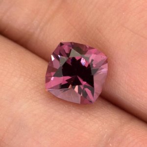
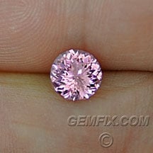
So these are my choices. A purple pink spinel or the bright one
and I intend to put one of them into a LOGR milgrain halo.

Appreciate your input anyone.

Peggy
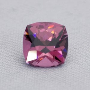
_29049.jpg

spinel_316_a.jpg
 
The two are as different as night and day, colour-wise. Any hand shots of the cushion spinel? The cushion is a darker puplish hue whilst the round is a lighter icy pink. Which is your preference?
 
Hi,
I know - but I really like them both. The pink sparkly one is sort of the 'I really want it but not really practical' and the other is more wearable I think - almost more elegant IMO. There is also a difference in price. They are about the same size.
Will see if I can find any more pictures of the cushion.
Thanks
Peggy
 
IMO the only thing that would make either of them unwearable would be the setting. Both are very nice stones for entirely different reasons.

The top one will be a bit darker in certain situations than the bottom. But basically, you basically have to decide what you like more in this instance.
 
Why do you think the round light pink is not practical? Don't ding the poor thing just because it is cut to be very sparkly.
The darker cushion will not be as flashy but the flash that it gives will be larger (slower speed and less often).
 
I posted the first one to the SGBTS thread, so you know I like it, but that said, I am a sucker for those baby pinks! Given how they are cut, it is likely that the second will have more brilliance; the first will have broader flashes. I would definitely ask the vendor of the first how it behaves in various lighting conditions (actually, that is a question one should always ask) and hopefully get some hand shots from him.

They really are completely different - the first is a bit more subdued; the second is a more typical color and cut (but don't get me wrong - beautiful).

Edited for typos: Oops! I mixed up their order - now I've corrected it. :oops:
 
I know ...the pink one was the one I saw first and it IS very sparkly and sparkly was all I really wanted.
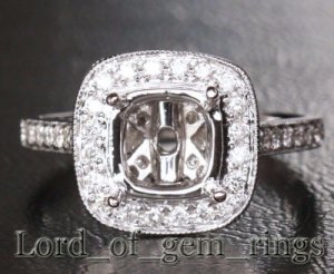
Was looking at this setting for either of them - although ask for the round basket for the pink one. I started off wanting a pink sapphire but saw the spinels on this forum and loved them.
Thank you for your comments....will have to go and make a decision!
Peggy

semi_mount.jpg
 
Like Chrono said, a hand shot of the square would be needed. I am familiar with this vendor and have a hard time making heads or tails of what's going on in his pictures. Almost all the pictures of stones he post's appear to exhibit blue and purple (among other colors) light return.
 
So a safer bet may be the pink sparkly one in your opinion.... Africa Gems have some pretty ones also. A softer color in a cushion cut.
Before I wanted a pink sapphire I had my heart set on a cornflower blue sapphire having visited Sri Lanka many many years ago. Too much choice!
 
I have this now as a comparison to sparkly pink. What do you guys think?
Would it still look ok or is one to stay clear compared to the other?

hand_shot_spinel.jpg
 
Both photos show a large band of extinction throughout the middle of the stone.
 
Ok - many thanks - not as sparkly as I was hoping for then!
 
GregS|1429028470|3861717 said:
Both photos show a large band of extinction throughout the middle of the stone.

Which is very possibly camera shadow. I dunno the vendor but it looks precision cut and if so, it's hard to believe they cut it with bad angles but idk really.

Regardless, I like the round. Never been a fan of medium dark/dark pink in spinel.
 
Its hard to know, but if all we have to go on is photos, then it sure looks like there is a good deal of extinction. With that cut, since it is broader facets, it might not take much for camera shadow to appear, but at this point, I can't tell and probably wouldn't chance it unless you asked him. He is kind and extremely honest.
 
Thank you - I did like the color and thought it would look nice in the setting. I will ask him and see what he says.
 
peggy222|1429027170|3861707 said:
I have this now as a comparison to sparkly pink. What do you guys think?
Would it still look ok or is one to stay clear compared to the other?

Its not my favorite, to be honest. I like purple but hmmm...that looks really flat. Maybe its the light being used. The extinction may well be the camera reflection (as many cameras are black). depends on the interest, I would ask. I also would not halo that stone either as its too dark for my personal comfort.

The pink stone is pretty. Will likely darken a little bit but it won't go dead if you halo it.
 
Arcadian|1429032842|3861763 said:
peggy222|1429027170|3861707 said:
I have this now as a comparison to sparkly pink. What do you guys think?
Would it still look ok or is one to stay clear compared to the other?

Its not my favorite, to be honest. I like purple but hmmm...that looks really flat. Maybe its the light being used. The extinction may well be the camera reflection (as many cameras are black). depends on the interest, I would ask. I also would not halo that stone either as its too dark for my personal comfort.

The pink stone is pretty. Will likely darken a little bit but it won't go dead if you halo it.

Thanks for your comments Arcadian. I really like that type of setting - which stones sit better in them? Much lighter ones?
 
Hi,


I am just loving the light pink. You can see the dispersion in it. I have a thing for light pink spinels. The other color is nice, but only you can choose the color you like.

Annette
 
Will you be using a white metal? I have found that baby pinks can kind of die in white metal, don't know if others have experienced that as well...
 
Hi - Yes I was going to use white gold. Would you suggest yellow instead?
 
peggy222|1429037076|3861794 said:
Arcadian|1429032842|3861763 said:
peggy222|1429027170|3861707 said:
I have this now as a comparison to sparkly pink. What do you guys think?
Would it still look ok or is one to stay clear compared to the other?

Its not my favorite, to be honest. I like purple but hmmm...that looks really flat. Maybe its the light being used. The extinction may well be the camera reflection (as many cameras are black). depends on the interest, I would ask. I also would not halo that stone either as its too dark for my personal comfort.

The pink stone is pretty. Will likely darken a little bit but it won't go dead if you halo it.

Thanks for your comments Arcadian. I really like that type of setting - which stones sit better in them? Much lighter ones?

I have this setting with a pink tourmaline in it that depending on the lighting situation goes quite purple, but does not black out. Its really an interesting stone considering its pretty much baby pink when I'm indoors! :lol: So, I don't think you have to go really light, but, I think that you have to be careful of the type of stone you put in a halo setting. its also a precision cut which of course helps a lot for any stone IMO.

When you halo a stone, picture a stone going 1-2 shades darker. In some cases it can even be more than that depending on the stone color and cut. So I think that unless you've seen the stone in all types of lighting, imo its a bit of a risk. I could of course be totally wrong, but I'm only going off the image I'm seeing. The stone looks (to me) to be a rather flat purple. I don't really see any nuances of other colors there.

If you're the type to just take the chance because well..you can...then it could be totally worth it. However, if you really want a sure thing, go with the pink portuguese cut stone. It will deepen but never black out...not with the type of cut on it.
 
Both appear beautiful and well cut. I suspect #1 may darken a little and will always be more "low key" in brilliance (yet very elegant!) whilst #2 is a bright flashy stone will will be more suited to halos. I think go with your gut, it you liked the baby pink one - go for that. :wavey:
 
I think the sparkly round in pink will look beautiful in a halo, I love the darker purple but I have reservations about its performance based on the second photo.
 
peggy222|1429024014|3861680 said:
Hi,

Just before I pull the trigger on a stone, I would appreciate some feedback on my possible purchases.
Budget is small with college costs looming and the ring is almost 12 months late because...well because we always are too busy doing daily stuff.
So these are my choices. A purple pink spinel or the bright one
and I intend to put one of them into a LOGR milgrain halo.

Appreciate your input anyone.

Peggy
The top one looks to be a dark plum color, and it will only darken in a halo. I think it would look best in yellow gold.

The bottom one is light pink, and hopefully as saturated as the photo suggests, and I can see it in a halo, but I think yellow gold would best suit it. White metal will wash it out.

Here's my purplish pink spinel in a two tone LOGR halo. Hope these pics help, although I think the tone is in between both stones. Not as light as the round, but not as dark as the cushion.

[URL='https://www.pricescope.com/community/threads/pink-spinel-cushion-in-two-tone-18k-legacyesque-setting.170646/']https://www.pricescope.com/community/threads/pink-spinel-cushion-in-two-tone-18k-legacyesque-setting.170646/[/URL]
 
Thanks for that input...your ring is so beautiful and I can see how the yellow gold would help the color. Did you make any changes to the diamonds in the ring or are they the standard ones?
Going to continue to mull over the decision!!
 
peggy222|1429095611|3862122 said:
Thanks for that input...your ring is so beautiful and I can see how the yellow gold would help the color. Did you make any changes to the diamonds in the ring or are they the standard ones?
Going to continue to mull over the decision!!

Thanks you! It's a totally upgraded ring, 18K gold, with upgraded clarity and full cut diamonds. I'm not sure what LOGR is using these days for their standard items, but the clarity might be poor, and the diamonds may be single cuts. The gold is more buttery than their standard 14K gold mounts. I haven't bought from LOGR in eons, but I do remember towards the end, I had to constantly upgrade the diamonds, as they were very bad if you didn't, and non-consistent.

I will say that the nicer LOGR's I have looked virtually identical in diamond weight and metal work to the ones I saw at Tiffany in person. This particular design is meant to emulate the Tiffany "Legacy" and the only difference I could see is that theirs are bezel set (poorly too, I might add), and the LOGR has prongs. I do have multiples of this ring since I love the style, but I have one that I won on auction, and it's really bad workmanship and very poor single cut diamonds.
 
GET 3 FREE HCA RESULTS JOIN THE FORUM. ASK FOR HELP

Featured Topics

Top