MamaBee
Super_Ideal_Rock
- Joined
- Mar 31, 2018
- Messages
- 14,534
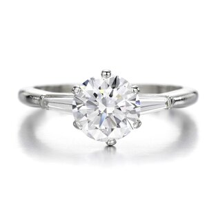
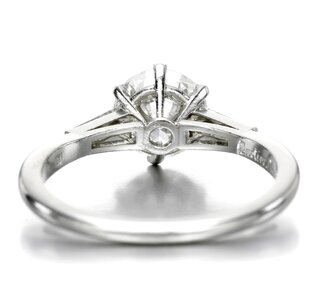
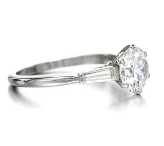
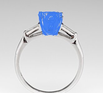
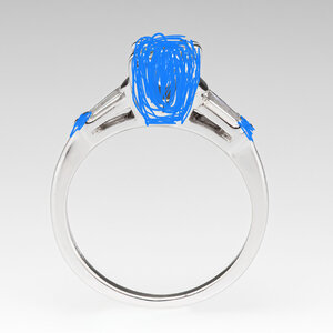
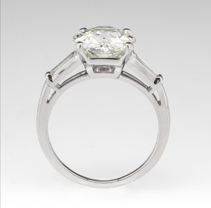
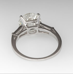
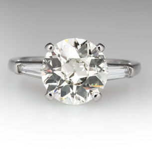
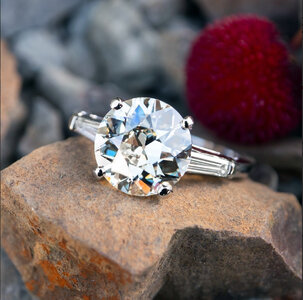
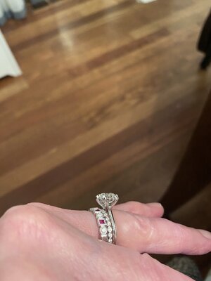
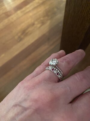
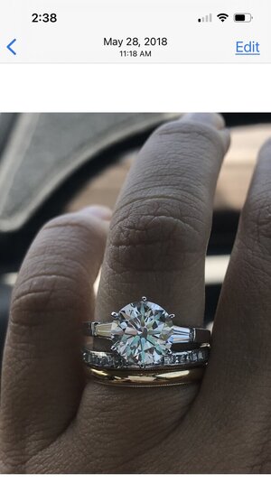
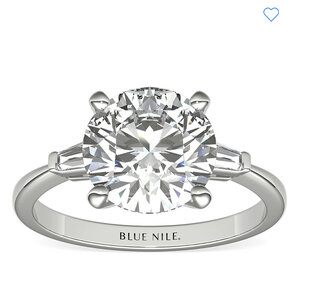
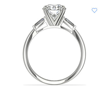
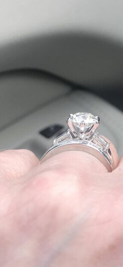
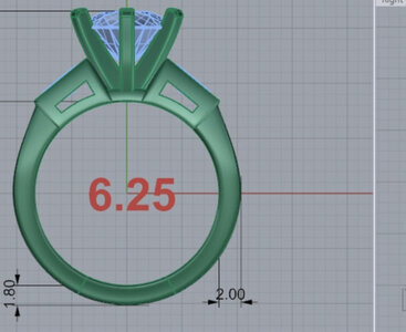
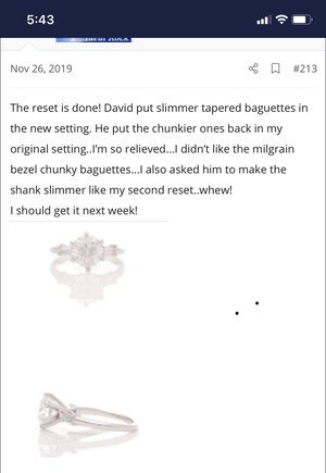
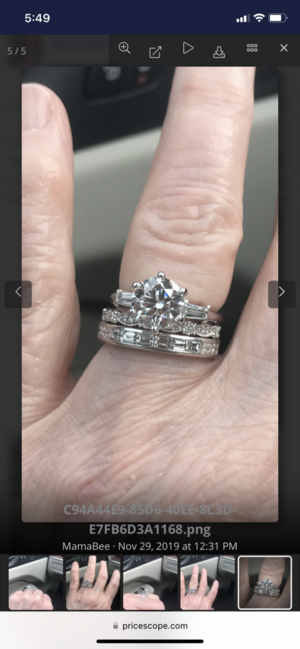
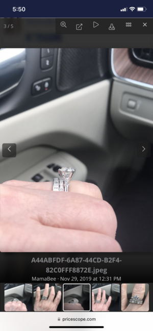
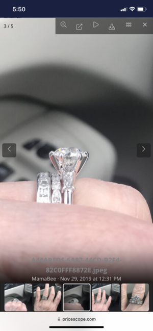
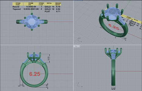
I completed my final upgrade last year to “Winter” my 3.01 ACA. I had her set in a Valoria setting from Whiteflash. I love the setting but I miss my tapered baguette setting. I don’t want it exactly like my last one. Libby, my former 2.03 diamond, looked like she was swallowed up in the setting I had done. It was close to a very low set vintage Tiffany. It bothered me so I reset her yet again to a higher setting. She looked much bigger in that setting but it was still not what I wanted even though David did everything I told him to do. This time I want to get it right. I want it like Goldilocks..not too tall…but not too low.. Winter is larger than Libby so I’m not too concerned about her being swallowed up..I’m not a fan of the tapered baguettes coming up so high on the sides. Ideally I would love the baguettes to be as low as possible with the head more defined. I love the swoopiness (I made that word up..
 ) of the Valoria setting. She looks like she’s cradled in a bowl. I would love a six prong setting too...but I don’t want a thick prong bar in front of the side view..I think I would change the prong orientation to avoid that. I also don’t want the baguettes to look like epaulets..So far I have a few inspiration photos. I love the side view of the Valoria setting. How do I incorporate the baguettes with the swoopiness. Do they go together? Also, what size baguettes would I need? I don’t want them too long or too short..I seem to have the Goldilocks syndrome…Any thoughts would be appreciated! @nala @mrs-b?
Attachments
-
 92B77309-7534-4DB1-8FA9-068691A0EE75.jpeg74.9 KB · Views: 30
 -
 13B19297-4FFA-4B3A-8E25-934D53B7743B.jpeg79.6 KB · Views: 26
 -
 D64E3D20-DF2C-4D21-AA3F-D70450E17A42.jpeg62.4 KB · Views: 27
 -
 EAA2A49D-63FB-4DA0-A251-4F1F0DC989C9.jpeg165.9 KB · Views: 24
 -
 F71D7AC6-1A50-4D3A-95DF-FB2CE43A66AB.jpeg446 KB · Views: 23



300x240.png)