shape
carat
color
clarity

Which invitation?

Status
Not open for further replies. Please create a new topic or request for this thread to be opened.

zoebartlett

Super_Ideal_Rock
Joined
Dec 29, 2006
Messages
12,461
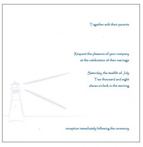
We''re torn between two invitation styles. I had to resize them and take the personal info. off, so I apologize if the quality isn''t the greatest. Which one do you prefer, the one on the left or the one on the right?

Our printer has asked that if we post her work, we also post her website. I hope it''s okay to do so here. www.albertinepress.com
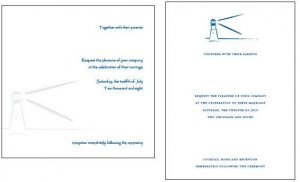
lighthouseinvites.JPG
 
I like the one on the right. Also, another thing to consider, the one on the left looks like it might be square, the US post office charges more for square envelopes since it can jam the machines.
 
I like the rectangular ones. Less postage, and they are bolder.
2.gif
 
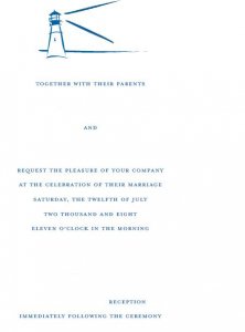
Yikes! Sorry -- they''re really hard to read or see the full detail but they are really pretty in real life, honest. The one on the right is in all caps, although we could change that if we wanted. The lighthouse on the left hand invitation is supposed to be more muted, almost fading, if that makes sense. The one on the right is your standard image that is centered on the card. The lighthouse is the same one that was used on our save the dates.

I didn''t realize that square cards cost more to mail. I suppose that''s something to consider. Thanks gtn!

Thanks Gypsy! I''ll give it more thought.
 
I like the one on the left. The thing I don''t like about the one on the right is that everything is centered and evenly spaced. Nice for a flyer. But I like the one on the left better for a wedding invitation- also like that the drawing not as bold as the writing..more of a subtle accent.
 
I think the one on the left looks more casual, which I prefer, so that''s my choice. Plus, I generally prefer squares to rectangles.
 
i like the one on the left too!
 
The one on the left. But whomever said the postage will be more for those is right. Its ridiculous how they charge extra for anything with an "irregular" shape. So, I would check into that before you make any final decisions....
2.gif
 
Was any of the personal info. you took out supposed to be above the lighthouse pic on the one on the left? With the blank space above the pic., that one looks a bit unbalanced to me (but my ocd mind loves things to be symmetrical) and maybe that''s the way it''s supposed to be. I like the faded pic. effect, but I like the centeredness of the one on the right better.
 
Okay, I think that's two votes for the right and five for the left. I'll try to resize them so they're a little more clear. Sabine, yes, our names are above the lighthouse. This is how it should read:

Together with our parents

Zoe Bartlett & FI last name

Request the pleasure of your company

at the celebration of their marriage

Saturday, the twelfth of July

Two thousand and eight

Eleven o'clock in the morning


Venue
Venue address
Town, Maine


Reception immediately following ceremony
 
Hopefully this is a bit bigger.

biggerinvitation.JPG
 
I like the layout of the square one, but I like the font better on the rectangle one. I think the font on the square one is just a little too casual.
 
I like the one on the right a little better too. I''m with Sabine that the blank space above the lighthouse on the other makes it look a little unbalanced.
 
I prefer the one on the left. I think as someone else said it''s more casual and I just prefer it in general.
 
Hi, Zoe!

I LOVE your lighthouse motif! I prefer the one on the right, but only because I tend to like all things traditional when weddings are concerned. While this layout isn''t that of a traditional formal invitation, it is far closer than the one on the left. I''m also with Sabine that all of that blank space above the lighthouse on the other invitation just doesn''t look right to me.
 
I vote for the square one simply because I love square invitations. But, I am biased because that''s what I had (and they did indeed cost a good bit more to send...something like 96cents, but they don''t make a 96 cent stamp, so I had to do $1 stamps)
I also like the faded look of the lighthouse on the square one.

However, both are very cute.
 
Thanks for your opinions everyone! I e-mailed the printer and asked if she could make the lighthouse on the square invitation a little bigger. It will still have the same faded look, compared to the rectangular invitation. I''ll post pics of that one if possible when I see it.
 
I like the one on the right for a wedding invitation. The other one looks great for a casual summer party, to me. The extra postage would definitely seal the deal for me regardless!
 
I like the one on the right, and I don''t like the idea of having to pay more for shipping the square ones!
 
I like them pretty equally. With the extra postage on the square one, though, my vote is for the one on the right!
 
Okay, we chose the one on the right. Thank you for your opinions! We did get a proof of the other one but we decided to just go with the one on the right instead. Now though, I''m not crazy about how the font is in all caps. We''ve played around with different fonts but I don''t see one I really love. Here is a bigger picture and again, the large white space is just the personal info.

the one we chose.JPG
 
Status
Not open for further replies. Please create a new topic or request for this thread to be opened.
GET 3 FREE HCA RESULTS JOIN THE FORUM. ASK FOR HELP
Top