shape
carat
color
clarity

Cushion modified brilliant vs Old miner help

peachflower

Rough_Rock
Joined
Sep 10, 2024
Messages
23
Hi everyone, I am new here (and new to diamonds)! My boyfriend and I have started shopping around for the perfect OMC stone for my e-ring. We are looking at a couple stones, and I was hoping to get some advice on if these are good options?

Stone A is listed as a Cushion Modified Brilliant, J VS1. The jeweler told me that Stone A is still an antique cushion cut, but I am concerned since it was classified as a Cushion Modified. It has a culet, but it's sort of elongated... could this still be considered an Old Mine? Here is the faceting pattern for Stone A.
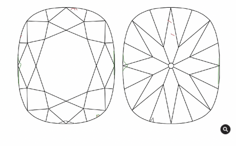
A.png

Stone B is an Old Mine Brilliant L SI1. I love the faceting pattern on this one more, but I am afraid will be too warm in most lighting? Here is the faceting pattern for Stone B.
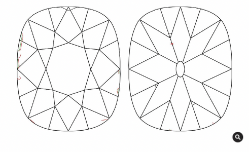
B.png

Pictures of stones together - Stone A on top, Stone B on bottom
Does Stone A have the soft romantic glow of Old Mines?
Does Stone B appear kind of dark?
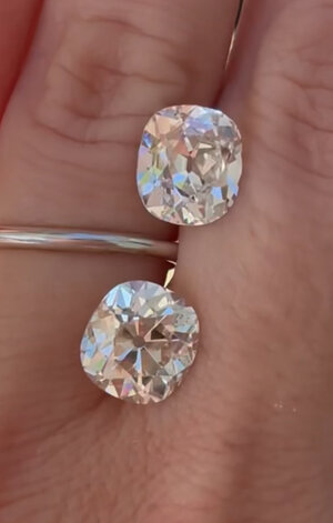
stones.jpg

TIA for the help! :)
 
It's a bit tricky to assess with just one photo however I love option B. It has similar faceting to my baby K. Which one do you prefer?

Here's a link to my thread for baby K https://www.pricescope.com/communit...-5-68ct-m-si1-omc-platinum-ring-by-dk.283188/

It's hard to tell your tolerance for colour. My stone is an M and while it's not icy white it's got a little bit of warmth. But I actually prefer old cuts that aren't white white.

Do you have videos of them together? You'll probably need a video indoors, outdoors, and in different lighting conditions to assess this properly.
 
Last edited:
Can we see the certs? The bottom one seems like a true antique. The top one could be newly cut-the keel facet is a giveaway.
 
I worry less about the naming convention and whether the stone fits every criterion GIA looks for in what
they categorize as an Old Mine Brilliant (that's just me). What's more important to me is how the stone looks.
Stone A does look like an old cut stone (which I assume is what you are looking for).

In my opinion, Stone A does have that soft antique glow. Stone B may appear darker under the table (it may be deeper
than Stone A)...you should post the whole report(s). This is somewhat typical of an Old Mine brilliant so not surprising.

I think you should go with the stone that you like the look of and worry less about what name GIA gives it (as long as its
an antique stone). You will be looking at the stone day to day, not the GIA report.
 
Can we see the certs? The bottom one seems like a true antique. The top one could be newly cut-the keel facet is a giveaway.

@lulu_ma @tyty333 here are the certs! let me know if anything stands out as a red flag or anything

i am trying to figure out how to share videos!

@maryjane04 your stone looks amazing! i told myself i am okay with a K, and stone B happens to be an L, so I was just worried it would be slightly warmer than my limit. but i'm not sure i can't really tell in the videos too much, so hoping to get some more opinions once i upload!

@tyty333 that is true, i definitely want to love the look of my stone. i just worry stone A doesn't have the same soft sparkle as stone B! would love more input!
 
Last edited:
I'm no help but I just wanted to let you know that I'm looking at similar types of stones. Hopefully we'll both have beautiful rings to share in a couple of months! Good luck!
 
I'm no help but I just wanted to let you know that I'm looking at similar types of stones. Hopefully we'll both have beautiful rings to share in a couple of months! Good luck!

Hi! I just saw your recent post as well! That stone you're considering is so beautiful! Hope you end up with your dream stone :)
 
I don’t like stone A. The faceting is not crisp. If I had to guess I would say it is shallow and the effect is a bit of a flat look without enough contrast.

Stone B is a gorgeous antique. The central facets look how they are supposed to look in this type of cut. This is just what antique stones of this make look like! Better viewed from a slight angle. I don’t see over darkness. The lower girdle facets are basically nonexistent in these oldies and so you have big huge facets under the table. It creates lots of contrast. I like it a lot! That diamond is probably cut pre-1860. Don’t judge it by modern standards.

Can you post lab reports? How are the girdles?
 
Just saw the lab reports. So stone A isn’t shallow, just not the best cut. Both diamonds have extremely thin girdles. You will have to consider that when setting either.

By the way the darkness you see on stone b isn’t called a bow tie in these oldies, it’s called a Maltese cross! And it’s a feature, not a bug.
 
Okay so looking at everything stone A is most definitely a newly cut antique style. It's not shallow but I feel it only looks white and lacks the fire/contrast. The facets are supposed to turn on and off and this one doesn't have that.

I'm biased I guess because my preference is really for the faceting of stone B. The darkness that you see is not apparent all the time. When you put something in front of the stone it'll appear that way. When you move the stone around the contrast pattern makes it a more lively stone.
 
I don’t like stone A. The faceting is not crisp. If I had to guess I would say it is shallow and the effect is a bit of a flat look without enough contrast.

Stone B is a gorgeous antique. The central facets look how they are supposed to look in this type of cut. This is just what antique stones of this make look like! Better viewed from a slight angle. I don’t see over darkness. The lower girdle facets are basically nonexistent in these oldies and so you have big huge facets under the table. It creates lots of contrast. I like it a lot! That diamond is probably cut pre-1860. Don’t judge it by modern standards.

Can you post lab reports? How are the girdles?

Okay so looking at everything stone A is most definitely a newly cut antique style. It's not shallow but I feel it only looks white and lacks the fire/contrast. The facets are supposed to turn on and off and this one doesn't have that.

I'm biased I guess because my preference is really for the faceting of stone B. The darkness that you see is not apparent all the time. When you put something in front of the stone it'll appear that way. When you move the stone around the contrast pattern makes it a more lively stone.

Thank you for the replies! Yes I agree with you @Dreamer_D the faceting did not seem as crisp! That is how I was feeling but you put it into words for me! Could you explain a bit more about the thin girdle and what I need to worry about when setting it? I like the look of solid baskets, but worry that will impact how the stone shines?

@maryjane04 I also like Stone B's facets and I guess you're right, the darkness isn't too bad I just wasn't sure if it was something worth passing on the stone for?

Does anyone think it's too warm for a white gold setting? It seemed warm in the video above, but appears pretty white/bright to me in this picture:
Thank you again for the help, everyone! I am very new to all this and am learning a lot from you all! :) <3
 
The L color is definitely the more charming of these two. Is it possible for you review it at home for a few days in different lighting conditions? Then you can make sure that you like the color and play around with metal colors.
 
I have a M coloured omc in platinum and don't think it's too warm although that's a personal preference. Some stones work better in yellow or white gold.

As for whether it's worth passing for.. it should be cheaper than the J and if you feel it's reasonably priced and the tint doesn't bother you then it's fine. The faceting/cut is not the factor that you should worry about.
 
The L color is definitely the more charming of these two. Is it possible for you review it at home for a few days in different lighting conditions? Then you can make sure that you like the color and play around with metal colors.

I have a M coloured omc in platinum and don't think it's too warm although that's a personal preference. Some stones work better in yellow or white gold.

As for whether it's worth passing for.. it should be cheaper than the J and if you feel it's reasonably priced and the tint doesn't bother you then it's fine. The faceting/cut is not the factor that you should worry about.

I agree the stone B is definitely the one I'm leaning towards now thanks to everyone's helpful words.

I feel like I cannot decide if the tint bothers me too much without seeing it in person. I am going to request to see it so I can compare in different lighting myself! @maryjane04 Your M colored stone looks amazing, I don't think it's too warm at all.

I guess I'm wondering if I should just commit to this one or wait and see if another similar (possibly whiter) stone comes along... I'm so indecisive!
Have you been able to see a good number of old cuts in person? The L definitely has potential.
 
Have you been able to see a good number of old cuts in person? The L definitely has potential.

I have seen a few in person and that is when I decided J/K was the target color range for me and for the budget! But this L's faceting pattern is so beautiful that I'm worried I'd be sad to let her go... other J/K options I've seen sometimes have more obvious inclusions or were smaller than I wanted.

I will wait to see the L in person and see if that helps me make up my mind! If this stone was a slightly whiter K, I would immediately say yes! :')
 
How will you set it? The tint will show mostly from the side, so make sure that you check that out in a stone holder type ring so you can see if it bothers you. From the top, it will look whiter than from the side.
 
I don't really care about tint in old cuts personally, or inclusions I can't see from normal viewing. This diamond is like 150 years old! She doesn't need to be clear and white. She is gorgeous! Cut is by far the most important.

My diamond is an L and set in platinum prongs (yellow gold shank). Looks great to me, but as I said, I don't care about tint anymore. With all these lab diamonds around I think a little tint in a natural diamond is a nice reminder it was baked in the ground.

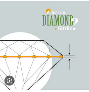
An extremely thin girdle will need protection to avoid chips. Bezel or 8 prong setting should be fine. Cannot be a 4-prong as that leaves the razer thin girdle exposed and may lead to chips.
 
Ok I came in to say, sheepishly, I kind of like A better… but I don’t know anything about diamonds other than what I like, and I just liked A more. It just looked brighter and whiter and I think that’s what sold me. But I’m reiterating that I’m not a diamond expert!! Just thought maybe it’s good for me to mention the contrarian option lol.

I will say that you absolutely need to see stone B, if that’s what you go with, in multiple lighting conditions before you commit, and really think long and hard about whether you’re okay with the colour or not. I have made the (expensive) mistake of buying a pair of old cuts (admittedly much lower than your L, at OP) because I was ok with the colour most of the time, and I loved everything else about the stones, but then over time developing a creeping dislike for the colour which eventually led me to need to sell them. I really would hate for that to happen to you.
 
Ok I came in to say, sheepishly, I kind of like A better… but I don’t know anything about diamonds other than what I like, and I just liked A more. It just looked brighter and whiter and I think that’s what sold me. But I’m reiterating that I’m not a diamond expert!! Just thought maybe it’s good for me to mention the contrarian option lol.

This is also really good advice! If you can see the stones and make a decision based on what you like - not what we like haha. I can honestly say though that old cuts are different in the they have more personality with a little bit of warmth. But if white and bright is what's important to you then B may not be your stone. It's really interesting to know what draws your eyes first. For me, I see the cut/faceting first, colour second and clarity last.
 
How will you set it? The tint will show mostly from the side, so make sure that you check that out in a stone holder type ring so you can see if it bothers you. From the top, it will look whiter than from the side.

I don't really care about tint in old cuts personally, or inclusions I can't see from normal viewing. This diamond is like 150 years old! She doesn't need to be clear and white. She is gorgeous! Cut is by far the most important.

My diamond is an L and set in platinum prongs (yellow gold shank). Looks great to me, but as I said, I don't care about tint anymore. With all these lab diamonds around I think a little tint in a natural diamond is a nice reminder it was baked in the ground.

An extremely thin girdle will need protection to avoid chips. Bezel or 8 prong setting should be fine. Cannot be a 4-prong as that leaves the razer thin girdle exposed and may lead to chips.
You're really starting to convince me more. I'm really excited to see the stone in person to gauge if it's really too warm for me or not!

I am honestly still open when it comes to settings, so if anyone has suggestions, please let me know! I know I want white gold and don't want the stone to look too square.

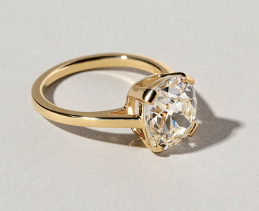
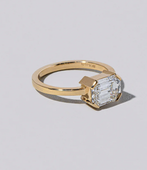
I like the look of flat tab prongs (?) like this image below. Would this be a bad option with the thin girdle?
Screenshot 2024-09-11 at 5.51.55 PM.png

I also don't mind the look of a solid, closed basket sort of like this? Not sure if a solid basket impacts the sparkle of the stone though?
Screenshot 2024-09-11 at 5.59.50 PM.png
 
Ok I came in to say, sheepishly, I kind of like A better… but I don’t know anything about diamonds other than what I like, and I just liked A more. It just looked brighter and whiter and I think that’s what sold me. But I’m reiterating that I’m not a diamond expert!! Just thought maybe it’s good for me to mention the contrarian option lol.

I will say that you absolutely need to see stone B, if that’s what you go with, in multiple lighting conditions before you commit, and really think long and hard about whether you’re okay with the colour or not. I have made the (expensive) mistake of buying a pair of old cuts (admittedly much lower than your L, at OP) because I was ok with the colour most of the time, and I loved everything else about the stones, but then over time developing a creeping dislike for the colour which eventually led me to need to sell them. I really would hate for that to happen to you.

This is also really good advice! If you can see the stones and make a decision based on what you like - not what we like haha. I can honestly say though that old cuts are different in the they have more personality with a little bit of warmth. But if white and bright is what's important to you then B may not be your stone. It's really interesting to know what draws your eyes first. For me, I see the cut/faceting first, colour second and clarity last.

Thank you for all the advice! I agree, I NEED to see it in person. This is a big purchase, so definitely want to make sure I'm 100% happy with the color. I just don't want to be in a position where I pass on the stone and don't end up finding another one in this size with the beautiful cut/faceting... :(
 
You cannot set an extremely thin girdle in a four prong setting like that. The exposed girdle will chip. It must be protected with lots of prongs or a bezel.

EDIT the basket has nothing to do with it because the girdle sits above the basket in prong setting. This yellow part is the girdle.

1726104332078.png
 
To my eye, the bottom diamond looks like a true antique cut. The top - A - while being a very nice stone, does not. Diamond B by a football field. And it's a light L.
Old saying: " A good horse is never of a bad color."
 
Throwing this out there, my antique old cut is classified as a modified cushion brilliant. It is most definitely an old cut. All 4 sides are bruited. The outline is the wonky shape of the diamond crystal. The table is 52%, it has a culet. There are certain criteria an old stone must hit to be an Old Mine Cut, but listed as an modified cushion brilliant does not necessarily mean a diamond is not antique.
 
You're really starting to convince me more. I'm really excited to see the stone in person to gauge if it's really too warm for me or not!

I am honestly still open when it comes to settings, so if anyone has suggestions, please let me know! I know I want white gold and don't want the stone to look too square.

I like the look of flat tab prongs (?) like this image below. Would this be a bad option with the thin girdle?
Screenshot 2024-09-11 at 5.51.55 PM.png

I also don't mind the look of a solid, closed basket sort of like this? Not sure if a solid basket impacts the sparkle of the stone though?
Screenshot 2024-09-11 at 5.59.50 PM.png

I don’t think a closed basket setting always impacts sparkle, but I think this look is extremely modern and doesn’t really suit the look of an old cut diamond!

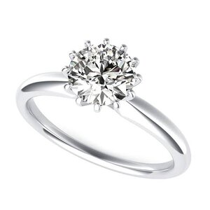
Also, 4 prongs - even tab prongs, will leave too much girdle exposed.

What do you think of 8 or 12 prong settings?

IMG_7002.jpeg

This is still very modern, but I included it to show what 12 prongs together look like. I think it looks great if you can do delicate claw prongs (these are too overwhelming for me).

IMG_7003.jpeg

I’m kind of obsessed with this.

IMG_7004.jpeg

Not this specific setting, but perhaps incorporating a faux bezel for safety?

IMG_7005.jpeg

With or without a halo? (This is a CVB design, I got it off Google, but I’m pretty sure someone on PS has either this exact ring or something similar)

IMG_7006.jpeg

The floweriness of this design is killing me (but in a good way).
 
@Dreamer_D @AllAboardTheBlingTrain Thank you so much for the information and suggestions! I am learning so much!

I don't think I love the look of so many prongs :( but the faux bezel is catching my eye... I have not really heard of that before, how does it differ from an actual bezel? Is it because of the prongs?

I love the look of tab prongs like in the 1st screenshot I shared... is there any way to incorporate those?
 
A faux bezel would be great. A full bezel may make the stone look more tinted.

Here’s a pic of my former M color in a faux bezel.

IMG_1807.jpeg
 
A faux bezel would be great. A full bezel may make the stone look more tinted.

Here’s a pic of my former M color in a faux bezel.

IMG_1807.jpeg

OMG that looks so white how is that an M!!?? Amazing!! You are giving me hope about the L being white enough!

What lighting should I test my stone in? I've noticed it looks very white in outdoor and low light. Want to make sure I see it at its warmest and see it in the what may be more common lighting.
 
GET 3 FREE HCA RESULTS JOIN THE FORUM. ASK FOR HELP
Top