- Joined
- Feb 2, 2016
- Messages
- 12,160
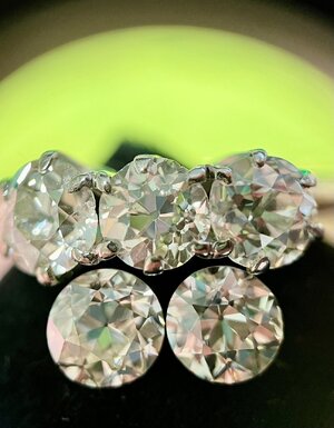

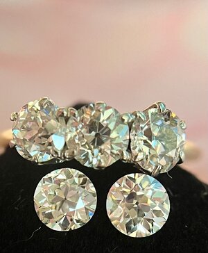
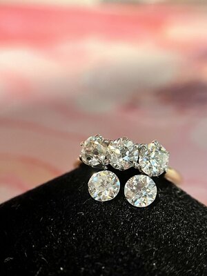
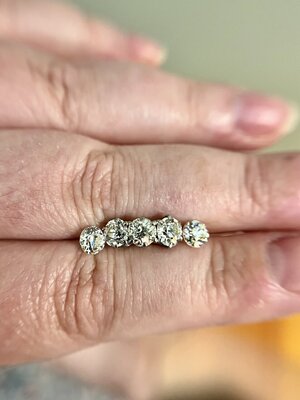

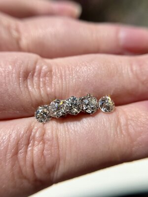

I mean, I ain't gonna stop yah.
Yay, shuffle puffle time! What's the lineup? What's the lineup?
Whaaaaat's the lineuuuuup, doot doooo

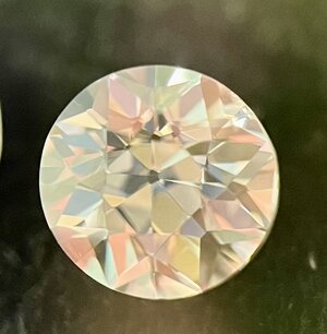
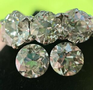
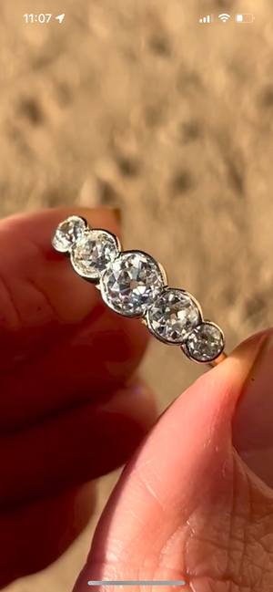
The lineup the lineup! I think Linda gets the place of honour both because she is the most round (the others are slightly cushiony) and because she is the most perfectly proportioned of the bunch. The Miss K and Miss Perfect, who are each a little cushiony and also very clean. Then the ugly step sisters on the ends. Each a little wonky but still lovable. Of course these are super magnified images. In person they just look like little sparkly circles.

These names just crack me up!
Amazing! This is going to be so glorious. Have you decided on a setting?
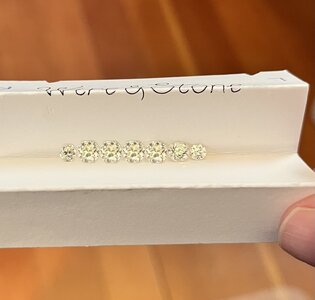
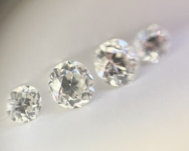
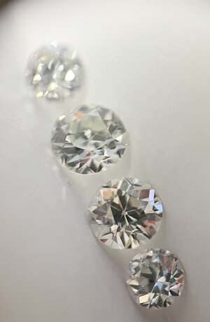
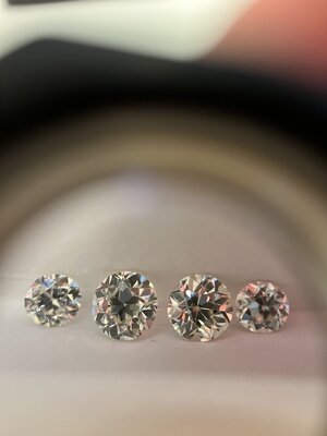
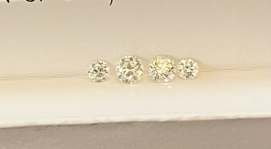

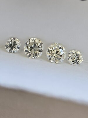
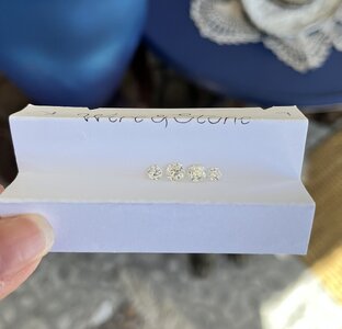
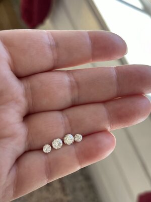
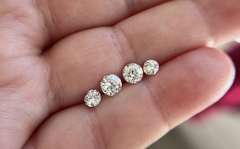
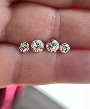
No! I have some finalist ideas and I will need everyone's help to decide.
First decision is whether to add my little guys on the end?
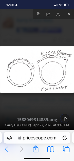
My ring size is a 10+ (depending on the finger) so there is probably room...
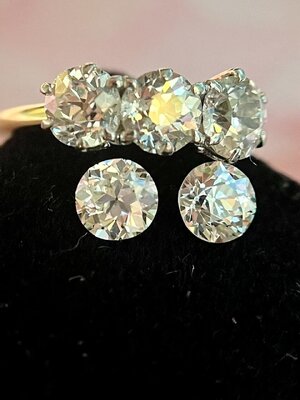
Earlier in the thread I talked about comparing the color of the little stones to the bigger ones and thinking the small ones -- which are GIA H/I -- were too tinted to pair with the bigger stones, which are in the J/K/L range.
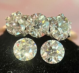
But I'm not so sure now. Old cuts are leaky, which means they often reflect the color of the surface under them. My suite is set in a mount that has some darkened metal on the inside. It makes them appear a little darker bodies than looks stones set beside them. But now I have two large stones loose with GIA grades. And comparing them to the small guys in lots of different lighting... it looks OK to me? Like, I can see a slight color difference in some light, but the size difference and brightness really masks it.
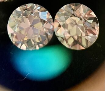
Color comparisons.

Usually I am a stickler about color match but to my eyes the littles work with the bigs.
Add the littles IF the ring width will be comfortable with them. Will you get a wax mold?
I am also a color stickler which is why I was so surprised to see that in person while I can see a slight difference, it is not bothersome and it doesn’t detract. Face down it’s much more apparent, and I don’t think I would like two similar size diamonds with such different colors, but somehow this seems ok to me.
I think I will be able to get a wax from the vendors I am considering. I am certain the ring with all 7 stones would work with my pointer. It might be a little more touchy if I size it for my ring finger. But let me share the designs I have been considering because in some ways these decisions are all depending on each other.
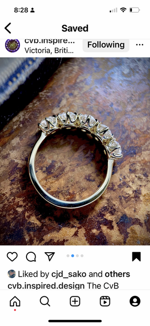
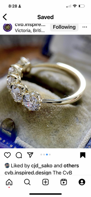
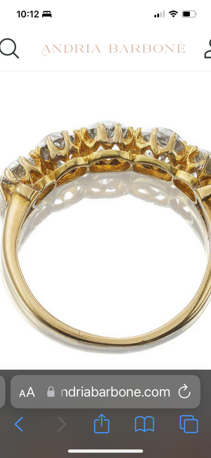
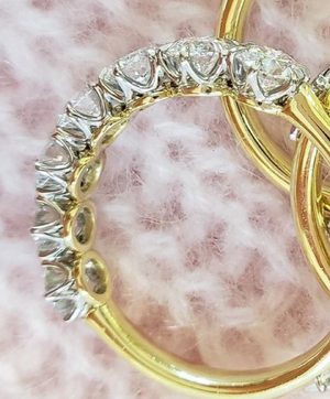
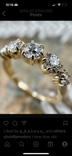
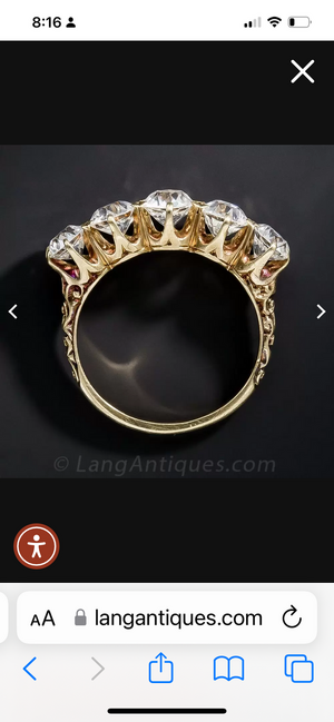

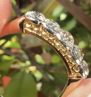
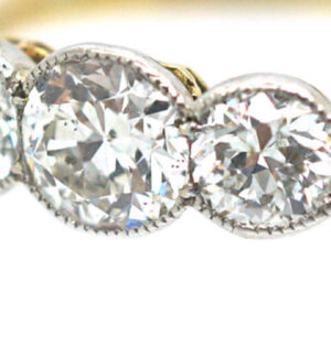
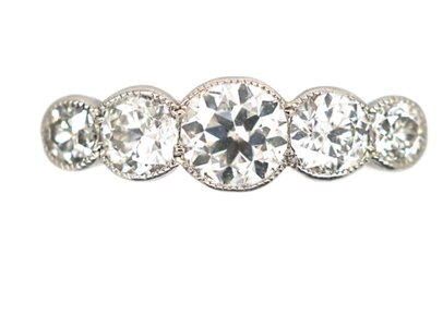
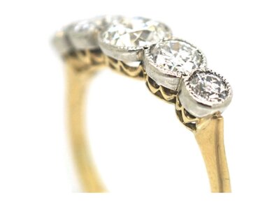
Setting option 1
Classic Victorian style. I’ve seen a few variations. Could be all yellow gold or yellow gold base and platinum prongs like my three stone.
CVB’s version is classic perfection.
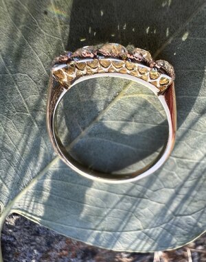
Barbone’s version is very low, which I like. It has so many prongs!
DK made this lovely version for @mrs-b which is basically perfect. I love the two tone and it’s very low profile.
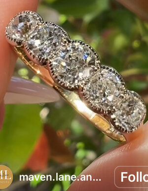
Sholdts version is attractive bc it’s a little modern. The diamonds are spread out for coverage and the setting makes each stone individual. I think @mayaINaU has this, I’d like to hear her thoughts on it, especially what she thinks about the prongs as they are a strong design element.
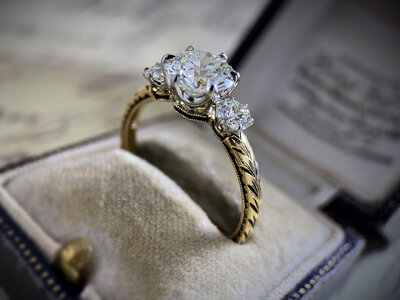
Classic Victorian, love the carved shank and the belcher style prongs without an obvious/distinctive donut.
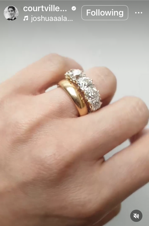
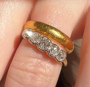
What I like about this option is that having it made would be simple. All the vendors I would work with have made this before. Likely the cost would be lower compared to some other options I’m considering. It also really lets the diamonds SING! I love how each diamond is distinct and you can appreciate the shape. I like that you can see the diamond profile. Love how this style looks paired with a wide gold band, which is how I’d like to wear it (look at this massive band!!)
Cons are that it’s a common design, and I usually prefer a bit of uniqueness (though maybe I can add that with engraving or other small details). It’s very similar to my three stone which is this style, which I suppose could be a pro or a con.
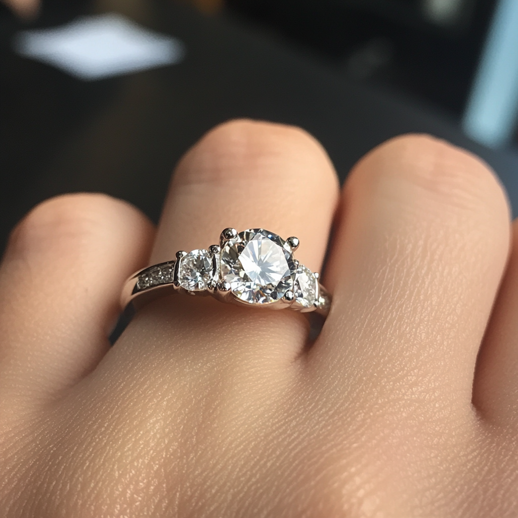
My three stone.
The biggest con is prongs. I’m a little sick of prongs! They catch on my hair and clothing and I was hoping to move away from them.
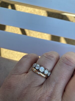
Hi, @Dreamer_D, I really love mine. The prongs look much more subtle in person. I asked for super petite and I think they delivered. I also think the metal cups don’t look obtrusive in person. It really just makes it look a bit more modern. I like it because it was sort of a mix between the traditional Victorian style and Sholdt’s style. I was just admiring it last night at the pool!
I also considered a full bezel style by Sholdt. Like you, I’m really drawn to it, but something about it just didn’t seem right for a five stone. I think it would’ve been good for a more smooth-to-the-touch finish, but I wouldn’t have been as happy with it aesthetically.
This is a good point and one weighing on my mind as well. I forgot to include it in my original summary! I notice that these old cuts are particularly leaky lol. They really pull colors from the underside. I noticed when I placed Linda in on hand, for example, that she really darkened. And I mentioned how the set stones reflect the blackened metal from the inside of the mount. I really want a comfortable ring I can forget about, which means bezel, but maybe these are not the right stones for that.The other reason I hesitate about going with bezels or more closed settings is that old cuts tend to be leaky.. I wouldn’t want to make them appear darker by limiting the light that can enter the stone. I feel like it makes a difference, personally.
Thanks so mug for responding Maya! Your ring looks so great on your hand and especially paired with that band. Love it. I can see what you mean about the prongs. In the second photo I can’t see them at all. Do you find they catch on things at all?
I also wonder if you know how tall the ring stands off your finger? It looks exceptionally low, which is why I think the baskets are constructed the way they are (because there needs to be a good base). My diamonds are deeper so I guess it would be higher, which I’m not sure how that would translate for the design.
How does everyone feel about the fact that my three stone is already the Victorian style prongs, and adding a second ring in that style for the five stone would be a very matchy look? Could be cute, could be annoying…
Thank you! I love this combo. I just measured with my calipers. The middle, largest diamond is 3.08 mm off the finger, including the crown of the diamond. They asked me if I wanted to stack the ring and how high my other ring was, so I think they can customize this part to some extent. I don't find that the prongs catch more than a normal prong. I.e., sometimes I get a bit of fuzz in them, but they don't snag on clothes or anything.
