shape
carat
color
clarity

DK CAD help for aquamarine ring

How would I have the shank?
I think the simple shank looks great. In the one pictured, it has a lovely, substantial rounded form which is nicely balanced with the stone and prongs.
 
[ATTACH said:
685215[/ATTACH] B13C69FE-3E7A-4A43-B0B4-1613460A257D.jpeg

I really like this one as well as the one with the green stone. I think the thin bezel with prongs outlining the shape of your stone would be perfect!
 
Late to the thread, but I heartily agree with everyone and commend you on your taste, @Hivona! ;-)
 
6AAF9E57-718A-43C3-9141-9D83BBC41912.jpeg 2E27B801-8A53-4E70-9A13-5DCE0D9F41B7.jpeg

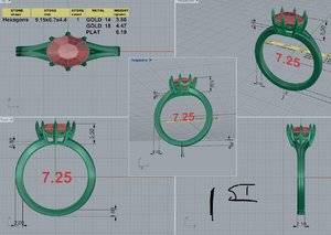
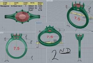
Round Two! I’m reposting the 1st CAD & then the new 2nd. It’s still a split shank, which I’m not sure how I feel about that with the 2nd CAD... Also, he made the shank curve up with how it connects to the basket. Added a bezel type metal strip around the girdle. I mentioned to DK that one of my goals was to keep the gemstone open to light so I don’t want the gem fully encased in metal.

I feel like the 2nd w/bezel accentuates the gemstone shape better than just prongs. But I like the swoops that connected the prongs in the 1st. Maybe the swoops are meant for a different stone! Too much going on with bezel & swoops?

Thoughts? :geek2:
 
I'm not experienced in finding issues on CADS, so I don't know if my opinion means anything, but I really like the second version. I think it will look gorgeous.
 
I’m loving the second CAD. I still like the split shank but I’m worried it’s taking away from the angled look of the bezel...like it’s all melding together. That could just be due the way I’m reading the CAD though. However, I love, love, love the bezel. It was definitely a perfect choice.
 
6AE41AD8-3C0C-4087-9CB4-671B17D6D05D.jpeg I like the second much better. If you liked the swoops before- maybe ad a triangle or a curved triangle at the bottom to give you some dimension while still having the bezel type aspect from the top view
 
Much better IMO. I too think that the split shank might visually ‘water down’ the strong shape of the stone if that makes sense. I personally would go with a substantial, rounded shank. Also, I’m not sure swoops are needed here. They are not the focus of the ring, but the bezel, stone and prongs are. I would imagine swoops would add a lot to a less interesting stone. But in this case, I really don’t believe that they are needed. Lovely improvement.
 
Maybe ditch the split shank and have the prongs "swoop" in to a center point on a single shank? I'd do a "cathedral" style to support the stone and the basket.
 
I’m loving the second CAD. I still like the split shank but I’m worried it’s taking away from the angled look of the bezel...like it’s all melding together. That could just be due the way I’m reading the CAD though. However, I love, love, love the bezel. It was definitely a perfect choice.

I like the split shank but don't love it. Maybe too cluttered. Also, I think with an unspilt shank it will attach to the end prongs (the East & West prongs) smoother. Right now the E/W prongs grow out between the split in the shank and I don't think I like that...
 
Much better IMO. I too think that the split shank might visually ‘water down’ the strong shape of the stone if that makes sense. I personally would go with a substantial, rounded shank. Also, I’m not sure swoops are needed here. They are not the focus of the ring, but the bezel, stone and prongs are. I would imagine swoops would add a lot to a less interesting stone. But in this case, I really don’t believe that they are needed. Lovely improvement.

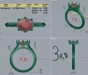
I completely agree! I think I will use that design element on a different ring but this one is more about angles and sharp lines. Thank you!
 
Really like the new CAD, the bezel really shows off the shape of your stone and the shank looks more integrated with the head. I personally wouldn’t add the swoops, it may get a bit too busy and will cover more of the stone.
 
95AE48E0-E566-4FB8-9DEC-9FC0361E983E.jpeg

In an effort to keep the stone “open” do you think structurally the 6 side prongs could only connect to the bezel? The E/W prongs would connect to the shank assuming it’s a single solid shank.
 
A96955B2-773C-428D-8C3E-CC7C19FF4D1E.jpeg if you kept the shank without the cathedral and back to flat like the last version, I think you could remove the split but leave that line down the middle. Give the shank visual interest without making the shank Like this
 
6FC01703-D264-44D2-99C2-C3F9CAAF7F63.jpeg 118BF698-6405-45A5-8046-CF838023011A.jpeg

Hey folks! I received the 3rd CAD today. I posted the second to easily compare the changes. 3rd CAD has Solid shank with a subtle knife edge. I asked if the prongs can only attach to the bezel & not extend below the girdle & if the ring needed more support to add a metal connection between the shanks. I thought this might keep the ring more open to light.

In the 2nd CAD I do like how the shank rises, cathedral-like, to connect to the head. If I went with that render I could ask for it with a solid shank (not split).

On the 3rd CAD David did ask if he should taper the shank so it would be a bit wider at the head?

Opinions please!
 
I really like the cathedral shoulders and the shorter prongs in the last CAD! It definitely leaves your stone more open. I think the non-split shank works better with your design, a slight taper would probably look good, but it’s fine without too.
 
Really like the cad but it's a lot more modern to my eyes than where you started out (the gallery in particular) but I think split shanks can often look a bit vintagy. I think it will be beautiful whether you leave as is or make some of the changes suggested just wondered whether it was your intention.
 
Really nice! I’m also a fan of the single shank. I like the tapering up to the prongs and the other version equally . Lovely lovely!!
 
Personally, I’m a fan of the prongs being attached to the head like that. I like the way it opens up the bottom.
 
I second what alene said.
 
Ugh! So tough! I ‘think’ I might like the second CAD best. I will ask for another render with the single solid shank though. I really like how the shank shoulder widens & attaches to the head in the second mode (the 3.50 measurement).

While I do like the 3rd render it is almost exactly how I plan to set an asscher spinel down the line... I like the openness below the girdle but this stone is bright & I don’t think it really needs an open/nonexistent gallery like that. I just wanted to see if I would love the look.

When I started this project I thought I had a pretty clear idea of what I wanted. But once I saw the CADs & with others’ input I was able to see a little better how certain elements didn’t work as I had hoped & well you can see how things change!

I really appreciate all of the feed back! Going to email DK soon! :geek2:

Suggestion?
Since this CAD morphed into a design close to what you have in mind for another stone - and it sounds like it's suited better for the other stone?
How about revisiting your original inspiration elements and reviewing the original CAD? Maybe in hindsight - take a different direction of the tweaks?

I think I need to step away for a few days. Right now I find myself drawn back to elements of the 1st CAD & wondering if I should revisit that one. I like the vintage inspired feel of the 1st render. And like meely said it got more modern over the other renders & im not sure I want this gemstone to have a modern feel...
 
Maybe it's the unusual cut of your stone and the lack of engraved elements? To me, none of the CADs or inspiration photos in this thread have given me the impression of vintage.
 
Maybe it's the unusual cut of your stone and the lack of engraved elements? To me, none of the CADs or inspiration photos in this thread have given me the impression of vintage.
You’re definitely correct it’s not really vintage. Just somewhere earlier in the thread it was mentioned how split shanks can remind of a vintage feel & my CADs got increasingly modern... part of my struggle could be due to my appreciation of simple settings with simple elements. Almost minimalist. I think initially I wanted this one to have a little more going on & thought I knew how that would look but I went back to simple designs! I’m going to take a breather & then look at more inspiration!
 
I would suggest, if you want a little more going on, to use little diamonds at the ends to fill up the gap created by the split shank in the second CAD, and to not have an open gallery but an entirely closed bezel cup that's engraved. But definitely take a breather! We all need it when it comes to decision-time.
 
I think I need to step away for a few days. Right now I find myself drawn back to elements of the 1st CAD & wondering if I should revisit that one. I like the vintage inspired feel of the 1st render. And like meely said it got more modern over the other renders & im not sure I want this gemstone to have a modern feel...
Could you do the gallery of the first cad but in an illusion style so you got the look of it being bezelled? I honestly think it will look beautiful whatever you go for they are all lovely designs. Totally get the stepping away from it for a few days though.
 
Last edited:
CB572D28-D0AD-4200-997A-099D43A425E8.jpeg 2731D6BE-1063-4243-BAE9-8D304BF36A81.jpeg C69475C6-A28A-450B-BD41-D512D2FAB975.jpeg 2B360E52-A710-4B73-8CCC-91FD73F84359.jpeg 9F32D749-EA8C-4545-9C1A-F04265BA1F19.jpeg 431CF0B5-B0FF-4897-9E33-E86B652F8101.jpeg FA82538C-F89D-4EB2-BFF7-BFBD236B67F6.jpeg
13FC6C6D-B351-46FA-A360-2C0A235CA1D3.jpeg Saw this on insta and thought of you.
Also the more I look at cad 2 the more I prefer it to cad 3
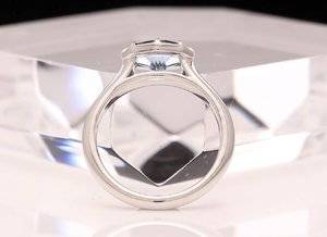
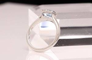
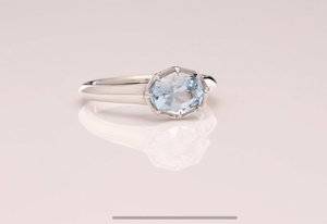
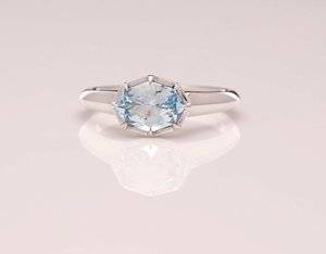
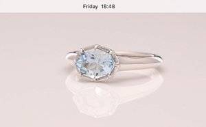
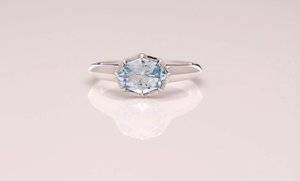
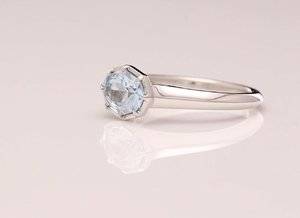
Hi Niel, I never saw this. Thank you for thinking of me though! I just got the finished video from DKJ a few mins ago! PS says the video is too big to attach. So here are some screen shots. I thought I knew strongly how I wanted this gemstone & ring to look but it morphed into something completely different and I am happy with that! There are elements from the 1st & 2nd CADs that I do like & May incorporate into other rings down the road.
 
It’s beautiful!!! :love::love::love: It makes me wonder if I am overdoing mine.
 
GET 3 FREE HCA RESULTS JOIN THE FORUM. ASK FOR HELP

Featured Topics

Top