shape
carat
color
clarity

Mint Green Tourmaline Setting

@FinleysMom
Can you explain more about the porosity of tourmaline? Chippy, yes, I agree but they are not porous.
 
I think there’s a decent amount of real estate, but I’m fine with scaling down the melee to fit. In any case I’m down with super blingy! :mrgreen2:

E997BB24-9E37-4B0F-A170-6148419AB53C.jpeg

Yay!!!! I think it’ll look so awesome!!
Im envious of your long elegant fingers. I can’t pull off wide rings at all.
 
My tourmaline had to be replaced due to clouding..I guess I did not understand how to clean it properly. (Use Soapy water. Dawn). ..yes..they are “chippy”. And porous. Love mine but I no longer wear it every day.

Your stone is gorgeous.
Thanks! Dish soap and warm water is my go-to.

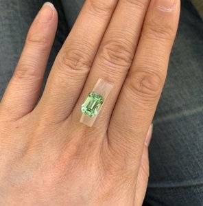
I was wondering how the colour would translate from Jeff’s photos. The colour in your handshot is amazing - if it’s like that IRL, you are one lucky lady!
The photos I took of it in the holder were in full sunlight. That seems to bring out the blue more. The photo on my hand is in very low office lighting that’s warm and yellow. I like seeing the difference that the lighting makes!

It’s gorgeous! I love that beautiful minty green color and it looks perfect with your skin tone. You’re a lucky girl. :love: I can’t wait to see how this ring turns out.
Thanks! I’m just waiting on a shipping label from DK now. Also debating between 18K or platinum...

Yay!!!! I think it’ll look so awesome!!
Im envious of your long elegant fingers. I can’t pull off wide rings at all.
Aw, thank you! :kiss2:
 
Ooooh what a luscious stone! :dance: Can't wait to see it set.

I think I liked the second design better but I'm a bit more drawn to that sort of thing... :whistle:
 
@FinleysMom
Can you explain more about the porosity of tourmaline? Chippy, yes, I agree but they are not porous.

My green tourmaline was so cloudy after a few years of wearing ( I take my rings off as soon as I get home..no harsh chems touch them). I do no know of any other reason it became so cloudy.... anyway, i sent my ring to the original artist who made it and she put a new stone in the setting. I was elated to have my “original” look back...took me back a decade when I first purchased my ring at a juried art show. If anyone has an explanation for the cloudy....I am all ears. Just happy with my ring.
 
What sort of setting was it in? If it isn't able to be cleaned properly underneath, dirt and oils will accumulate and it will appear cloudy.
 
the stone is my unicorn tourmaline. it's beautiful.

I, by far, love the 2nd setting because first off I'm a linear chick.. and I have to have straight lines, that is me, but everyone's comments are wonderful. I go modern, so I like the 2nd for that reason also.. so pick what you want and what calls to you and I know we all will love it! it's beautiful.
 
Chrono... Set in 14kt gold
 
Is it prongs or bezeled?
Is the bottom enclosed or totally open?
 
Bezeled with an opening that is difficult to reach underneath due to the support structure and band. That is the most likely cause. You'll need to have a brush with a small head to reach the underside. It's a lovely design and very protective.
 
Thanks Chrono. Interesting input. Who knew? I could clean the bottom and top..just not the sides as you mention.... ( used jewelry cleaner at the time...ugh) I learn a lot from this board.

I purchased my ring in 1999... i looked at EVERY jeweler booth at the St Louis Art Fair in Clayton , MO. ( juried). This was the only ring that stood out for me...impulse buy...never a regret! Patty Bolz is awesome.
 
Woohoo! What a colour! Such a gorgeous piece. Looking forward to see it set
 
I think there’s a decent amount of real estate, but I’m fine with scaling down the melee to fit. In any case I’m down with super blingy! :mrgreen2:

E997BB24-9E37-4B0F-A170-6148419AB53C.jpeg
Your new stone is gorgeous and is going to look amazing in that setting :love:. I like your method of sticking the stone to a piece of tape on your finger too. The stone looks perfect on your hand =)2.
 
Your new stone is gorgeous and is going to look amazing in that setting :love:. I like your method of sticking the stone to a piece of tape on your finger too. The stone looks perfect on your hand =)2.

Thank you! I don’t have a stone holder so I made do. :mrgreen2:
 
Such a fresh and alive stone with that cut and color.
Re settings, I love pears . Maybe if they were pointed in rather than out is another option. As is, they have a kind of ribbon/bow effect which has a nice lively energy which goes with the spirit of the color and stone well . In design 2, it’s a classic, more like architecture and more static, less motion. This setting i can imagine with other stones and feels less like an answer to your specific stone spirit, but still something one cannot go wrong with, and timeless.

Both are really lovely but both have completely different spirits to them. Defining to fit the individual soul of the stone is hard I think, but worth the extra time. Sorry if this is not much help. Just my first gut impressions. I’m sure it will be amazing when done. I love your jewelry style:)
Thank you! :kiss2:
 
My green tourmaline was so cloudy after a few years of wearing ( I take my rings off as soon as I get home..no harsh chems touch them). I do no know of any other reason it became so cloudy.... anyway, i sent my ring to the original artist who made it and she put a new stone in the setting. I was elated to have my “original” look back...took me back a decade when I first purchased my ring at a juried art show. If anyone has an explanation for the cloudy....I am all ears. Just happy with my ring.
I suspect that you mean that tourmaline gets dirty easily. Believe it or not, they have a small electrical charge and are prone to attracting dust. Also, just about any pastel stone in a ring tends to look dirty after a few hand washes.
 
I gently soaked and scrubbed the crap out of the stone. It never cleared up. My diamond cleans up nicely. When one puts a piece of jewelry away out of frustration with the inability to clear up the. Situation..I dunno...”tends to look” dirty should be an easy fix.....it was not.
 
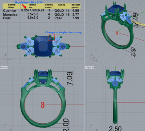
Got the CAD. Feedback welcome!

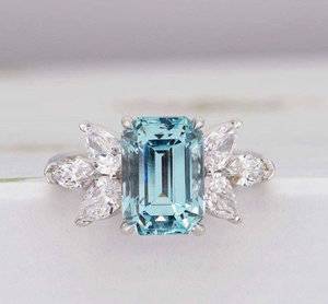
Original inspiration:
2019-01-16_9-29-48.jpg

CAD
  • I requested this simple, open gallery for easy cleaning
  • The profile is as low as the tourmaline will allow
  • I generally prefer my shanks to be on the thinner side. In this case, it's 2.5 mm at the base, but tapers at the sides.
upload_2019-1-28_14-44-39.png
 

Attachments

  • upload_2019-1-28_14-28-9.png
    upload_2019-1-28_14-28-9.png
    856.5 KB · Views: 20
Last edited:
I’m not great at cads, but it looks gorgeous to me! All of your request are things I would have asked for too. Will he be sending you new cads showing the updates? I would love to see cads with the corrected dimensions of the center stone. It’s going to be a fabulous piece!
 
@2Neezers thanks! I think he also made the CAD for a size 8 instead of 6.5. Once I get the revision I’ll post it.
 
I’m no pro but I think it looks great. :mrgreen2: I think the tapered shank was a nice touch.
 
Very nice and on the first run too!
 
Thanks @elle_71125 & @chrono! Here's the updated CAD with my notes:

upload_2019-1-30_15-33-39.png

I think the 2mm shank looks good. Still obviously tapered without being too thick. That one is more of a personal preference. I like my rings fairly thin.

Also, I actually prefer the new layout, where the pear doesn’t line up with the edge of the tourmaline. It gives it more dimension. :mrgreen2:
 

Looks beautiful! I agree. I prefer the way that the pears don't line up with the top of the stone in the CAD. Your tourmaline appears to be a bit squatter than the inspiration, so I think the smaller pears help achieve a similar visual balanc. If that makes any sense.

Can't wait to see the final result!

ETA: I actually think the stone dimensions were just wrong in the first CAD. The second one is mush more similar to the inspiration. But I still like the smaller pears! Haha
 
Thanks @elle_71125 & @elliefire99 ! Waiting to get this priced out for platinum with G-H VS melee. I originally inquired about 18K WG with SI1 melee but I’m curious to know the difference.
 
Yay or nay?

Definitely yay!!! =)2

Ask for their ideal cut melee, it sparkles like crazy!
 
GET 3 FREE HCA RESULTS JOIN THE FORUM. ASK FOR HELP

Featured Topics

Top