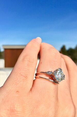
shape
carat
color
clarity

Please help me figure out the subtle differences between my setting and my inspiration

Moonie

Shiny_Rock
Joined
Mar 10, 2020
Messages
301
Hi ladies,

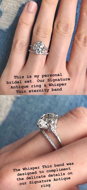
I got engaged recently and I love my ring. I asked for the setting to be inspired by Ring Concierge's Signature Antique, which is inspired by an Edwardian triwire setting as well.

My main requests were that: 1. it looks very delicate 2. the prongs don't overwhelm the diamond

I of course sent many photos of what I liked about the inspiration setting and realize that it's quite hard for it to look exactly the same, but there's something about my setting that is off from the inspiration in a small small way.

I think it's one of two things. Either the shoulder petals are too "long" and take up too much real estate along the side of my fingers, or my fingers are just smaller than other photos I've seen, in which case, that can't be helped. But I've seen so many great posts here helping to pinpoint setting issues, so I thought I would post to see if anyone else has any other thoughts!

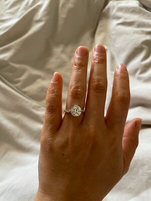
My ring:
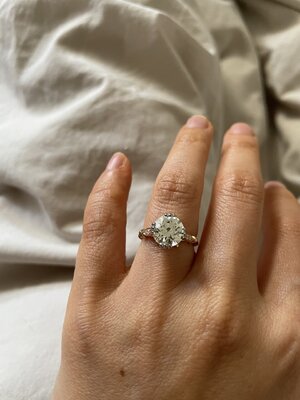
IMG_0530.jpeg
IMG_0467.jpeg
IMG_0471.jpeg

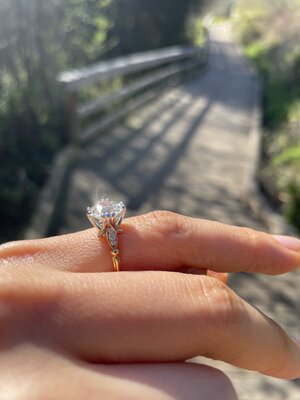
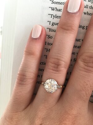
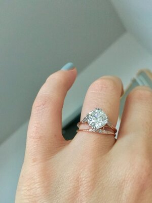
Inspiration Setting photos:

2F914F9D-1A50-4C44-BC18-A545C2132391.jpg873ce43853b5152a3e4c680ca925115e.jpgIMG_4462.jpgIMG_4595.jpg
 

Attachments

  • IMG_0531.jpeg
    IMG_0531.jpeg
    142.8 KB · Views: 21
Yes, it does seem like your petals are longer and have larger diamond melee.

Also your diamond appears round, and the inspiration design seems to have cushion-y / off-round stones.


FWIW I think your setting is fantastically beautifully perfect, and I prefer its aesthetic over the inspiration setting.
 
I agree, your setting is beautiful. I do see that the melee is probably a bit bigger in your ring than in the inspiration, so maybe the petal is a bit wider and a bit longer to accommodate that. I too, prefer yours. The melee in the inspiration is so small it's hard to tell it is there and in some of the pictures, it looks like it's mostly metal.
 
Yes, it does seem like your petals are longer and have larger diamond melee.

Also your diamond appears round, and the inspiration design seems to have cushion-y / off-round stones.


FWIW I think your setting is fantastically beautifully perfect, and I prefer its aesthetic over the inspiration setting.

I agree with all of this 100%
 
+1! So beautiful! Also I don’t know the terminology but the bump on your shank after the petal of melee seems thicker than the inspo photos too. Yours is beautiful and looks substantial!
 
Your petals are an even eye shape. Like leaves.

The petals on the inspiration are more paddle shaped, with the wider end close to the diamond and the narrow part close to the wraps. This may result in a more tapered look from a top down view.

Also, the inspiration petals might be curved upward instead of meeting the diamond at a 45ish degree angle. This would draw the wider part of the petal vertically and close to the diamond, further contributing to the more tapered look in a top down view.

Both are gorgeous but these kinds of details are hard to pick out in 2d pics.
 
Yes, it does seem like your petals are longer and have larger diamond melee.

Also your diamond appears round, and the inspiration design seems to have cushion-y / off-round stones.


FWIW I think your setting is fantastically beautifully perfect, and I prefer its aesthetic over the inspiration setting.

Thank you, that's so kind of you to say :kiss2:

Ah yes, I should've clarified, some of the inspiration photos are a mix of OMCs and OECs and mine is a OEC so that would definitely make it look a little different.
I agree, your setting is beautiful. I do see that the melee is probably a bit bigger in your ring than in the inspiration, so maybe the petal is a bit wider and a bit longer to accommodate that. I too, prefer yours. The melee in the inspiration is so small it's hard to tell it is there and in some of the pictures, it looks like it's mostly metal.

That's interesting, I was thinking that although the petal is longer for sure, it's actually a bit skinnier than the inspiration photos. It's hard to tell in photos since everything is so magnified but my ring looks more uniform in its band whereas the inspiration seems to be more wide around the petal and slimmer around the band? I can't tell if this is me simply obsessing over details of course LOL.
Frankly, I like yours better! I agree with other comments re: melee and petals.

TYSM!
+1! So beautiful! Also I don’t know the terminology but the bump on your shank after the petal of melee seems thicker than the inspo photos too. Yours is beautiful and looks substantial!

Oh good point, my band is a teeny bit thicker overall, but that's true now that I look at it the bump does seem more substantial!
I like your setting better and I am very picky!!!

Thank you that's sweet of you to say!
 
Your petals are an even eye shape. Like leaves.

The petals on the inspiration are more paddle shaped, with the wider end close to the diamond and the narrow part close to the wraps. This may result in a more tapered look from a top down view.

Also, the inspiration petals might be curved upward instead of meeting the diamond at a 45ish degree angle. This would draw the wider part of the petal vertically and close to the diamond, further contributing to the more tapered look in a top down view.

Both are gorgeous but these kinds of details are hard to pick out in 2d pics.

I love coming to Pricescope because people pick up on such minute details!! I stared at the petals for AGES wondering if it was the width or the length that made it look a bit different, but now that I look at it, you're right the shape is actually different!!

Even though I think the jeweler did a beautiful job and I love my ring, I think the reason why it feels a tad off to me is because I love the tapered look and how the inspiration setting seems to "wrap" around the finger a bit more organically, whereas my ring feels more like it's sitting on top of my finger.
 
@Moonie Glad I was able to help!
 
I love your ring the best !
If i were you (and of course I'm not) but I'd make myself stop looking at those other photos

Ok its not the same thing as an ER
but 4 years ago i had my first and so far my only ring commission made
And i have to confess i was a little disappointed it didn't look exactly like the inspirational picture i supplied
so i put it away .... - i know this won't work with your ring because its an ER
meantime i got my phone nicked and i lost all those inspirational photos

Anyway i finally wore it for the first time on Tuesday - and Wednesday
Bad me i know !
And i now love it
it isnt exactly as i wanted it but i know love the differences (that i can remember)

I would wear your beautiful ring for a week and be strong and don't look at those pictures for the whole time and see how you feel after living with it on your finger

i actually love the bigger petals and i think the whole thing looks beautiful on your hand and everything is sized perfectly
but i also understand somewhat the disappointment with it being not exactly how you envisioned it looking
 
Your ring is better than the inspiration! To me the inspiration ring looks a bit flimsy. Your ring looks like a beautiful custom made heirloom!
 
I love your ring.
comparison now is the thief of joy.
what I see is being different is so minor - but also am familiar with that feeling/thought process, so that’s easier said than done.

the original also has its tri prongs a bit splayed out at the tips and is a bit nipped in narrower right below the girdle area. The splayed out tips would translate differently on your rounder stone.
 
I think your ring looks more balanced, the proportions are better which is, overall, more pleasing to the eye. You have a very beautiful and sizeable diamond there, and I think having a slightly more substantial setting will pay off in the long run. Your setting is by far the one I would prefer! =)2
 
I think your ring is gorgeous! I agree with others about the petals being a bit different and maybe not being angled in the same way as the inspiration picture. I follow RC and I wonder if some of the difference in what you’re seeing is also because of diamond size. She posts a lot of really large diamonds and those obviously take up more finger space which makes the petals look smaller. Here’s an example: https://www.instagram.com/p/CLfKGkyFrEh/?igshid=1wv3yhpvx8jj6

But from the side, to me, the petals don’t seem much larger than yours.

For what it’s worth I think your ring is perfect as is! I hope you’re able to enjoy it!
 
I like yours better too. Looks like it’s more substantial and will stand up to wear much better.

Hope you will grow to love it. It really does look lovely.
 
Your setting looks much more balanced to me. I love the fact that the petals reach to the side of your finger so you don’t see too much band like in the inspiration pictures. Yours is a superior version without doubt.
 
Hi ladies,

I got engaged recently and I love my ring. I asked for the setting to be inspired by Ring Concierge's Signature Antique, which is inspired by an Edwardian triwire setting as well.

My main requests were that: 1. it looks very delicate 2. the prongs don't overwhelm the diamond

I of course sent many photos of what I liked about the inspiration setting and realize that it's quite hard for it to look exactly the same, but there's something about my setting that is off from the inspiration in a small small way.

I think it's one of two things. Either the shoulder petals are too "long" and take up too much real estate along the side of my fingers, or my fingers are just smaller than other photos I've seen, in which case, that can't be helped. But I've seen so many great posts here helping to pinpoint setting issues, so I thought I would post to see if anyone else has any other thoughts!

My ring:

IMG_0530.jpeg
IMG_0467.jpeg
IMG_0471.jpeg

Inspiration Setting photos:

2F914F9D-1A50-4C44-BC18-A545C2132391.jpg873ce43853b5152a3e4c680ca925115e.jpgIMG_4462.jpgIMG_4595.jpg

Love your ring! The petals are a little longer but overall your ring is beautiful!
 
Add me to the "I like yours better list". It's exactly what I said to myself as I was scrolling through the pictures and before I read any of the comments.
 
@Moonie , your ring is lovely.
As others have noted your petals appear to be at a less steep angle than the RC ones; there is also a difference in shape of your petal (marquis) vs. the RC petal which is wider on one end and thinner on the other. It also looks like there is only one stone in the RC petal and the skinnier end is just filled with graduated metal beads.
 
I think the metal color is the biggest difference -- all tonal in the inspo so it makes it hard to compare, really.

That said, I like yours better.

No digging in the garden with that one!
 
Beautiful! I really love your setting. My understanding is that duplicating a signature design is a not something most jewelers will do. That said, the differences on yours are so very slight. I’ve heard that some of those uber delicate RC settings don’t hold up so well over time, so having something built a bit more solidly will be a good thing in the long run. Enjoy it, it’s truly stunning!
 
I love your ring the best !
If i were you (and of course I'm not) but I'd make myself stop looking at those other photos

Ok its not the same thing as an ER
but 4 years ago i had my first and so far my only ring commission made
And i have to confess i was a little disappointed it didn't look exactly like the inspirational picture i supplied
so i put it away .... - i know this won't work with your ring because its an ER
meantime i got my phone nicked and i lost all those inspirational photos

Anyway i finally wore it for the first time on Tuesday - and Wednesday
Bad me i know !
And i now love it
it isnt exactly as i wanted it but i know love the differences (that i can remember)

I would wear your beautiful ring for a week and be strong and don't look at those pictures for the whole time and see how you feel after living with it on your finger

i actually love the bigger petals and i think the whole thing looks beautiful on your hand and everything is sized perfectly
but i also understand somewhat the disappointment with it being not exactly how you envisioned it looking

I'm sure everyone here on PS knows the feeling of envisioning something in their head and being a little thrown off when it doesn't look exactly how you imagined! I totally agree and I should stop analyzing the inspiration pictures like you said. I do absolutely love my ring and have been loving wearing it, so I appreciate your kind words, thank you!!
 
Your ring is better than the inspiration! To me the inspiration ring looks a bit flimsy. Your ring looks like a beautiful custom made heirloom!

That is so sweet of you to say, thank you!! I was really hoping to pass it on as an heirloom one day so that makes me feel super happy!
 
I love your ring.
comparison now is the thief of joy.
what I see is being different is so minor - but also am familiar with that feeling/thought process, so that’s easier said than done.

the original also has its tri prongs a bit splayed out at the tips and is a bit nipped in narrower right below the girdle area. The splayed out tips would translate differently on your rounder stone.

Ah yes, I agree on the prongs! I think the very original one (Ring Concierge's ER) is made by Davis and Gray and it's quite beautiful, but would likely not work with mine, as her center stone is an OMC and very large. But I didn't notice the nipping below the girdle, that's a really good point. I was trying to understand if the petals were "curved" more than mine, and that is probably what I'm seeing also.

But you are so right, I should treat mine as a beautiful piece instead of trying to think of it as a comparison, thank you for the kind words!
 
I think your ring looks more balanced, the proportions are better which is, overall, more pleasing to the eye. You have a very beautiful and sizeable diamond there, and I think having a slightly more substantial setting will pay off in the long run. Your setting is by far the one I would prefer! =)2

thank you so much! It's such an intricate setting and I do of course hope to wear it for a long time and then some <3
 
I think your ring is gorgeous! I agree with others about the petals being a bit different and maybe not being angled in the same way as the inspiration picture. I follow RC and I wonder if some of the difference in what you’re seeing is also because of diamond size. She posts a lot of really large diamonds and those obviously take up more finger space which makes the petals look smaller. Here’s an example: https://www.instagram.com/p/CLfKGkyFrEh/?igshid=1wv3yhpvx8jj6

But from the side, to me, the petals don’t seem much larger than yours.

For what it’s worth I think your ring is perfect as is! I hope you’re able to enjoy it!

Very true! A lot of rings from RC are quite a bit larger on the 3ct+ side, which would definitely make the petals less visible, especially on hands that are smaller. For that photo the petals look wider but shorter to me, probably because the stone is huge. Thank you so much!
 
I'm sure everyone here on PS knows the feeling of envisioning something in their head and being a little thrown off when it doesn't look exactly how you imagined! I totally agree and I should stop analyzing the inspiration pictures like you said. I do absolutely love my ring and have been loving wearing it, so I appreciate your kind words, thank you!!

=)2your ring is very beautiful, im glad love it :twirl:
You chose a drop dead gorgouse style that is jaw dropping to me
if i saw it up close ive probably trip over my feet in excitment and end up on the deck !
 
I like yours better too. Looks like it’s more substantial and will stand up to wear much better.

Hope you will grow to love it. It really does look lovely.

Your setting looks much more balanced to me. I love the fact that the petals reach to the side of your finger so you don’t see too much band like in the inspiration pictures. Yours is a superior version without doubt.

Love your ring! The petals are a little longer but overall your ring is beautiful!

Add me to the "I like yours better list". It's exactly what I said to myself as I was scrolling through the pictures and before I read any of the comments.

Thank you everyone for such kind compliments! I really didn't expect such an outpouring of nice things about my ring and wasn't fishing, but it really does feel so nice that people here who see gorgeous jewelry every day thinks my ring looks beautiful! :kiss2:
 
GET 3 FREE HCA RESULTS JOIN THE FORUM. ASK FOR HELP
Top