shape
carat
color
clarity

Setting expertise, please?

Status
Not open for further replies. Please create a new topic or request for this thread to be opened.
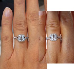
I will definitely ask Sundial about her WG setting. I'm having it made so that I can fit a band next to it, so no I'm really not planning on wearing it alone. That's why I definitely think that the Daniel K's shank is the better of the two looks for me. With a 1.5 mm band next to that double shank... my diamond's gonna disappear!

ETA: I'm also seriously considering the gap between the halo and the diamond like the one anacgarcia posted. I really like that look... but I'm wondering if it will defeat the purpose of making the stone look bigger?

Hmm. Okay. Gotta run. Will check in tomorrow. THANK YOU ALL, again.
 
Gypsy,

I like Widget''s version of the shank. If you are planning to wear a wedding band with the ring, the double shank may be too much. If you want to see a Daniel K in person, try CH Premier at Westfield Valley Fair Mall in San Jose or Darren McClung in Palo ALto.

Art Nouveau
 
Date: 10/23/2006 10:21:29 PM
Author: Gypsy
I will definitely ask Sundial about her WG setting. I''m having it made so that I can fit a band next to it, so no I''m really not planning on wearing it alone. That''s why I definitely think that the Daniel K''s shank is the better of the two looks for me. With a 1.5 mm band next to that double shank... my diamond''s gonna disappear!

ETA: I''m also seriously considering the gap between the halo and the diamond like the one anacgarcia posted. I really like that look... but I''m wondering if it will defeat the purpose of making the stone look bigger?

Hmm. Okay. Gotta run. Will check in tomorrow. THANK YOU ALL, again.
I think that it will still make your stone look bigger AND stand out more. What I mean is that it will really showcase the stone for the beauty it is and the halo will just be like a wall around your stone guarding it. I love the photoshop from Irina and I do agree on the shank like Widget posted, I think it will flow better. This is going to be really beautiful. Congrats!
 
Date: 10/23/2006 10:21:29 PM
Author: Gypsy
I''m also seriously considering the gap between the halo and the diamond like the one anacgarcia posted. I really like that look... but I''m wondering if it will defeat the purpose of making the stone look bigger?

I think it looks bigger with the gap
31.gif
 
Date: 10/24/2006 11:07:15 AM
Author: anacgarcia

Date: 10/23/2006 10:21:29 PM
Author: Gypsy
I''m also seriously considering the gap between the halo and the diamond like the one anacgarcia posted. I really like that look... but I''m wondering if it will defeat the purpose of making the stone look bigger?

I think it looks bigger with the gap
31.gif
Ditto and I notice this too with my own rings is that when you can see some skin showing between the two rings, it makes the stone look bigger. That''s part of why I really like those split crown rings worn alone, it''s two rings but you can see skin so there''s no mistaking the center stone for a big blob of sparkle amongst the melee. For me my two rings together is too much metal and diamonds and the diamond gets lost.
 
ArtNouveau -- That''s now on my list of Bling to do before FI comes down. Thank you. Depending on where Valley Fair is in relation to work I might try and pop down on a lunch break after giving them a call to see if they have it in.
11.gif


You all have me seriously considering that gap now. Any other votes for or against the gap?
33.gif
 
Date: 10/24/2006 11:52:40 AM
Author: Gypsy
Any other votes for or against the gap?
33.gif
okay.....since you asked
28.gif

me no likey the gap.
i think it looks like you are trying (too hard) to make the stone look bigger. the halo without the gap looks like a whole piece, not so much that you are trying to make it look bigger. it just looks like a nice, continous, beautiful all encompassing ring. like the halo is a part of the overall design that harmonizes with the center stone (and just happens to make it seem bigger!
3.gif
). the gap halo doesn't seem as fluid. it seems like the only purpose is to expand the diameter with no regard to asthetics. it says, 'here's my stone with this halo out here to make it appear bigger!'

you asked!
11.gif
 
Date: 10/24/2006 12:05:58 PM
Author: belle

Date: 10/24/2006 11:52:40 AM
Author: Gypsy
Any other votes for or against the gap?
33.gif
okay.....since you asked
28.gif

me no likey the gap.
i think it looks like you are trying (too hard) to make the stone look bigger. the halo without the gap looks like a whole piece, not so much that you are trying to make it look bigger. it just looks like a nice, continous, beautiful all encompassing ring. like the halo is a part of the overall design that harmonizes with the center stone (and just happens to make it seem bigger!
3.gif
). the gap halo doesn''t seem as fluid. it seems like the only purpose is to expand the diameter with no regard to asthetics. it says, ''here''s my stone with this halo out here to make it appear bigger!''

you asked!
11.gif
well since you said it, I''ll just sit here and nod LOL Airlines are a personal preference thing - I''ve seen a lot of rings with them but I''m not super fond myself. I like more flow.
 
Well, since you asked...
2.gif


No gap. With the gap, it looks like it was meant for a bigger stone but a smaller one was put in the setting instead. Without the gap, it looks more fluid, more singular.
 
Date: 10/24/2006 11:24:10 AM
Author: Mara

Date: 10/24/2006 11:07:15 AM
Author: anacgarcia


Date: 10/23/2006 10:21:29 PM
Author: Gypsy
I''m also seriously considering the gap between the halo and the diamond like the one anacgarcia posted. I really like that look... but I''m wondering if it will defeat the purpose of making the stone look bigger?

I think it looks bigger with the gap
31.gif
Ditto and I notice this too with my own rings is that when you can see some skin showing between the two rings, it makes the stone look bigger. That''s part of why I really like those split crown rings worn alone, it''s two rings but you can see skin so there''s no mistaking the center stone for a big blob of sparkle amongst the melee. For me my two rings together is too much metal and diamonds and the diamond gets lost.

That''s very true. Last week when I was trying on settings, I instantly loved the non flush look because it made the center stone just POP. I''ve always had my rings fit flush together but I nixed it this time because it made such a difference to have a bit of skin between the e-ring and w-band.
 
Compromise...a very, very tiny airline.
 
Interesting....I have always loved the ''floating'' look of airspace between a stone and a halo. I think it really helps set off and showcase a smaller gem.

That this mounting already has airspace on the E/W sides of the asscher is probably one of the reasons I like it so much. Does it need a gap on the N/S sides too? I dunno...maybe...

LOL, not much help, am I?
5.gif


widget
 
Another vote here for no gap.
5.gif
 
FI voted no gap too. He agreed with Feb-bride that it makes the setting look like it was made for a larger diamond. The thought of which bugs me... so I''m thinking that it''s no gap folks. DanielK single shank and no airline. Now to let Erik know.

Thank you very much for all your help ladies! (Widget, you were a great help with the shank so it all balances out!)
 
Date: 10/24/2006 12:21:41 PM
Author: widget
Interesting....I have always loved the ''floating'' look of airspace between a stone and a halo. I think it really helps set off and showcase a smaller gem.

I like the gap not only beacause it looks bigger but because it stands out, and doesn''t get lost in the halo
 
Widget is indeed to be commended for her single shank design--I love it with a halo of course and it would be perfect with your asscher!

I too vote no airline.

I''m a little confused as to the w-ring you''re going to wear with it...??? Has that design been decided??
 
Date: 10/24/2006 2:30:09 PM
Author: isaku5

I''m a little confused as to the w-ring you''re going to wear with it...??? Has that design been decided??

HI Isaku! No they will eventually (2 months before wedding) make one to fit with it. It will be a matching 1.5 mm pave eternity.
 
Date: 10/24/2006 12:16:24 PM
Author: february2003bride
Well, since you asked...
2.gif


No gap. With the gap, it looks like it was meant for a bigger stone but a smaller one was put in the setting instead. Without the gap, it looks more fluid, more singular.
Yep, I agree. You want the setting to look like it was made for your stone. I love the way the halo fits up against the center stone before it breaks away at the sides to form the V.
 
*Ducking*

Irina/ Leonid-- can you possibly (pretty please with sugar on top) alter Photoshop the beautiful picture you did of the setting in 6 mm size so to show it with the single Daniel K shank instead of the double shank--so I can verify whether or not I really do prefer it that way?
 
Date: 10/24/2006 9:06:04 PM
Author: Gypsy
*Ducking*

Irina/ Leonid-- can you possibly (pretty please with sugar on top) alter Photoshop the beautiful picture you did of the setting in 6 mm size so to show it with the single Daniel K shank instead of the double shank--so I can verify whether or not I really do prefer it that way?
Sure, are we having an air or not?
 
Excellent work, Irina!

Well, I''ll just say it, I like the shank on the right best (the original one). The other just looks a little too flimsy to me.
 
OH MY GOD!
19.gif
this setting was MY 2nd choice.... in a 1.3 asscher. Actually, the FI LOVED it, and it was too delicate for my taste... But please calm those concerns, it was beautiful! And not too far off from those photoshops. Also, I tried it with slightly smaller stones, with a space, and exactly meeting... and I tended towards the tiny space... but that is all personal preference.

BTW- It was at New York Jewelers in Chicago on Wabash (yeah, I know, that''s funny!)
 
Date: 10/24/2006 11:20:38 PM
Author: diamondseeker2006
Excellent work, Irina!

Well, I''ll just say it, I like the shank on the right best (the original one). The other just looks a little too flimsy to me.
Me too....

widget
 
okay I''ve changed my mind about the airline - sort of. I still like the look without it BUT it changes the perception of shap a bit... f you look the stone looks more rectangular because it blends top and bottom ut not side to side.... now don''t get me wrong, I *like* it BUT if you want to maintain a very square stone look, migh want a tiny airline.

also... I do prefer he double shank...
 
i agree, i like the original better on the right, the left looks too delicate and it almost makes the stone look smaller?? i think the stone almost looks bigger in the original setting on the right in that photoshop. and i like the idea of a tiny airline too. hee hee.
 
I like the original one as well, the one on the right. The other one is too thin, at least to me. And agree the original one makes the stone look bigger. It''s just more balanced to my eye. Nice work Irina!!!!
 
Date: 10/25/2006 12:24:25 AM
Author: Kaleigh
I like the original one as well, the one on the right. The other one is too thin, at least to me. And agree the original one makes the stone look bigger. It''s just more balanced to my eye. Nice work Irina!!!!

ditto..
 
Date: 10/25/2006 8:47:19 AM
Author: mrssalvo

Date: 10/25/2006 12:24:25 AM
Author: Kaleigh
I like the original one as well, the one on the right. The other one is too thin, at least to me. And agree the original one makes the stone look bigger. It''s just more balanced to my eye. Nice work Irina!!!!

ditto..
double (double?) ditto.
 
YIKES!!! I have to say this job is SERIOUSLY cutting into my PS time.

I''m going to have to think about the shanks I''m not sure how I''m feeling about them. And I may re-consider the airline-- because without the airline the diamond is looking rectangular like Cehra mentioned! OY!

Okay well... I''ve got to go home now. Much as I like spending 14 hours a day here 14 hours IS where I draw the line!

THANK YOU IRINA/LEONID! And everyone who voted on the shanks. And everything else.

If I wasn''t so freaking tired I''d stay and chat... but it''s only Wednesday and I am already in pain waiting for the weekend.
 
Status
Not open for further replies. Please create a new topic or request for this thread to be opened.
GET 3 FREE HCA RESULTS JOIN THE FORUM. ASK FOR HELP
Top