Autumn in New England
Ideal_Rock
- Joined
- Jan 20, 2012
- Messages
- 5,531
@Rfisher All very salient points!!
Thank you! I just looked at the Lotus report and it says the cut is an Antique cushion shape with a brilliant crown and a step pavilion. They did switch the prongs to tiny claws. He said either way would look good because they’re quite small. I’m excited to see the changes!Oh good lawd, have mercy... s t u n n i n g ! ! First, I didn't realize how beautifully cut your sapphire is.About the milgrain, I realllllly love how the entire "D" shaped area surrounding each diamond is textured. But then the scallops above it and below it (in the gallery) are highly polished. I feel like this variation in the finish is creating layers, depth, and richness. Personally, and it's not even a question for me, I wouldn't touch it. About the prongs, I think this is going to be a more "personal taste" thing. Some folks are strictly claw prong people, some love the rounded style, and some enjoy a mix. I can see why David elected to use rounded here, because there are 10, and they are minimally intruding upon the sapphire. I like them. But I'd probably also like the claws. Totally up to you! Lastly, the "gaps" you mention just look like a function of the design to me, and I'm not bothered by them whatsoever. But this is your unique beauty (and my opinions don't matter in the slightest), and you should request whatever changes you'd like to see until you're 100% satisfied. I'll love this ring regardless, of that I'm certain!!
OMG this ring is so stunning. I personally love the difference in texture and rounded prongs, but like Autumn said, all that matters is what you like! Please post handshots when you get it, however you choose to change it (or not) I'm sure it will look amazing.
It's magnificent!
+1 to all this. I think the milgrained lower tier and the smooth upper tier read clearly as a coherent design concept. Same with the gaps between the two tiers.
FWIW, I'd have chosen pointed claw prongs. Here's a very rough-and-ready edit. (Don't look too closely at the details.)
Of course, it's your preference that counts, not mine, Also, there may be technical issues. Your ring will look absolutely stunning either way.
Same here. It gives the design definition and depth. I like it a lot.
Looking at the claw vs round prongs comparison image, I agree with Autumn - a matter of personal taste as they both look lovely and fit in well with the overall design.
I like the look of the milgrain on as is, next to areas of polish - same as others have stated. I’d leave it.
The prongs?? - I’m not quite sure there’s enough material to fashion what’s there down into claws, honestly. I’m not an expert though. I’d ask what it entailed to make it happen.
Could be a trick of the eye, but a few seem right now to be just hanging on barely past the center stone’s girdle -
Then on the one side view - it sure looks like a variance of prong lengths from one side to the opposite side?
Petite claws will look nice, but I do really like the current shape as is for this design as well.
I do see the areas you mention about the gaps. I don’t think it’s just a photo shadow. I doubt it’s structural - but if it bugs you - ask about it. I have mixed feelings about asking to have them filled in- due to a past experience with this.
I’d forget about them unless you have naked eye supervisionor even just consider it a sign of separate cast pieces being individually hand assembled - not a mass produced one piece cast.
I can’t wait for you to post pics of this beauty on your finger!!
That’s a killer ring!!! Omg. Ditto to what @Rfisher and others say.
OMG I love it!
Wow, it's absolutely gorgeous!! I can't wait to see your photos. Regarding the milgraining, the heart wants what the heart wants. My ER was supposed to have milgraining everywhere but came with polished bezels. Everyone including my hubby said to leave it that way and I tried to live with it for months. Eventually it went back to add the milgraining to the bezels. It's perfect now. So maybe a good thing he already had started the changes.
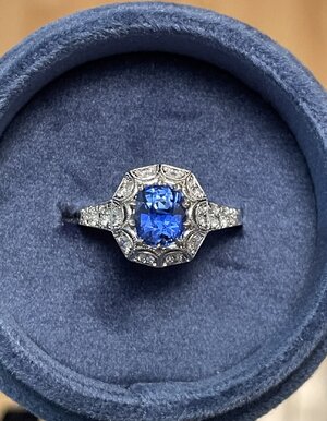
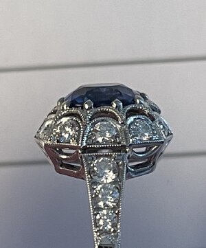
Hallo!
Love the color and cut of your sapphire!!!!! Blue sapphires for the win! I'm a convert!
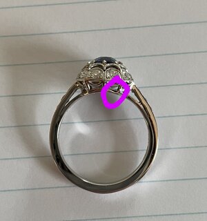
Since you're sending it back, thought I'd bring this up too.
Is this just the camera angle or is something going on with the metal in this part? It looks like there is missing metal? My apologies if it's just the camera! I can't tell if it's metal reflecting or missing metal.

I love blue sapphires too! I think that‘s just a weird light reflection..I looked the metal over with a loupe when the ring first came and I didn’t notice any missing metal. The lighting is so bad here today and my iPhone is taking mostly distorted blurry pictures. I’ll double check that area though and will report back! Thanks for letting me know
Thank you @Autumn in New England ! The claw prongs were a great choice and I'm happy David changed them and am also thankful for all of the claw prongs votes
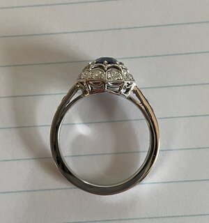
Here’s a picture of the side profile. I hope it gives a better idea of how it’s attached.
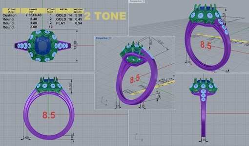
I also found the last cad David had sent me, this was after I had asked for holes behind the halo diamonds for easier cleaning. He said to ignore the different colors on the cad, but looking at it now, I’m wondering if it’s showing two separate parts/pieces. If so, there are more solder points than I had originally thought.
I have been wearing the ring to see if the air gap at the shank connection catches my eye, and since it does, I think I should see if David can fix it. I was thinking about what you wrote about intuition, and as much as I want to let it go because it would be less hassle, the gap is going to bother me. I haven’t heard back from David yet, but plan to reach out again after the holiday weekend.
Haha I should have known that a PSer would loupe the entire ring!
Hope to see this in the "What are you wearing today" thread when you're done with it!!!!!!
I am quite fussy about my gems, but tend to lack the particularity (is this a word?) that some PSers have for jewelry design. In that respect, I've learned a tremendous amount here. So, in all honesty, I might not have even recognized that gap as an issue. But now that you've pointed it out and shown how it was not evident in the CADs, I think you're making the right decision in bringing it to David's attention. It almost sort of looks like an ill-fitting joint now that I'm zeroed in on it. I don't think there would be a durability issue, but would the ring be MORE sound if the top of the shoulders were soldered to the head? I believe so. Let us know how it turns out! One thing's for sure, you have a very beautiful, special ring to look forward to... tweaks are just part of the process sometimes.
ETA: All of what I wrote aside, and as you said, if this issue bothers you now, it will only intensify in the future. So now is the time to address it!
Thank you @Autumn in New England ! I don’t want to be picky or a pain in the you know what customer. That’s also why I asked what people thought about the gap, because I wasn’t sure if I was being overly particular. I think the shank shoulders will look better with a solid connection to the ring head though. Hopefully it’s an easy tweak!
I hope it didn’t come across in any way that I’m not happy with the ring. It’s actually the opposite and I love it!! I’m so glad you and all of the other PS’ers encouraged me to stick with this design and helped me work through the details. I’ve been wearing the ring everyday since it arrived and I really enjoy looking at all of the design details while I’m wearing it. It will be hard to have to pry it off my finger and ship it back to David!
Do you mean that everyone does not loupe their entire rings?
I double checked the metal and thankfully, what was showing in the picture ended up just being a reflection.
I love the “What are you wearing today” thread and need to join in the fun more often!

But I tend to avoid louping the finer points of the ring itself. I'm afraid to what extent I will take my OCD.
