shape
carat
color
clarity

2 down, 1 to go - FCD Update

kenny

Super_Ideal_Rock
Premium
Joined
Apr 30, 2005
Messages
33,865
I sent back two FCDs and am shopping for one to add.
Below is a new shot of the four I'm keeping and I'm still considering the pure orange in this link.

http://www.fancydiamonds.net/view_diamonds/2418.htm

Do you see another FCD under $6K that IYHO would go better with this collection than the orange?

Again, for this decision I want a stone that goes well with these four - don't think about which new color would look good all by itself.
I'd like to keep it between 0.10 and 0.30 ct so one does not overpower the others in size, like that yellow heart did.
Any shape.
The new color can be similar to or different from existing colors.
I'm looking for suggestions from people who have a good sense of color.

The pic was taken on a stainless steel guitar pick.
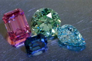
831.png
 
I'll give you the first thought I had. I miss the yellow color.
 
I'm glad you returned the yellow, it didn't have the saturation to match these. If you're getting a yellow, I would do a fancy intense or fancy vivid.
 
I have been eyeing the orange one sober guy linked....buy it before I do...please, lol.
 
Amazing colors- but I really love the steel guitar pick!
Must sound cool!!!
 
Thank you.
These two are very very good suggestions.
Hmmmmmmmmm.
 
Another vote for intense yellow.
 
kenny, you returned the fancy light bluish green ec? may i ask why? is the color too light? i was eying that one for a while... how are the imperfections? did you take more pics of that one? i would love to see some if you did... how do we exchange emails around here?
 
acebruin|1292025106|2793789 said:
kenny, you returned the fancy light bluish green ec? may i ask why? is the color too light? i was eying that one for a while... how are the imperfections? did you take more pics of that one? i would love to see some if you did... how do we exchange emails around here?

We can't exchange email on PS; it's against the rules here, but I'm not hard to find on FB.
Sorry, I do not have any other pics of it other than group pics.
It did have a tiny black spot or two but that did not bother me overall.
I cannot take more pics as it went out Registered mail yesterday.

Why did I return it? Good question which I'm asking myself now.
I loved that diamond and it was not an easy decision.
That was a lovely lovely lovely diamond with astonishingly fantastic light performance (second only to my round green) - a real bonus for an FCD, which are not cut for light performance.
Even though only Fancy Light, it was on the expensive side for the size.
Green and Blue are two words that translate into dollar signs in the world of naturally colored diamonds.

One reason is I already have blue and blue-green respectfully represented - though I still want an intense or vivid pure blue.
At the moment I want to take my tiny collection in a different direction, with my limited budget.
Beautiful diamonds are like beautiful women; a man's harem can only be so large. :Up_to_something: (we need a emoticon for running away)

While a fantastic diamond, it did not contribute well to the theme of this tiny collection.
The colors in my collection are fairly assertive, and this was more of a delicate pastel.
Perhaps some day I'll assemble a collection of the exquisite soft hues of FCDs.
God knows, for the same budget at least pastel shades would be more visible without optics. :naughty:

I'm not rolling in dough.
The indulgence of this collection would shock anyone knowing my income level.
That's another reason I want to maximize the my little collection's appropriate balance.
 
Kenny, how do you feel about purple? I think it would look smashing with your current collection.
 
I want a violet but the only ones available have gray modifiers and are tiny even for me.
Leibish has some purple but with inclusions I don't like.
 
VL, I LOOOOOOVE that first one. :love: :love: :love:
Wish it was more than 7 points.
BTW, it's more of a pear than a heart AFAIC.

Still it's on my short list and may vanish at any moment, IOW if I have another glass of wine. :naughty:
 
Yeah, that violet with red flashes is powerful, I think it would need to be only 7 pts not to overpower the others. I looked over your group pic again and also think you need something trillion, just to balance out the platonic solids. A nice triangular pumpkin!
 
Hmmm.
Not quite to scale.
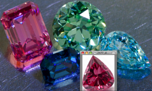
The new one is too large, but check out that color combination. :naughty:

Picture 9.png
 
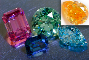
Here's how it would look.

Picture 8.png
 
kenny|1292039188|2793981 said:
Here's how it would look.

THIS.

Love that juicy orange color.
 
I think you need them both.
I'm sorry.
 
kenny|1292039188|2793981 said:
Here's how it would look.


That's the one! :appl:

LOVE IT! :love:

It looks almost juicy!
 
I have to say I'm not the least bit crazy about the small purple pear. I think the pink you have right now blows that one to the dust. I do love the orange though. :love:
 
Kenny, IMHO, I think you need a warm colour that balances out your beautiful cool colours but does not compete with your stunning pink. I second the suggestion that the yellowy-orange pear is the one to pick in terms of colour. I also like the shape contrast/complement within the set.
 
Love the orange pear. Its shape is between the pear and round you have. And orange is the contrast for blue on the color wheel so it is a good addition to make the blues you have pop.
 
Def something orange. It really completes your collection.
 
I like the orange oval that was posted in the beginning.
 
I would balance with the pink-pear.

You have an intense blue emerald and a ligher blue pear;
The intense emerald pink with a ligher pink pear would balance the pinks.

IMHO, an intense orange would compete with, rather than compliment, the other stones. The color is just too different.

Just my .02.
 
GET 3 FREE HCA RESULTS JOIN THE FORUM. ASK FOR HELP

Featured Topics

Top