shape
carat
color
clarity

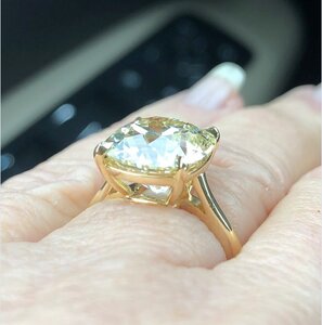
Help setting an O colored 1.59ct AVC diamond

It’s going to be gorgeous! I’m so excited for you!
Looking at your color combo choices my eye is most drawn to : Yellow gold outside edge of emeralds and lower half of band, from your first pic.
A very close second is : Rose gold inner semi cup and lower half of band, from your second pic.
Rose gold looks so great on you, it actually might be a tie between those two :)).

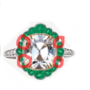
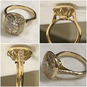
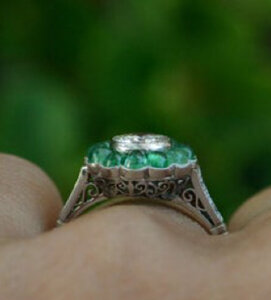
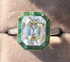
This one from Knoxjewel, on Etsy, is what made me consider a colored metal on the outside of the emeralds. It has a white metal bezel but yellow gold on the outside. Doesn’t it look so pretty?

Edited to add: The rose gold combo is pretty high on my list too. I have an 18k rose gold ring that almost has a champagne color.
9119D7D4-5677-4B0F-81DA-9AB0AB053EDA.jpeg

 
I like your proportions much better!

Thank you. I can’t draw for beans so I’m pretty happy with how this turned out.
ps. You do not want to know how many times I had to hit the “undo” button.:lol:
 
This one from Knoxjewel, on Etsy, is what made me consider a colored metal on the outside of the emeralds. It has a white metal bezel but yellow gold on the outside. Doesn’t it look so pretty?

Edited to add: The rose gold combo is pretty high on my list too. I have an 18k rose gold ring that almost has a champagne color.
9119D7D4-5677-4B0F-81DA-9AB0AB053EDA.jpeg


It is so pretty! I’m so happy you decided to halo your diamond in emeralds :love:. I can’t wait to see what you decide on for your metals. I hope you’ll post pictures of your finished ring on the CS side of the forum since the ring will have emeralds :)) . I don’t wander out of colored stones often and don’t want to miss seeing it!
 
It is so pretty! I’m so happy you decided to halo your diamond in emeralds :love:. I can’t wait to see what you decide on for your metals. I hope you’ll post pictures of your finished ring on the CS side of the forum since the ring will have emeralds :)) . I don’t wander out of colored stones often and don’t want to miss seeing it!

I definitely will. CS is my home base too. ;)2
 
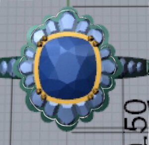
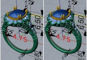
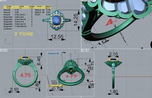
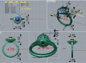
My new CAD is here. I haven’t had any time to look it over yet but I wanted to get it up ASAP to get your suggestions.

8C7B5C3F-5987-4069-93F0-22C45EAD8D54.jpeg
 
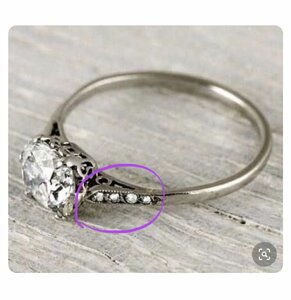
Curious: do you have other rings that have sub 2mm shanks?

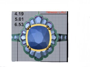
And while I think this latest CAD has a much better halo design closer to your inspo - it’s still off on this tiny little detail that (to me) really sets it apart
6CBE7ABD-89C1-4F49-BD8F-B9E42E47CAC0.jpeg

Last thought on this last CAD - the face up view - does it look like the halo outline is drawn in after the fact, not generated by the CAD, or is it or just me? Don’t know if that matters....
:)

It does kinda look drawn in. Weird.

That element you pointed out is actually really important to me. The halo is still not right so I’m working on that right now. I also need to tweak the shoulders because I don’t care for how they look with the new CADs. I have had a ring under 2mm before. I didn’t ask for this one to be but 1.8mm didn’t seem too far off.
 
I‘m focusing most of my efforts into getting the halo right. Everything else should be easier, I think. I took the metal framework from my inspiration/ mock up ring and laid it straight over the latest CAD. I colored over those lines in blue below so it’s easier to see.

9924DE66-6AF1-40B0-8F26-9A7F88B37A28.jpeg

DA2BA10C-E55D-4632-B783-3A66C47184B4.jpeg


I’m not sure what to do with the shank. It doesn’t look great right now.
Here are a couple pics I thought might work but I’m happy to hear your thoughts / ideas.

05F69D36-C924-4C4F-8D72-72AD9849CB5E.jpeg

145C38FB-5D8A-48D5-BF84-14BC8D05421F.jpeg
 
It's getting there(!), but I definetly think your edits perfect that halo.
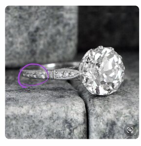
I have found that I prefer a little swoop at the top of the shoulders.
I don't think I'd go below 2mm. I think mine is 2.2mm. Thin but not too thin.
20200326_021712.jpg
 
It's getting there(!), but I definetly think your edits perfect that halo.
I have found that I prefer a little swoop at the top of the shoulders.
I don't think I'd go below 2mm. I think mine is 2.2mm. Thin but not too thin.
20200326_021712.jpg


Thank you. I like that little swoop too. Ideally, I don’t want the shoulders to look too thick from the top, which was my problem with the other CADs.

After looking at the CADs some more, I‘m going to change the bottom from two lines down to one.
806469FD-7971-4067-A5C3-6BFD1BCCAED1.jpeg
 
The swoop not only helps the side view, but changes the top view too. It was night and day when DK made that change on mine!
 
The swoop not only helps the side view, but changes the top view too. It was night and day when DK made that change on mine!

Thanks. I just sent a message over to DK to try that “swoop” to see if it makes a different for me. :mrgreen: Thank you So much for all your input.
 
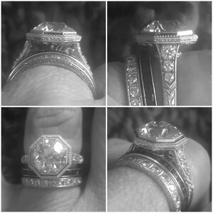
@elle_71125 to illustrate what a difference the shank shape made, here's before and after that change was made on cad (But still early on, when I thought I was just doing the round bezel). But the swoopy shoulders carried on into the octagon design because it made such a difference! To me it's more feminine, like sexier? And though the top of my shoulder is wider, you don't see that width from the top.
20200326_172703.jpg

And the final ring ( in black and white to focus on the structure):
20200326_174633.jpg

Oh wow! That’s a huge visual difference. I think this is an excellent way to make it appear thinner. I agree...it’s way more feminine/ sexier. :love:
 
I hope you don't mind, but I did a (very crude ) mock up on your cad. The red arrows show where an observers eye hits the shoulder from the top. I just wanted to share all this as I had the very same dilemna!
20200326_182437.jpg

The other effect I noticed is it makes the center appear more lifted up, prominent. And your center deserves that!

Thank you! It looks way more feminine with that dip. I love it! :D
 
Again, very crude rendition, but see how that gives the stone and halo like "center stage"? Like it's "lifted up" for presentation? Hopefully you'll like it in a way more professional cad. (I don't mean to butt in too much, but I just think this is going to be one of the MOST amazing rings! I'm excited for you!)
20200327_113415.jpg
 
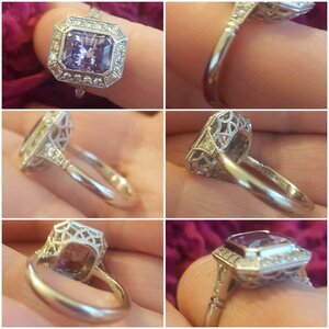
Ok, one more bit of input. I made a very similiar shoulder on my spinel, with that little dip. Made a huge difference. I also loved the way D&T had her tapered shank that widens in the back. I think she told me hers was 3mm at the back, rounded, comfort fit. So I made that last minute change in my spinel. It is SO comfortable too. And can help with spinning as there's extra weight at the bottom. I didn't do it on my octo as I'm a stacking fan. But if you plan to wear this alone, I highly recommend it. Just ask DK for a shank like Terry gets. They knew immediately what I meant. My spinel widens to 2.5mm in the back for reference.
20200327_115816.jpg

@mrs-b does something similar. The lovely floral setting I bought from her (my little ball of sunshine ring) has a tapered shank that gets bigger in the back...and it’s super comfortable to wear. I‘ll probably be wearing this as a stand alone ring. That’s what I usually do anyway...so this is something I’ll seriously consider. :mrgreen:

BTW, I like how your shank is more rounded, after the shoulders. I find the rounded shanks to be much more comfortable than the squared off ones. I asked for DK to round the shank on mine (that’s shown in the last CAD) but I was worried it might be too rounded, if that makes sense.

The dip is happening, no questions about it. I LOVE the look it gives. :cool2:
 
I was just admiring @bright ice 's new VC again and realized it's another perfect example of same dip. Glorious!
20200327_140946.jpg

Her ring is absolutely swoon worthy! Like...damn! :love:
Just another reason why the dip needs to happen.

Oh, feel free to keep on “butting in” because I love all your ideas. :D
 
@mrs-b does something similar. The lovely floral setting I bought from her (my little ball of sunshine ring) has a tapered shank that gets bigger in the back...and it’s super comfortable to wear. I‘ll probably be wearing this as a stand alone ring. That’s what I usually do anyway...so this is something I’ll seriously consider. :mrgreen:

BTW, I like how your shank is more rounded, after the shoulders. I find the rounded shanks to be much more comfortable than the squared off ones. I asked for DK to round the shank on mine (that’s shown in the last CAD) but I was worried it might be too rounded, if that makes sense.

The dip is happening, no questions about it. I LOVE the look it gives. :cool2:

@elle_71125 -

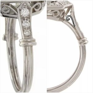
I do the same thing with the shank - and also with the dip on the shoulders. I prefer the shank to join the head slightly *under* the head, rather than on the same level as it. I always tell Amy - "More swoop! More swoop!" She knows what that means, if you want to use the same expression with her. It's a more elegant look, and makes the head look like it's not being consumer by the band/shank.
 
By the way - VC does the perfect swoop - as does Leon. Here's a shot of Bright Ice's original setting for her 7ct cushion; it's not the setting she stayed with, but it *does* have the perfect swoop. You'll also see what I mean about the shank joining under the head, rather than on the same level as it.

BI's original VC setting.jpeg

Thank you @mrs-b :wavey:
That pic is a perfect example. I’m saving it so I can show them on my next round of CADs. More swoop it is. :mrgreen:

I like how the shank joins under the head. That’s a great idea. Thank you.
 
Yes, @mrs-b is right! Mine like this also meet under the head, great point! Exactly as she said, it keeps the head from being consumed by shank.

I was worried about my spinel shank being "too round" also, but went with it anyway. I'm so glad I did, it is SO comfortable! And highly recommend the thicker in the back of you're wearing this solo. The added heft feels more luxurious too!
 
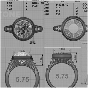
My newest CAD is here and I can definitely see some improvement with the halo.

59643BEE-CAB0-42AD-9034-9616D0BCFB58.jpeg


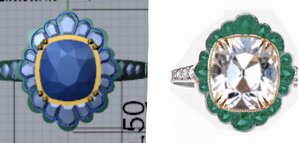
The shape for the halo is much better but I noticed the emeralds don’t all match that shape leaving gaps between the halo and the stones.
49C45B81-442D-41E2-AC9A-19F05F749DC0.jpeg


This one shows how close the shape is to my inspiration pic and what needs to be adjusted on the halo. I find it really helpful for me to see it this way.
E64E8AC4-2D83-4308-A8C6-845DC20EF0C5.jpeg


@CHRISTY-DANIELLE any thoughts on the swoop factor? What would you change for the shoulders? I definitely need help on that front.
 
Another vote for liking the swoop =)2
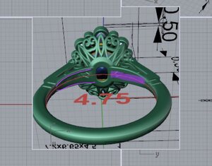
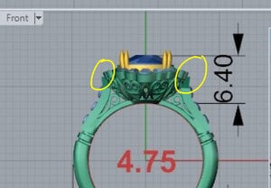
But I don’t think I enjoy the way the attachment is shown in the CAD
170EC754-79F3-4B0E-8592-2D5032116261.jpeg
But not quite sure how this exact CAD would translate to an exact cast IRL?

And a random pic of a similar effect that transitions a little smoother than the CAD shows.
78DF8E32-FCB1-49B6-8809-0316CD04F890.jpeg
 
GET 3 FREE HCA RESULTS JOIN THE FORUM. ASK FOR HELP
Top