shape
carat
color
clarity

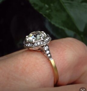
Help setting an O colored 1.59ct AVC diamond

I would get quote both ways. If I could swing it - custom cut for sure.
I think success of using rounds in this design will totally depend on the finesse of how it’s set and the amount of metal.
With you and DK and viewing all your previous successes - I think it would be pulled off beautifully.
(My local jeweler prong or channel or attempting pave setting all that - absolutely not would it look well at all - lol)

Thank you, Rfisher. I actually did request a quote for both ways. I love the rounds but I'm worried about the same thing you are. If it's not done well, there would be too much metal messing with the look.
 
Ok- another thought on this @elle_71125
As I’m sure you’ve got this under control!

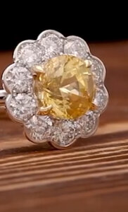
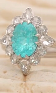
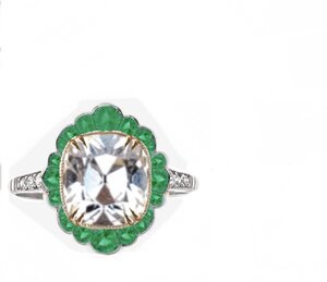
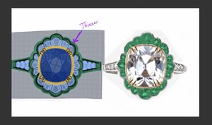
I bet DK can set the round emerald stones as in your lovely mockup, like he did the diamonds in @whitewaves yellow cluster or @distracts paraiba
C804C8EC-107F-4896-AD6D-C134060CBC55.jpeg9D0557EA-FB6D-4524-904D-863D6938F604.jpeg
And I bet his bench could manipulate the outline shape of the white metal semi bezel to the shape you’ve created by both the emerald size and sculpting the metal semi bezel shape a bit......

If it’s something their bench could do -
But maybe labor in that option might negate the savings of going rounds over custom cut?

As opposed to setting round emeralds instead of diamonds into your Tsav halo, as an example of how a bench might complete this project ‘easily’ and not be the look you intend.
 
I received my quote from David Klass and it was pricey (thank you custom cut emeralds :shock:) but still worth it IMO. So, I’m going ahead with the project. Now I have to start fine tuning details.

B3869E89-82FA-447C-BF7C-D738909A3743.jpeg
 
Ok- another thought on this @elle_71125
As I’m sure you’ve got this under control!

I bet DK can set the round emerald stones as in your lovely mockup, like he did the diamonds in @whitewaves yellow cluster or @distracts paraiba
C804C8EC-107F-4896-AD6D-C134060CBC55.jpeg9D0557EA-FB6D-4524-904D-863D6938F604.jpeg
And I bet his bench could manipulate the outline shape of the white metal semi bezel to the shape you’ve created by both the emerald size and sculpting the metal semi bezel shape a bit......

If it’s something their bench could do -
But maybe labor in that option might negate the savings of going rounds over custom cut?

As opposed to setting round emeralds instead of diamonds into your Tsav halo, as an example of how a bench might complete this project ‘easily’ and not be the look you intend.

@Rfisher I decided to go with the fully custom cut emeralds. I think that will give me the best chance of success. :mrgreen: I hope you follow along because your input is truly invaluable to me. You have a great eye for the details.
 
I think that's a great choice. A little financial pain now but no regrets later! This is going to be amazing!
 
I think that's a great choice. A little financial pain now but no regrets later! This is going to be amazing!

I think so too...and it’s a good thing my DH agrees. :love:

I hope you’ll consider helping me with some details. Your ring turned out absolutely amazing!
 
Now that I have a design in place, I’m trying to work out some specifics.

For the gallery: I submitted this one to DK as a starting point. I don’t know how it will look with the new design but it seems like a good place to start.
63E23F7E-D656-429C-872C-29A5F48F115C.jpeg


I’m also toying with metal color. Should I use straight white gold / plat? Rose gold two tone? Or yellow gold two tone. Choices, choices. I tried to mock up the pics a little bit here.

1. All white
2. Yellow gold outside edge of emeralds and lower half of band.
3. Rose gold outside edge of emeralds and low half of band.
EA0D0FBB-A032-4E44-8D44-B5C96A0A9788.jpeg


1. Rose gold inner semi cup and lower half of band.
2. Yellow gold inner semi cup and lower half of band.
5BE574A2-0C49-4F34-9F4C-9177D03A6361.jpeg


Any thoughts?
 
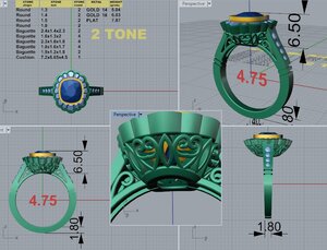
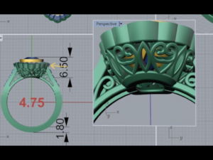
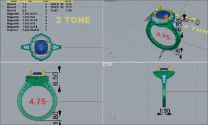
David sent me the first CADs today. I’ve already requested a few changes.
1. The halo is definitely not what I have in mind. Also, the overall look is bulky.
2. I asked for him to thin the shoulders down and taper them more.
3. I asked him to tuck the gallery in more.

F6BAD48F-A78E-4988-9E36-76408FF71ECF.jpeg

Does anyone have experience with the semi cup (semi bezel). I can see a lot of it under the gallery. Is that normal?

Should I try a different shoulder look or a different gallery? I’m open to options. :mrgreen:
 
I have yg with both of my AV light yellow stones, and they don't obstruct the pavilion of the stone. I can't understand what I am seeing through the gallery. I don't think you should see yg through there. I think the halo needs to be tilted downward a tiny bit. It looks pretty flat.

This is hard for me to explain, but when I look at the side view of the gallery, that top piece is too wide. It needs to be narrower and the gallery can come up a tiny bit more.
 
Last edited:
I love this whole design, (and you know I love that gallery! ) :love:

Of the metal combos, I like the bottom left the most. The rose gold around your AVC with rose gold lower shank. The color combination is SO striking and a bit unexpected.

The CAD does look bulky. I agree the halo should angle down more. And thinner outline of metal around the halo. And on the side view, the halo is too thick. Looks like nearly 2mm. If that is thinned and Then they angle the gallery in more it will look more like your example. (I absolutely love that gallery, I hope you can make it work!) And what about making the stones at 3'o'clock and 9'o'clock more prominent?
20200317_234732.jpg

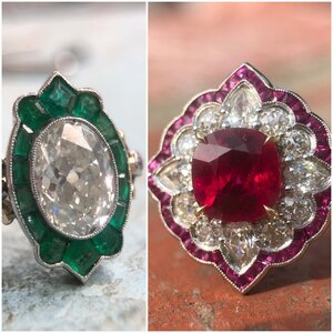
I think you are seeking a design with a bit more finesse, like these examples from Sako:
20200317_235634.jpg
 
Please keep posting updates @elle_71125 . The style you’re aiming for is exactly my taste too and this thread is cheering me up no end - I keep compulsively checking the Covid threads and depressing myself, so some beautiful bling is just what the doctor ordered as an antidote!
 
Also, the ring in my avatar has a similar cup that can been seen under the gallery (like in your cads). I’ll post some pics in case they help. And I love @CHRISTY-DANIELLE ’s version with the larger 3 o’clock and 9 o’clock stones!
 
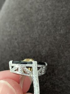
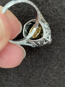
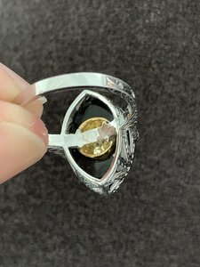
Here’s some pics. I can’t seem to show the cup fully, but it goes down and meets the top of the shank. I don’t notice the yellow cup through the white gallery at all when wearing it, although it looks very noticeable in close up pictures. Please excuse the cat fluff all over my trousers - an advantage of quarantine is wearing slobby house clothes all day! Ditto for dry hands from all the hand-washing.
9E554810-28B4-420A-BB8F-1FD25D966602.jpeg7327176D-7602-4860-B2BE-51654F83E9F7.jpeg2DF2DD32-E1FD-4887-8C53-56D0BDCD5CB5.jpeg
 
I may have missed it, are you cupping it for color?
Is it a true bezel or faux with prongs?
I have had cads from DK that have had artifacts (I think it was called) like what this looks like that meant nothing - but I didn’t like seeing them there, and requested refreshed cad without them showing, just to be sure.
+1 on the side ( and top) view halo bezel too thick.
And the calibre cut emeralds don’t look to be in groupings /graduated proportions like your inspo.

And another +1 for the great mind distraction!
 
I have yg with both of my AV light yellow stones, and they don't obstruct the pavilion of the stone. I can't understand what I am seeing through the gallery. I don't think you should see yg through there. I think the halo needs to be tilted downward a tiny bit. It looks pretty flat.

This is hard for me to explain, but when I look at the side view of the gallery, that top piece is too wide. It needs to be narrower and the gallery can come up a tiny bit more.

I think I understand which area you’re referring to. Is It the side view of the halo?
Right where I pointed an arrow?

54AF8305-5F93-49AD-8C0D-375E8B96B502.png

I don’t know what I’m seeing through the gallery either. I want it purely for the way it looks from above and I thought that it would barely come down under the stone.
A great example of what I’m talking about is CvB’s Casablanca. You can see the semi cup just barely goes into the setting.

BFE910E6-39E6-49D6-97AA-EADDD2CE58CA.jpeg
 
I love this whole design, (and you know I love that gallery! ) :love:

Of the metal combos, I like the bottom left the most. The rose gold around your AVC with rose gold lower shank. The color combination is SO striking and a bit unexpected.

The CAD does look bulky. I agree the halo should angle down more. And thinner outline of metal around the halo. And on the side view, the halo is too thick. Looks like nearly 2mm. If that is thinned and Then they angle the gallery in more it will look more like your example. (I absolutely love that gallery, I hope you can make it work!) And what about making the stones at 3'o'clock and 9'o'clock more prominent?
20200317_234732.jpg

I think you are seeking a design with a bit more finesse, like these examples from Sako:
20200317_235634.jpg

Yes! Those designs are much more in line with what I’m trying t do with my ring. I want it to be delicate and elegant. It’s tough to describe to the CAD artist exactly what I mean by that.

I agree that the halo should be tilted down more (which I forgot to ask for) and that the metal on the side should be narrowed down (which I also forgot to ask for).:shifty:
The halo itself is still a long way off from what I had in mind. I asked him to try and make it more like my inspo piece. I guess we’ll see where the next CAD takes us. I totally agree that the emeralds at 3 & 9 should be bigger. Not much smaller than the ones at 12 & 6 by my thinking.

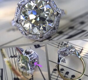
I‘m also looking for the shoulders to taper off better. The ones on the CAD are too thick and straight. I like how this one starts small and tapers quite noticeably towards the shank.
6C012AF4-E159-46BA-ABFD-7EFB262C15D2.jpeg
 
Please keep posting updates @elle_71125 . The style you’re aiming for is exactly my taste too and this thread is cheering me up no end - I keep compulsively checking the Covid threads and depressing myself, so some beautiful bling is just what the doctor ordered as an antidote!

Absolutely! With everything going on, I could use a pick me up too. Plus, I’m watching my upcoming vaca plans crumble around me. It’s small potatoes, in the scheme of things, but I’m bummed nonetheless.
 
Thank you for posting those pics. It’s very helpful. :D That’s what I think is happening but it’s also not necessary for this setting (since I’m not trying to bump the color).

BTW. The cup looks gorgeous on your ring. What a perfectly lovely setting! :love:
 
I may have missed it, are you cupping it for color?
Is it a true bezel or faux with prongs?
I have had cads from DK that have had artifacts (I think it was called) like what this looks like that meant nothing - but I didn’t like seeing them there, and requested refreshed cad without them showing, just to be sure.
+1 on the side ( and top) view halo bezel too thick.
And the calibre cut emeralds don’t look to be in groupings /graduated proportions like your inspo.

And another +1 for the great mind distraction!

Nope, I’m not cupping for color. i just like the look of a semi cup (or semi bezel?) with prongs. Kind of like the CvB pic I posed above.

i totally agree on the halo / bezel being too thick. I’m going to message DK about that. Also, I’m glad you noticed the calibre cut emeralds aren’t proportioned correctly. I already messaged DK to ask him to make the halo look much more like my inspiration pic. I did a lot of work mocking that up and I’d like to see it become reality. :mrgreen:
 
Would what the tone of the emeralds end up as, sway you towards one metal color or the other?
 
Would what the tone of the emeralds end up as, sway you towards one metal color or the other?

Good question. I’m not really sure. :think:
 
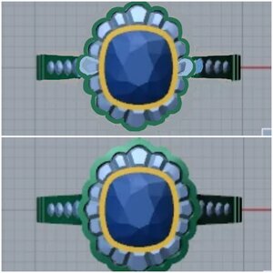
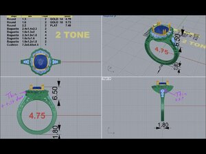
Here’s the new CADs. I already know I want to thin out the metal around the halo (from the top and sides).

FE7AB205-58C6-48F4-ABE2-55CF51439CFF.jpeg
 
Last edited:
Well , that's already better! Halo looks more like your design. I like the shoulders better too. I think the emeralds might still be too small though?:think:
 
@CHRISTY-DANIELLE Thank you for your thoughts on metal color.

Anyone else want to chime in on color combos? Pics located right here:
https://www.pricescope.com/communit...olored-1-59ct-avc-diamond.252103/post-4700350

It’s going to be gorgeous! I’m so excited for you!
Looking at your color combo choices my eye is most drawn to : Yellow gold outside edge of emeralds and lower half of band, from your first pic.
A very close second is : Rose gold inner semi cup and lower half of band, from your second pic.
Rose gold looks so great on you, it actually might be a tie between those two :)).
 
Oh elle this is going to look so beautiful!
This ring is going to be such a dream ring! ❤
 
I tried drawing on the CAD to make it closer to my inspo pic. Larger emeralds and a more floral look. What do you think?

52A55F17-4100-472B-9497-CAFE85AFCFE9.jpeg

0956224E-F27F-49A3-A2A8-6954876E729E.jpeg

I submitted some new changes to DK and I’m hopeful that my next CAD will be even better. :D
 
Last edited:
Looking good!
 
GET 3 FREE HCA RESULTS JOIN THE FORUM. ASK FOR HELP
Top