shape
carat
color
clarity

Announcement PriceScope Upgrade of October 7th

Okay, I figured it out.

To be clear, the issue occurs when I am logged in, viewing PS threads (I haven't started a new thread since the update).

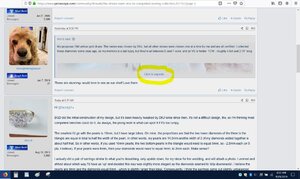
It seems the "click to expand" command comes up only when the photo is part of a quoted post, as shown in the attached screenshot

1570635658550.jpeg


I actually don't remember if this was the status quo before the update; either way, personally I'd prefer everything in a thread to be fully expanded rather than have to click to see the image.

Thanks Admin for all you do to make PS such a wonderful community and such a great website!

Haha, wow I just way over complicated things -- sorry.

I forgot about the expanded quote section. It behaved the same before, as I have taken time to trim quotes so that if people don't expand they are sure to hone in on critical information. Unfortunately, that solution doesn't always work.

As far as which way is better? Depends. I prefer less scrolling, but will take the time to expand it. But I was used to it because it was the same in the old forum.
 
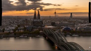
Going off the bolded section above, I am posting a screen cap of my desktop (a few items blacked out for privacy reasons). I run 4k resolution which will be much larger than the width of the content section. You should see an image, but you will need to click on it to maximize the size.

That said, I think this may be different than what @marymm was experiencing. I have a few feeling my past few posts addresses her issue. Unfortunately, in that case, it would depend on how the author decided to upload/embed the image and @marymm wouldn't have any control over that function. As admin, there is likely control features to limit how people can post images that could force all users to do one way or the other.

FWIW, in the old forum, if you didn't insert the image, it simply didn't show up. It never showed as an attachment like in post #143

Inkeddesktop_LI.jpg


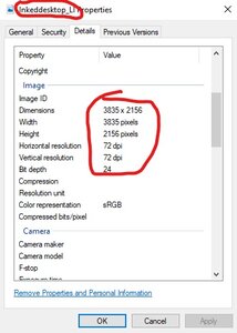
Also, FWIW, the forum neutered my image. 4k resolution is 4096 x 2160. I run dual monitors and over cropped the image so I ended up with slightly less.

Here is a screen cap of the image properties of the photo I uploaded:

InkedCapture888_LI.jpg

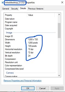
And here is the version that I clicked to expand and then downloaded from the PS server. See how it reduced to 1280 x 720? Still larger than the width of the max forum width, but considerably less than the original.

Also, the original file size was 3.42mb, whereas the neutered version is only 159kb. The size difference is what matters here, as imagine how many images get uploaded and how much hard drive space those eat. Server costs are partially based on bandwidth and space needed to host your files, so it's easy to understand the "why" for neutering.


InkedCapture889_LI.jpg
 
Can I block my attachments below the reply box?
 
@psadmin
When I copy and paste the emoticons the animation doesn't function. Can it be fixed?

1570635449506.png1570635549780.png1570635600403.png


Testing to confirm if emoticons from a different site work.

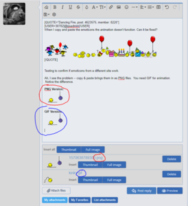
Ah, I see the problem -- copy & paste brings them in as PNG files. You need GIF for animation. Notice the difference.

My guess is mods need to change default image from PNG to mimic original source file rather that be JPG, PNG, GIF, etc.


PNG Version:
1570636789300.png


GIF Version:
kinky.gif


Capture99.PNG
 
Can I block my attachments below the reply box?


Do you mean you don't want to see "My Attachments"?

If so, I've voiced that concern. Sounds like smilies will be the default entry once they get it fixed. The rest seemed unclear.

I don't like seeing all the attachments either. Too cluttered and messy. Only want them if I'm specifically looking for them.
 
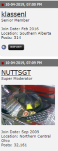
User status has been removed and we cleaned up the banner under the avatars.

I am thinking we need to have those redesigned.

Is anyone interested to help create new ones?
 
Last edited:
User status has been removed and we cleaned up the banner under the avatars.

I am thinking we need to have those redesigned.

Is anyone interested to help create new ones?


Nice job, thank you. I actually noticed BEFORE I saw this post.

My Photoshop skills are pretty limited. However, I'm happy to help brain storm some ideas.

Are you wanting to keep the same structure? And what is that structure? I know I've seen various levels for awhile. Is this it, or am I missing some?
  • Rough Rock
  • Shiny Rock
  • Brilliant Rock
  • Ideal Rock
  • Super Ideal Rock
  • Trade
  • PS Staff
Seems like there should be a Moderator one, but that could also be PS Staff.
 
One of my car forums does it this way:

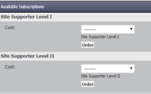
Here they have a supporter badge, as you can donate money if you desire. Several forums have this option. This one gives you a 20 year supporter membership for different amounts.

Level 1 = $15
Level 2 = $25

Capture10.PNG

Capture11.PNG

Capture12.PNG

Capture13.PNG


Another forum I visit chose to be simple. They too have a support module, but it's more costly -- $50/year. Hardly anyone does it.

Capture14.PNG

Capture15.PNG
 
Regarding image size, we did limit the total overall due to spacing and download time. If all the images on Show me the bling where 4K size it would take forever to upload one page.

Saying that I do have plans to see what can be done to improve that as drive space is getting cheaper and image resolution is getting better.
 
@psadmin
When I copy and paste the emoticons the animation doesn't function. Can it be fixed?

1570635449506.png1570635549780.png1570635600403.png


That depends on how you copied them and from what page?

Can you tell me where you copied them from? I wonder if we can make them like smiles? hmmm
 
Okay, I figured it out.

To be clear, the issue occurs when I am logged in, viewing PS threads (I haven't started a new thread since the update).

It seems the "click to expand" command comes up only when the photo is part of a quoted post, as shown in the attached screenshot

1570635658550.jpeg


I actually don't remember if this was the status quo before the update; either way, personally I'd prefer everything in a thread to be fully expanded rather than have to click to see the image.

Thanks Admin for all you do to make PS such a wonderful community and such a great website!

Thanks for clarifying.

In general, the non expanded is the preference due to mobile bandwidth and less scrolling, but let me think about it.
 
Here is the info on the badges.


This probably needs its one thread on hangout. :)
 
Thanks for clarifying.

In general, the non expanded is the preference due to mobile bandwidth and less scrolling, but let me think about it.

Is it possible to give set the default to non-expanded, but allow an option in the user control panel for a person to change it to fully expanded, if they prefer?
 
I certainly have the Photoshop skills that I could help with new badges, but doing an entire set by myself from scratch is not something I'm sure I could take on at the moment.

Glad to help with things, however.

Also, come to think of it I don't think I've ever even seen the "prosumer" badge.
 
Is it possible to give set the default to non-expanded, but allow an option in the user control panel for a person to change it to fully expanded, if they prefer?

Those are my thoughts, but at this time I want to make sure to fix things as they are.

In addition, the more options we add the more need for testing, fixing, and the slower the page uploads.
 
Regarding image size, we did limit the total overall due to spacing and download time. If all the images on Show me the bling where 4K size it would take forever to upload one page.

Saying that I do have plans to see what can be done to improve that as drive space is getting cheaper and image resolution is getting better.

1280 is probably sufficient for most items here, although with technology getting better it may be possible to increase. I think 4k is overkill. I just used it earlier as I thought I'd get an exaggerated result to easily show what I was trying to say. It kind of backfired, lol.

In the US, high speed internet is pretty common. However you still have remote areas with limited data speeds.

Also, cell phone speeds continue to improve and many use wifi when available; however, it's nice to have a fast site as mobile speeds tend to be less reliable.

I'm not sure how many international users we have, but I know we get a few and it seems not all countries are enjoying the same luxuries of the US in regards to internet speeds, rather home based or mobile.

Storage space is cheap and camera resolutions continue to grow. I can appreciate the struggle you face to maintain balance.


That depends on how you copied them and from what page?

Can you tell me where you copied them from? I wonder if we can make them like smiles? hmmm

We currently have a few animated smilies. I haven't dove into the technicalities but I don't think it would be too terrible to add more. A Jeep forum I used to visit had so many it was on the verge of too much.

I think this is where really exploring the image options could be useful. If users could create their own folders, I could have a folder for special animations. If I have the ability to select which folders show up by my edit box I can then use them different ways as well.

As far as the source where @Dancing Fire found them I bet it's the smilie thread here on PS. There is a boat load of them and it was a simple copy and paste operation before.

Now as I posted upstream it appears when you do that same thing it brings in as PNG format instead of the original destination file format, which is GIF for animations.
 
I certainly have the Photoshop skills that I could help with new badges, but doing an entire set by myself from scratch is not something I'm sure I could take on at the moment.

Glad to help with things, however.

Also, come to think of it I don't think I've ever even seen the "prosumer" badge.


Thanks for the offer. Maybe we can have the whole community involved.

The "Prosumer" Badge was only given to one person ever. It has gotten mixed opinions on it and I need to rethink it.

It was based on this context. https://www.pricescope.com/community/threads/rockytalky-prosumer-guidelines.145983/
 
Last edited:
testing

cheerleader1.gif
 
We have a thread dedicated to emoticons here:


I was able to just drag the emoticons and it worked. The key is to make sure you click on it and hold to get the drag initiated happening.

Hope that helps.


1236088g0hr2ipvh9.gif
 
The current banners have a dated feel to them. The following may not be the right answer but is maybe a starting point.

I think maybe some simple designs, with small variances and colors could potentially be a good change.

A few examples.

Screenshot_20191009-134043_Chrome.jpg

Maybe a higher level:

Screenshot_20191009-134314_Chrome.jpg

And an even higher level:


Screenshot_20191009-134248_Chrome.jpg

Screenshot_20191009-134446_Chrome.jpg

Super ideal level?

Screenshot_20191009-134728_Chrome.jpg
 
We have a thread dedicated to emoticons here:


I was able to just drag the emoticons and it worked. The key is to make sure you click on it and hold to get the drag initiated happening.

Hope that helps.


1236088g0hr2ipvh9.gif

Drag and drop works, but copy and paste won't? I use keyboard, so CTRL C and CTRL V.

And thank you for the link to the thread. I have it bookmarked on a different device.
 
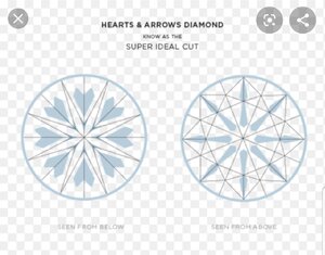
What about you get an arrow for the next level, and then at last the top posters have all of their arrows for a true H&A? :P
 
Actually now that I think about it, for me @Victor Canera already has the perfect logo if we were to do a H&A design.

Of course, never without proper permission. And besides that, we are spitballing at this point.

Still, truly one of my favorite avatars on here.

48007.jpg
 
What about you get an arrow for the next level, and then at last the top posters have all of their arrows for a true H&A? :razz:

That could be cool too. VC inspired logo in a blue theme and as your level progresses up you get all the H&A. Lower levels have less of them and the remainder is defunct of the H&A shape.

Maybe marry the hearts and image of this style together (similar to VC) so you see something until the H&A shapes fully merge.

716914
 
You all are awesome. Love your ideas.

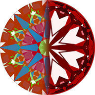
Made me think about maybe an HCA Score logo as well. :)
 
You all are awesome. Love your ideas.

Made me think about maybe an HCA Score logo as well. :)

I really like the HCA score idea. Obviously your score gets better as you.progress up the ranks.

Just be careful not to use numbers. People already ask if a 1.2 is better than a 1.7 for instance.

But imagine the H&A image above with the color bar below and the position of the black arrow moves from red to green as you go from rough rock to super ideal.
 
It was not 'our' trade people, it was random scroggers from all around the world. I am not sure but at one time all Indians were banned from joining the forums.
LOL. What?
I guess I got kicked off and didn't notice - or it was before 2009 :lol:
 
@psadmin An upgrade is never easy - first and foremost colour me hugely impressed that y'all were able to complete successfully over one night!!

I did have two questions - I don't know what might be possible.
1. Would it be possible to allow users to delete their own images? I've become more aware of my presence on the internet over the years, and have a few I would like to remove. I know I can always ask the moderators for help, but I do feel bad doing that several times!
2. Many threads now show both full-size images and those same images as attachments. Can we eliminate visibility of the attachments, so only full-size renderings are visible in threads? The duplication takes a LOT of space on a mobile interface.
 
GET 3 FREE HCA RESULTS JOIN THE FORUM. ASK FOR HELP
Top